3D Snack Brand Website Redesign for Twigz

Umar Tanveer

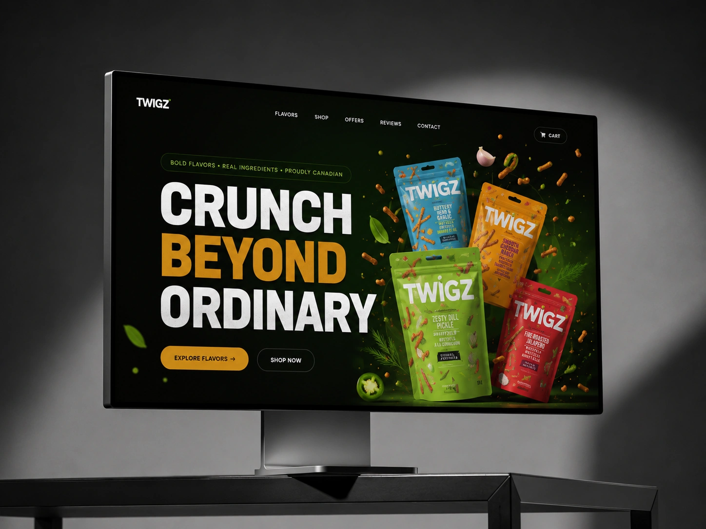
Twigz Crunch Craft — 3D Snack Brand Website Design
Twigz Crunch Craft is a premium digital experience created for a Canadian snack brand built around one simple idea: great snacks should feel as exciting as they taste.
For this project, I designed a bold, playful, and highly visual website that turns the brand's products into the main characters of the experience. Rather than relying on a conventional food-commerce layout, the direction combines 3D-inspired product presentation, immersive visuals, strong typography, and playful storytelling to create a website that feels as energetic as the brand itself.
The goal was to make visitors immediately curious about the products while giving Twigz a distinctive digital identity that could stand apart from conventional snack brands.
The Challenge:
Snack brands operate in an extremely visual category. Packaging needs to grab attention on a shelf, but the digital experience has to do even more—it needs to communicate flavor, personality, quality, and craving within seconds.
The challenge was to create a website that could:
Make the products the visual hero
Communicate the playful personality of Twigz
Create an appetite-driven browsing experience
Showcase multiple products without making the interface feel crowded
Give the brand a contemporary, premium digital presence
Create a memorable experience beyond a standard product grid
The solution was to treat the website less like a traditional snack store and more like an interactive brand experience.
Creative Direction:
The creative direction was built around movement, crunch, color, and product personality.
Instead of presenting products as static packshots, I explored ways to make them feel dimensional and tactile. Large product visuals, layered compositions, playful graphic elements, and depth-based layouts help create the sensation that the snacks are almost breaking out of the screen.
The visual language balances two seemingly different qualities:
Playful enough to feel approachable.
Premium enough to feel intentional.
That balance became the foundation for the entire interface.
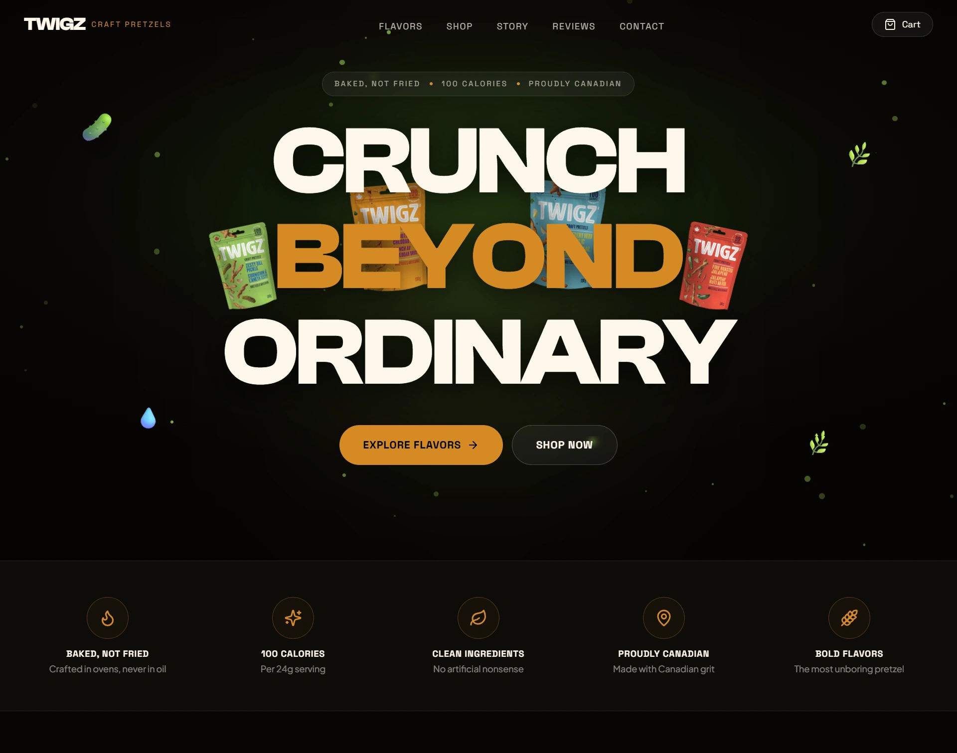
The Hero Experience:
The hero section was designed to make an immediate visual statement.
Rather than opening with a conventional headline followed by a product grid, the experience puts the snack products front and center, using scale and composition to establish the brand's personality immediately.
The product arrangement creates depth and movement while leaving enough breathing room for the headline and call-to-action. This allows the first screen to communicate three things almost instantly:
What the brand sells.
Why it feels different.
Where the visitor should go next.
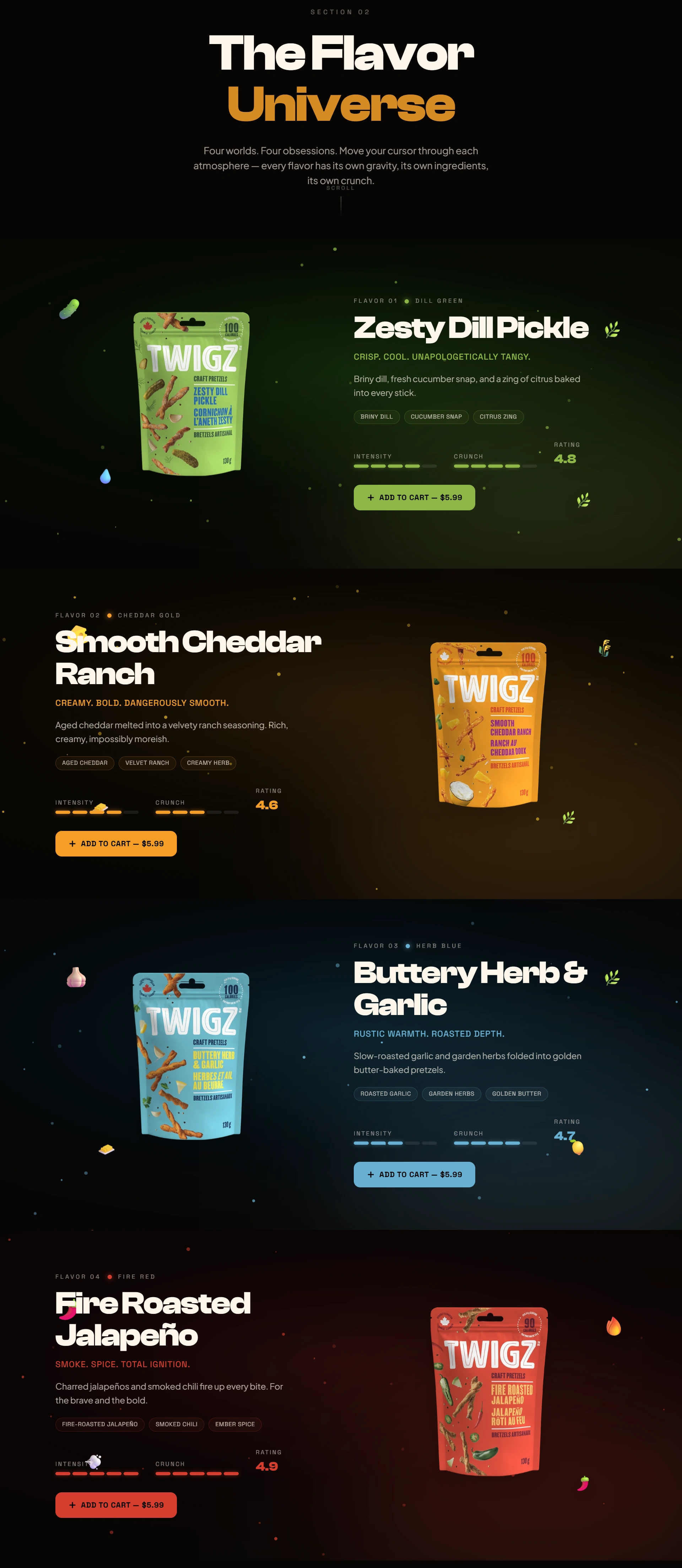
Product-First Storytelling:
One of the most important decisions was to make the products the protagonists.
Each product receives enough visual attention to feel distinct while remaining part of a cohesive brand system. Instead of overwhelming visitors with technical product information, the design uses visual hierarchy to encourage discovery.
The result is a browsing experience that feels closer to exploring a collection than scrolling through a conventional e-commerce catalog.
3D-Inspired Visual Language:
The website uses depth, scale, layering, shadows, and dimensional compositions to create a more immersive experience.
This approach was particularly important for a snack brand because physical texture is difficult to communicate digitally. The visual system therefore focuses on creating a sense of crunch, volume, and physical presence through composition.
The intention was simple:
Make the visitor feel the product before they taste it.
Brand Personality Through UI:
Every interface decision was made to support Twigz's personality.
Instead of rigid grids and overly corporate components, the layout introduces:
Dynamic product compositions
Oversized typography
Playful visual transitions
Layered elements
Bold calls-to-action
Strong visual rhythm
Generous whitespace around key products
This creates an interface that feels energetic without sacrificing usability.
Designing for Conversion:
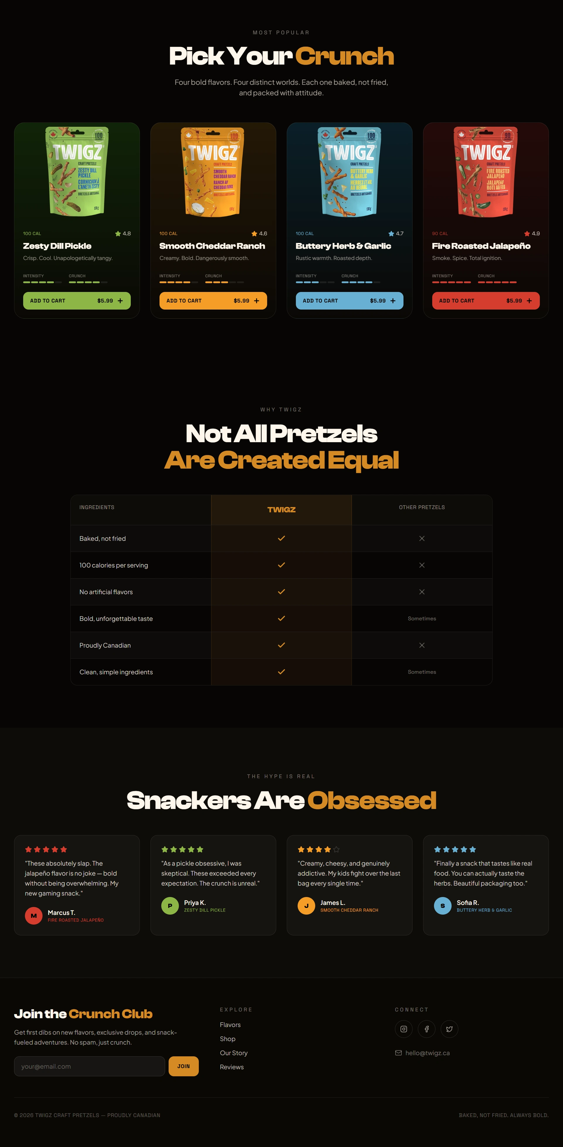
A visually exciting website still needs to guide visitors toward action.
The information architecture was therefore structured around a straightforward journey:
Discover → Explore → Understand → Crave → Act
The homepage introduces the brand and products first, then gradually gives visitors more reasons to explore. Calls-to-action are positioned around natural decision points rather than interrupting the experience.
This keeps the interface promotional without making it feel overly sales-driven.
Responsive Experience:
The visual system was designed with responsiveness in mind from the beginning.
Large product compositions and dimensional elements need to translate carefully to smaller screens, so the layout prioritizes:
Clear content hierarchy
Flexible product positioning
Readable typography
Comfortable spacing
Touch-friendly interactions
Consistent brand storytelling
The objective was not simply to make the desktop layout smaller, but to preserve the same sense of energy and personality across devices.
Design Process:
The project followed a product-focused creative process:
01 — Brand & Audience
Understanding Twigz as a playful snack brand and identifying the visual characteristics needed to appeal to modern consumers.
02 — Visual Exploration
Exploring product compositions, typography, depth, color relationships, and graphic treatments to establish a distinctive visual direction.
03 — Experience Architecture
Structuring the website so the visual impact of the products works together with intuitive navigation and clear calls-to-action.
04 — Product Presentation
Developing product-led sections where packaging and snack visuals become central storytelling elements.
05 — Interaction & Refinement
Polishing spacing, hierarchy, transitions, responsiveness, and visual balance to create a cohesive final experience.
The Result:
The final website transforms Twigz from a snack product into a visual lifestyle brand.
The experience gives the products a stronger digital presence while creating a playful environment that encourages visitors to explore. The combination of dimensional product presentation, bold typography, immersive compositions, and structured UX gives Twigz a recognizable digital personality.
Most importantly, the design doesn't try to make the brand look like every other premium food website.
It makes Twigz feel like Twigz.
What This Project Demonstrates:
This project showcases my ability to work beyond conventional website layouts and think about brand experience as a complete visual system.
From product presentation and art direction to UX structure and responsive behavior, every component was designed around one central objective:
Turn a simple snack into an experience people want to interact with.
For a consumer brand, that distinction matters. The website becomes more than a place to display products—it becomes an extension of the packaging, personality, and story.
Tools & Approach
Base44 · AI-Assisted Web Design · UI/UX Design · Creative Direction · 3D-Inspired Web Design · Responsive Design · Product Art Direction · Prompt Engineering
Like this project
Posted Aug 7, 2026
3D web design for Twigz Crunch Craft, combining immersive product presentation, bold visual storytelling, and a playful modern snack-brand identity.
Likes
0
Views
5
Timeline
Aug 5, 2026 - Aug 7, 2026