The Swing Source High-Performance Product Website

Umar Tanveer



The Swing Source — High-Performance Product Website Experience
The Swing Source is a baseball training brand built around a simple idea: better training creates better performance.
For this project, I created a bold digital experience designed to communicate the product's performance, innovation, and credibility within seconds.
🔗 See it live at TheSwingSource
Rather than treating the website as a conventional product store, the experience was designed to feel like a high-performance training environment — energetic, technical, and built around movement.
The result is a visually intense website concept that positions the product as an essential training tool for serious players, coaches, and athletes.
The Challenge:
The product needed to stand out in a competitive sports training market.
The website had to quickly communicate:
What the product does
Why it is different
Who trusts it
How it improves performance
Why users should take action
The challenge was to create a digital experience with enough energy and personality to appeal to athletes while maintaining a premium and credible brand presence.
The Creative Direction:
The entire visual direction was built around performance, movement, precision, and impact.
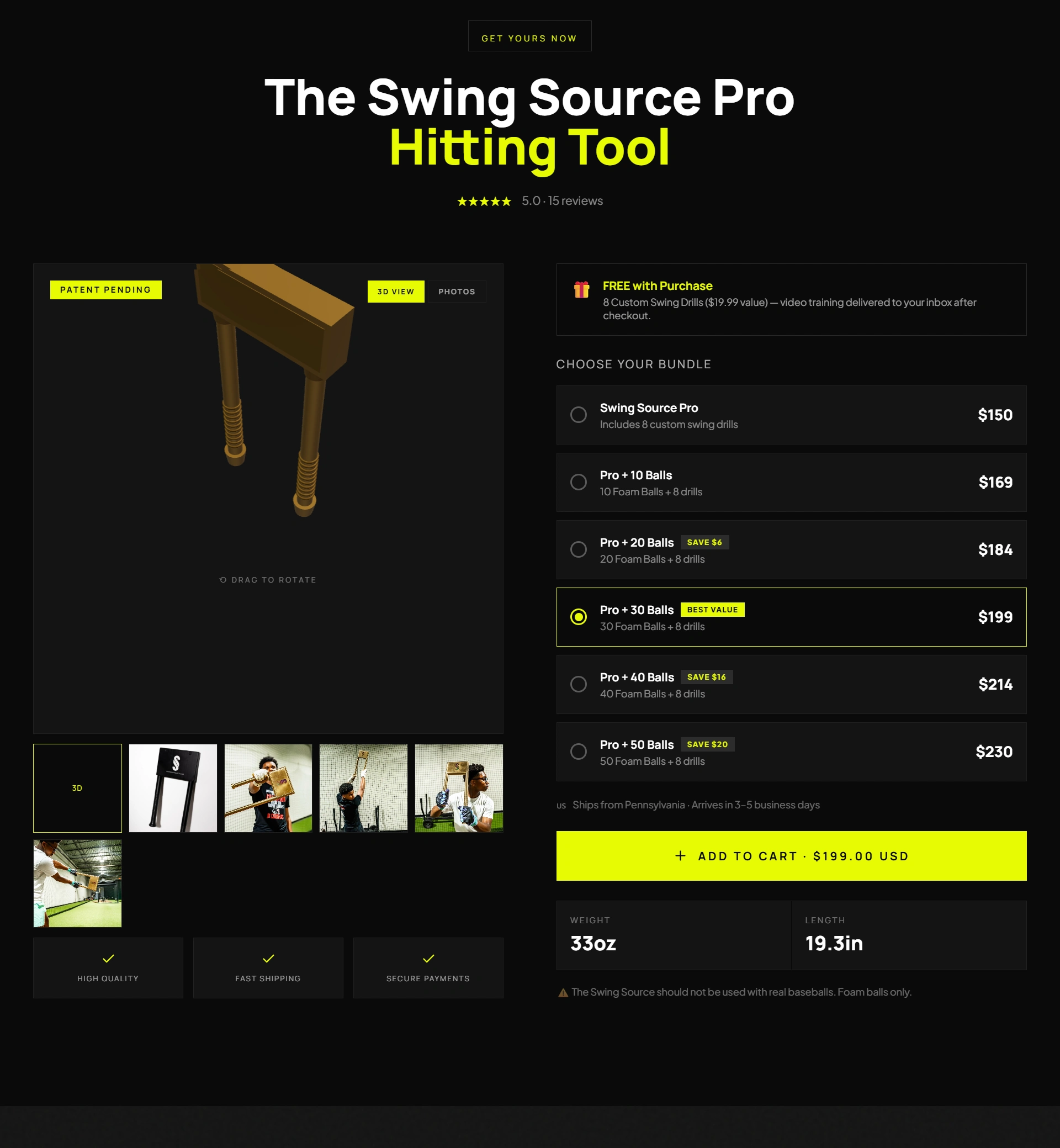
The design uses:
A high-contrast black background
Electric neon yellow accents
Oversized athletic typography
Floating product information cards
Cinematic 3D product visuals
Motion-inspired graphic elements
Scrolling information bars
Strong product-focused storytelling
The result feels more like a sports performance system than a traditional eCommerce website.
The Hero Experience:
The hero section was designed to immediately answer the most important question:
What does this product help athletes do?
The headline:
TRAIN YOUR SWING. TRANSFORM YOUR GAME.
creates a direct connection between training and performance.
The product is positioned as the visual centerpiece, while floating information cards reinforce key trust signals such as:
Patent Pending
Product specifications
5.0 rating
Trusted by MLB players
This creates a strong combination of emotion, credibility, and product clarity.
Design Highlights:
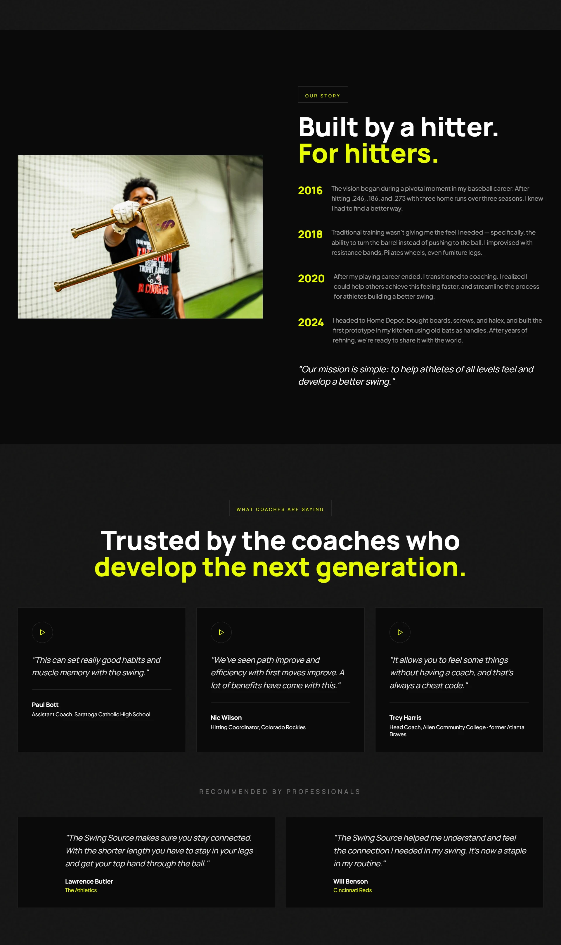
High-Impact Typography
Oversized typography gives the brand an athletic and confident personality.
The headline is designed to feel almost like a sports campaign rather than a typical website headline.
Neon Performance System
The black and neon yellow color palette creates immediate visual recognition and gives the brand a powerful, energetic identity.
Yellow is used strategically for:
Key messaging
Important highlights
CTAs
Trust indicators
Product information
3D Product Presentation
The product is presented through a cinematic 3D-inspired visual experience.
Rather than simply showing a static product image, the design creates a sense of depth and technical precision around the training equipment.
Floating Product Intelligence
Important information is presented through floating data cards.
This creates a visual connection between the product and performance metrics, helping visitors understand the product quickly without overwhelming the interface.
Trust-Driven Design
The experience uses credibility as a key part of the visual hierarchy.
MLB trust, ratings, patent status, product specifications, and shipping information are integrated directly into the experience to reduce hesitation and reinforce confidence.
The User Experience:
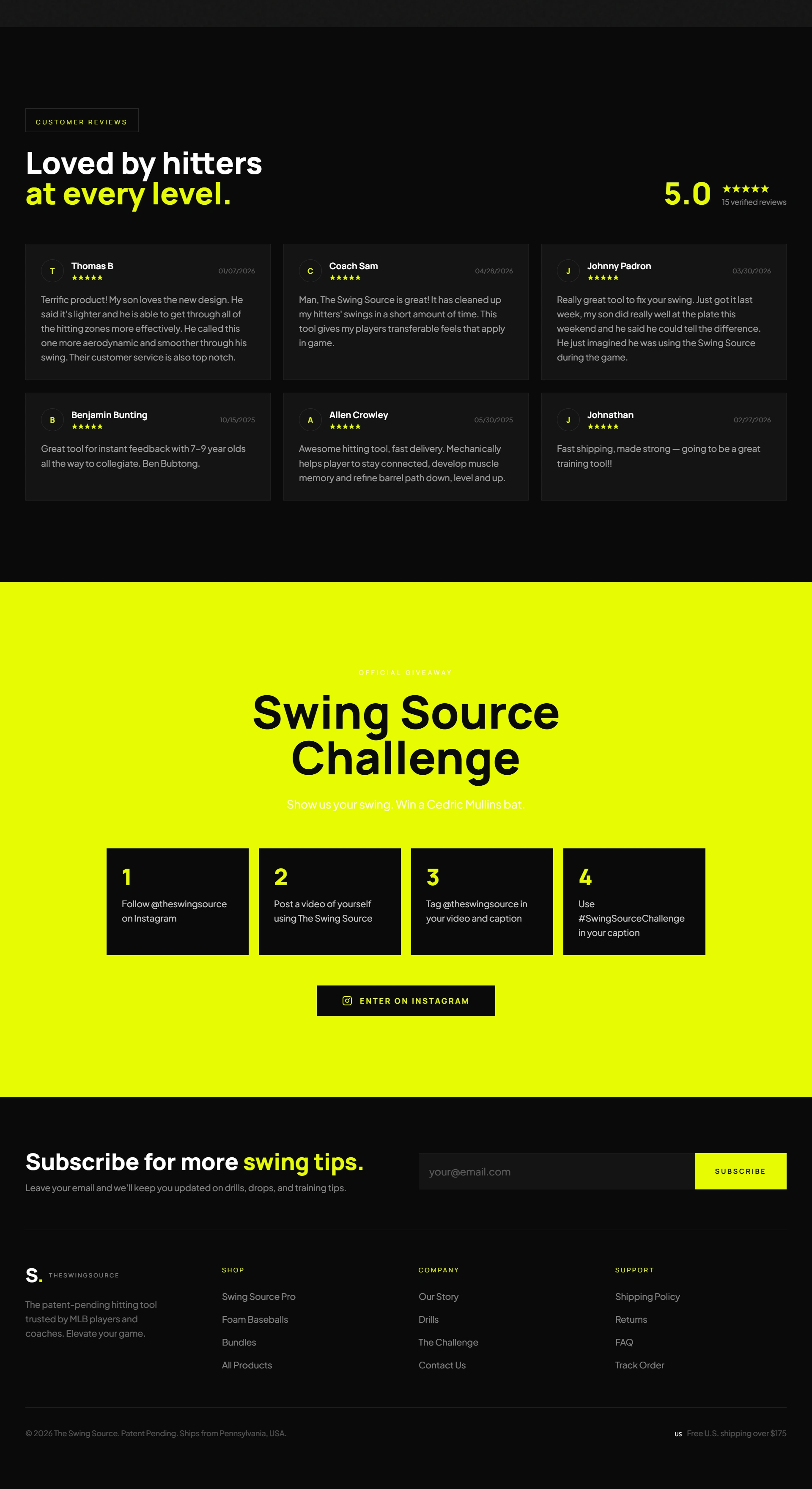
The website journey is designed to move users through three stages:
01 — Attention
A bold statement and high-impact visual immediately capture attention.
02 — Credibility
Trust signals, product information, and performance claims establish confidence.
03 — Action
Clear CTAs guide users toward exploring the product and making a purchase.
Outcome:
The final concept transforms The Swing Source into a bold, high-performance digital experience.
The website combines sports energy, product storytelling, 3D visual design, and eCommerce strategy to create a brand experience that feels modern, confident, and built for serious athletes.
The goal was not simply to design another product page.
It was to create a digital environment that makes the visitor feel like they are already stepping into their next training session.
My Role
Creative Direction · UI/UX Design · Website Design · 3D Visual Direction · Interaction Design · Visual Storytelling
Tools & Technologies:
Figma
Base44
3D-inspired web design
Motion design principles
Interactive UI/UX
AI-assisted visual development
Like this project
Posted Jul 22, 2026
Designed a bold, immersive eCommerce website experience for The Swing Source, combining 3D product visuals, and a performance-driven visual system.
Likes
1
Views
12
Timeline
Jul 21, 2026 - Jul 22, 2026