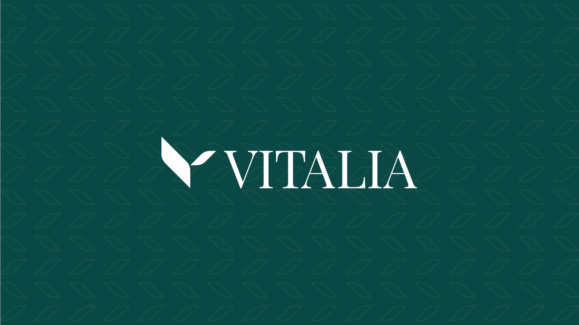
Vitalia | Logo & Brand Identity
Emmanuel Cagossi
Vitalia | Day Center
Redefining aging through care, community and clarity.
Creative Direction · Visual Identity · Brand Strategy · 2023
The goal was to build a distinctive and emotionally resonant brand identity for Vitalia as they launched their first healthcare facility focused on daytime care for older adults.
The brand needed to convey trust, warmth, and professional care while breaking away from institutional or clinical clichés.
Vitalia is a new day center committed to redefining the aging experience through a holistic, human-centered approach. The founding team wanted to create a space that felt more like a supportive community than a traditional care facility. The project owners approached us to build a brand from the ground up that reflected this emotional and cultural vision.
We needed to solve for two critical challenges:
Positioning a new elderly care facility as a modern, emotionally appealing alternative to cold, institutional spaces.
Creating a visual identity and tone that would feel credible to healthcare professionals, but also welcoming and relatable for families and seniors.
There was also a need to avoid falling into clichés or using generic imagery often associated with aging or caregiving.
We anchored the project in the 4C Brand Foundation framework:
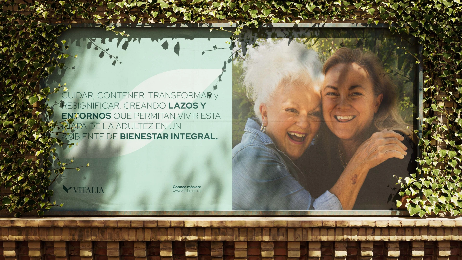
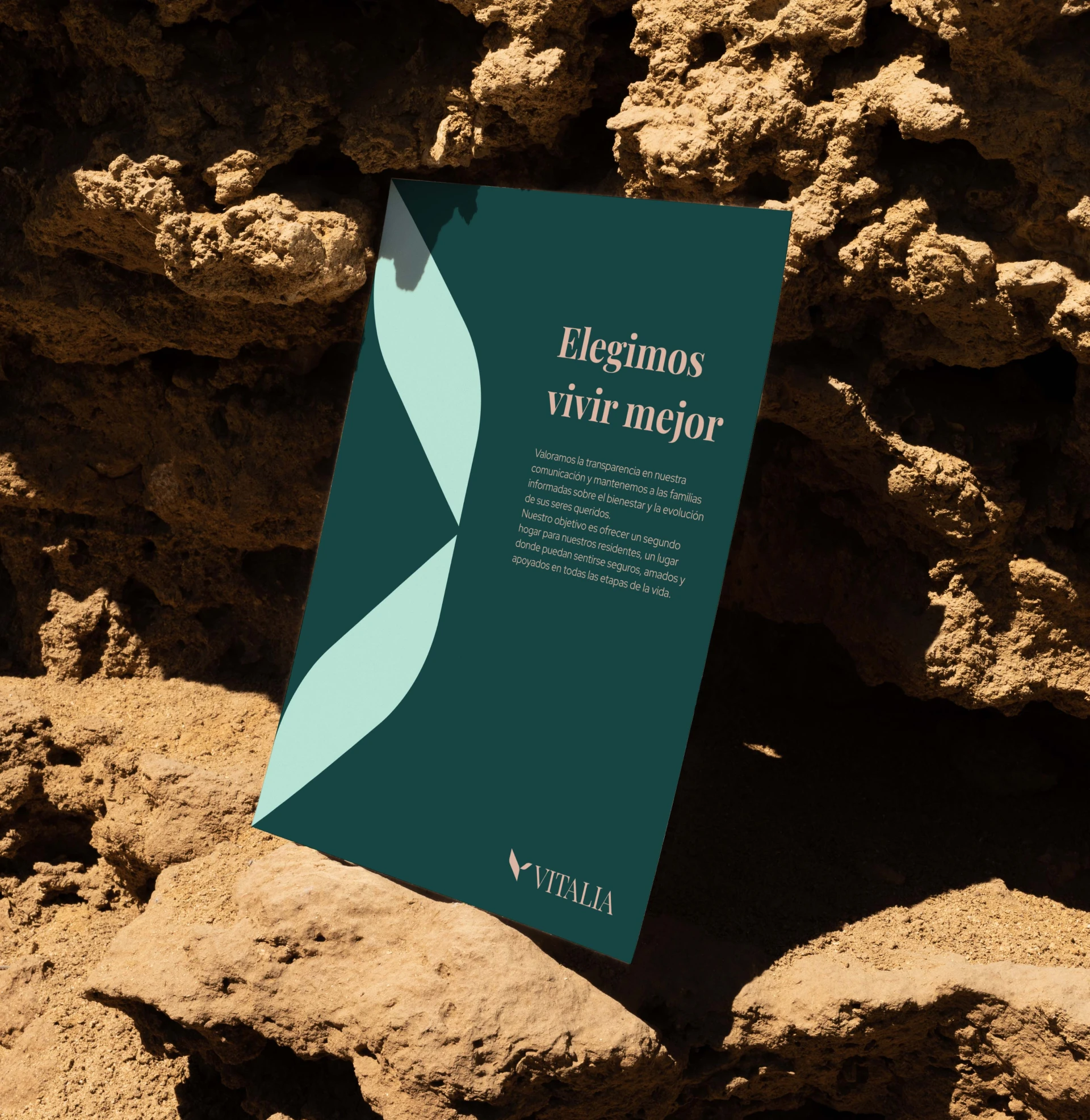
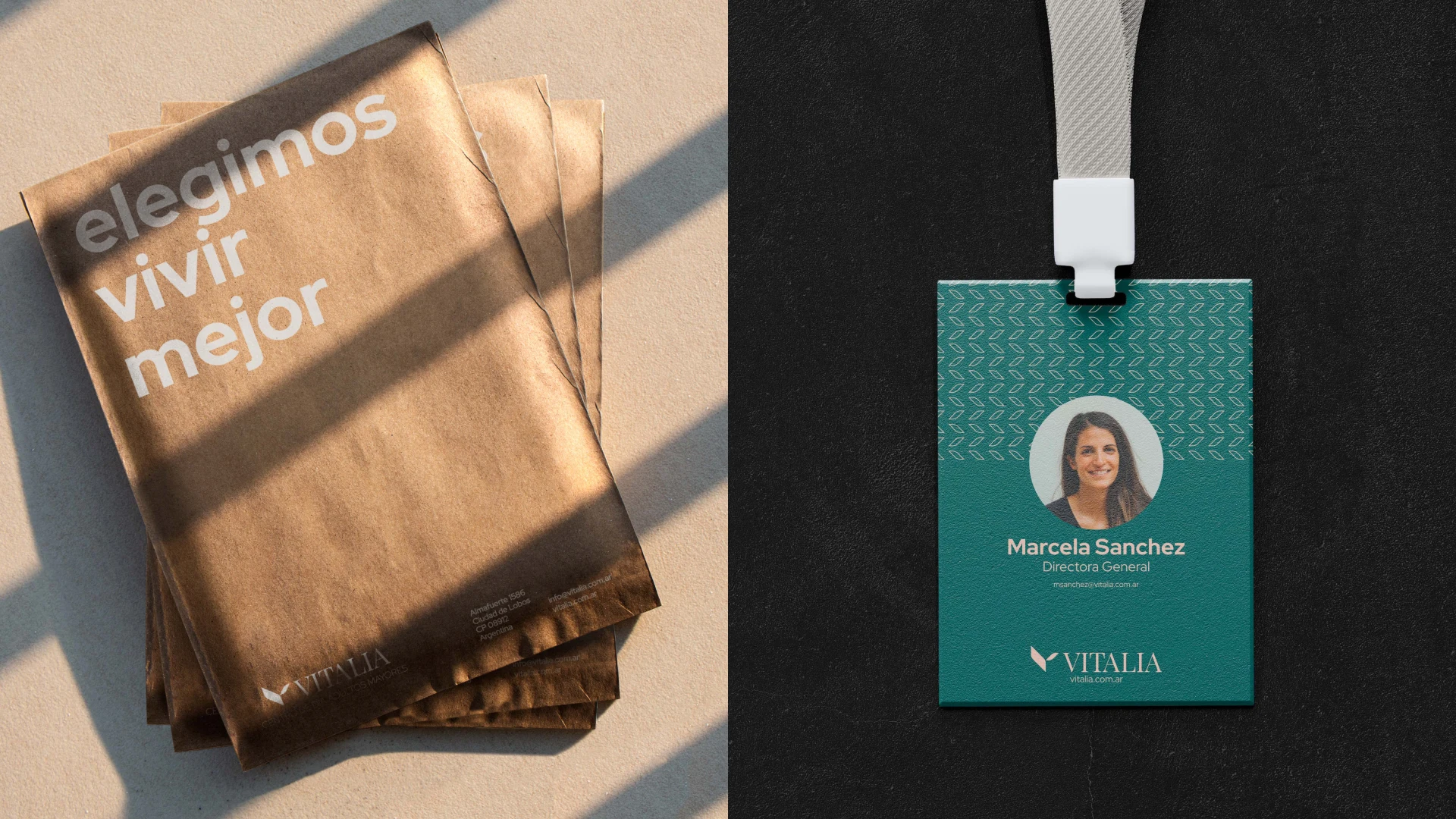
Clarity: We defined a core message — "We choose to live better" — and built the brand purpose around the idea that aging is a stage of potential, not decline.
Connection: Through tone of voice, color, and messaging, we built emotional relevance for families, caregivers, and seniors alike.
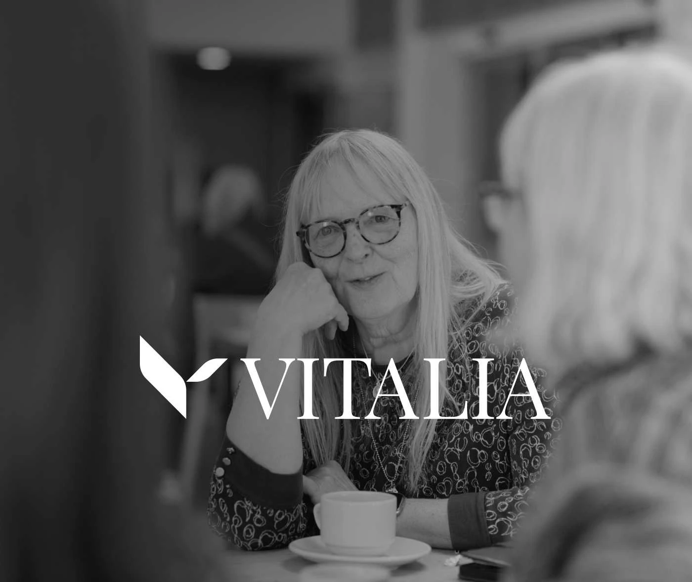
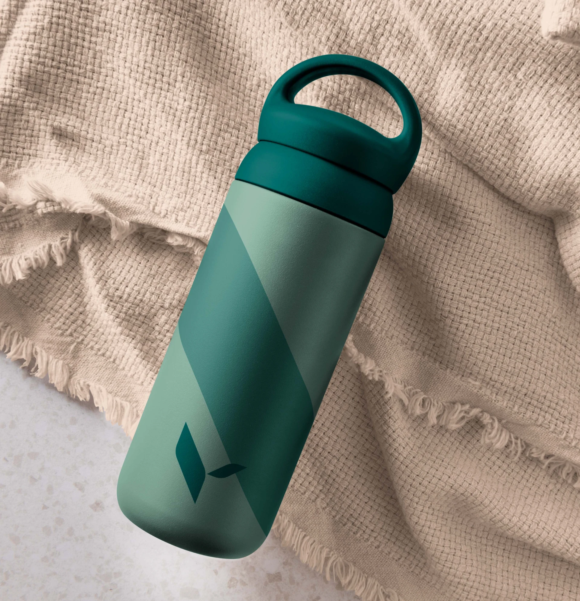
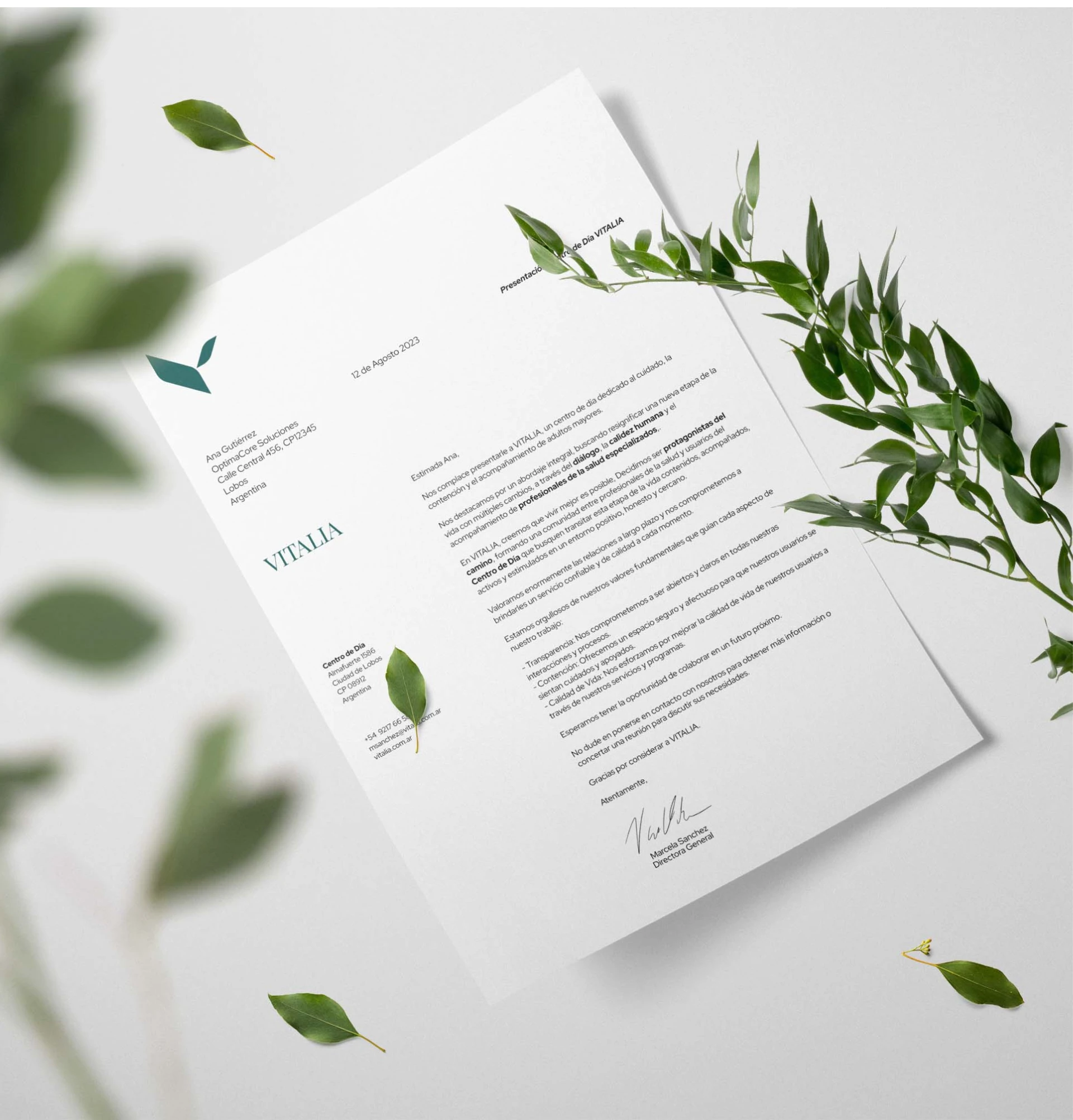
Character: The design system used soft, nature-inspired tones and honest photography to create an atmosphere of real human warmth.
Contribution: We developed a communication strategy that supported both brand awareness and community engagement — including workshops, educational content, and SEO-ready materials.
This project reinforced how powerful it is to design for emotion and care, not just for clarity or elegance. It also emphasized the importance of language in healthcare branding — how the right words can shift perceptions and build trust across generations.
Creative Outcome
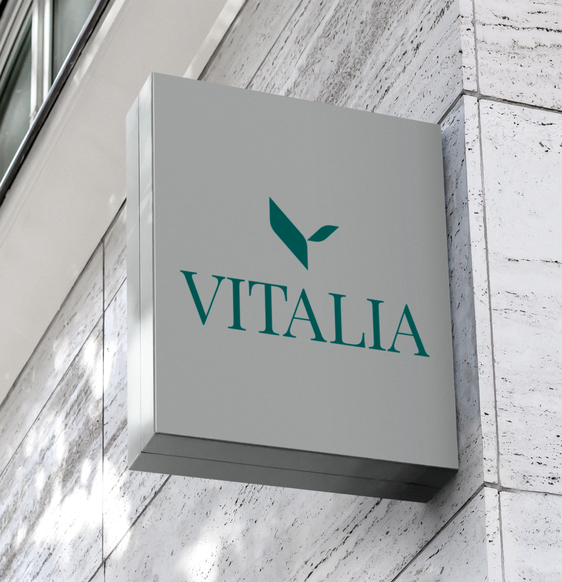
We designed an identity system that is adaptable, honest and emotionally intelligent. The brand symbol is geometric yet warm — reflecting the balance between structure and empathy. The modular graphic system supports diverse formats while staying cohesive and elegant.
Every detail — from icons to layouts — was designed to create a welcoming, vibrant, and confident brand that families will trust and older adults will enjoy being part of.
The client was the founding team behind Vitalia, a new center in the healthcare space. With this launch, we helped them enter the market with a highly differentiated identity — one that felt warm, trustworthy, and modern.
The brand resonated with both families and professionals, enabling Vitalia to stand out from competitors and build an immediate sense of community around its offering.
Looking for building or relaunch your brand or website?
Let´s connect!
Like this project
Posted Aug 17, 2023
A fresh, human brand for eldercare — light, natural, and built on trust. Designed to resonate with seniors, families, and care professionals.