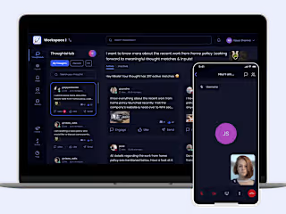
Website Redesign for 4M+ Milaap users
Brand Overview: Milaap, the largest crowdfunding platform has raised nearly $255 million. With 10M+ donors, they have supported 665K+ causes, transforming millions of lives.
Project Requirement: The brand needed a homepage redesign to drive more people to start a fundraiser and maximise user engagement.
Timeline: 4 weeks
Final Result: Using data-driven insights, user interviews, and analysis of competitor brands, I created a seamless homepage experience that led to a 25% increase in user clicks on the "Start a Fundraiser" button.
Milaap Landing Page
How does fundraising work?
Download the App
Project Requirements🔥
Milaap has raised nearly $255 million to support 665,000+ causes, impacting millions of lives across the country. Now, Milaap is constantly striving to take the concept of online fundraising to more and more Indians.
What were the challenges to solve?🚩
To start the project, the client provided me with 4 problem statements based on old research and hypotheses.
High % of people leave the homepage without taking any action. High bounce rate.
2. Inconsistencies in design system being used- lower the overall brand trustworthiness.
3. Currently, homepage of Milaap appears intense & uninviting.
4. Users are less likely to donate because of the design of campaigns listings.
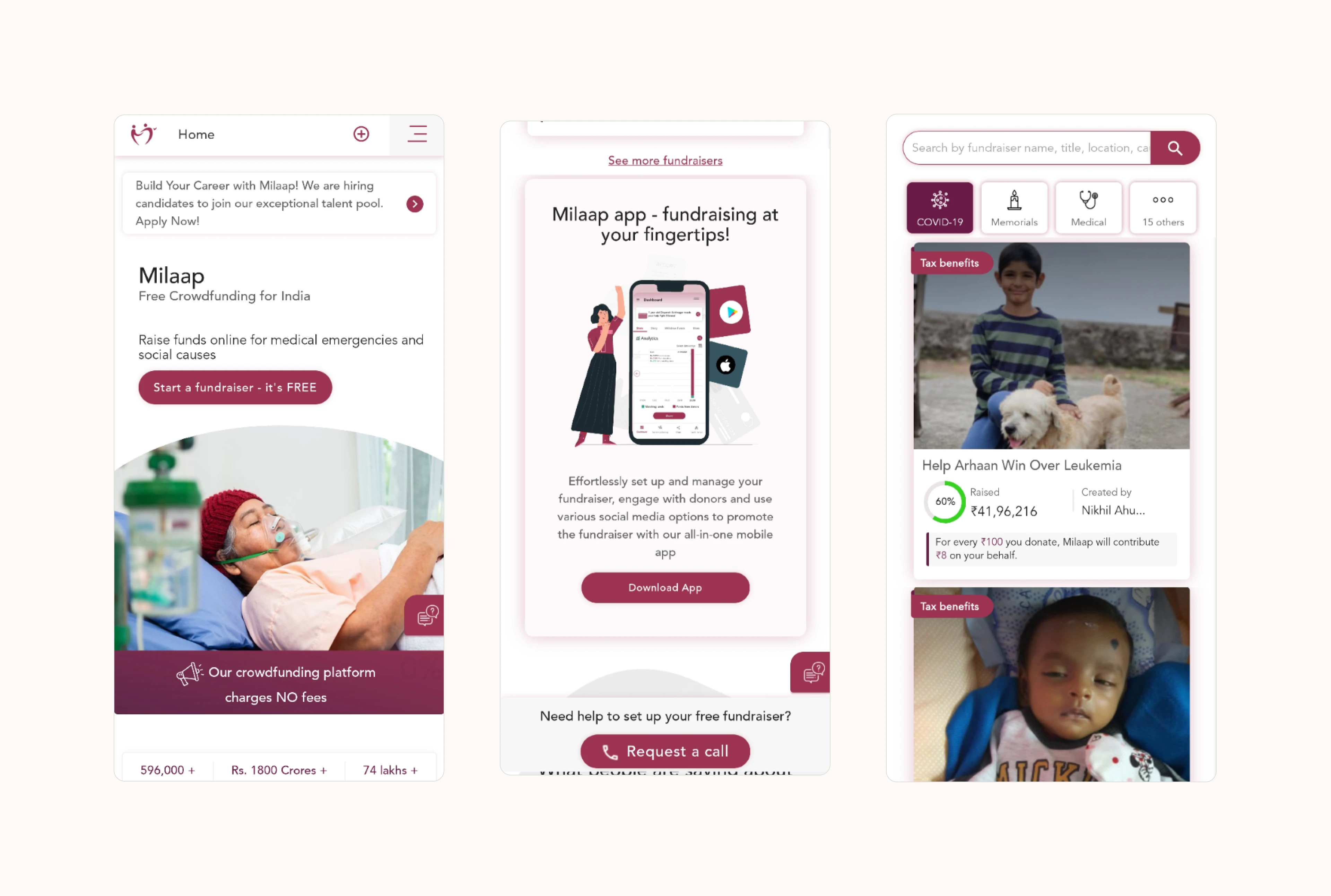
Old Designs
User and Business Goals📈
1. Lower the bounce rate. Drive a higher number of people to start a fundraiser from the homepage.
2. Develop a design system that ensures consistent user experience across the website. Brand Milaap as a community coming together to help (a positive impression)
3. Campaign card design must motivate and drive users to donate
Tip to Milaap from users who raise funds is bigger than tip from donors 💰
If you observe, the most prioritized goal for the homepage redesign was to drive users to raise funds. But why? We aimed to design solutions primarily for this user group to maximise revenue and business impact. Our primary target audience was "users who want to raise funds."
Deep Dive into Crowdfunding 🌏
Next, I collated a lot of essential qualitative and quantitative data to understand more about how things work in crowdfunding. Insights:
1. Fake campaigns and frauds
Seeing the success of campaigns, and the ease of making quick money without any real effort, fraudulent people too are increasingly starting fake campaigns and fundraisers.
2. Users unsure whether they can raise funds online Some crowdfunding campaigns run for weeks, with no guarantee of success in raising the required funds.
3. Crowdfunding inspires hope and goodwill among people
The success of these crowdfunding platforms proves that calamities indeed bring humans together. It provides a true fighting chance and health for all.
4. Past impact by crowdfunding platform helps people to decide
Reputation is key. To avoid wasting time on the wrong platform, people look at what campaigns and ideas have had the most success. Are they aligned with what you’re attempting to achieve?
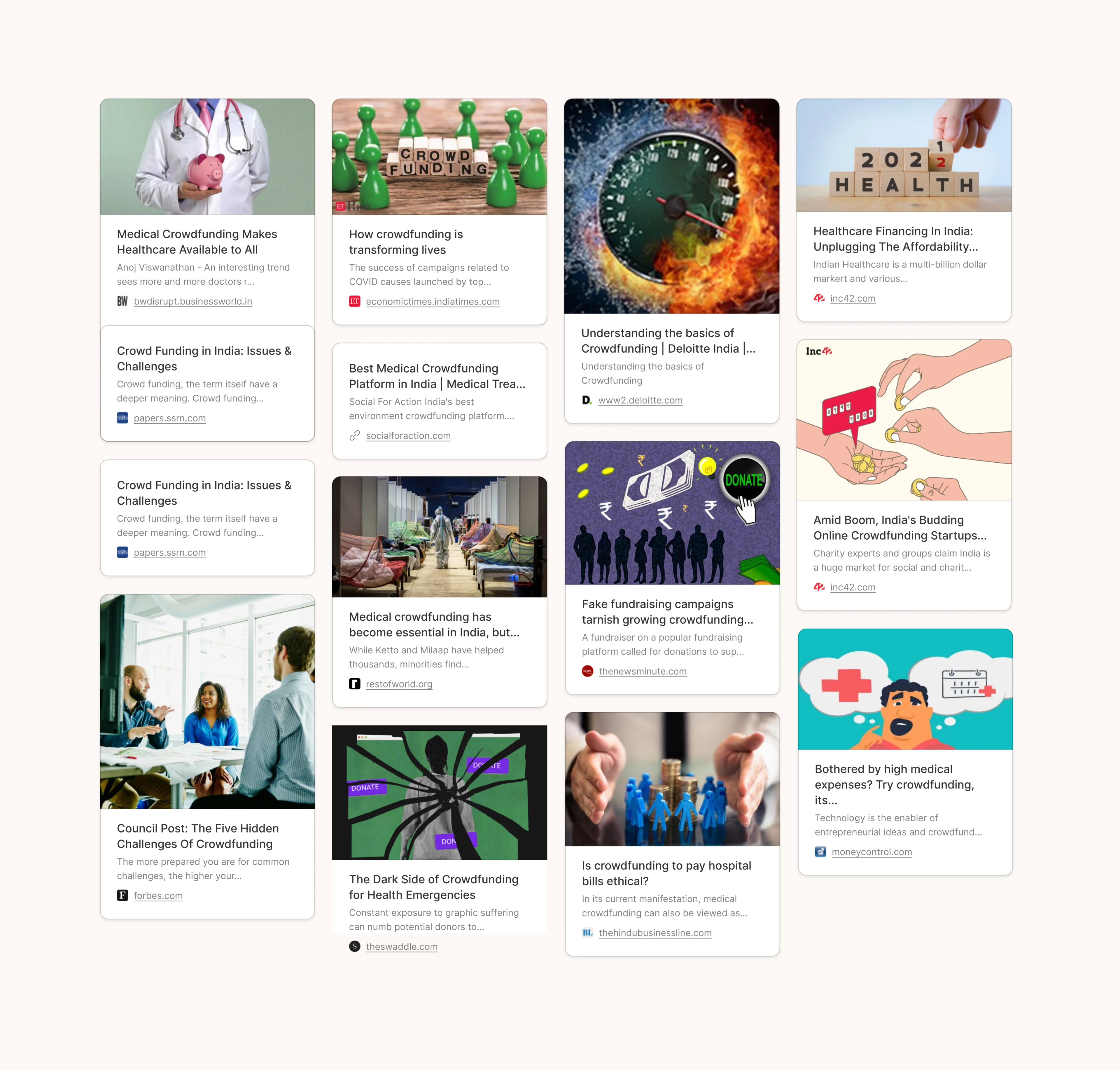
Critical crowdfunding aspects
Analyzing competition👀
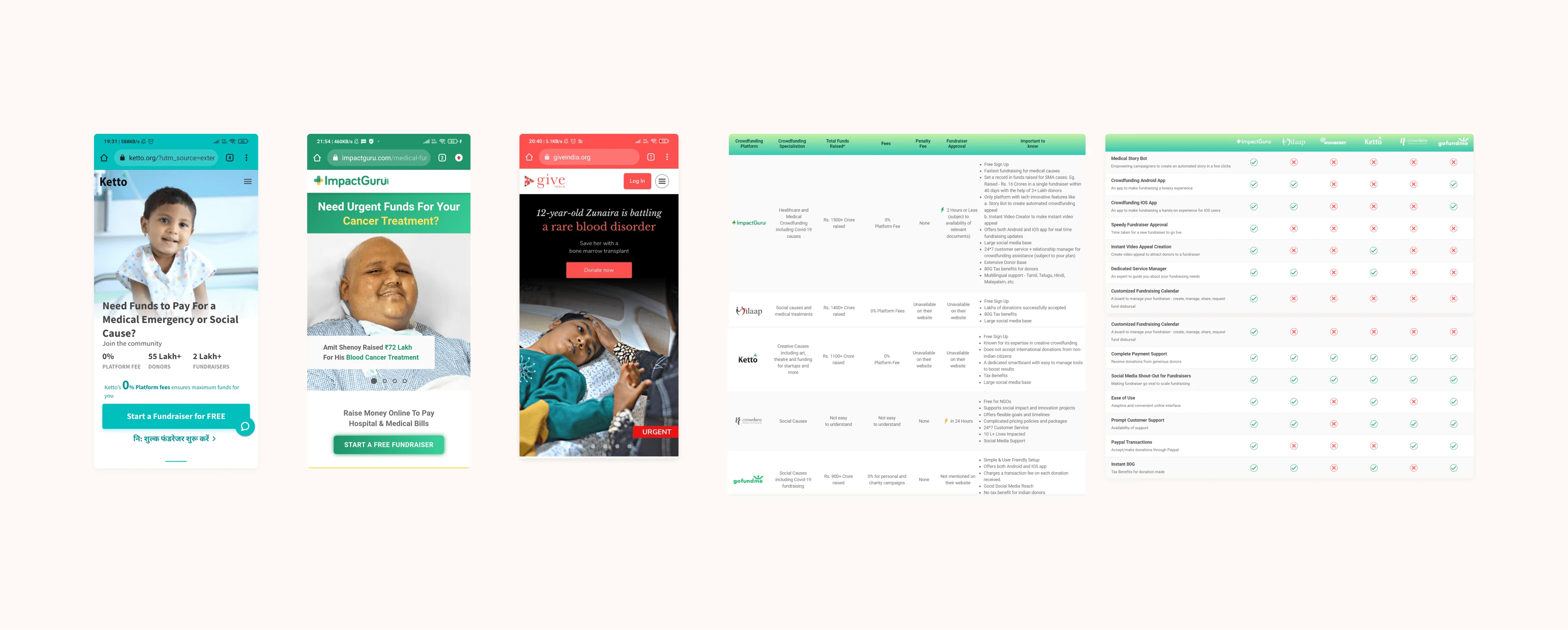
Studied leading Global and Indian crowdfunding platforms to benchmark Milaap against successful models.
1. Homepages of Gofundme ($9B), Classy ($3B), Givebutter & DirectRelief provide an efficient homepage experience.
2. Interactions and typefaces used on Gofundme's homepage are subtle & highly effective in conveying primary action to be taken.
3. All brands have built a minimalist homepage that is easy on the eyes and conveys only the critical stuff upfront.
4. Global competitors appeal to the users both emotionally and rationally. Sections like "How it works" eases user doubts and make them believe in the platform.
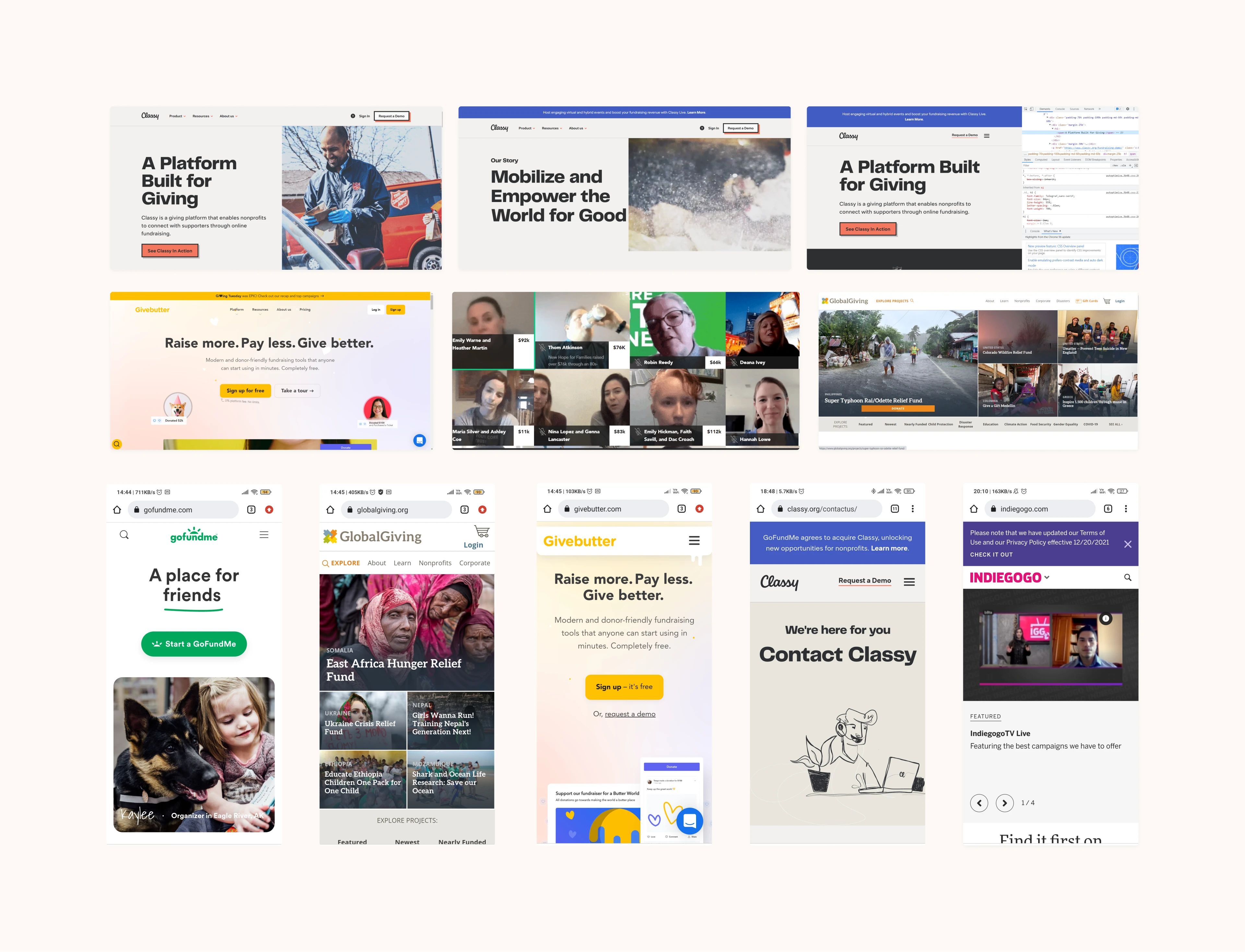
Indian crowdfunding brands Ketto, ImpactGuru, and GiveIndia are putting up a strong fight.
GiveIndia's home page has an attractive, clean look and feel.
Displaying all the features & tools of the crowdfunding platform on the homepage is a good strategy.
Most brands show sections like “impact numbers”, “what people say about the platform” & “success stories” on the homepage. (to drive user decisions)
Assessing the pains🔍
Telephonic calls were effective when assessing the needs, frustrations and goals of people who have raised funds using Milaap and donated to campaigns in the past.

Interview calls
Hotjar & Data Analytics 📱
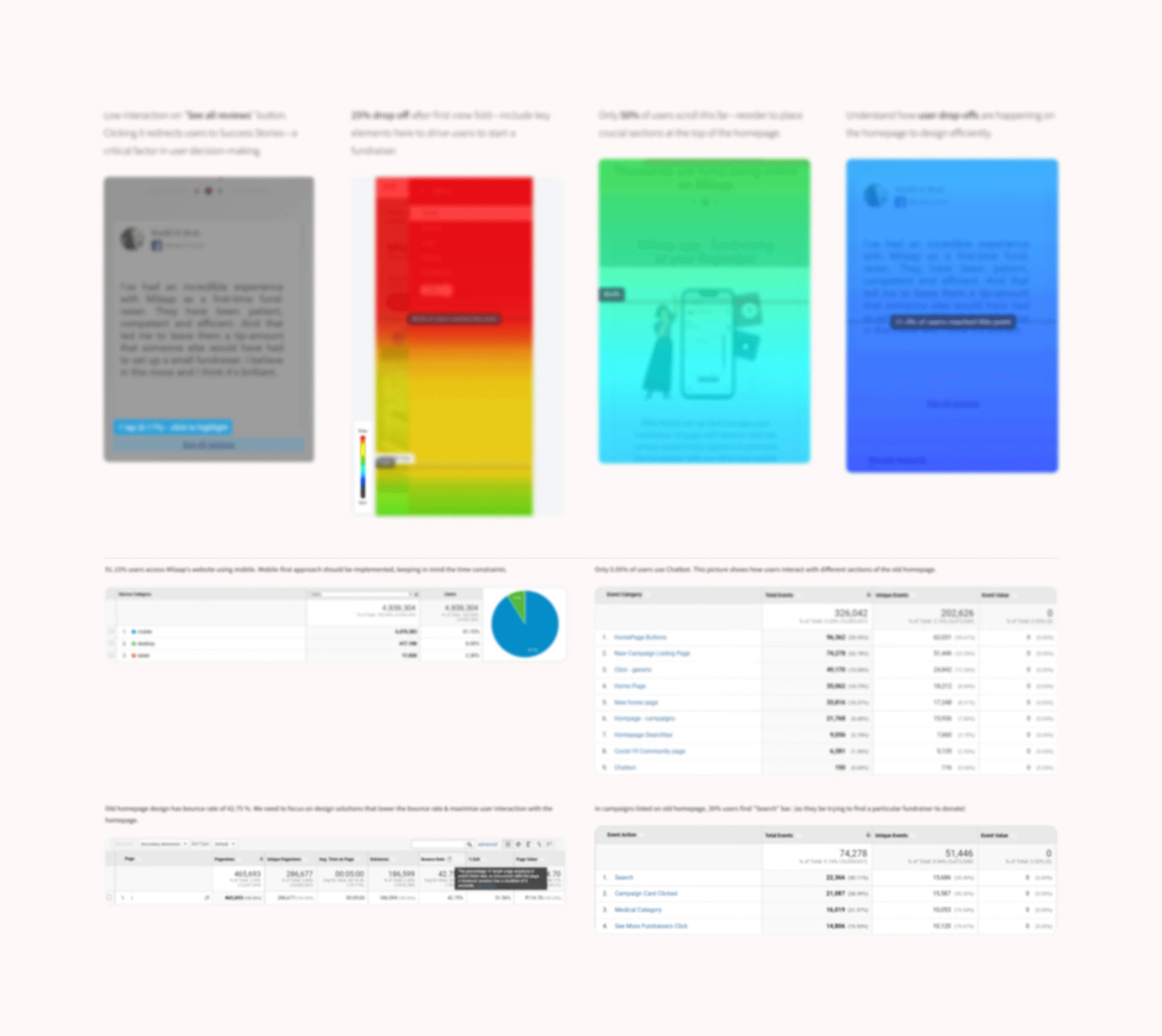
Insights revealed which sections users clicked on, which features they engaged with, and where they dropped off. This data allowed me to pinpoint critical design improvements.
9 insights: Hotjar (last 6 months-668 user sessions)
4 insights: Google Analytics (last 3 months)
For confidentiality purposes, the data has been obscured.
Hotjar & Analytics Insights
Heuristic evaluation of old design ✔️❌
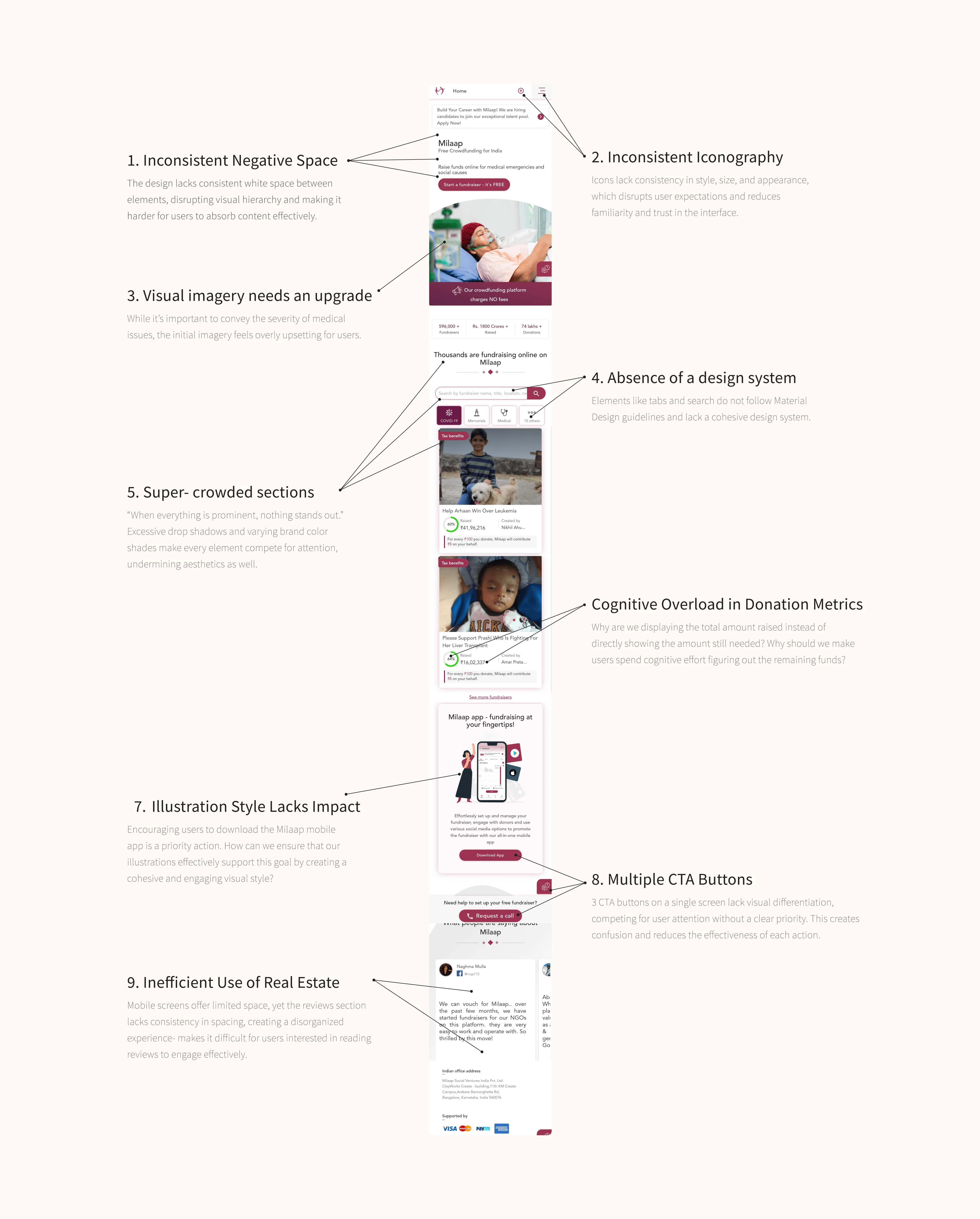
In-depth analysis of the old homepage revealed areas violating usability heuristics, causing friction in user journeys. Let's examine them in detail. Shall we?
Colour: A Calming Experience 🎨
Problem: Red dominated the old design, which, while bold, often conveys feelings of danger and urgency—not ideal for a fundraising platform. Inspired by global and Indian brands, I aimed to create a calming experience better suited for users dealing with life challenges.
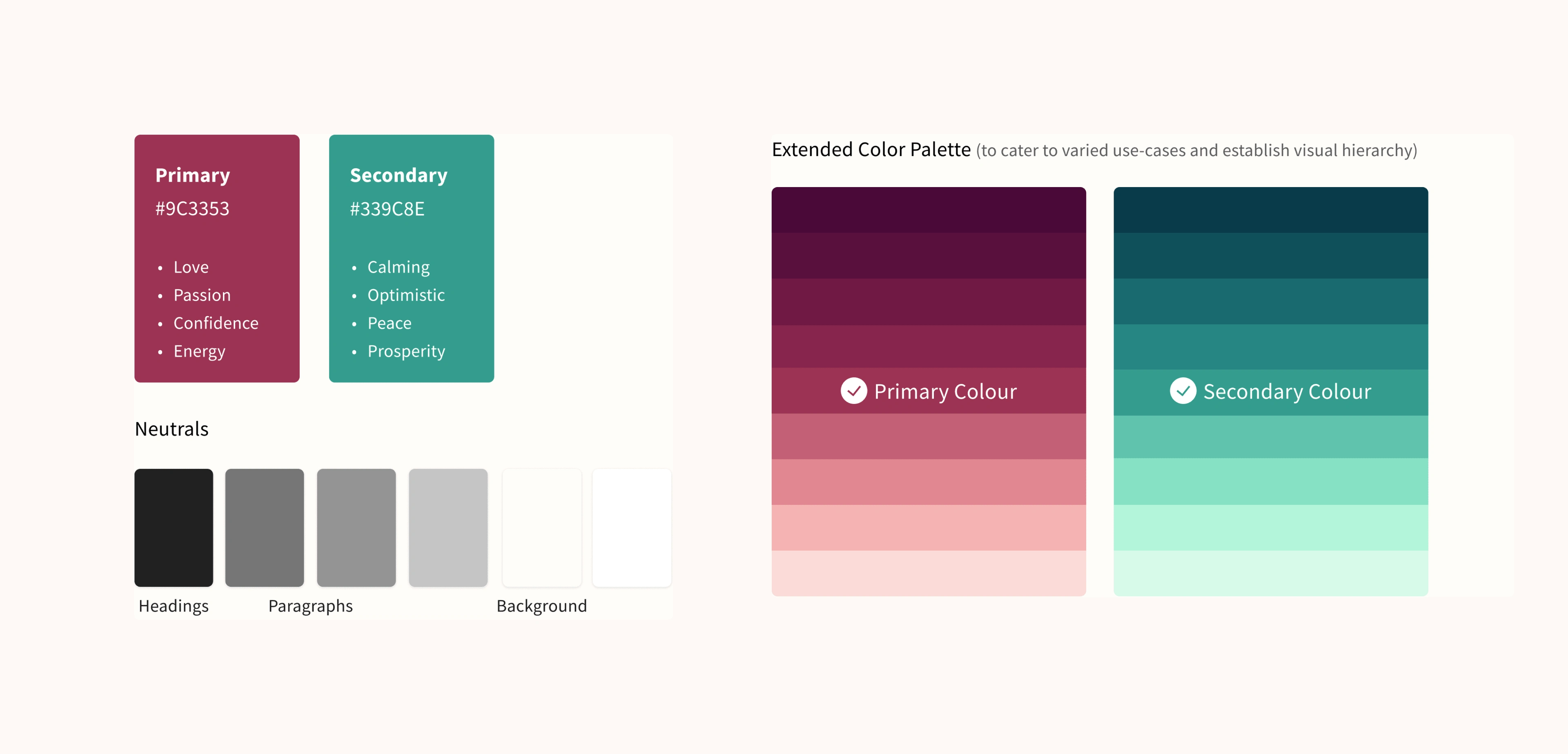
Solution: To retain brand consistency, red was kept as the primary color but limited to CTAs and buttons. I introduced green as a secondary color to evoke peace, optimism, and trust, especially fitting for Milaap’s medical causes.
New colour palette
Redesigning the homepage⚔️
Design Approach? The new homepage was crafted using insights from:
Research Analysis
Competitor Benchmarks
User and Business Goals
Analytics and Interviews
Brainstorming & Client Feedback Sessions
By combining these insights, I developed a seamless user experience, creating a welcoming homepage to convert traffic & drive users to start a fundraiser!
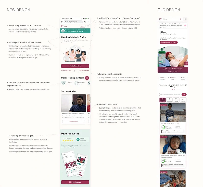
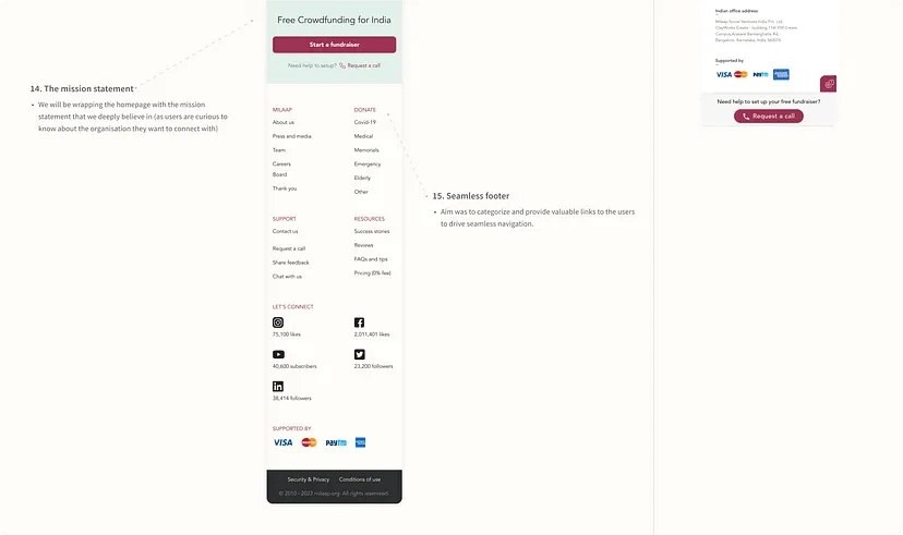
New Design
Refining Through Feedback🔄
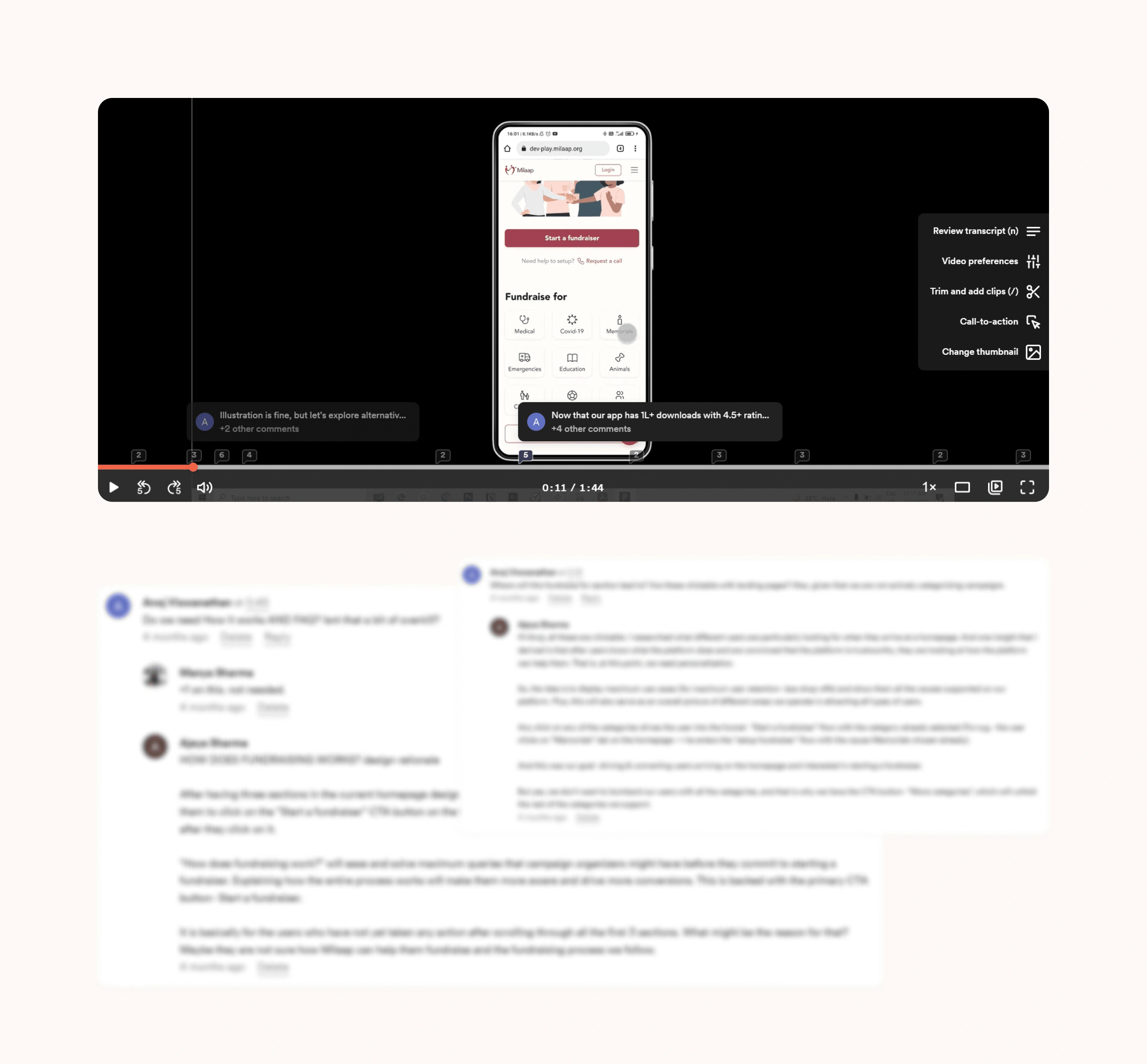
The journey to the final design in Figma involved multiple rounds of iteration. After 5 versions and collaborative feedback from the brand, I refined the design to reach an optimal solution. Each version included Loom video updates for clear communication and alignment. Want to have a snapshot?
Hey there, thank you for making it to the end! 🙌❤️
Ready to get started? Book me on Contra, and let’s make it happen! ⚡
Like this project
0
Posted Nov 6, 2024
Milaap, the largest crowdfunding platform has raised nearly $255 million. With 10M+ donors, they have supported 665K+ causes, transforming millions of lives.


