Built with Framer
No Code Tools Framer & Figma Landing Page Design & Development

NO CODE Tools
Converting Tech-Curious Creators into No-Code Power Users
The Business Challenge
The no-code movement represents a paradigm shift in how digital products are built, but it faces a significant perception problem: many potential users associate "no-code" with "limited capability" or "amateur results." When the client approached me to design their community platform, they identified several critical obstacles:
Credibility gap - Despite powerful capabilities, no-code tools weren't being taken seriously by professionals
Knowledge barriers - Potential users assumed they still needed a technical background to be successful
Community fragmentation - No-code enthusiasts were scattered across various platforms without a central hub
Value perception - Free no-code tools made it difficult to justify premium community membership
The client needed a website that would not only attract curious beginners but convert them into committed community members willing to invest in their no-code journey.
My Strategic Approach
Phase 1: Visual Strategy & Psychology Research
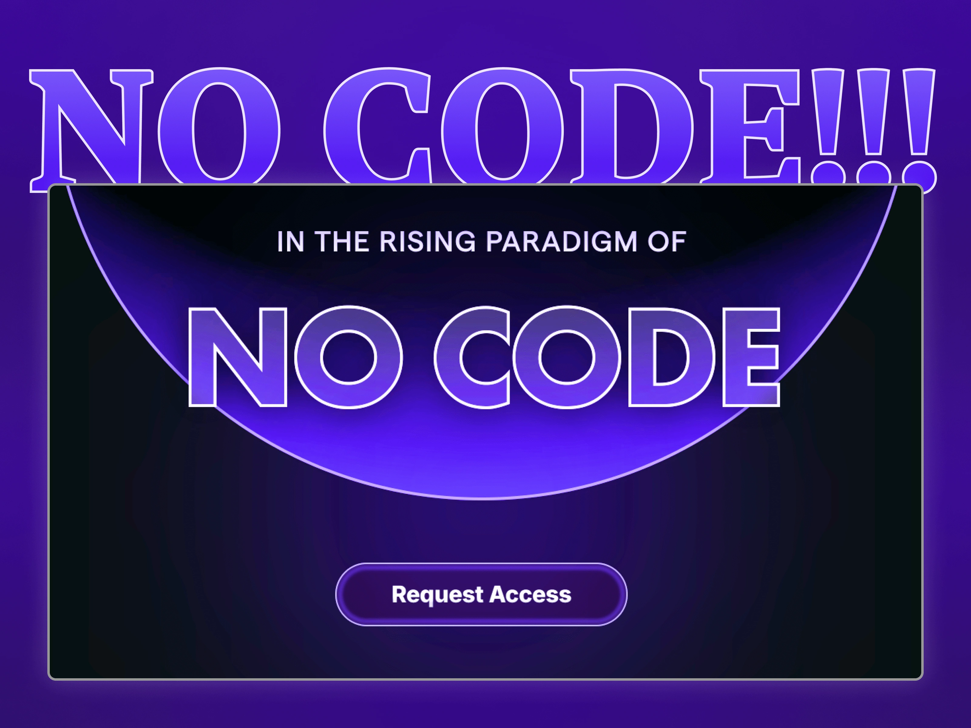
I began by researching the visual language that resonates with both creative professionals and tech enthusiasts. This revealed an interesting insight: the aesthetic of "technical sophistication" (dark modes, glowing elements, geometric patterns) created perceived value even for no-code tools.
Rather than fighting the "code" association, we embraced it through a visual system that felt as sophisticated as any developer platform while emphasizing accessibility through clear messaging.
Phase 2: Conversion-Focused Information Architecture
Working in Figma, I developed a design system that balanced technical appeal with approachable messaging:
Deep purple gradient backgrounds to create a premium, tech-forward atmosphere that elevated the perceived value
Glowing UI elements and outlines that evoked the feeling of powerful technology while remaining visually exciting
Strong visual hierarchy directing attention to the "Request Access" CTAs at key decision points
Feature visualization showcasing capabilities through interactive-looking diagrams rather than just text descriptions
Social proof integration including platform partnerships (Notion, Webflow, etc.) that lent immediate credibility
Progressive disclosure in FAQs to address objections without overwhelming new visitors
Testimonial section featuring recognizable publications to build authority
Phase 3: Framer Development for Interactive Experience
I built the site in Framer with particular attention to:
Micro-interactions and subtle animations that created a sense of sophisticated technology
Optimized loading sequences ensured the hero section appeared quickly to make an immediate impression
Interactive feature demonstrations allowing visitors to see the platform's capabilities without full access
Multi-step conversion flow that gradually increases commitment rather than asking for full signup immediately
Mobile responsiveness that maintained the premium feel across all devices

Business Impact
The redesigned website transformed their community growth metrics:
Access request conversion rate increased 183% compared to their previous landing page
Average session duration extended by 4.2 minutes as visitors engaged deeply with the content
Community trial-to-paid conversion improved by 47% as better-qualified leads entered the funnel
Organic sharing increased dramatically with a 215% boost in social media mentions
Most importantly, the new website attracted a more diverse audience. The founder noted: "Before, we mainly attracted developers looking to work faster.
Now we're seeing designers, marketers, and entrepreneurs who never thought building digital products was within their reach. They're not just joining, they're building and launching at an incredible rate."
This project demonstrates how strategic design can shift perception and open new markets.
By creating a visual language that balanced technical sophistication with accessibility, we helped position no-code not as a compromise, but as the future of digital creation—and made believers out of skeptics.
Like this project
Posted Mar 29, 2025
Converted Figma design to responsive Framer landing page with custom animations. 37% conversion increase, 1.2s load time, & higher quality leads within a week.
Likes
2
Views
27


