Newsletter Platform Website Design Study | SparkLoop

Joshua Adehi


Original full-page Wix design study showing the complete newsletter-platform page.
A Wix website design study for a newsletter growth platform. This portfolio piece focuses on page structure and visual presentation: explaining referrals, giveaways and partnerships, then helping a visitor choose a next step. It is a design concept, not a claim that I created SparkLoop’s underlying software.
The page challenge. Several features compete for attention on a long software homepage. The layout needs to make the core offer clear first, then give each feature enough space to be understood. Visitors should be able to scan the page without losing the path to a demo or signup.
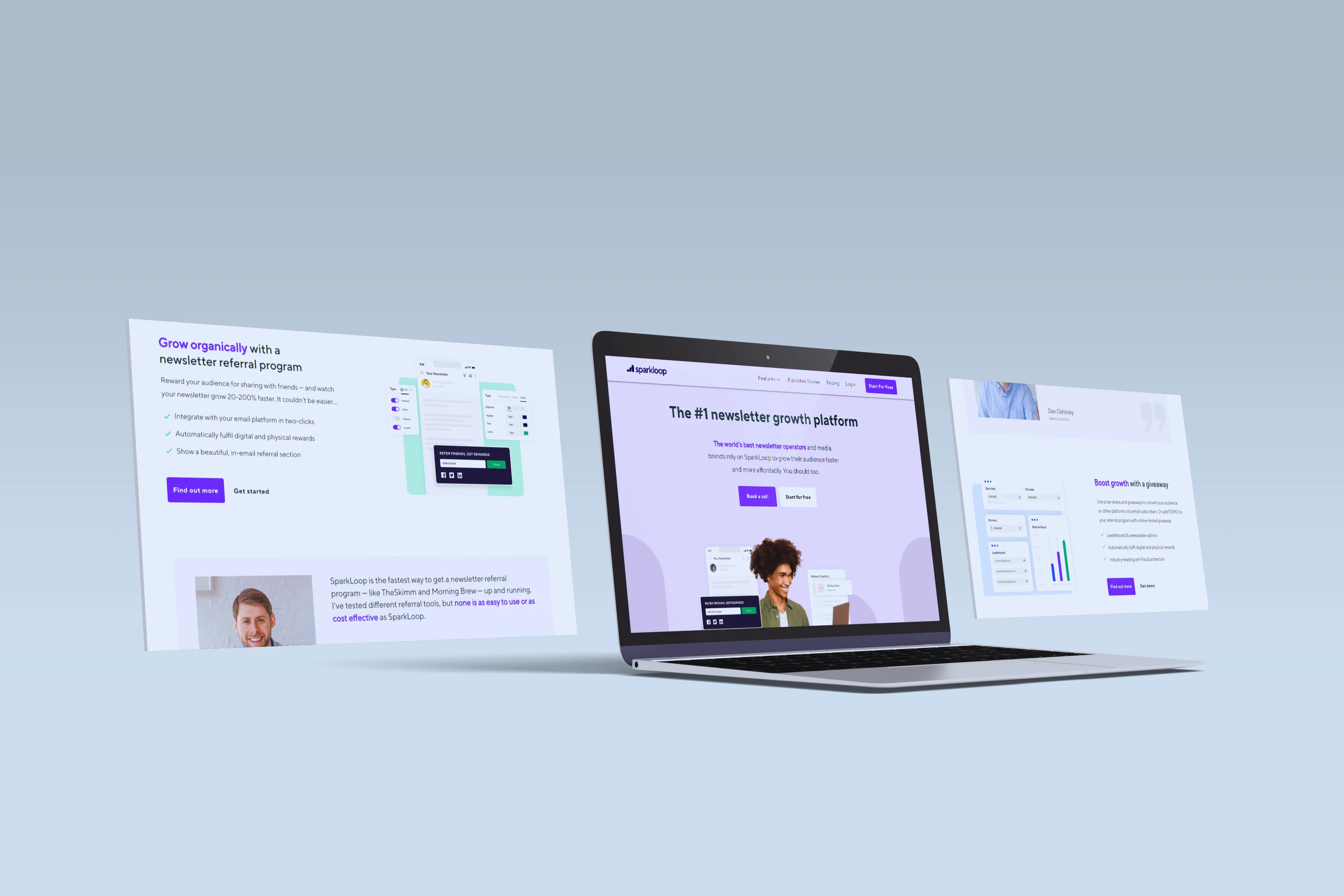
The visual approach. A pale-purple hero introduces the offer with a portrait, interface previews and two clear actions. White sections give the feature explanations room to breathe. Purple buttons repeat through the page, while darker sections separate the integration and pricing information from the main product story.
The page structure. Referral rewards, giveaways and partnerships each have their own text-and-image section. Testimonial panels sit between those explanations. Further down, an integration grid and four feature cards make a dense product offering easier to scan before the closing pricing prompt and footer.
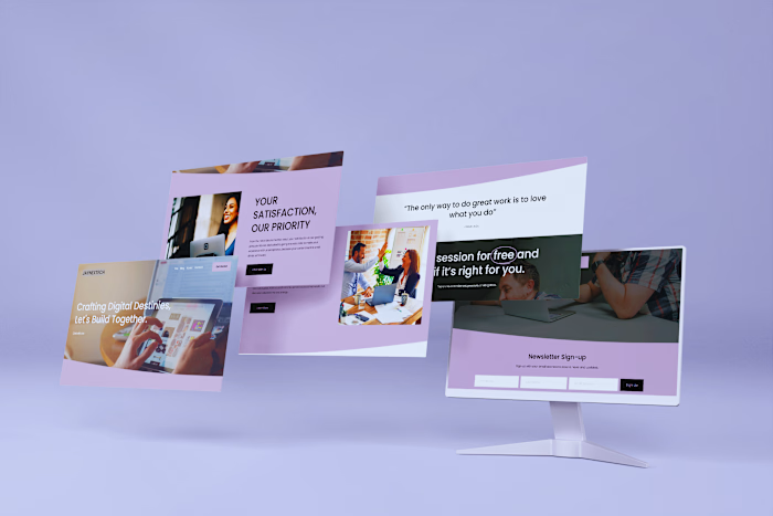
What the images show. The device mockup gives a quick view of the visual direction. The separate full-page preview shows the complete sequence, section spacing, feature hierarchy and repeated calls to action. Both are original portfolio assets; no new interface or dashboard was generated for this case.
Scope and outcome. This case demonstrates a marketing-page layout and product storytelling, not a production software build. Product statistics, customer quotes and company logos visible in the supplied design belong to that example and are not results or endorsements of my work. No subscriber-growth or conversion increase is claimed. More of my project history is available through the linked Upwork profile.
Like this project
Posted Aug 24, 2026
A Wix design study showing newsletter referrals, giveaways and partnerships through clear feature sections, product previews and signup paths.
Likes
1
Views
3