Built with Framer
Cinematic Framer Website Design & Development for via
Rachel Cohen
Verified
Picture this
An early stage startup on a mission to connect people through third places has a tight budget, an undefined visual identity, and pitch deadlines in a few weeks. I partnered with Olivia Lubeck and via to design and build wemetvia.com on Framer, balancing a cinematic, wistful feeling reminiscent of your favorite rom coms with a refined, tech-forward experience sure to capture the attention of any investor.
give fate a little hand with via
I’d worked with via’s founder Olivia Lubeck many times before on projects for her work as a screenwriter and filmmaker. I offered to help develop a one-of-a-kind, show-stopping website for the app to help her secure venture capital funding and ensure that via doesn’t come off as just another dating app.
via is a social exploration platform built to bring serendipity back. via is about romanticizing life, exploring your world, and living in the moment. Then letting the tech turn missed connections into meet cutes.
the auteur’s vision
A dreamy, cinematic, and elevated mobile-first website that builds momentum for via while driving folks to sign up for the waitlist, join the app beta, and follow on socials.
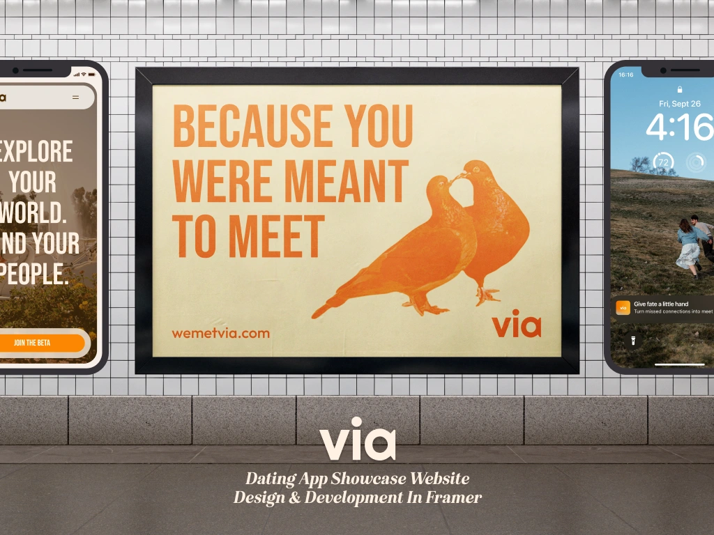
mobile loading animation and hero
Setting the scene
I had already developed a rough site plan, conducted competitive research, and pulled inspiration in a previous exploratory project with Olivia.
While there were a few via brand elements established in the app UI and we had a solid sense of creative direction, a brand system hadn’t been codified yet.
I collaborated with Olivia and her team to solidify via’s visual identity:
expanding the color system to create a warm, vibrant, and retro feel
sourcing new accent typefaces that balanced the editorial, modern display font, making it feel more casual and approachable.
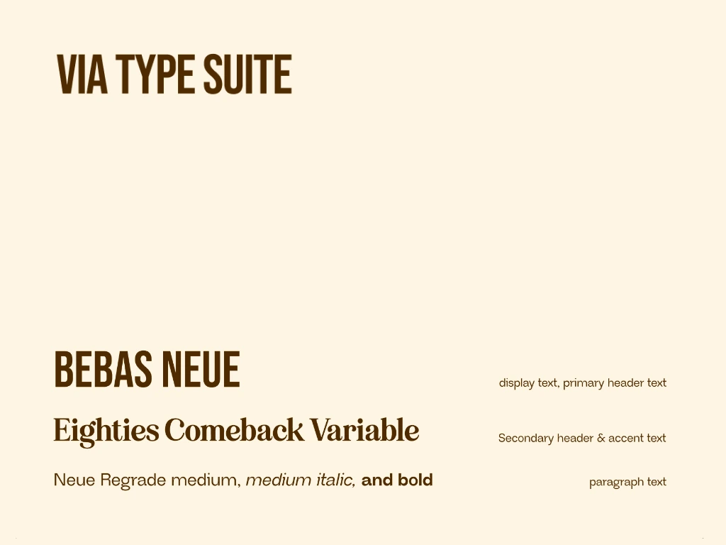
via type suite
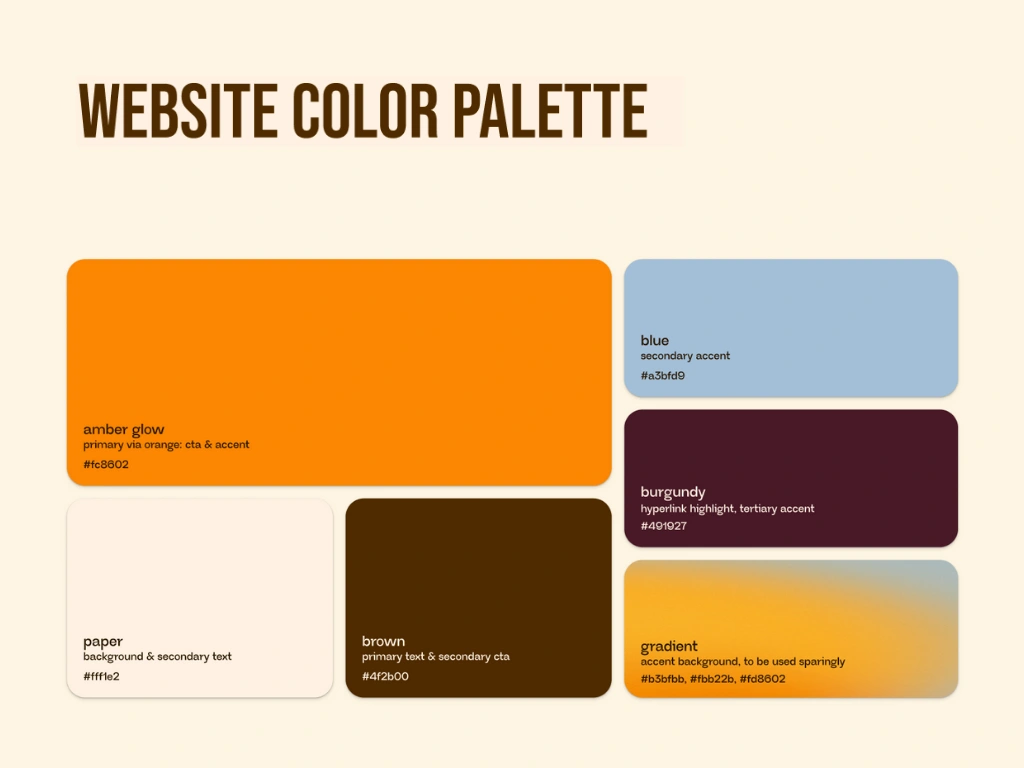
via web color palette
Bringing the story to life
I got to work designing and developing the site on Framer:
writing concise, thematic, cheeky copy
developing minimal but bold components
crafting animations that flow with the brand story without overpowering it.
curating transportative film photography
Sticky CTA
To drive users to sign up with one minimal button that’s always on screen.
Minimal Universal Nav
To keep it short and sweet with links to sign up, sign in, and check out our socials.
App showcase
Using app screens with subtle scroll animations to tie the product into the visual story without feeling overly techie.
Universal Nav & Sticky CTA
app showcase scroll animations
a little movie magic
Then, I got started with the really fun bit—brainstorming immersive, experiential elements to bring users into the world of via.
Reopen sliding doors
The beta app is launching in NYC and LA, so when Olivia showed me one of the social taglines, “reopen sliding doors” I immediately thought of stepping onto a subway car, locking eyes with someone on the platform, only to have the doors close behind you.
What resulted is our loading animation, which is both my and Olivia’s favorite part of the website. The doors slide open…and off you step into the world of via.
Easter Eggs
On the 404 page, I pulled inspiration from Olivia’s background as a screenwriter to create vignettes that set the scene for new love, life-changing friendship, and community you can count on.
The result: image cards that flip to reveal the first moments of a meet cute.
Time: 2:43 PM
Location: Museum of Modern Art
Narrator: “She can't stop staring at that painting. I can't stop sneaking peeks at her. I should introduce myself before it's too late…”
I also got to lean into the cheeky tone here.
"404: Missed Connection
Sure, we believe in fate, but we're not sure this is where you're meant to be..."
CTA: "Take me home"
desktop loading animation & hero
404 page easter eggs
Happily ever after
Before we started, Olivia had a clear vision and a passion for connecting people. Now she has a marketing tool she’s excited to share, 10,000 people on the waitlist, a way to build via’s CRM and capitalize on the momentum of their socials, and guidelines for keeping the brand consistent across platforms.
Plus some concepts I brainstormed for the website that ended up being a better fit for socials and in-person events:
a series of vignettes focusing on mementos from the places you meet: matchboxes, ticket stubs, coasters, festival bracelets, a totebag from your favorite farmer’s market, a loyalty card from your neighborhood cafe…
symbols of giving fate a hand: cootie catchers, fortune cookies, magic 8 balls, and tarot decks.
embroidering our beloved kissing pigeons from the loading animation on merch as via’s unofficial mascots.
Check out the live site here.
partners section & "we met via" footer animation
Developing the sequel
Once the beta app launches and the via budget grows, we’ll be able to pull data and iterate on the site to keep improving conversions and further building out the site.
Olivia and I have a wonderful, highly-communicative working relationship and I look forward to partnering on projects in the future.
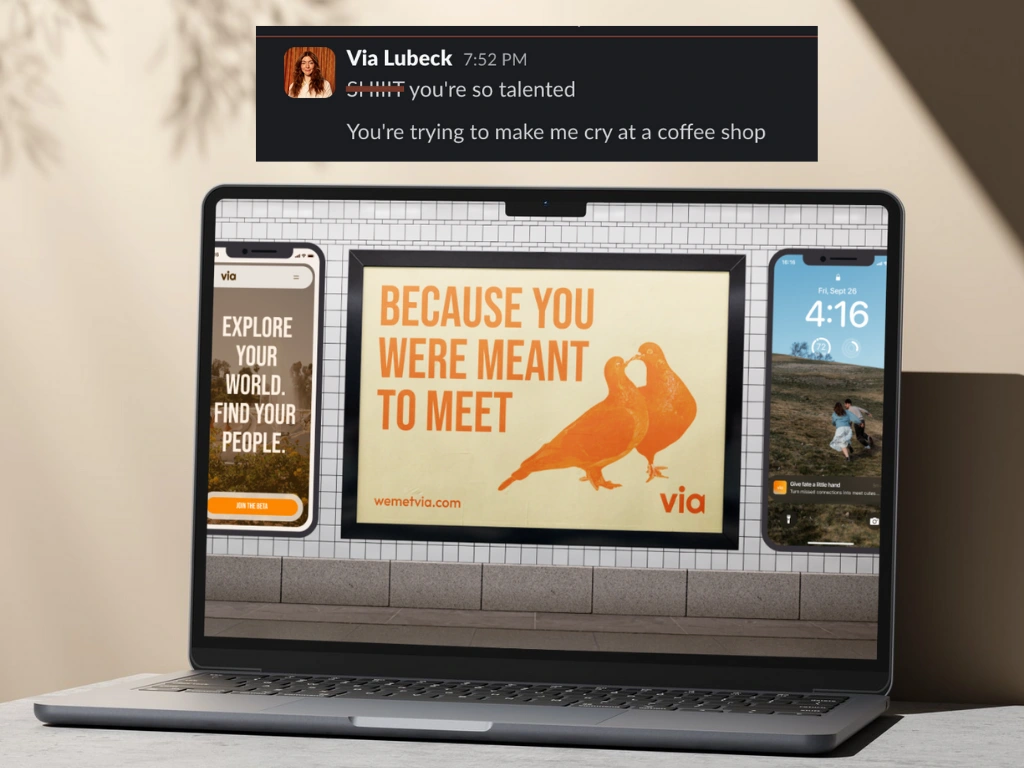
Olivia's slack review: "**** You're so talented / You're trying to make me cry at the coffee shop
Like this project
Posted Oct 22, 2025
A dreamy and cinematic mobile-first Framer site that built momentum for via and led to 10k waitlist sign-ups in 4 months.
Likes
2
Views
40
Timeline
Aug 12, 2025 - Sep 27, 2025
Clients
via