ALIVE Library - A living reference of design knowledge
Lívia Kiss
ALIVE Library — Case Study
A free, living reference of design knowledge — designed, written, and built end-to-end.
Lívia Kiss · ALIVE Design Studio
Live at: alivedesignlibrary.com
What it is
ALIVE Library is a free, slowly growing reference site for designers and design engineers. It launched with 50 entries across five themes — Mind & Behavior, Calm Technology, AI & Human Interfaces, Patterns & Practice, and Tools & Workflow — each one tracing a design idea down to the mechanism beneath it, then drawing the practical implication.
It is not a blog. There are no dates leading the experience. There is no newsletter pressure, no community feed, no login wall, no comment threads. It's built to be returned to, learned from, and passed along — the kind of resource a designer bookmarks and a developer sends to a colleague.
I designed it, wrote every entry, and built it myself.
Why I made it
I'm a Design Engineer roughly a year into design, currently learning the backend side of full-stack development. Across that year, I noticed something repeating in the design content I was reading: most of it stops at naming an effect. Here's Hick's Law. Here's the peak-end rule. Here's why streaks work. The named concepts get repeated; the mechanism beneath them rarely does.
That bothered me. Not because the surface-level explanations are wrong — they're often correct — but because the why underneath an effect is what makes it useful in practice. Knowing that "users prefer fewer choices" is a starting line. Knowing what cognitive load actually costs the brain, in mechanism, is what helps you design differently.
So I wanted to build something that goes the layer deeper. A reference, not a blog. A body of work, not a content feed. A place I'd want to use myself.
The core idea
Design knowledge, built slowly and intentionally — each idea traced down to the science beneath it, and connected to the rest.
That's the entire library in one sentence. Everything else serves it.
Three principles flow from that single idea:
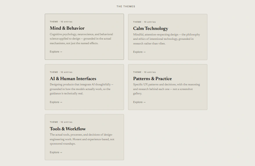
Depth over breadth. Five themes, not twelve. A small, focused taxonomy that reads as a considered body of work rather than a content farm. The five themes can comfortably hold 200+ entries over time, but they stay narrow enough that the library has a clear identity.
Mechanism over name. Each entry takes a concept most designers have heard of and goes a layer deeper — to the cognitive psychology, the neuroscience, the actual research, or the technical reality. The library is written to be used by people who already know the basics and want the next layer.
Connection over isolation. Entries link to each other. Reading one entry should pull you toward two more. Over time, the library becomes a graph of related ideas, not a stack of standalone posts.
Who it's for
Three audiences, in priority:
Designers and design engineers who've outgrown the surface-level content and want grounded depth.
Developers who care about the human side of what they build.
Product managers and founders who want frameworks beyond growth metrics.
Whoever the reader is, the library treats them as someone serious. No hype. No "you won't believe..." headlines. No engagement bait. Just clear writing on real ideas.
The five themes
The themes were chosen carefully — wide enough to give the library range, narrow enough to give it identity.
Mind & Behavior — Cognitive psychology, neuroscience, and behavioral science applied to design. The most research-heavy theme. Entries go down to the biological and psychological mechanism, not just the named effect.
Calm Technology — Mindful, attention-respecting design. The philosophy and ethics of intentional technology, grounded in research on attention, stress, and digital wellbeing.
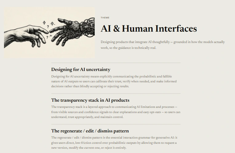
AI & Human Interfaces — Designing products that integrate AI thoughtfully. Grounded in how the models actually work, so the design guidance is technically real, not hand-wavy.
Patterns & Practice — Specific UX patterns and decisions, with the reasoning and research behind each one. The utilitarian "I need to design this thing" theme.
Tools & Workflow — The actual tools, processes, and decisions of design-engineering work. Honest and experience-based, not sponsored roundups.
Science isn't a sixth theme — it's the quality that runs through every theme. That distinction shapes the library's whole voice.
How I designed it
The library needed a visual identity that matched what it was: a book that became a website.
The aesthetic brief I wrote for myself was "a quiet study room on the web." Warm paper, deep ink, hand-drawn illustrations, restrained accents. The kind of space where reading feels deliberate, not extracted from a feed.
The decisions that came out of that:
Color palette — Ivory Silk background (
#ECEAE2), Obsidian text (#0C0B09), Void Black for illustration ink (#262420), Amber Dusk for margin notes and captions (#706A5C), and a single Golden Hour accent (#88867A) used sparingly. No pure white anywhere. No pure black. Warmth as the identity.Typography — A serif for body text, because reading should feel slower and more considered than scrolling. A clean sans-serif for UI elements only. The handwritten font reserved for margin notes — the human breath beside the printed word.
Layout — A calm gallery grid on the home page. A book-like entry page with numbered sections, generous margins, max content width around 680px so the eye never has to track too far. Hand-drawn illustrations that earn their place by explaining something, never decorating.
Motion — Slow, gentle, restrained. No parallax, no scroll-jacking, no popups, no notification bars. The interaction design is part of the message. A library about calm technology can't itself feel anxious.
Domain decision — I gave it its own domain (alivedesignlibrary.com) rather than a subdirectory of the studio site. Search engines treat subdomains and standalone domains as separate sites with their own identity, and the library deserved its own room to breathe.
How I built it
The library is built in vanilla HTML, CSS, and JavaScript — the same stack I use for my studio and for projects like Ondine. Static, fast, easy to maintain.
Hosting is on the open web, behind a custom domain. Imagery is served through Cloudinary. Analytics are minimal and privacy-respecting. There is no database, no user accounts, no comment system, no newsletter integration in v1. The library is, technically, a deliberately simple site — and the simplicity is part of the value. A reference site should load fast and stay clean.
The trade-off: features like full-text search, dark mode, true margin notes in the desktop layout, and a digitized version of my own handwriting are all planned but deferred to v2. Shipping the readable, structured version first was the priority. The craft layer gets added over time, while the library is live, not gated behind perfection.
How I wrote it
50 entries is a lot of writing. Most of it happened in concentrated bursts of research and drafting, distributed over several months alongside client work, learning, and my other projects.
The process per entry, roughly:
Pick a concept that interests me and feels under-explained in existing design writing.
Read 2–3 primary sources — the original research papers, the canonical books, or the technical documentation.
Find 2–3 real product examples that demonstrate the concept, both well-handled and poorly-handled.
Sketch the visual that would explain the concept best.
Write the entry in one or two sittings, then edit over a few days.
The voice across all entries: direct, honest, no clichés. The same voice I use on LinkedIn and in client conversations, slightly more reference-oriented. Less "I think…" and more grounded "Here's what this is, why it matters, and how to apply it."
What I chose to leave out
The discipline of a reference site is in the omissions. The library deliberately does not have:
A newsletter signup
A community or forum
User accounts or favorites
Comments under entries
A search bar in v1 (theme navigation does the wayfinding for now)
Dates leading the experience
Pop-ups, banners, or any interruption to reading
These weren't features I forgot. They were features I refused. Each one would have made the library feel more like a content platform and less like a reference. The restraint is the design statement.
What I learned building it
Three things stand out so far:
Naming what something isn't is as useful as naming what it is. The clearest decisions on this project came from saying "this is not a blog, not a course, not a newsletter, not a community." Each NOT made the YES more defined.
Sequencing matters more than scope. When I first sketched this, I imagined launching with three entries and growing from there. Launching with 50 instead changed the entire perceived weight of the project. The same library with three entries reads as "early experiment." With fifty, it reads as "real reference." That difference is worth months of upfront work.
Calm design is harder than busy design. Restrained interfaces show their flaws faster — there's nowhere to hide. Every typographic choice, every margin, every color is visible. Building this taught me discipline I didn't have at the start.
What's next
The library is built to grow slowly. One new entry every two to three weeks, indefinitely. Existing entries revised as I learn more. The craft layer (margin notes, handwritten font, search, dark mode) added progressively over the coming months.
It's a 5-year project, not a 30-day product. The compounding happens entry by entry, year by year. Most freelancers spend 5 years bouncing between platforms. I'd rather spend 5 years adding to a single body of work.
Why this project matters to me
I'm building toward a career as a Design Engineer at the intersection of design, full-stack development, and intentional product work. The library is the public record of that practice. Over years, it becomes evidence of how I think — across design, building, AI, and the small choices that make products feel honest or extractive.
Most of all, it's the thing I wanted to exist and couldn't find. So I made it.
ALIVE Library is live at alivedesignlibrary.com. New entries are published every two to three weeks. Follow along on LinkedIn or X.
Designed, written, and built by Lívia Kiss · ALIVE Design Studio
Like this project
Posted Jun 15, 2026
A free reference site for designers and design engineers: 50 entries across five themes, each traced down to the science beneath it.