


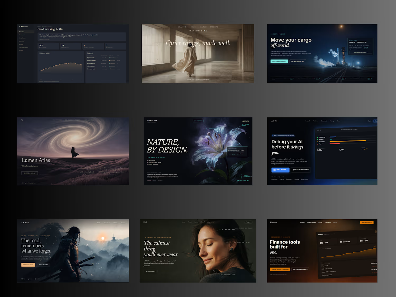
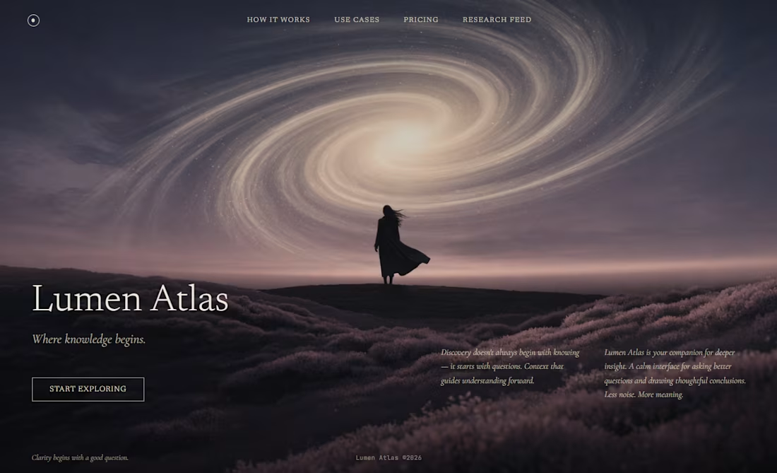
A concept landing page for a fictional AI product called Lumen Atlas — a "companion for deeper insight."
Most AI landing pages default to glowing orbs, tilted product screens, and speed benchmarks. Lumen Atlas takes the opposite approach: a single cinematic photograph carries the whole page, editorial serif typography does the compositional work, and restraint replaces feature clutter.
No pill badges. No trust bar. No aggressive CTAs. Just the image, three sentences, and a ghost button that says "Start Exploring."
A design study in what an AI product could feel like if it stopped selling capability and started selling the quality of the questions it helps you ask.
Concept project · 2026
0
66
Neon Ash — A cinematic landing page for a fictional noir detective game
A concept landing page for a fictional noir detective game called Neon Ash: a design study exploring how a cyberpunk aesthetic can lean into cinematic restraint instead of the neon overload most games in the genre default to.
The visual language most cyberpunk landing pages use is loud: neon everywhere, glitch effects, aggressive gradients, particle rain, glowing every button. The problem is that once everything is neon, nothing reads. The atmosphere becomes noise.
Neon Ash takes the opposite approach. A single cinematic hero image of a lone detective on a rain-soaked rooftop carries the mood. The neon signs are treated as set-dressing inside the image, not as UI accents. Magenta appears only in two places: the primary CTA and the small overline. Everything else /the wordmark, the nav, the tagline, the platform indicator/ sits in restrained white and muted cyan.
The typography does most of the compositional work. "NEON ASH" occupies the left third at display scale, with the second word rendered as outline-only: giving depth without adding color noise. Small letter-spaced uppercase for the overline ("DETECTIVE NOIR · SINGLE PLAYER") signals the genre without shouting.
The copy leans into the story rather than the marketing: "Forty stories up, the city drowns in its own light. A missing witness. A detective with a flooded memory. Every reflection hides a lie - and the rain never stops talking."
Designed as a single-screen concept study /hero, video variant, and mobile responsive/ to explore how disciplined restraint can make an atmospheric genre feel considered instead of loud.
Concept project · UI + motion design · 2026
0
79
ALIVE Library - A living reference of design knowledge
0
10
Quiet: A login that doesn't push
A concept exploring how a single screen — the login — can quietly communicate a product's values before the user has clicked anything.
Most login screens are built around efficiency: email, password, button, social-login shortcuts, marketing nudges. The default is transactional and slightly cold. But the login is also the first screen a returning user sees — the first moment of the relationship every day. That's a design opportunity most products waste.
Quiet is the opposite: a login built around intentional first impressions.
A serif welcome line — "Welcome back. Take your time." Soft form fields that feel like depressions in the surface, not boxes stuck on top. A subtle warm halo appears when a field is focused — the interaction itself feels like attention being paid. A primary button without urgency or exclamation marks. Reset-password copy that treats forgetting as something that happens, not a failure: "That's okay — it happens." A "New here?" link that simply says Begin. No social-login clutter. No marketing nudges. Restraint as the design statement.
Designed in a deep midnight palette with a single warm gold accent, serif welcome typography, and a quiet ambient background that connects visually to my other work.
A single-screen concept study exploring how much character and intention can live in a screen most products treat as utility.
Concept project · UI + interaction design · 2026
3
176