
Lívia Kiss's Work | ContraWork by Lívia Kiss
Lívia Kiss

Lívia Kiss

Design Engineer (UX/UI + Frontend + Learning Backend)

New to Contra

Lívia is ready for their next project!

Cover image for A concept landing page for
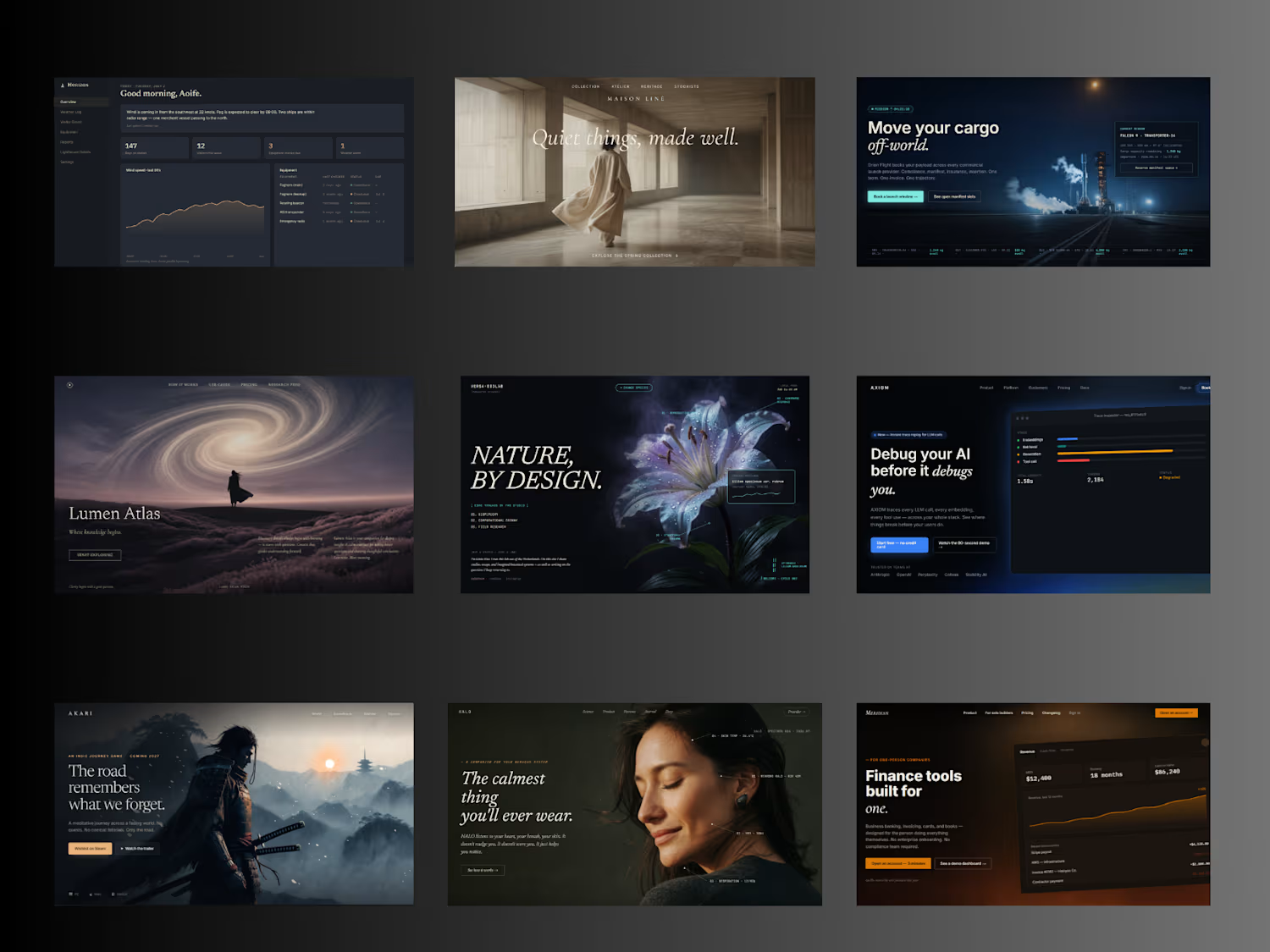
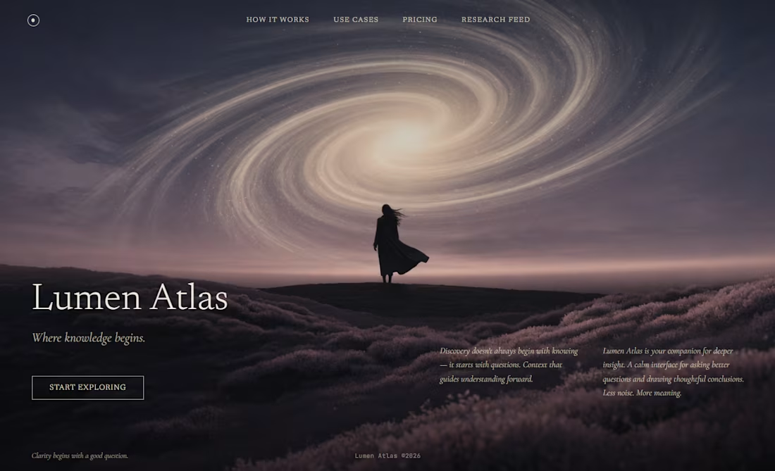
A concept landing page for a fictional AI product called Lumen Atlas — a "companion for deeper insight." Most AI landing pages default to glowing orbs, tilted product screens, and speed benchmarks. Lumen Atlas takes the opposite approach: a single cinematic photograph carries the whole page, editorial serif typography does the compositional work, and restraint replaces feature clutter. No pill badges. No trust bar. No aggressive CTAs. Just the image, three sentences, and a ghost button that says "Start Exploring." A design study in what an AI product could feel like if it stopped selling capability and started selling the quality of the questions it helps you ask. Concept project · 2026
0
30
Neon Ash — A cinematic landing page for a fictional noir detective game A concept landing page for a fictional noir detective game called Neon Ash: a design study exploring how a cyberpunk aesthetic can lean into cinematic restraint instead of the neon overload most games in the genre default to. The visual language most cyberpunk landing pages use is loud: neon everywhere, glitch effects, aggressive gradients, particle rain, glowing every button. The problem is that once everything is neon, nothing reads. The atmosphere becomes noise. Neon Ash takes the opposite approach. A single cinematic hero image of a lone detective on a rain-soaked rooftop carries the mood. The neon signs are treated as set-dressing inside the image, not as UI accents. Magenta appears only in two places: the primary CTA and the small overline. Everything else /the wordmark, the nav, the tagline, the platform indicator/ sits in restrained white and muted cyan. The typography does most of the compositional work. "NEON ASH" occupies the left third at display scale, with the second word rendered as outline-only: giving depth without adding color noise. Small letter-spaced uppercase for the overline ("DETECTIVE NOIR · SINGLE PLAYER") signals the genre without shouting. The copy leans into the story rather than the marketing: "Forty stories up, the city drowns in its own light. A missing witness. A detective with a flooded memory. Every reflection hides a lie - and the rain never stops talking." Designed as a single-screen concept study /hero, video variant, and mobile responsive/ to explore how disciplined restraint can make an atmospheric genre feel considered instead of loud. Concept project · UI + motion design · 2026
0
43
ALIVE Library - A living reference of design knowledge
0
4
Quiet: A login that doesn't push A concept exploring how a single screen — the login — can quietly communicate a product's values before the user has clicked anything. Most login screens are built around efficiency: email, password, button, social-login shortcuts, marketing nudges. The default is transactional and slightly cold. But the login is also the first screen a returning user sees — the first moment of the relationship every day. That's a design opportunity most products waste. Quiet is the opposite: a login built around intentional first impressions. A serif welcome line — "Welcome back. Take your time." Soft form fields that feel like depressions in the surface, not boxes stuck on top. A subtle warm halo appears when a field is focused — the interaction itself feels like attention being paid. A primary button without urgency or exclamation marks. Reset-password copy that treats forgetting as something that happens, not a failure: "That's okay — it happens." A "New here?" link that simply says Begin. No social-login clutter. No marketing nudges. Restraint as the design statement. Designed in a deep midnight palette with a single warm gold accent, serif welcome typography, and a quiet ambient background that connects visually to my other work. A single-screen concept study exploring how much character and intention can live in a screen most products treat as utility. Concept project · UI + interaction design · 2026
2
153
A concept landing page for a fictional ocean conservation nonprofit, designed and built end-to-end. Most environmental websites lead with alarm — big statistics, urgent colors, fear-based calls to action. The psychology backfires: when faced with overwhelming threat, people retreat rather than engage. Ondine is designed around the opposite principle. The visitor moves through a deliberate emotional sequence — awe, meaning, reality, hope, action — that mirrors how people actually decide to care about something and act on it. They descend into the ocean as they scroll. Slow motion. Deep blue. A single bioluminescent accent that only appears where it matters. The hard truth shown not as horror but as one drifting bottle in the deep. The donation ask framed with dignity, not pressure. Designed in Figma, built in HTML/CSS/JavaScript with a fixed-background scrolling technique. Cinematic imagery created with AI image generation and curated for consistent mood. Mobile-first and fully responsive. Live demo: https://liviakiss.github.io/ondine/ Case Study: https://alivedesignstudio.net/ondine.html
3
2
174
A hero design for a matcha brand🩶 🍵
0
132
Cover image for My race gave me a
My race gave me a bit of inspiration, so I made a Spartan landing page using the brand colors and the fire that is the symbol of this event for me.
1
114
Cover image for Discover Stillwater: Elevate Wellness with Botanical Rituals
Stillwater — a wellness brand built around botanical rituals and the quiet between days. Calm without being flat. Warm without being cluttered. → alivedesignstudio.net (http://alivedesignstudio.net)
1
112
Cover image for A self-initiated mobile app concept
A self-initiated mobile app concept for couples and small households. Full UX process — brief, user flows, design system, 16 screens designed in Figma — plus a coded prototype built in HTML, CSS, and JavaScript and deployed live. The app combines a shared grocery list, pantry tracker with expiry notifications, recurring item cycles, and a saved items library with photos and store notes. Case study available at alivedesignstudio.net/pantry.html
0
110
Cover image for Goldmaster — a full UX/UI
Goldmaster — a full UX/UI + frontend dashboard for indie game studios. Brief, user flows, 5 screens designed in Figma, coded in HTML/CSS/JS, deployed live. Built to showcase Package 4 scope: end-to-end product design and frontend implementation. Live demo: https://liviakiss.github.io/goldmaster/
0
142
Cover image for ALIVE Design Studio — Designed
ALIVE Design Studio — Designed & Built From Scratch This one is personal. Every designer needs a portfolio. Most use a template. I built mine from scratch — hand-coded in HTML, CSS, and JavaScript, deployed on GitHub Pages with a custom domain. Not because templates don't work, but because a designer who codes should be able to prove it. The site itself is the proof. The design system behind it — teal on near-black, chip-style components, teal accent rings, minimal dark aesthetic — is entirely custom. No frameworks, no shortcuts. Every spacing decision, every hover state, every transition written by hand. It also lives and breathes: Google Analytics, Search Console, a Gumroad integration, and a fully custom client onboarding system connected to a Node.js backend. Designed it. Then built it. Then shipped it.
1
143
Cover image for Logo design isn't my main
Logo design isn't my main service. But when a client asks "do you have any ideas?" — I try. This is for a cybersecurity company with a connection to Japan. The kanji means red. The name of the client inspired the color. He liked it. The website comes next. Sometimes the best work happens when you say yes to something slightly outside your lane.
0
143
Warm Component System — Design System Built a complete design system from scratch. Not a concept — a real, coded, documented component library. The brief I gave myself: what does a design system look like when the palette is warm? Deep olive, burgundy, and cream. Every decision had to earn its place. Colour tokens, typography scale (Cormorant Garamond + DM Sans), spacing, and a full component library — buttons, inputs, cards, navigation, modals, toasts, badges, avatars. All variants, all states. Coded version on GitHub — CSS custom properties, component files, live showcase page, physical interactions. Design in Figma. Code in VS Code. Both delivered.
1
154
Friture Holka — Unsolicited Redesign A local snackbar with real character — but a website that wasn't showing it. So I made a concept. Warm tones, dark background, appetite-driven layout. Design that actually matches the personality of the place. Same spot. Different feeling.
1
145
Discovery Museum — Unsolicited Redesign Nobody asked for this one. Discovery Museum is a brilliant place — interactive science, exhibitions for all ages, real community value. The website just wasn't keeping up. I stripped back the chaos, rebuilt the hierarchy, and let the content breathe. Dark background, strong typography, clear visitor paths — children, adults, school groups — all above the fold. Same museum. Different feeling.
1
139
Cover image for Moral Me — Unsolicited Redesign
Same
Moral Me — Unsolicited Redesign Same brand. Different design maturity. Moral Me is a gamified social platform built around character development — rewarding meaningful dialogue, not follower counts. The concept is original. The website wasn't keeping up with it. So I redesigned it. Without being asked. Three directions, each with a different strategic argument: dark editorial for the serious early adopter, evolutionary for structural improvement, brand-led with orange as the emotional foundation. The goal wasn't to change what Moral Me is. It was to make you feel it in the first three seconds. Sent it cold. The founder responded the same day.
1
122
Nami — High-Fidelity Focus Experience The blueprint was the logic. This is the feeling. For Nami's second phase, the architectural foundation became a premium dark mode interface designed for deep-work immersion — where colour theory and typography work together to reduce cognitive load and support flow states. High-fidelity visual design, an interactive clickable prototype for user testing, and a complete developer handoff — style guides, exported assets, and documentation that protects design integrity all the way through the build. From blueprint to pixel. Nothing lost in translation.
1
117
Cover image for Product Blueprint — UX Architecture
Product Blueprint — UX Architecture & Logic Great products are built on solid logic, not just good-looking screens. For Nami, a minimalist focus app, I mapped user flows, defined information architecture, and built interactive wireframes — all before a single high-fidelity pixel was placed. The deliverable: production-ready documentation. Flow logic, grid systems, rem-based typography specs, and developer handoff notes that leave zero room for interpretation. Design and development speak the same language here — because I speak both.
1
105
EchoLocate — Accessibility Diagnostic Tool What does a website look like to a screen reader? EchoLocate answers that question. Built under a strict binary constraint — Terminal Green on Obsidian Black — the tool strips away visual design to reveal the semantic skeleton assistive technology actually navigates. No shadows, no gradients. Hierarchy through line weight alone. Three core flows: Focus Path Mapping visualises the literal tab key journey. The Zoom-In Inspector bridges broken code and real audio friction. Virtual Patching injects ARIA fixes in real time. Accessibility isn't a checkbox. This makes it visible. Stack: Inter · JetBrains Mono · 8px grid · #00FF41 · #0F0F0F
1
109