Built with Framer
Pieces | Design & Framer Development
Simplicity, clarity and the power of memory
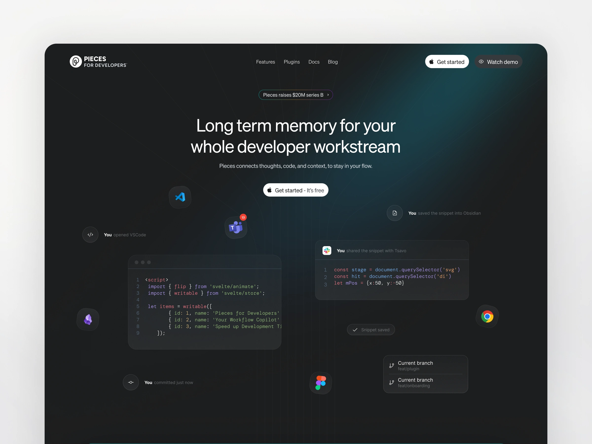
Pieces is an AI-powered tool that helps developers save, organize, and retrieve their code snippets and materials with ease — acting as a second brain. When tasked with redesigning their website, the challenge wasn’t just visual polish; it was about communicating the product’s purpose in a way that felt intuitive, meaningful, and memorable.
Design Philosophy
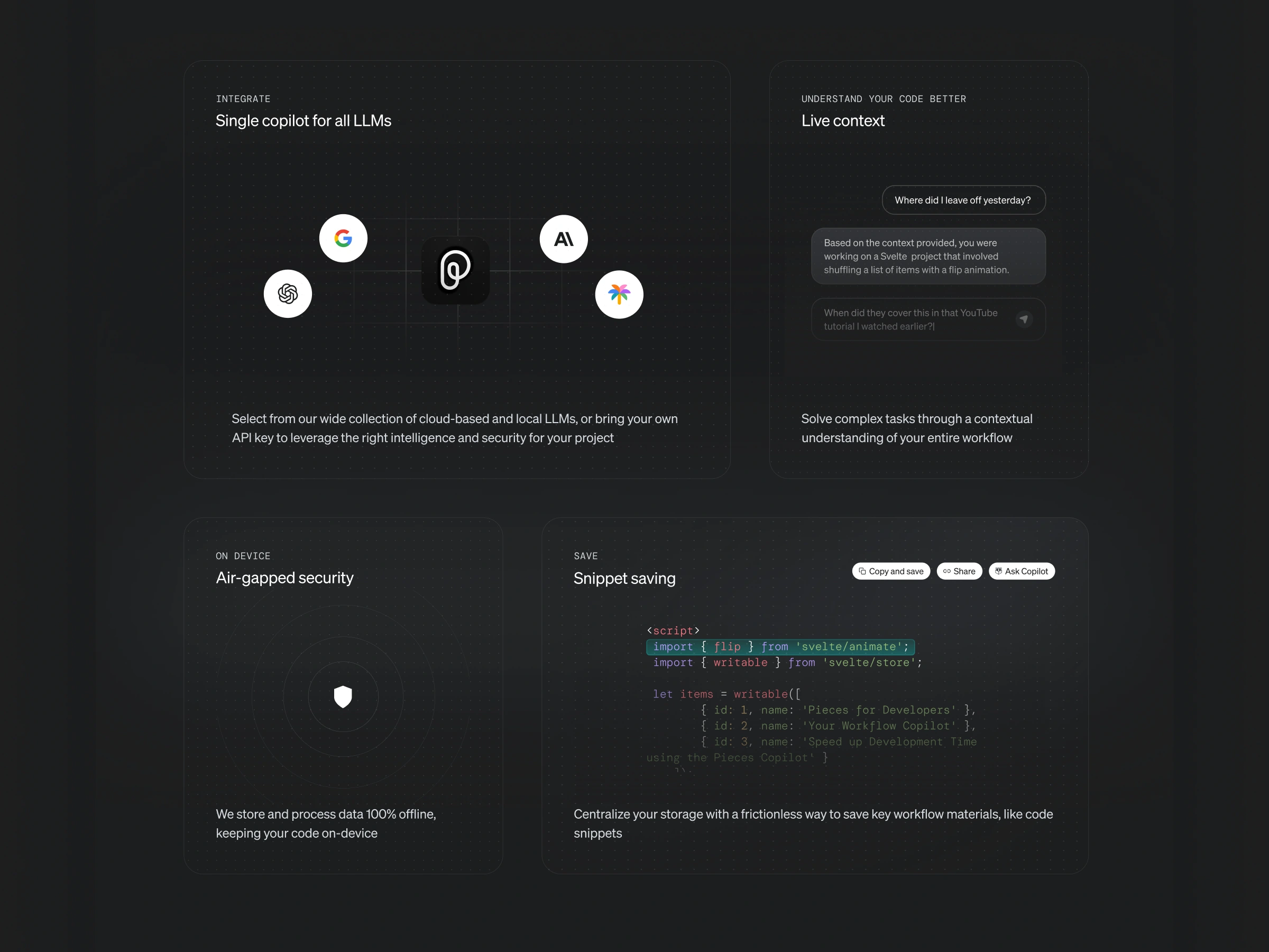
Inspired by Massimo Vignelli’s philosophy that design should be clear and purposeful, the redesign centered around a minimalist, functional approach. Every element was scrutinized for intention and impact. The goal: to remove distractions and ensure the interface served the story — that Pieces gives developers long-term memory for their work.
Key Improvements
1. Streamlined Messaging
The new website eliminates vague tech jargon and clearly positions Pieces as “a second brain for developers.” It bridges the gap between messaging and function, showing how Pieces replaces fragmented workflows by seamlessly saving and surfacing the right code, at the right time.
2. Elevated User Experience
Navigation was overhauled to remove friction and cognitive load. The design visually echoes a transition from chaos to clarity — mirroring how Pieces brings order to scattered code. The interface encourages exploration while staying out of the way, reinforcing the product’s core promise: enhanced productivity without added complexity.
3. Strategic Platform Migration
The site was migrated from Webflow to Framer to improve performance, responsiveness, and collaboration. Special attention was paid to SEO during the transition to ensure existing traffic and search rankings were preserved and enhanced, not disrupted.
Outcome
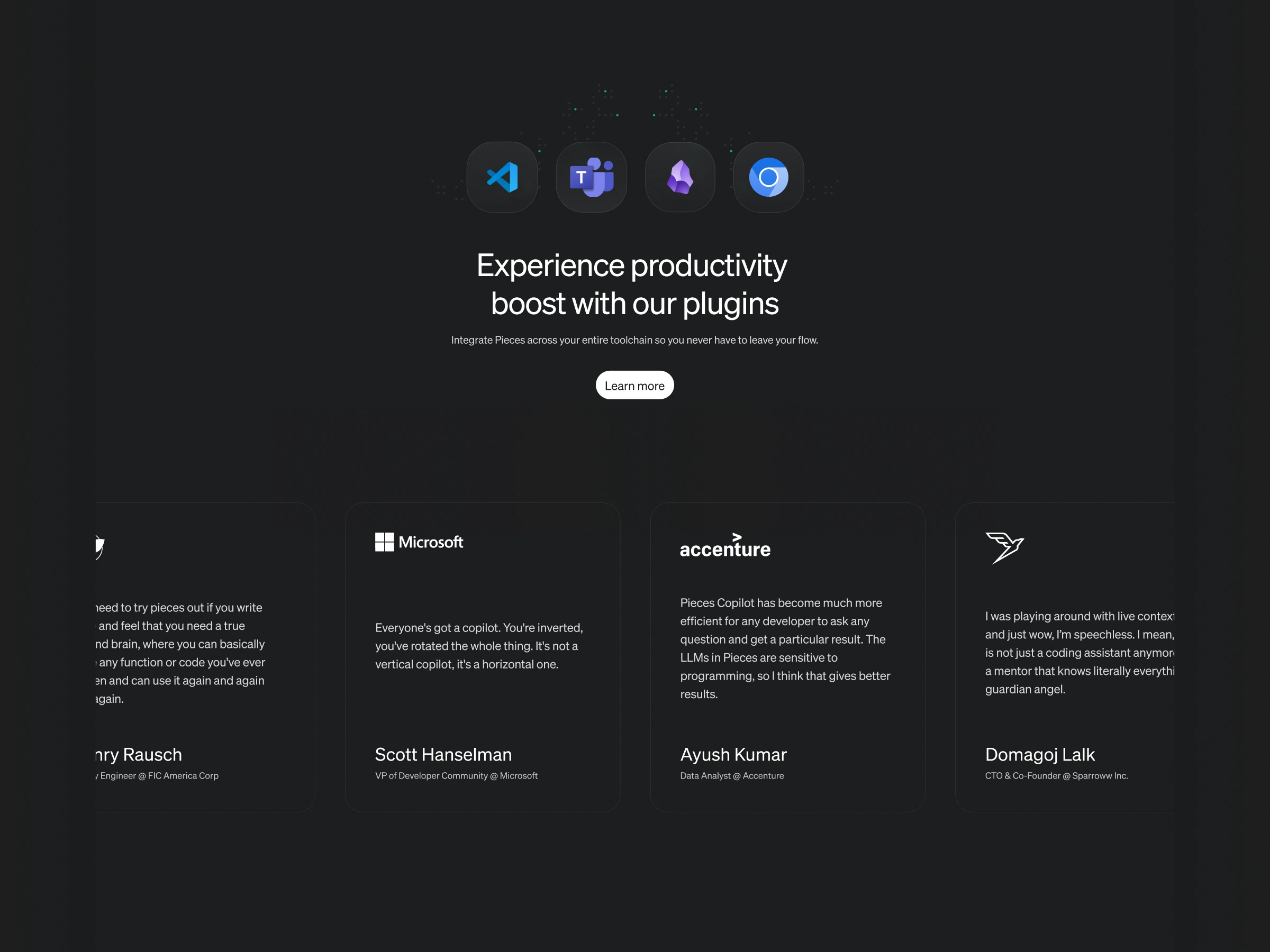
The new Pieces website is clean, fast, and deeply aligned with the product’s purpose. It communicates what Pieces does — and why it matters — within seconds. Early metrics indicate longer session times and improved user engagement, confirming that clarity and simplicity are more than aesthetic values — they’re business drivers.
Migration from Webflow to Framer with SEO in mind.
The new Pieces website looks awesome.
— One of Pieces' investors during an Investor meeting.
Like this project
What the client had to say
Excellent communicator with attention to detail. Pleasure to work with
Cole Stark, Pieces
Jan 23, 2024, Client
Posted Sep 30, 2024
Pieces new website enhances clarity, redefines messaging, and reflects on what's next for the app.
Likes
0
Views
96
Timeline
Jan 12, 2024 - Jan 23, 2024
Clients
Pieces

