MOHE | Design & WIX Development
Thay C
1. Discovery & IA
We began with a complete audit of the existing website and developed a new information architecture (IA) to simplify navigation and improve content hierarchy. The structure grouped MOHE’s offerings under clear sections like “About Us,” “Projects,” “Sponsor a Child,” and “Donate,” while maintaining room for expansion.
2. Design Concepts
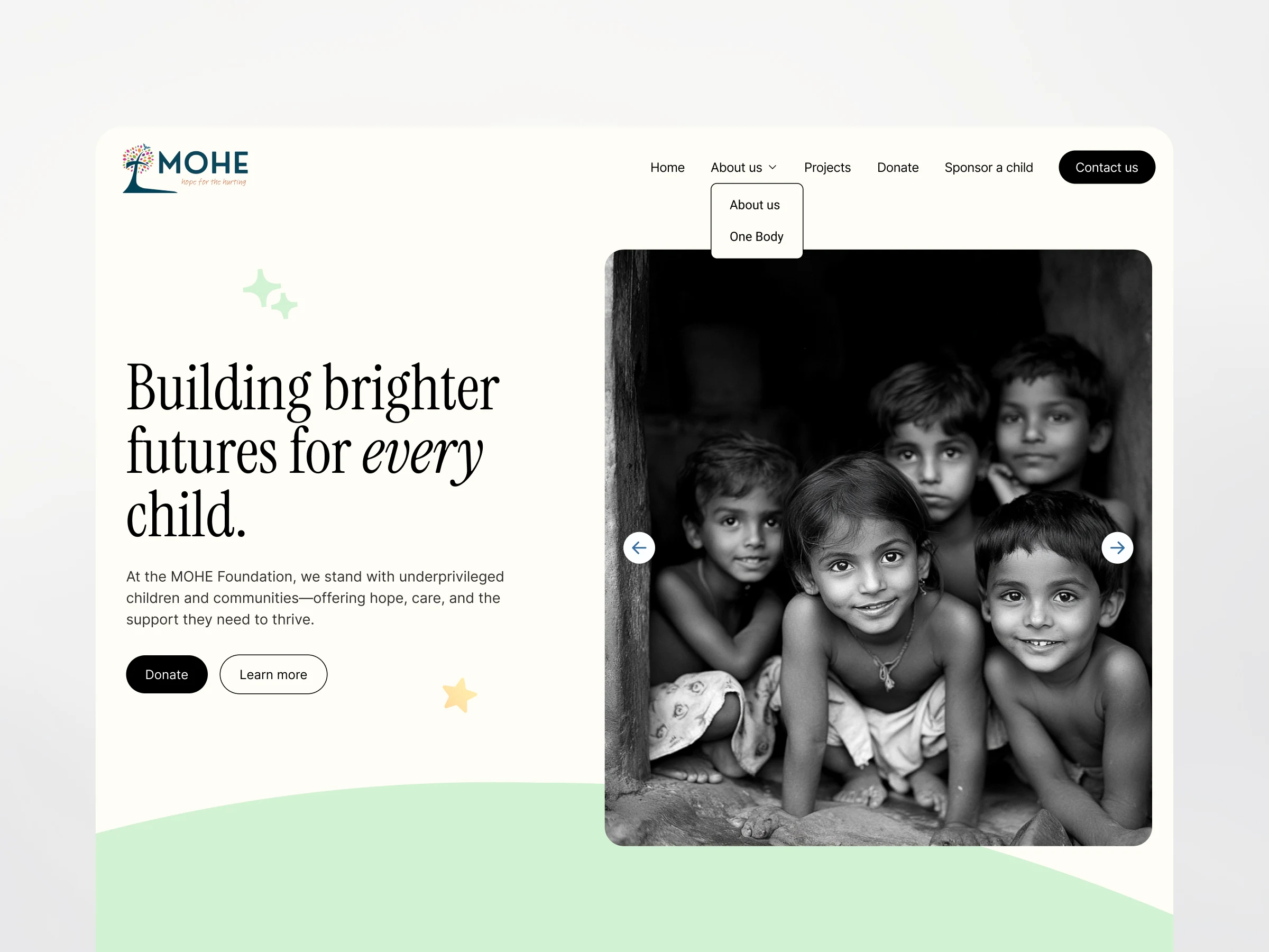
I presented two homepage concepts—one bold and editorial, the other soft and community-driven. After thoughtful discussion with the client, we selected the second option for its warmth, accessibility, and compatibility with interactive elements like a scrolling mission carousel and image slideshows.
3. Full Page Designs
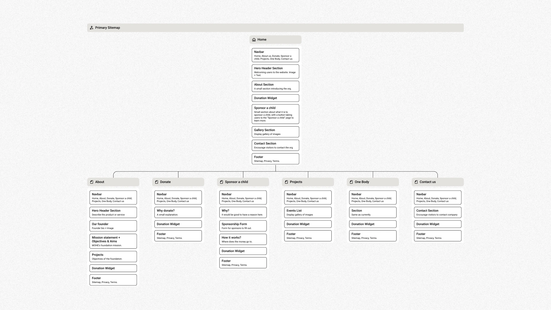
Once the concept was approved, I designed all core pages:
Homepage – with key CTAs, mission highlights, and emotional storytelling
About Us – featuring the founder’s story, objectives, and MOHE’s roots
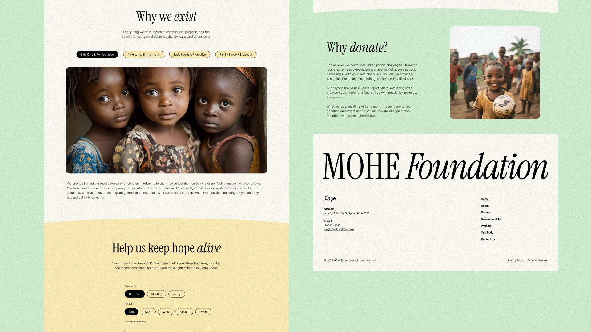
Donate – with clear messaging and a streamlined donation widget
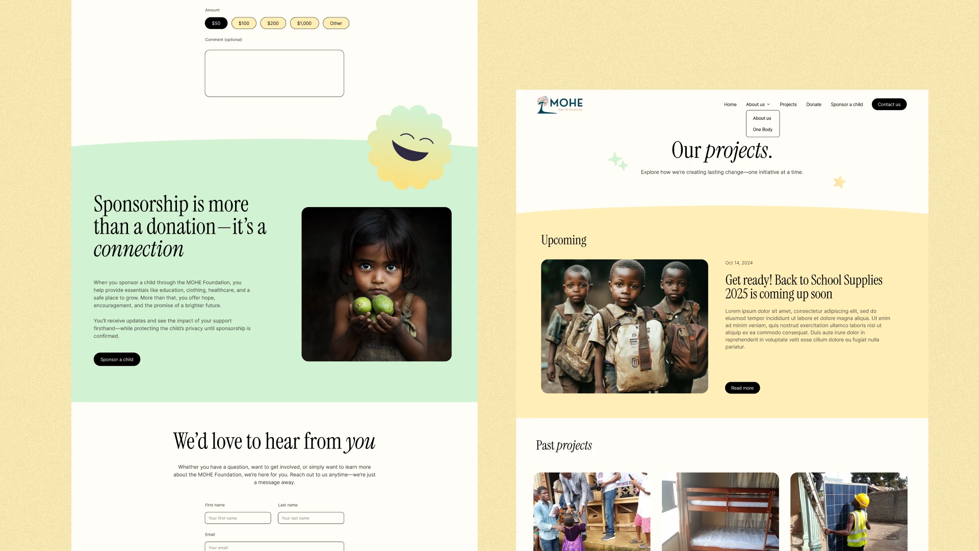
Sponsor a Child – with a detailed sponsorship journey and form
Projects – showcasing real-world initiatives and upcoming goals
Contact – simple, direct access to MOHE team and branch info
Key Features
Looping Mission Carousel — Adds subtle movement and reinforces MOHE’s message without overwhelming users
Photo Slideshow — Showcases real children and events to build trust and relatability
Integrated Donation Widget — Makes it easy for users to donate without leaving the page
Accessible, Mobile-Responsive Design — Ensures a smooth experience for users on all devices
Brand-Consistent Visuals — Soft tones and organic shapes reflect hope, care, and compassion
Outcome
The final design delivers a clear, emotionally resonant user journey—from understanding MOHE’s story to taking action. With consistent branding, accessible language, and structured calls to action, the site is now positioned to better support MOHE’s outreach, fundraising, and storytelling goals.
Like this project
Posted May 27, 2025
Redesigned MOHE's website for improved navigation, storytelling, and user engagement and developed on WIX.
Likes
1
Views
79
Timeline
May 1, 2025 - May 30, 2025