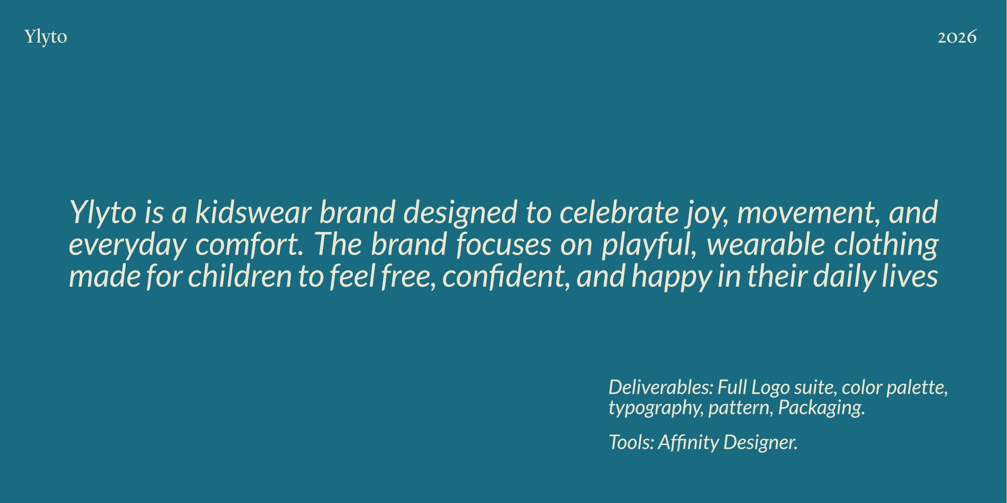
Ylyto Brand Identity
Zineb B

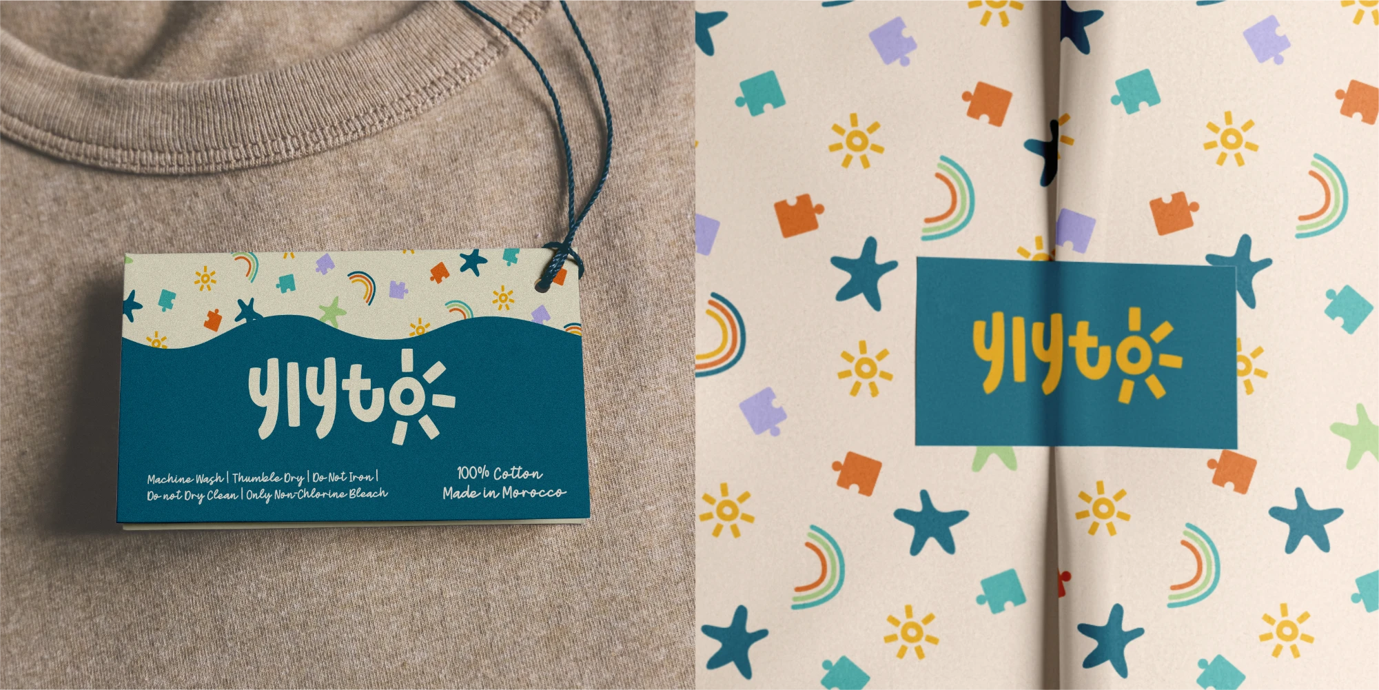
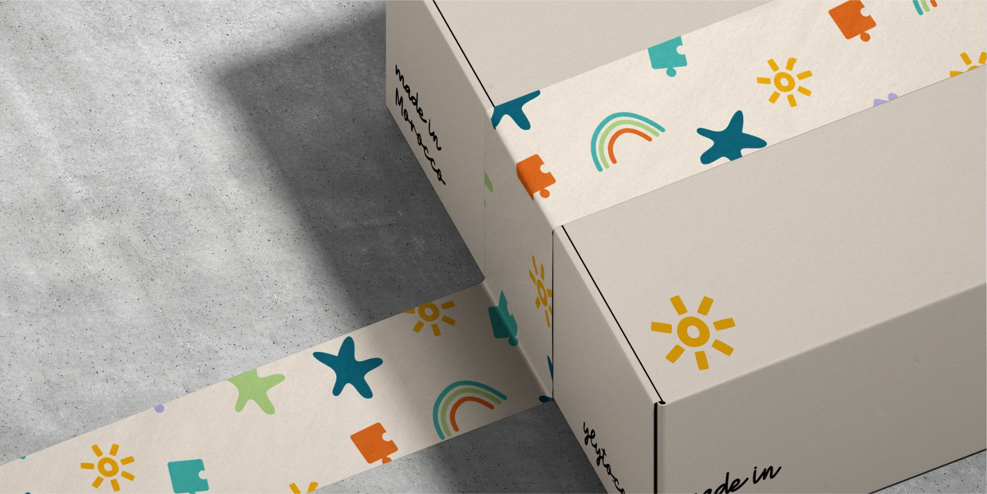
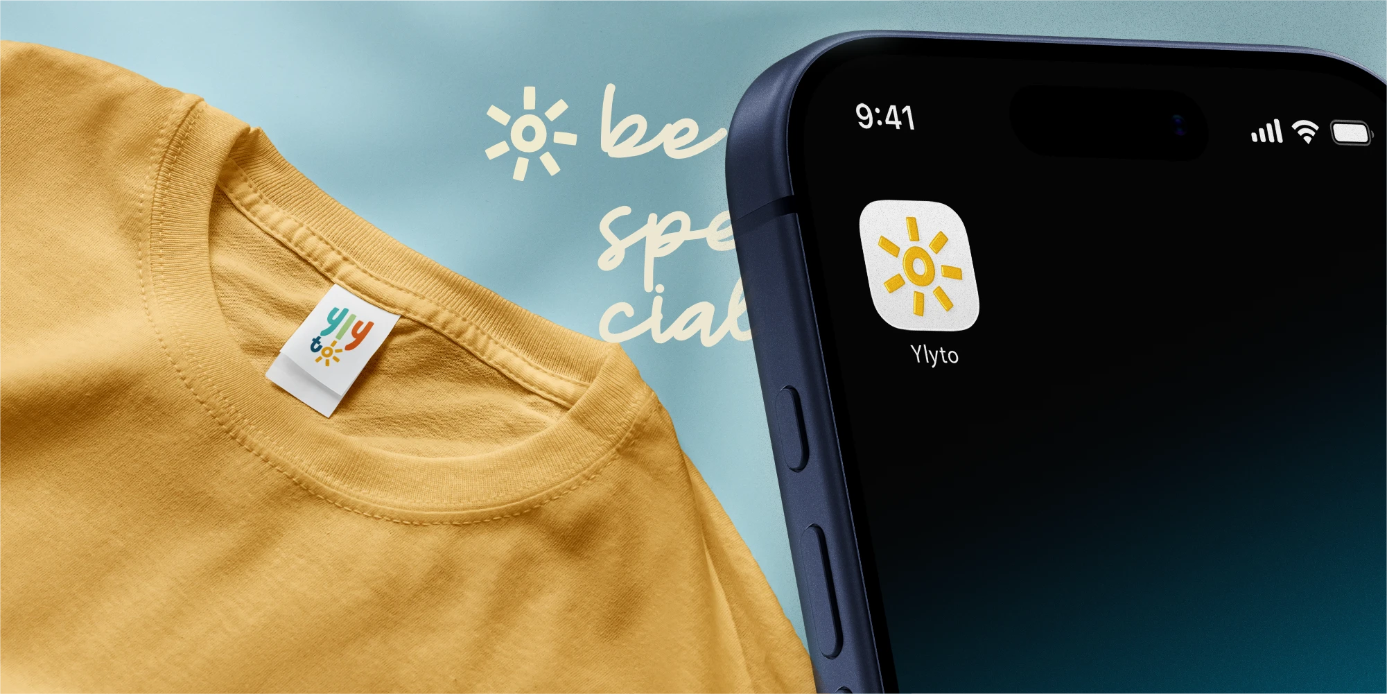
The challenge was to create a brand that feels playful without chaos, colorful without clutter, and appealing to both children and parents. The identity needed to communicate happiness and positivity while remaining clear, adaptable, and easy to apply across packaging and marketing materials.
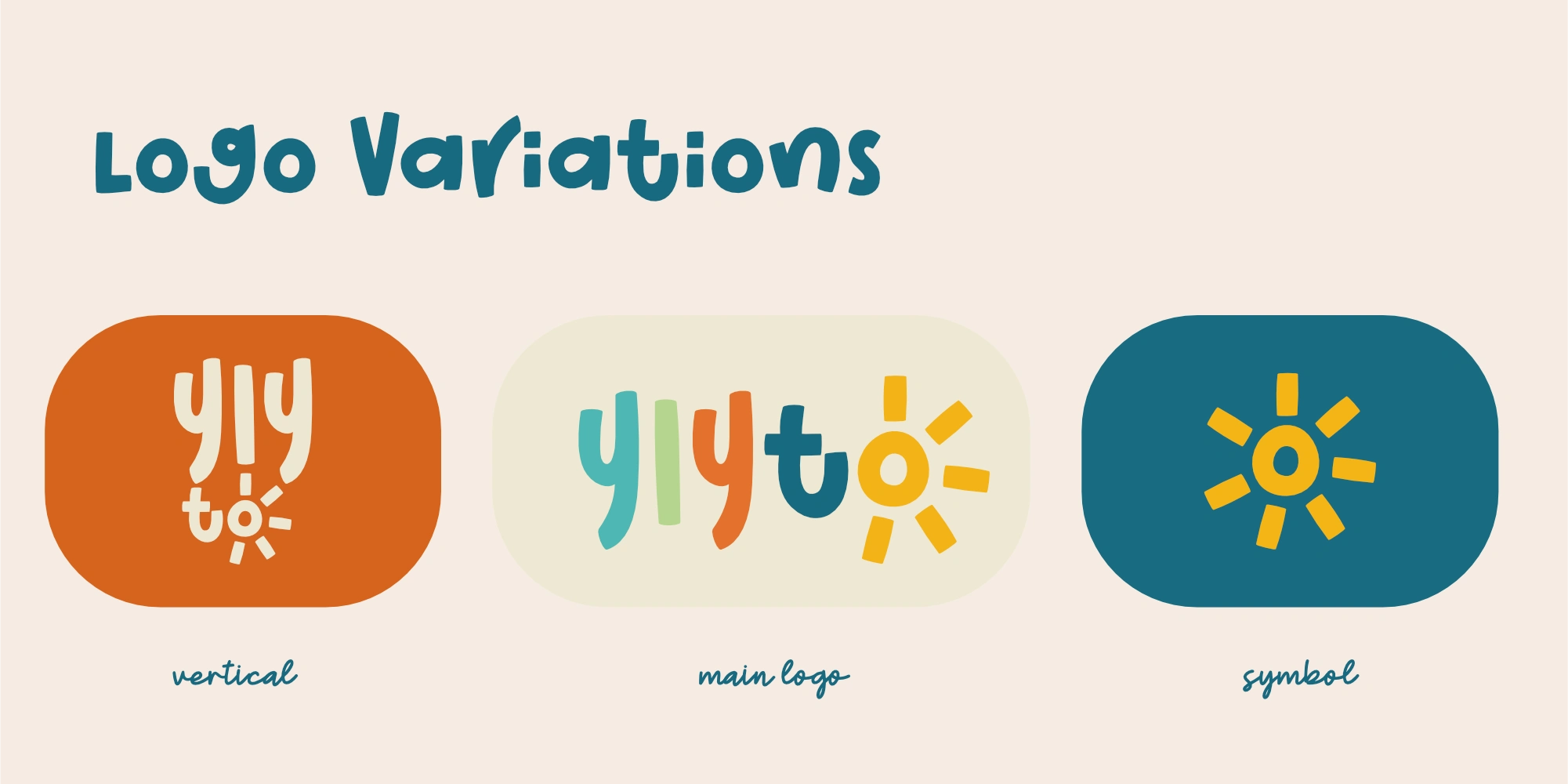
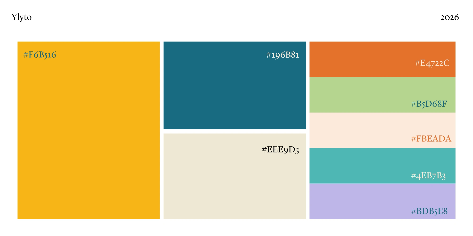
The creative direction for Ylyto is centered around sunshine, play, and positivity.
A sun was chosen as the main symbol to represent:
Joy and warmth
Energy and movement
Optimism and everyday happiness
The overall aesthetic is lighthearted and friendly, designed to feel like a bright moment in a child’s day.

Like this project
Posted Feb 4, 2026
Designed a playful brand identity for a kidswear brand. The project aims to create a brand that feels friendly, fun and easy to recognize