Brand Identity for a light therapy health center.
Miguel A Coelho
Overview
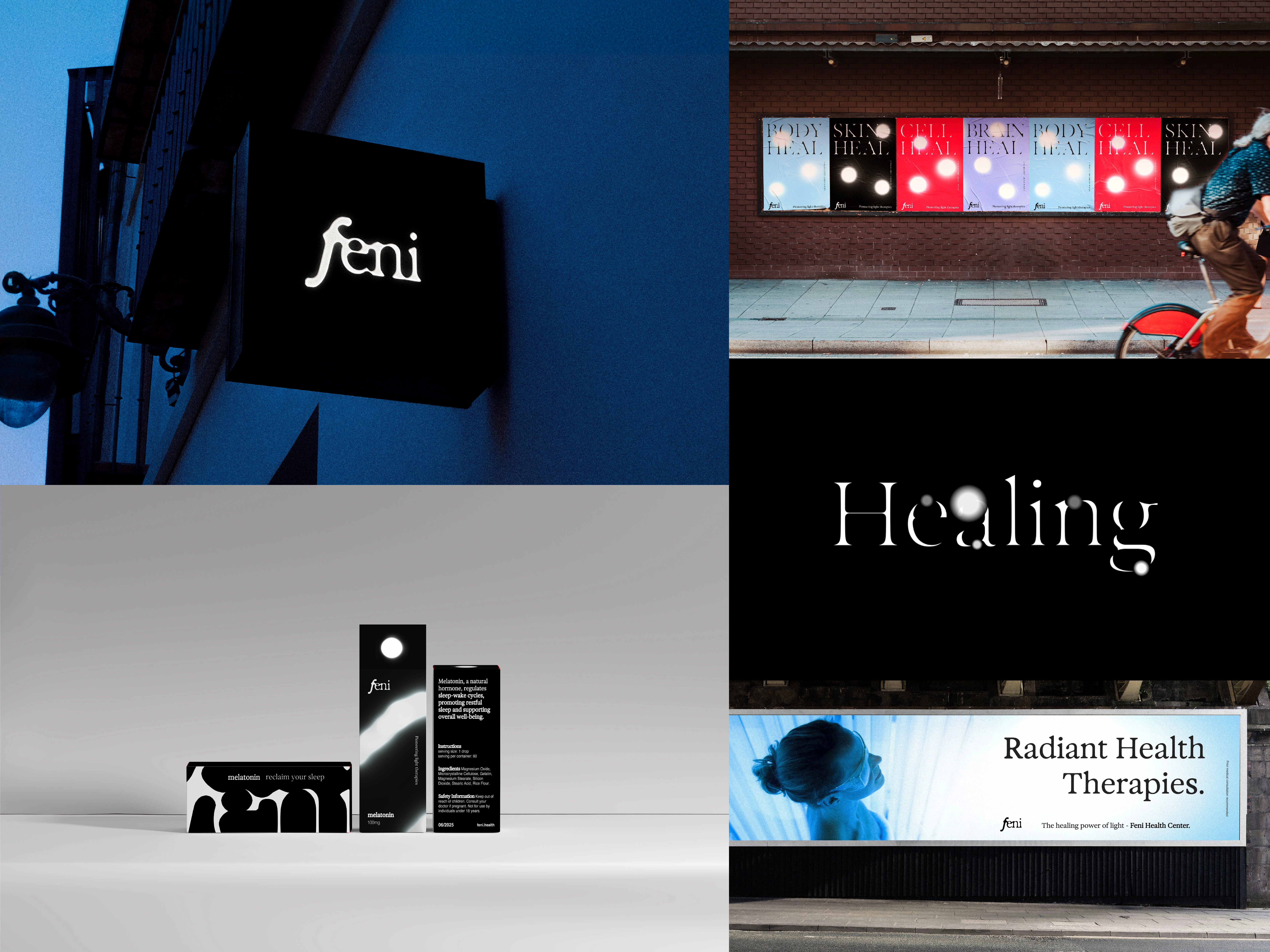
Feni is a health center based in London specializing in advanced light therapies designed to treat a range of conditions affecting the skin, bones, muscles, and mental health. Through targeted applications of red, blue, and violet (UV) light, the clinic harnesses the therapeutic potential of light to promote healing and overall well-being.
In a highly competitive wellness and therapy market, Feni required a visual identity capable of communicating both scientific credibility and a holistic approach to healing.
The goal was to create a brand that positioned Feni at the intersection of ancient healing traditions and modern therapeutic technology.
The Challenge
The wellness and therapy sector in London is saturated with clinics offering similar treatments and aesthetic-driven branding.
Feni needed a visual identity that could:
• Stand out within a crowded market
• Communicate trust and scientific credibility
• Reflect the clinic’s unique focus on light-based therapies
• Create a flexible visual system that could expand across physical and digital environments
Rather than adopting the cold environments often associated with medical clinics, the brand needed to communicate restoration and transformation.
Strategic Approach
Light has been associated with healing for thousands of years. From sunlight therapy in ancient cultures to modern photomedicine, light represents one of the most fundamental sources of energy and regeneration.
The brand concept was built around this duality:
Ancient solar healing × modern light therapy science
This idea positioned light not only as a treatment method but as the core narrative of the brand.
The identity system explores how light behaves, expands, and transforms — visually translating these properties into the brand language.
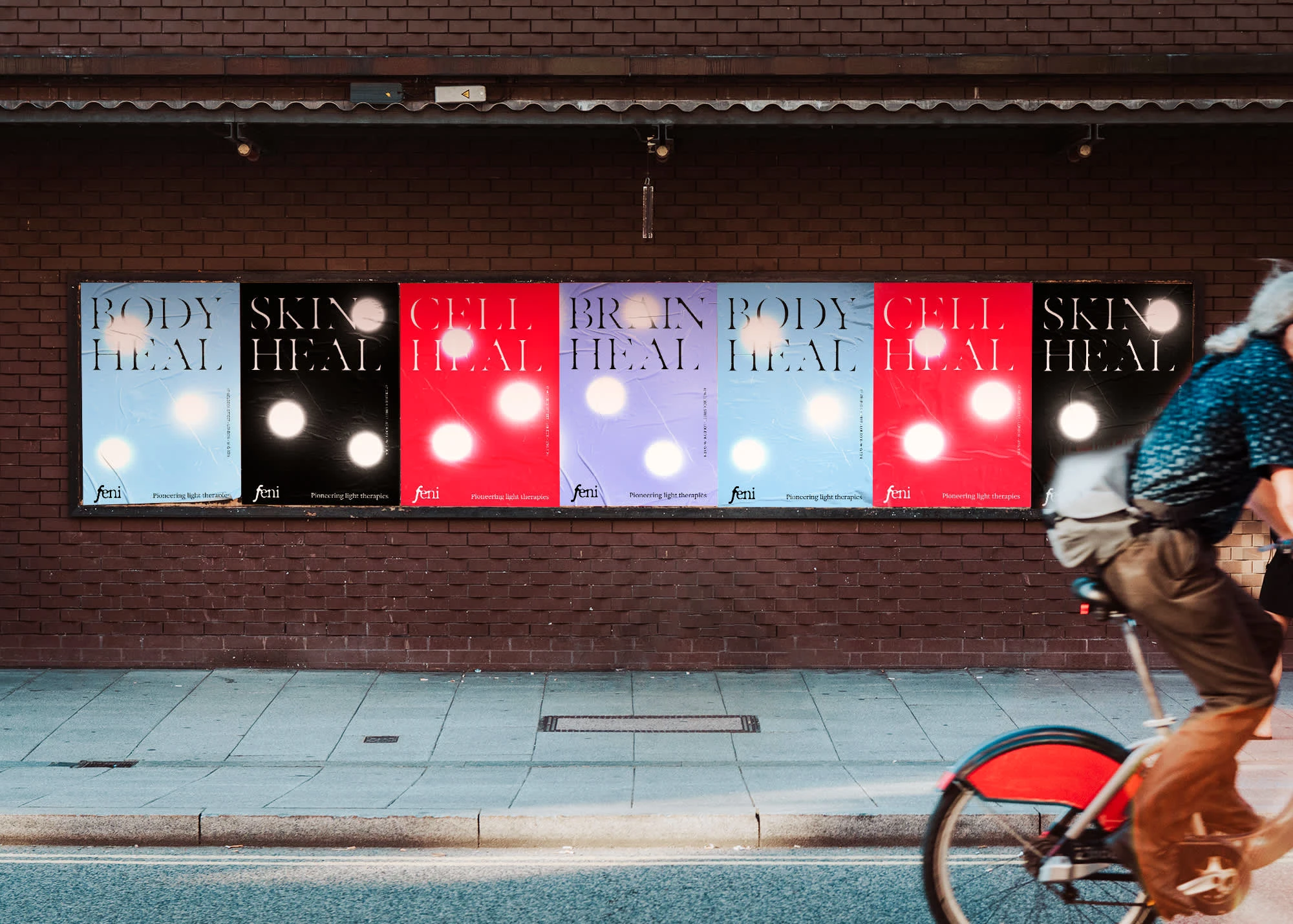
Focal points of Light
Brand Identity
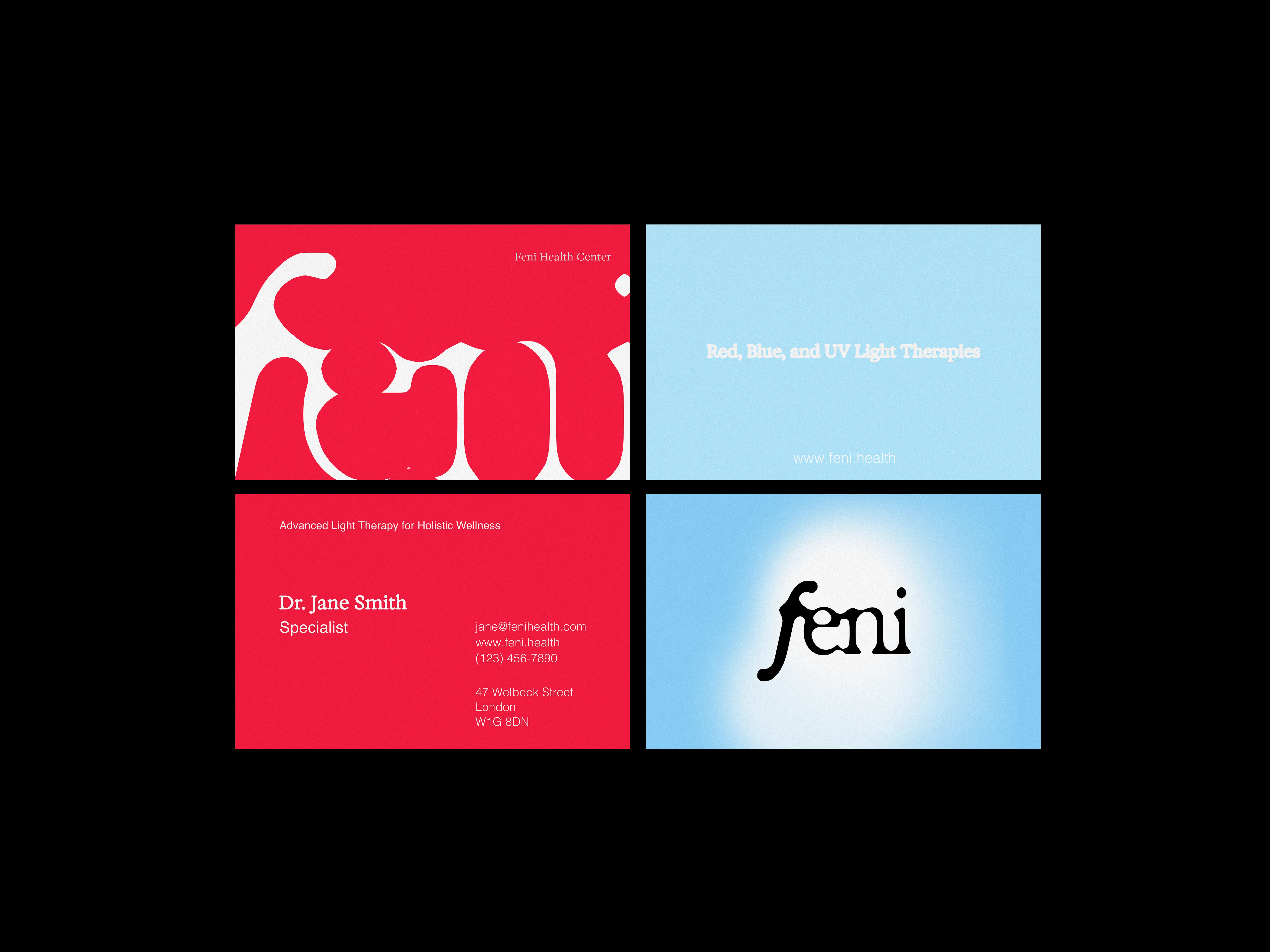
The logotype was developed to reflect the spectrum of light exposure, representing the transition from the subtle emergence of light to its maximum intensity.
This progression mirrors both the scientific principles of phototherapy and the journey of healing experienced by patients.
A modular system of identifiers inspired by focal points of light was created to support the brand across different applications. These visual markers mimic the behavior of light concentration, providing flexibility while maintaining visual coherence.
The result is a brand system capable of adapting across multiple touchpoints while remaining rooted in a singular conceptual framework.
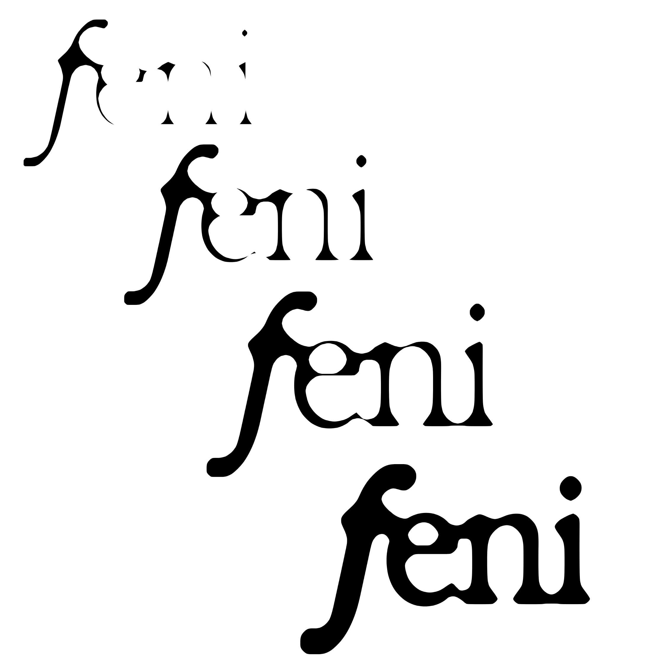
logo development - light exposure
System
Typography
Typography plays a central role in expressing the brand's concept.
The system incorporates a variable typeface developed by Federico Parra Barrios, inspired by the mechanics of photographic exposure. The typeface explores the extreme boundaries of letterforms, shifting weight and presence in ways that echo the behavior of light intensity.
This typographic approach reinforces the idea of light as a transformative force and adds a dynamic layer to the brand identity.
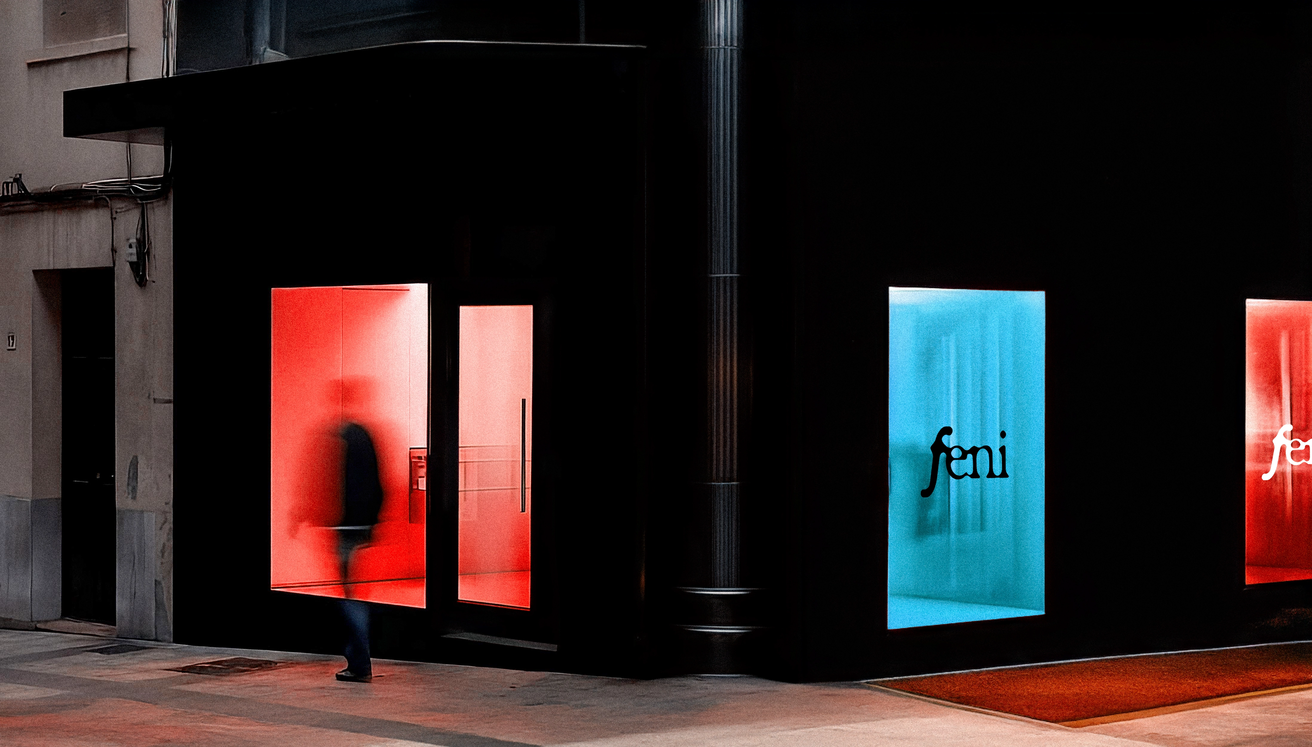
Health Cente - Facade
Spatial Experience
The brand identity extends into the physical environment of the clinic.
The facade and spatial branding are designed to reflect the unique experience offered by Feni — a place where technology and wellness converge. Light becomes not only the subject of treatment but also the core visual and experiential element guiding the customer journey.
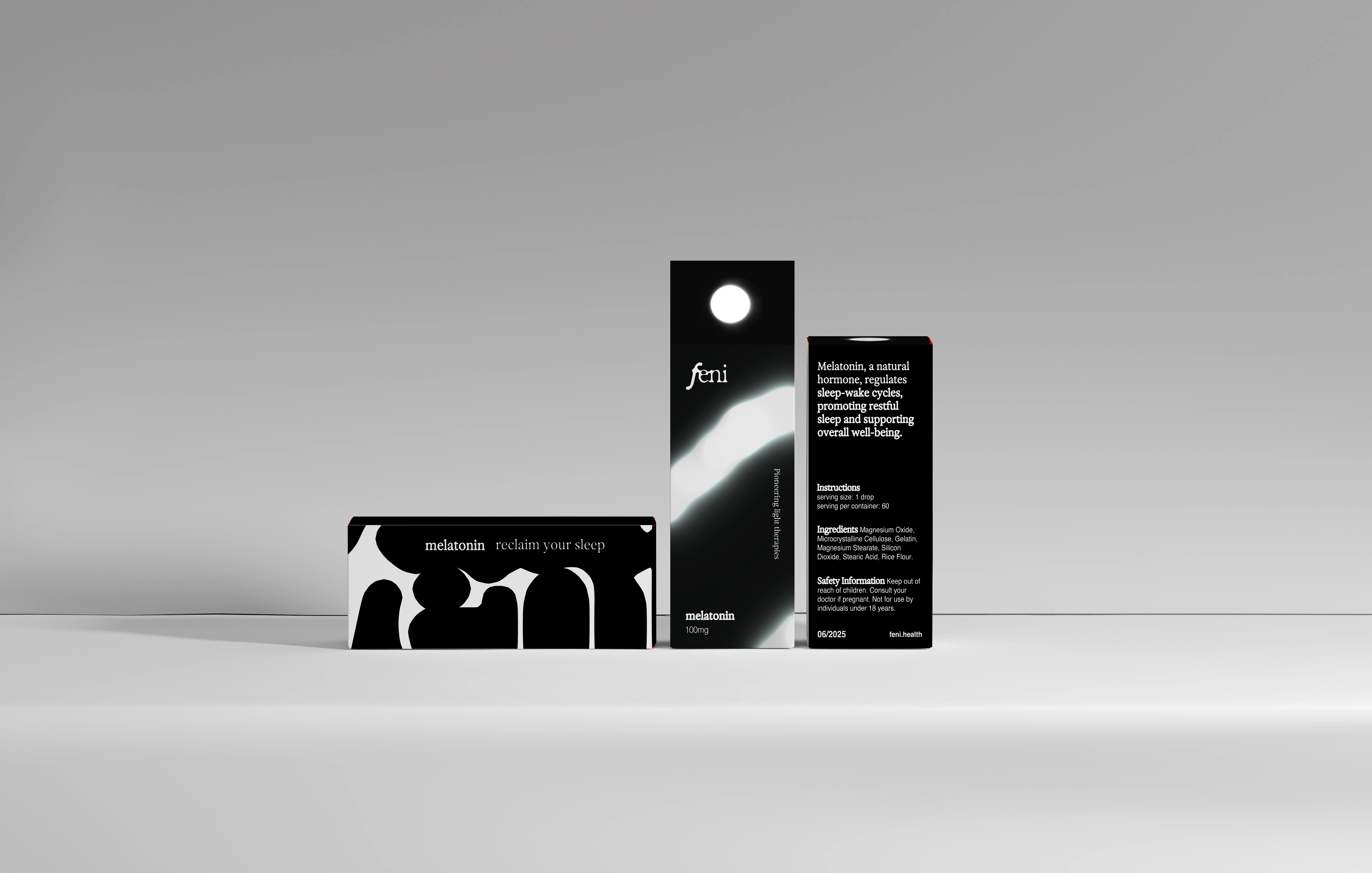
Packaging
Extending the Experience
Feni’s commitment to holistic healing extends beyond in-clinic treatments.
The brand identity expands into product packaging for targeted supplements designed to support specific therapies. Each touchpoint reinforces the brand's visual language, ensuring consistency across the ecosystem of services and products.
Through this approach, the brand creates a unified experience where every interaction reflects the central theme of light as a source of restoration.
Like this project
Posted Mar 6, 2026
Strategic brand identity for a London light therapy clinic, creating a distinctive visual system that translates the science of light into brand experience.