Gharko case study · Colour story Before I touched layout for...
sanni .sahil
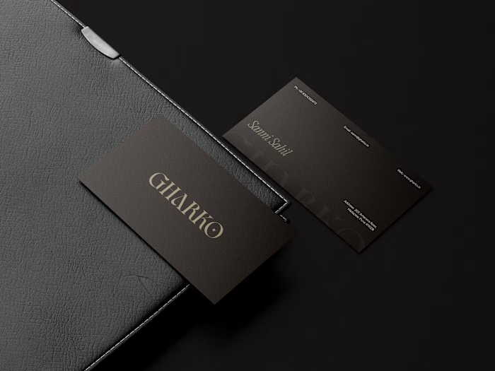
Gharko case study · Colour story
Before I touched layout for Gharko, I spent time on the colours that would hold the whole brand together.
I ended up with five anchors: Earth, Terracotta, Sage, Chalk, Mist.
They’re all pulled from real materials, soil, clay, woven textiles, plaster, soft light on ceramics. Together they do a few jobs:
• keep the brand grounded and warm, not glossy or shouty
• let product textures (ceramic, glass, fabric) stand out without fighting the UI
• work across website, print, packaging and photography without feeling dated
For me, a good palette is less about “trend colours” and more about:
Can this quietly support the brand for years while products and campaigns change on top of it?
Like this project
Posted Nov 28, 2025
Gharko case study · Colour story Before I touched layout for Gharko, I spent time on the colours that would hold the whole brand together. I ended up with fi...
Likes
0
Views
0