Oryza Skincare
Jessie Cohen
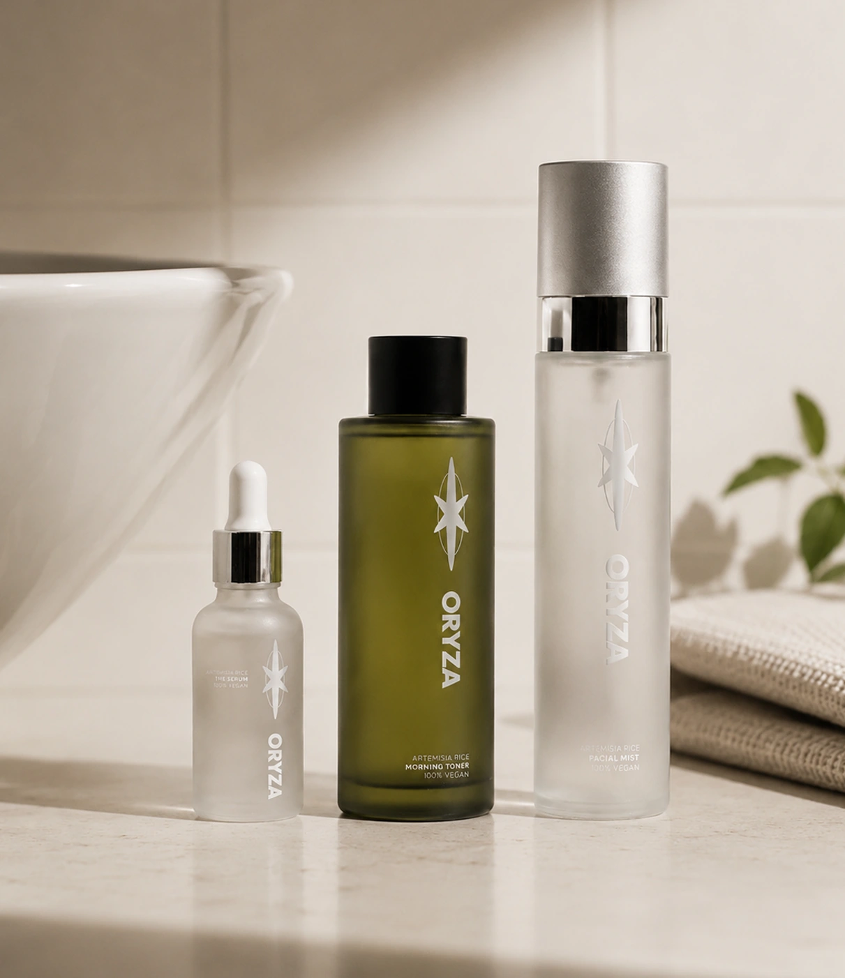
Oryza Skincare
A conceptual natural and vegan beauty brand, using rice to brighten and hydrate the skin barrier. An antioxidant-rich approach to achieving the popular ‘glass skin’ look.
The challenge
The term ‘clean beauty’ has come a long way since its phase as a buzzword. Consumers are more conscious than ever. There’s been a noticeable shift in the skincare industry towards ‘conscious science’, alongside a growing awareness of centuries-old traditional ingredients in Eastern skincare, together setting a trend to minimise greenwashing and vague labelling.
The solution
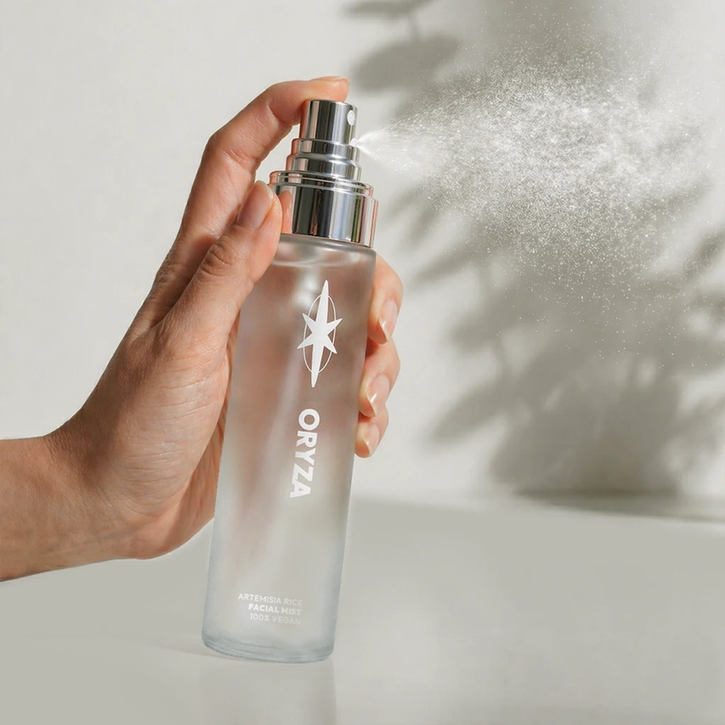
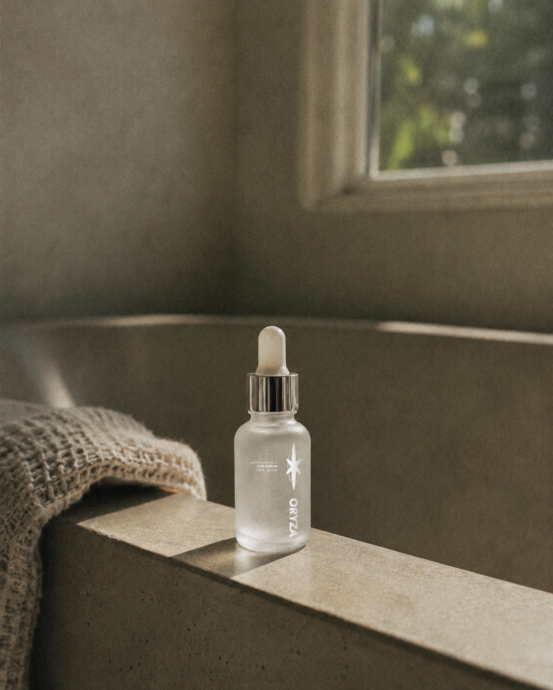
Advocating for clean and natural skincare, this conceptual beauty brand presents a playfully minimalist identity, reviving and modernising a traditional ingredient for a younger target demographic which may not be aware of its benefits. The logo mark takes on two symbolic meanings: rice with a glass-like shine.
Scope
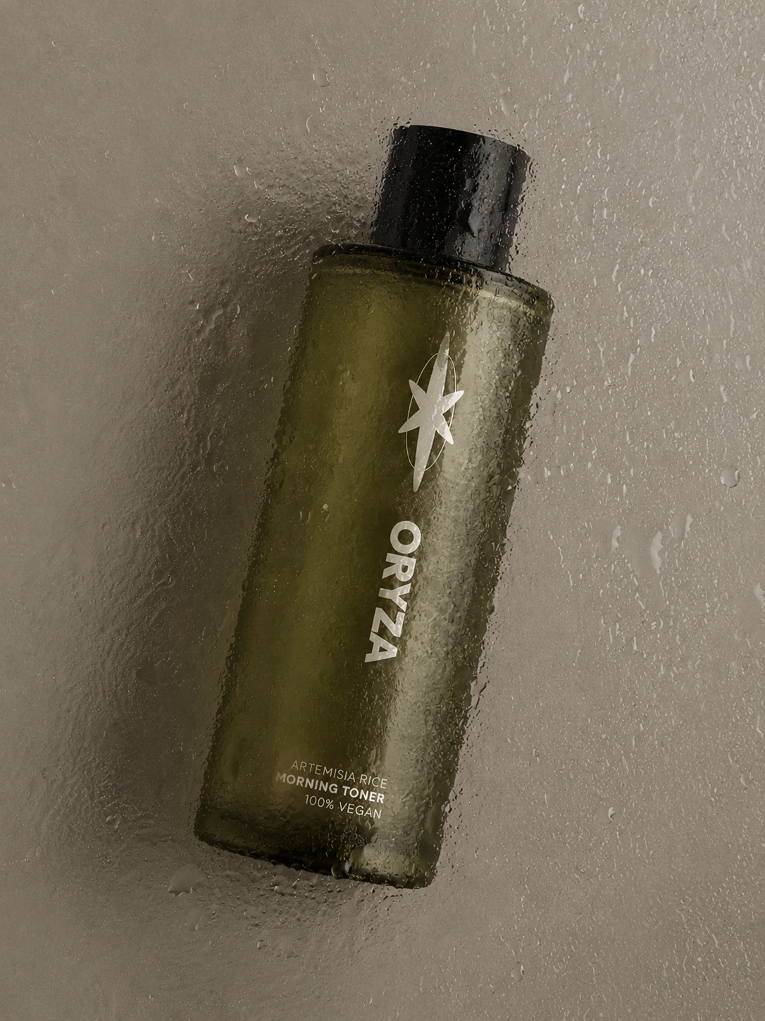
Art direction, Brand design, Concept design, Creative direction, Packaging design
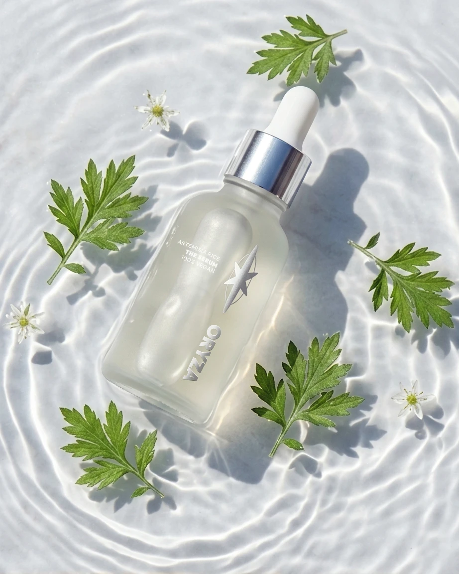
Rice has been a staple in East Asian routines for centuries, and for good reason. It’s packed with specific compounds that target brightening and soothing.
Oryza Skincare modernises this traditional ingredient for a younger demographic.
Purity without depleting natural resources. Oryza Skincare is a conscious brand which taps into the next generation of clean beauty – biotech over botanical.
89%
inhibition of elastase activity, an enzyme linked to wrinkles and loss of elasticity, from boiled rice water extracts ( Source) – making rice an excellent traditional ingredient with anti-ageing efficacy.

Design takeaways
Premium through minimalism. I learned that using restrained typography, soft neutral colors, and clean layouts helped communicate purity, wellness and luxury more effectively.
Texture plays a major role in beauty branding. Incorporating tactile elements like embossed grain patterns, matte finishes or soft-touch materials helped reinforce the sensory identity of rice as a calming and nourishing ingredient.
Cultural references need balance. With this project, there was a need to honour rice’s cultural heritage whilst creating relevance for a global consumer market.
Let’s work together
If you have a similar project you’d love a new design perspective on, get in touch with me at hello@chromakane.com – I look forward to finding out about your brand’s story.
Like this project
Posted May 13, 2026
Conceptual branding for a natural and vegan skincare line focused on rice as an ingredient.