Kishi Creative (https://www.linkedin.com/company/kishi-creat...
Ganiyu Razak
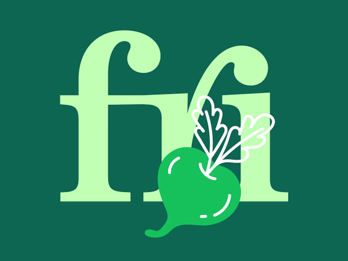
Kishi Creative embarked on a brand asset expansion journey, prompting a strategic decision to undergo a rebranding process. The approach involved introducing an expanded color palette, new design elements and a redesign of their logo, which now incorporates a symbol, a departure from their previous wordmark logo.
Check out full case study on behance.
https://lnkd.in/djBJcxha
Like this project
Posted Oct 9, 2025
Kishi Creative (https://www.linkedin.com/company/kishi-creative/) embarked on a brand asset expansion journey, prompting a strategic decision to undergo a re...
Likes
0
Views
2
Timeline
Apr 7, 2023 - May 11, 2023