APEDA Logo Redesign
Arkin Samanta
My Research
Brand Overview
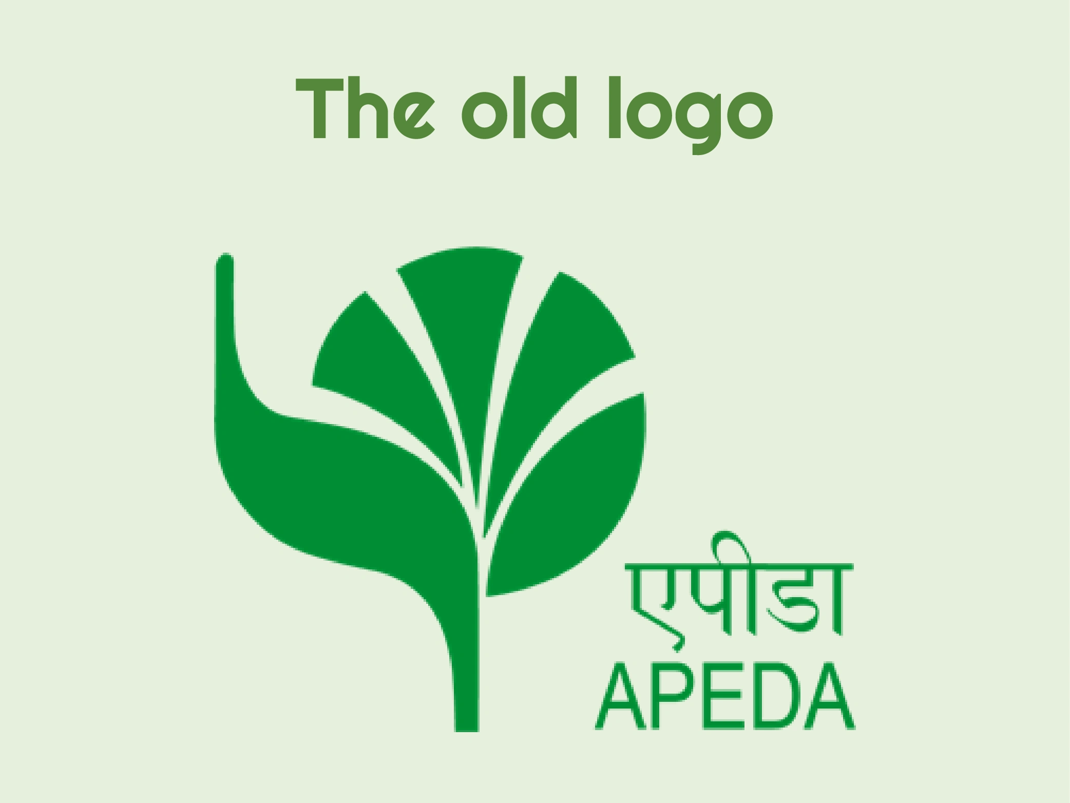
APEDA is an apex organization established by the Government of India under the Ministry of Commerce and Industry. Its primary mandate is to promote the export of agricultural and processed food products from India to global markets. Created in 1986 through an act of Parliament, APEDA is responsible for the development of industries involved in the production, processing, and export of these goods, ensuring that Indian products meet international quality standards.
Problems
The logo is not balanced
The green color of this logo is not the right green which are of plants
The font is very thin
The placement of the text is not appropriate due to the leg of the peacock
The logo looks outdated
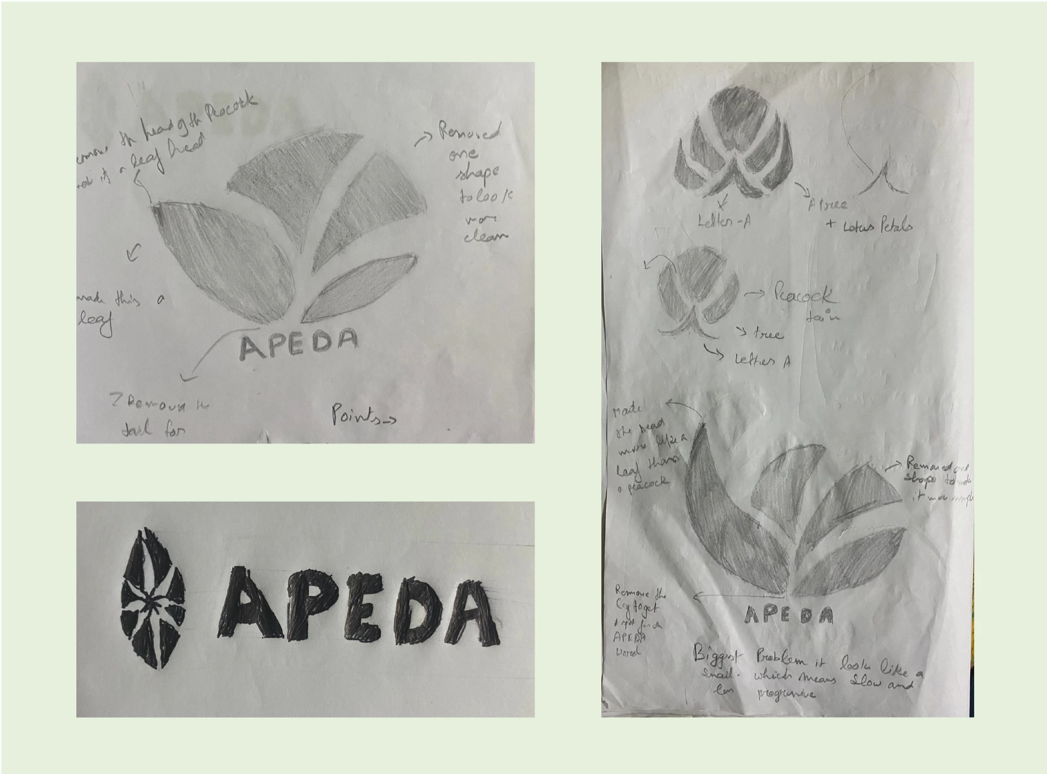
My goal
Make the logo balanced
Use the right green
Use a better font
Get a right place for the text
Make the logo modern without losing its identity
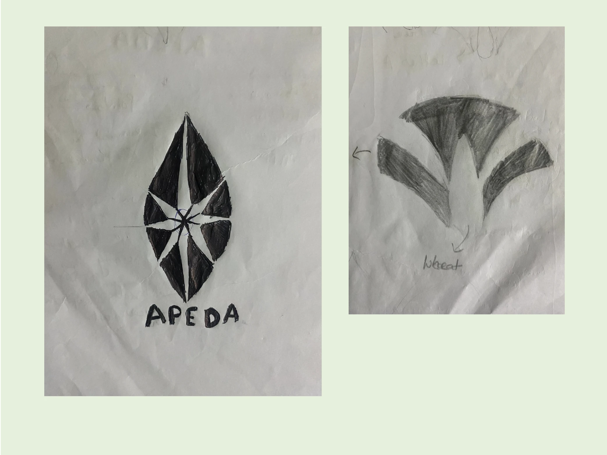
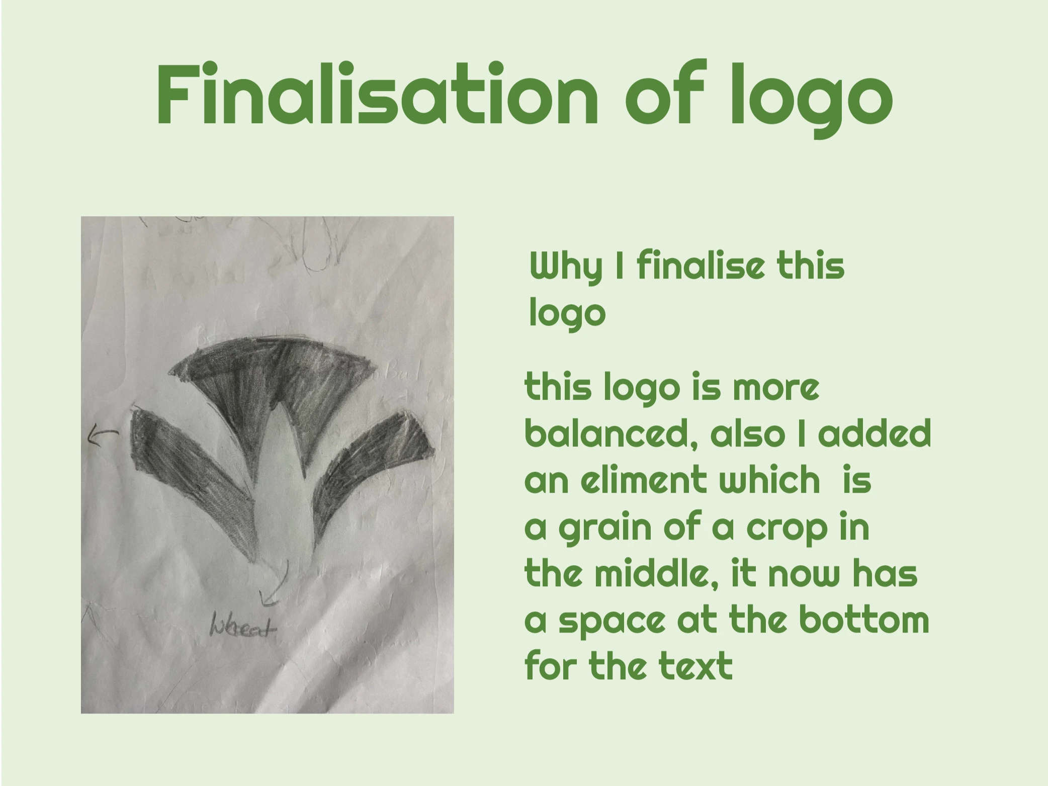
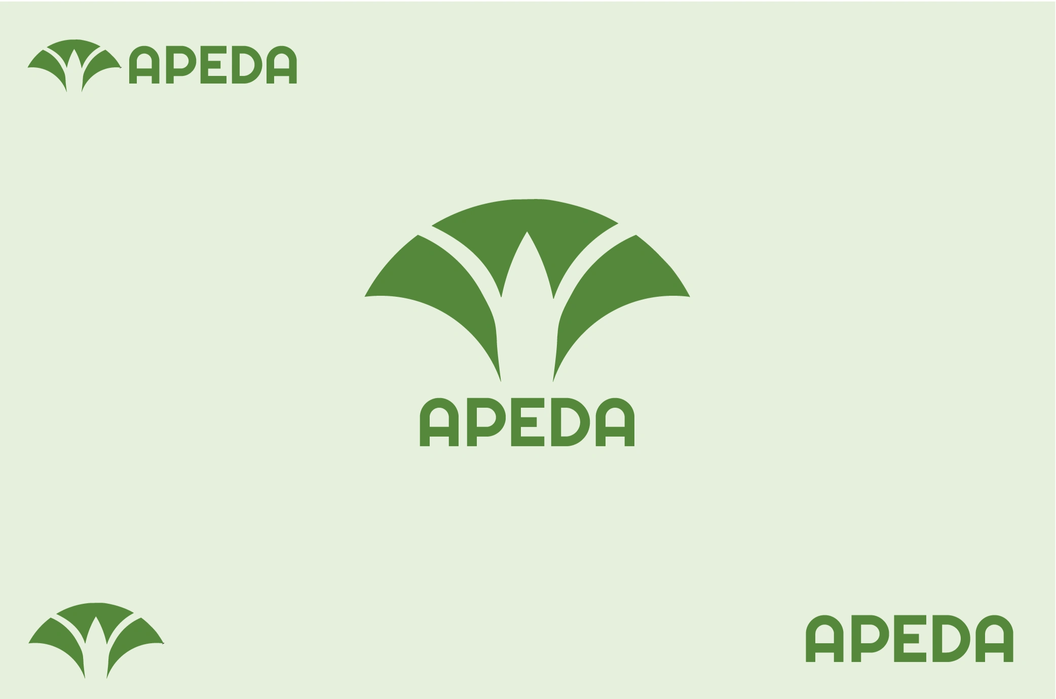
Finalisation of logo
Why I finalise this logo:
This logo is more balanced, also I added an element which is a grain of a crop in the middle, it now has a space at the bottom for the text.


Like this project
Posted Apr 13, 2026
Modern redesign of the APEDA logo improving clarity, scalability, and visual relevance while retaining institutional credibility.
Likes
0
Views
5