Crafting NiteLyfe's Dating App Brand Identity
NiteLyfe's founders approach me to craft their dating app's brand identity to help prepare them to pitch to investors. The process involved comprehensive research, creative ideation, and crafting of preliminary branding guidelines. Below, I outline the key steps taken to achieve this remarkable result!
Step 1: Research
At the onset of the project, I conducted an in-depth research phase to fully understand the aspirations and objectives of NiteLyfe. Through these conversations, I discovered that
NiteLyfe aims to revolutionize the current stale, choice-paralysis plagued dating app ecosystem with a completely new model.
Their dating app mimicks the excitement and suspense of organic interactions by bringing the nightclub experience to the online dater. This combines the appeal of live dating with the convenience of dating apps to make mobile dating more fun.
Step 2: Ideation
Armed with insights from the research, I embarked on the creative ideation process. My goal was to generate a range of distinct brand identity concepts that would resonate with NiteLyfe's audience; young, fun, wild people looking for a date or partner. I presented the founders with some crafted options, each showcasing a unique visual identity and messaging approach. Each concept aimed to capture the app's essence and create a lasting impression on its users 💗
Color Palette
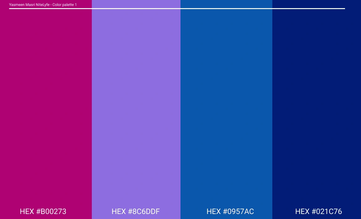
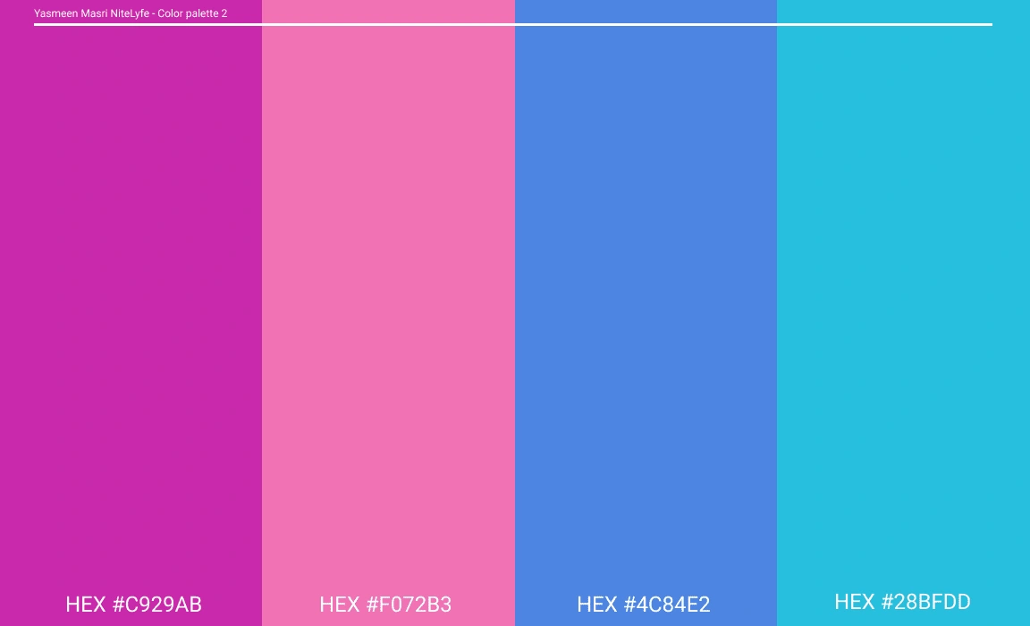
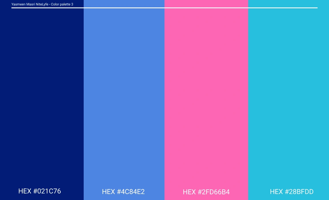
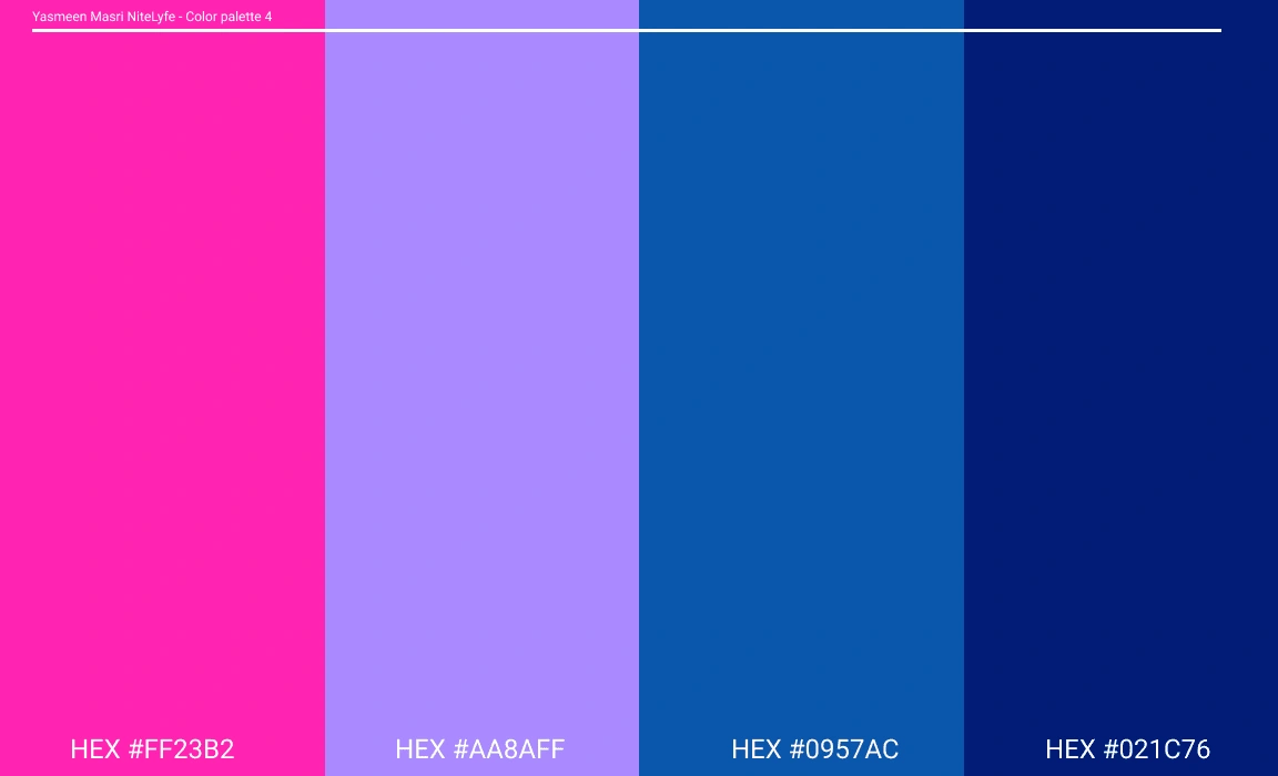
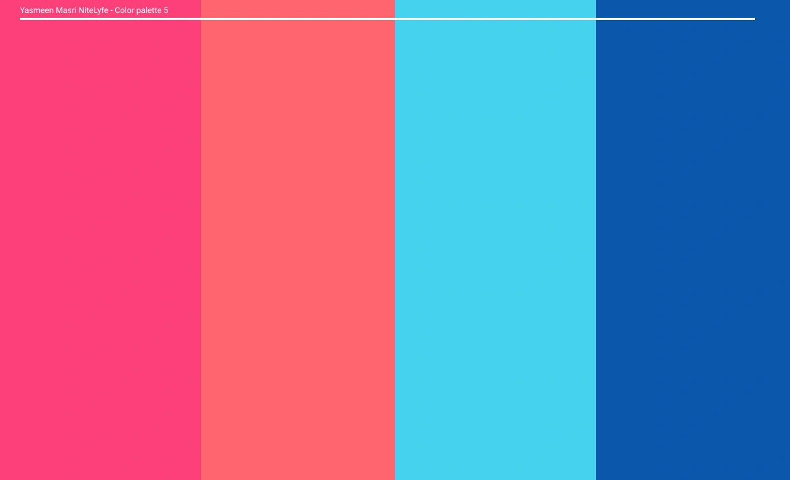
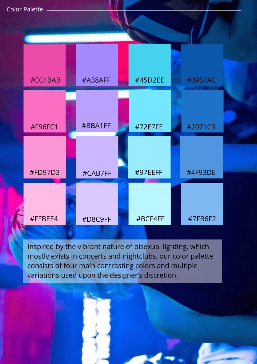
For NiteLyfe's color palette, we sought to encapsulate the electrifying ambiance of nightlife and the allure of vibrant neon lights. To achieve this, we carefully curated a set of colors that would evoke the excitement and energy synonymous with nocturnal adventures.
The selected colors blend seamlessly to create a captivating and modern visual experience for the app's users. Below are the key colors that form NiteLyfe's distinctive color palette:
Logotype
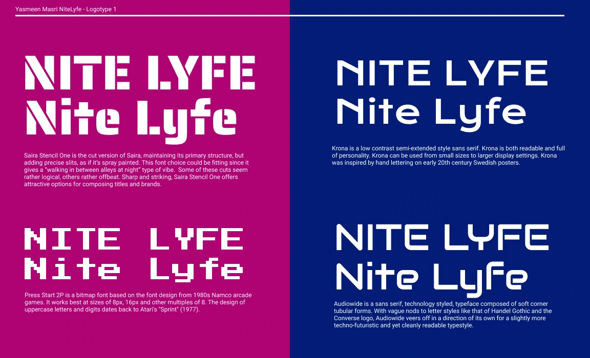
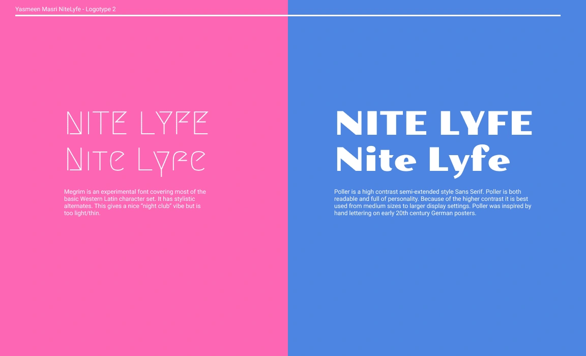
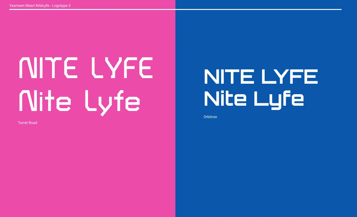
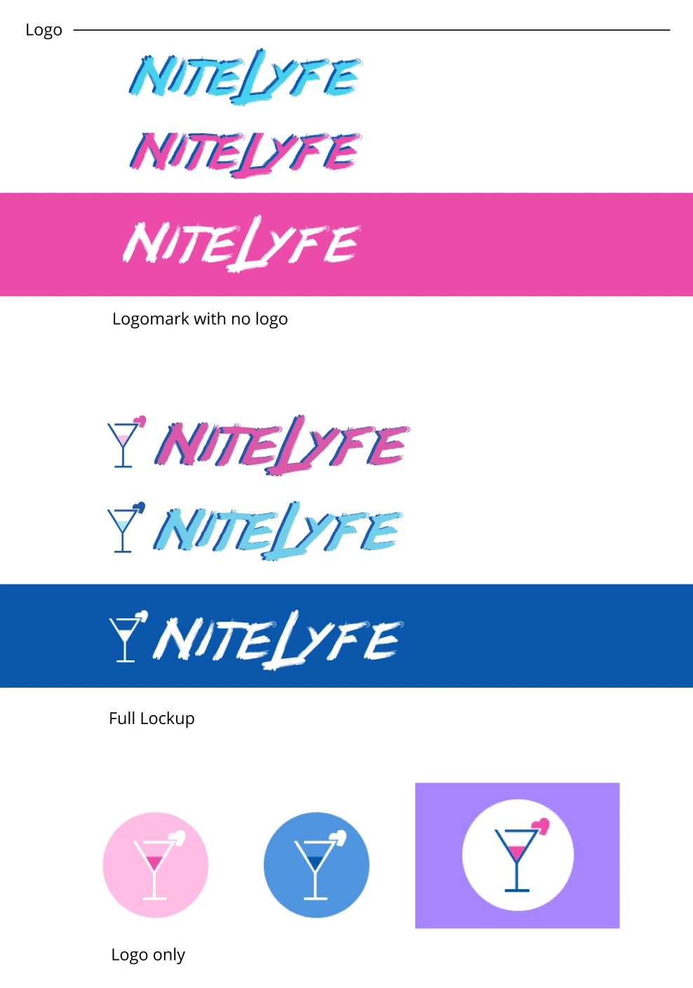
For NiteLyfe's logotype, the design direction was to create an edgy, youthful, and almost punk rock vibe. With these characteristics in mind, I experimented with an all-upper-case lettering style to amplify the brand's bold and rebellious personality. The logotype showcases a fusion of sharp angles and distinctive letterforms, exuding a sense of dynamism and modernity.
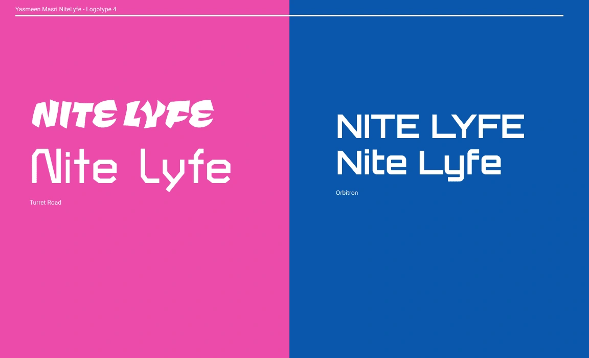
Logo
For NiteLyfe's logo, I embarked on a creative journey to seamlessly blend elements of love, nightlife, and drinking. The primary goal was to craft a visually engaging and distinctive symbol that resonates with the app's target audience. Through experimentation, I explored various design variations that combined drinks and hearts, resulting in a logo that symbolizes romance, excitement, and the vibrant night scene.
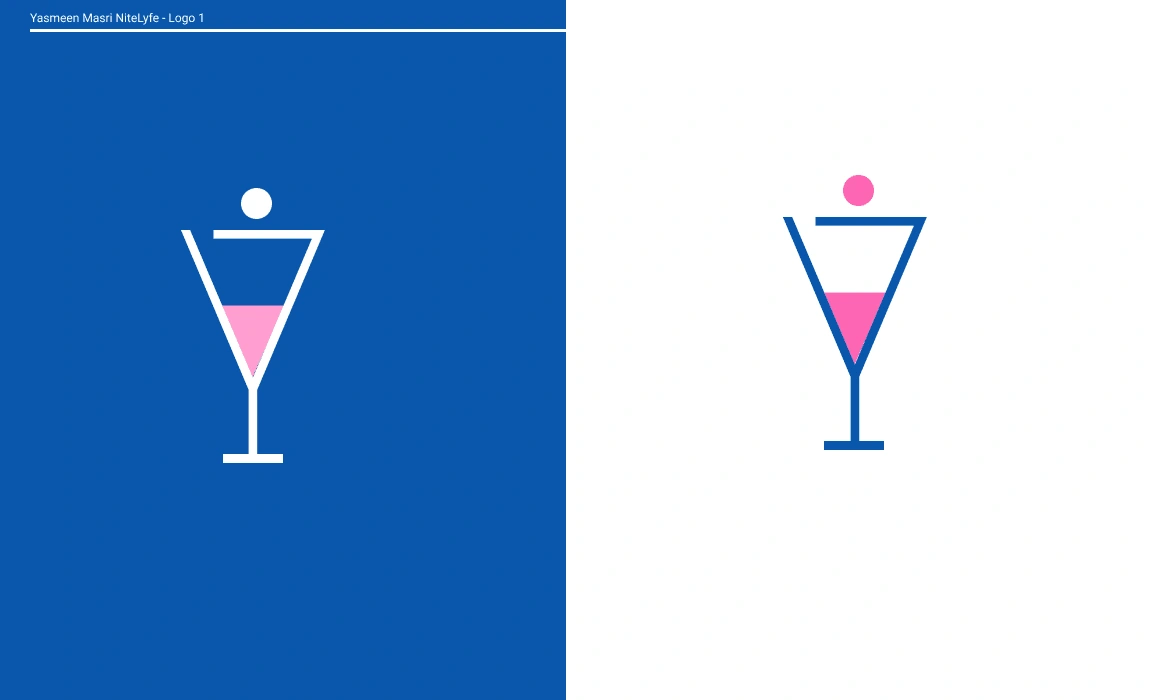
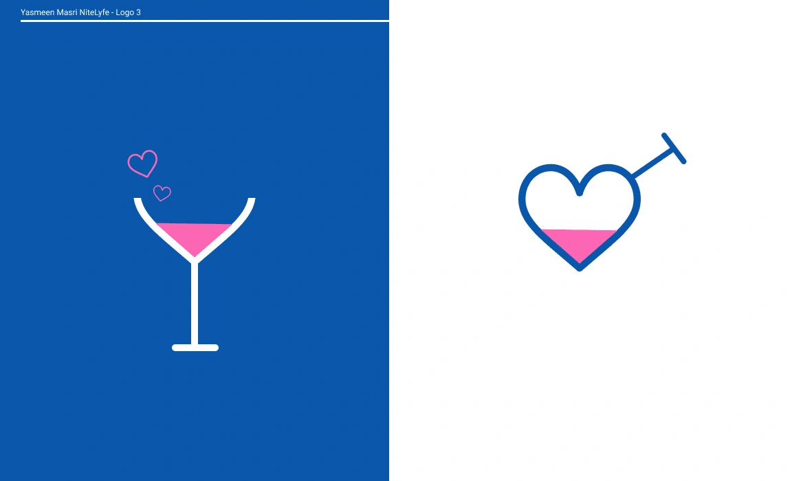
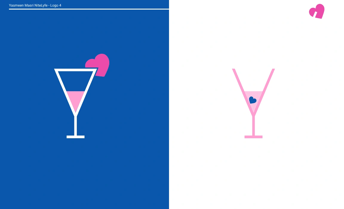
Step 3: Final Choice
With the ideation phase completed, the NyteLyfe team carefully reviewed and deliberated on the presented options. After thoughtful consideration, they made the final choice—the brand identity that perfectly aligned with their vision and core values.
Step 4: Branding Guidelines
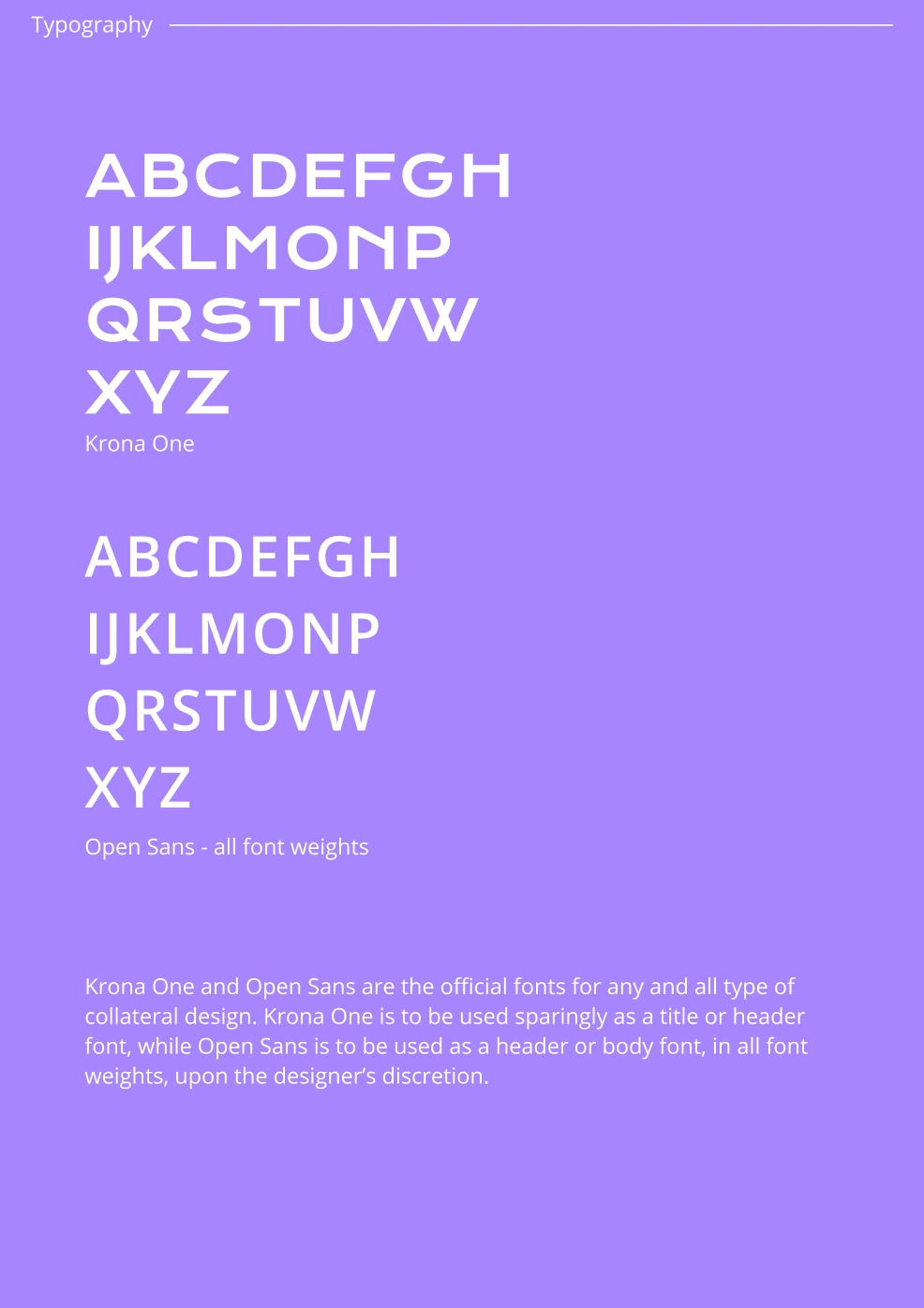
Once the design direction was solidified, I created comprehensive branding guidelines that outlined the appropriate usage of the logo, color palettes, typography, tone of voice, and imagery. These guidelines were crucial to maintaining a consistent and cohesive brand representation across all touchpoints. Here's a quick snippet of what was included in the branding guidelines.
Like this project
Posted Aug 3, 2023
Worked with the founders of the app to craft a brand identity that reflects NyteLyfe's bold, exciting, and punk rock personality to their target audience
Likes
0
Views
12
