TruePublic Engagement Redesign
Tatevik Anoyan
TruePublic: Turning Quarantine Boredom Into Honest Conversations
Partner: TaxAct · Mobile/Web App · ~6 min read
TruePublic is an anonymous opinion sharing platform where people come to ask questions they would not normally ask on social media and also to answer similar questions. Once you answer a question, you can immediately see statistical breakdowns of how others responded. No name, no email, no profile picture. The product gives brands and researchers a rare view into how different groups actually think at the moments they're making decisions.
The team needed to reduce churn rate, improve engagement, and introduce Reasons (a new way for users to explain their answers) without compromising the anonymous, low-toxicity model the product depended on.
But TruePublic was losing users at every stage, and the research showed the problems went well beyond churn rate.
We didn't have a clear segmentation of who was leaving or why. The experience was also inconsistent across surfaces (design, navigation, and front-end implementation), so even when a problem was identified, the fix didn't always propagate cleanly across the product.
The challenge
Research
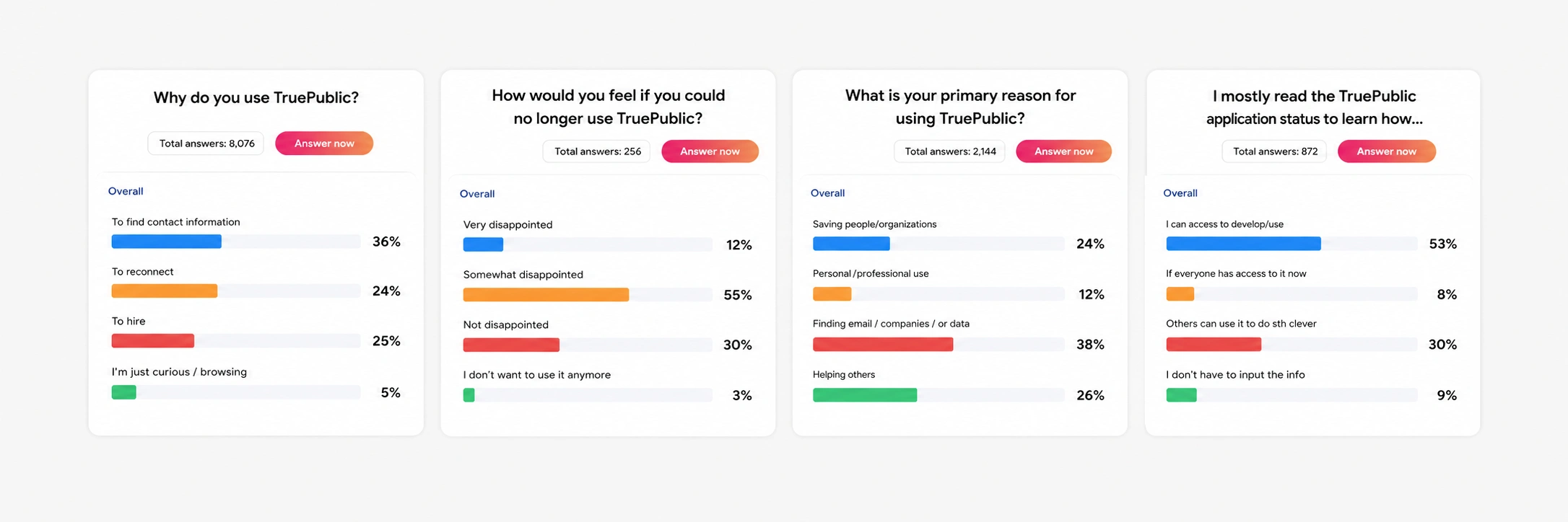
60% of churned users complained about poor onboarding and complex navigation. The original onboarding was a series of marketing-style screens explaining what TruePublic was before letting users do anything. The homepage was a static category list, not a personalized feed.
40% of new users said they didn't find engaging questions on the categories page. Without ML-driven personalization, users landed on content irrelevant to their interests and bounced.
55% of users wanted a way to express their feelings about the options they chose, not just vote. The platform had no mechanism for that, and adding one was risky. A comment field on a polarized-topic platform leads to long threads, harassment, and moderation overhead a small team cannot manage.
This was a live product with ~19K followers on the "Would you rather" Space alone by early 2020. Getting any change wrong would impact existing user behavior, not just new users.
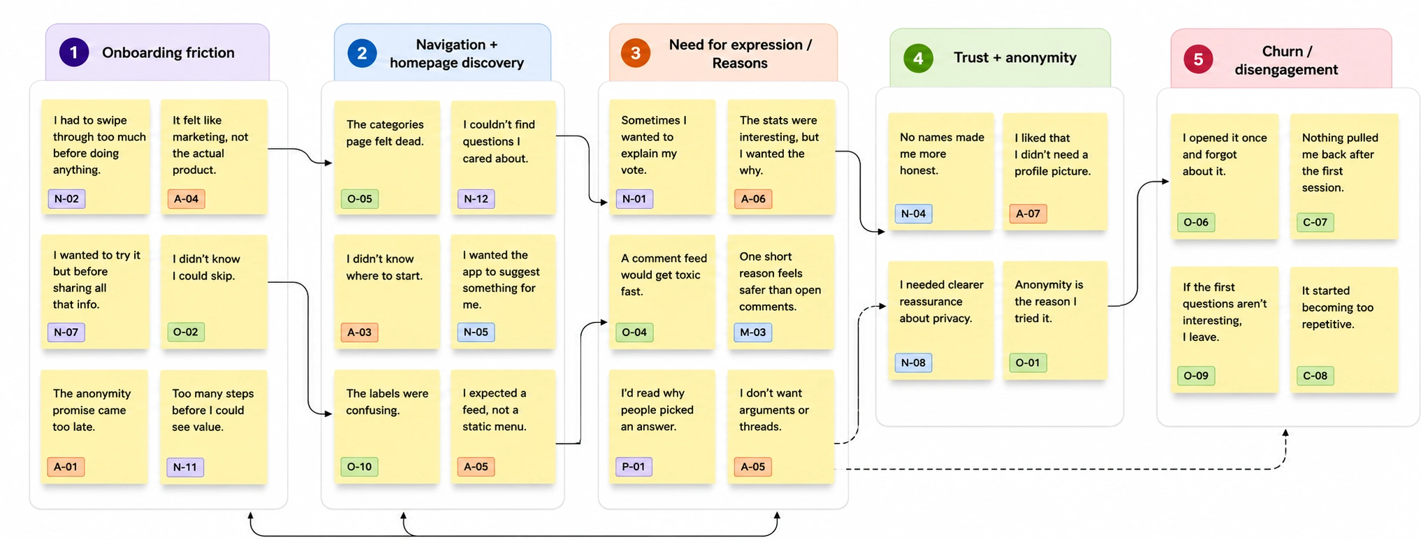
I combined qualitative and quantitative research to understand both behavior and intent:
20 user interviews across new, active, power, and churned users
5 moderated usability tests on onboarding and homepage navigation
In-app surveys to validate insights at scale
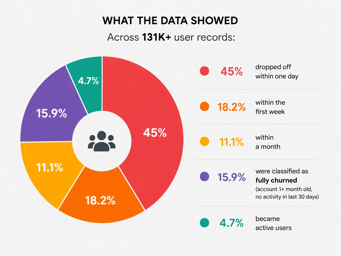
I segmented users into six cohorts: new, active, churned, and three churn windows (one day, one week, one month). Treating churn as one number hides the underlying retention problem. Someone who leaves after one day has a different reason than someone who leaves after a month, and the interventions are different.
That segmentation, combined with the pain-point data, mapped to three areas of work:
One-day churn + 60% onboarding complaints → simplify onboarding
One-week churn + 40% disengagement on categories → personalize the homepage
55% of users wanting to express feelings → build Reasons
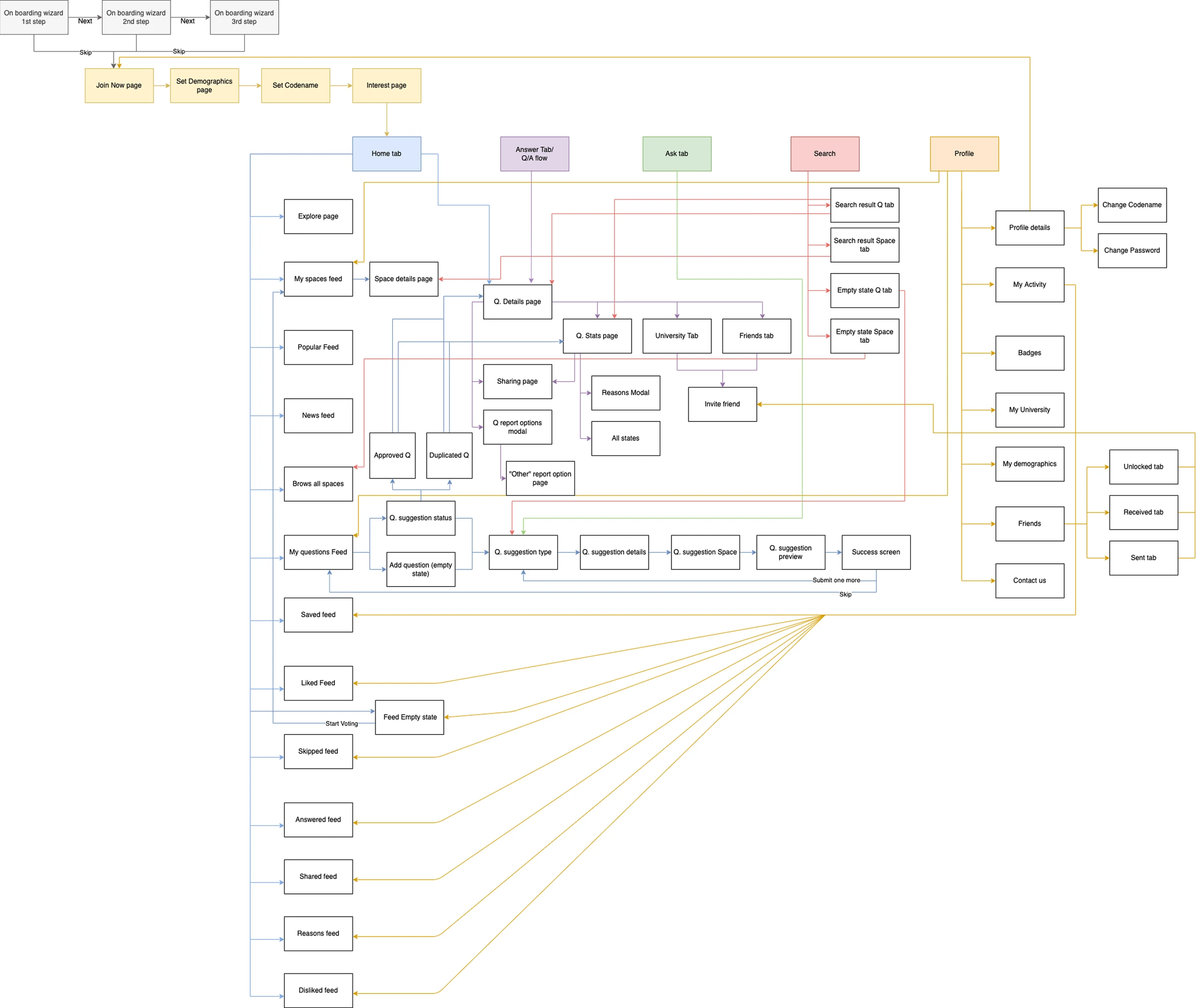
Research and design ran in parallel. I validated each hypothesis through usability testing or in-app surveys before development. For Reasons, I tested the core interaction before launch to check the constraints didn't feel limiting. They didn't. All three improvements aligned with the existing sitemap so they could ship incrementally without breaking active flows.
Strategy
What I Owned
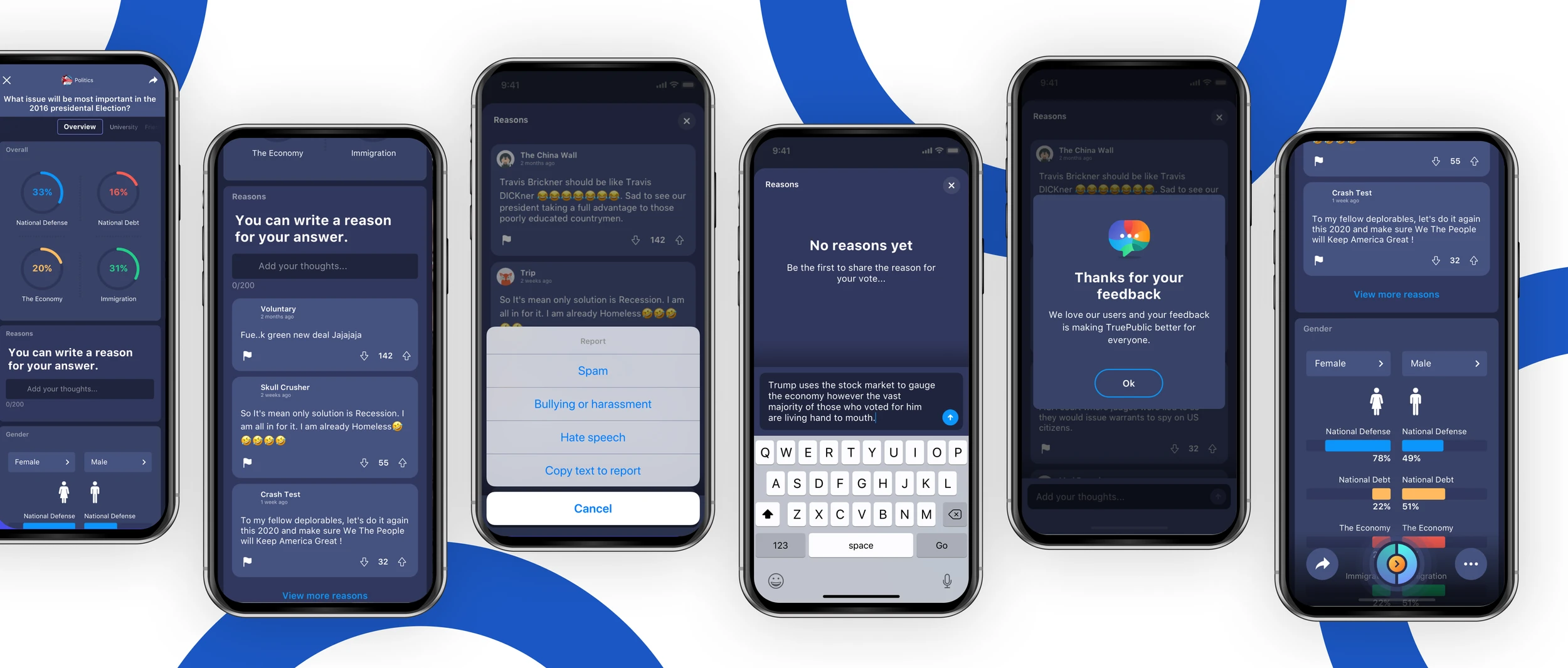
Onboarding: simplified and skippable
60% of churned users complained about onboarding. The original flow was a series of marketing-style screens that explained what TruePublic was before letting users do anything.The redesign focused on three things:The new flow also reinforced anonymity in concrete terms (no name, no email, no phone, no geolocation, no picture) instead of a generic privacy reassurance.Comparison of mobile app screens labeled 'BEFORE' and 'AFTER'
Prove value before asking for commitment. The first screen led with "What do your Friends really think?", a hook tied to the actual product, not a tagline.
Simplify the content. Demographic capture (gender, race, political leaning, city, age, religion, sexual orientation, income) was framed against what users got back: "Share your opinion and instantly understand others based on..." So the data ask felt earned, not extractive.
Make every stage skippable. Users could jump to sign-up at any point instead of being forced through every screen.
Homepage and Navigation: a personalized experience
40% of new users said they didn't find engaging questions on the original homepage. The page itself was a static category list. Users had to know what they wanted before they could browse.The redesign rebuilt content discovery around three things:Post-launch usability testing and analytics both showed users navigated more easily and engagement increased.Screenshots of a dating app with various features
ML-powered Trending Spaces. Instead of a text-only category list, users saw visual cards predicting relevance based on their demographics and behavior.
Three intent-based entry points. Most discovery patterns assume users know what they want. Ours assumed they often didn't:
Let me choose for users who wanted to browse
Pick for me for users who wanted to be surprised
Answer for users who wanted to jump straight into voting
Simplified navigation labels. Usability testing showed users were getting lost in the original labeling. The redesign cleaned up the language and reduced cognitive load.
Reasons: a new expression layer
55% of users wanted to explain their votes, but adding a comment system risked accelerating the toxicity Reasons was meant to prevent.
Reasons added a new layer to every question's stats page. Users could reveal the reasoning behind their vote without turning the platform into a comment feed. The design relied on constraints to keep the feature healthy:
One reason per question, no threads or replies
Users must vote before writing a reason
Default view shows a limited set of reasons, not a full feed
No editing, only delete and repost
Voting and reporting on every reason, with human moderation
Each constraint was a tradeoff. Threaded replies were the obvious feature ask from users, but rejected because polarized topics turn threads into arguments and demand moderation a small team cannot sustain. The 280-character single-reason model was a deliberate ceiling.
Reasons also unlocked B2B value. By turning every question's quantitative answer set into qualitative motivation data, brands could finally see why people chose what they chose, not just which option won.
Results
+47% engagement — measured as weekly active sessions per user
+65% new users — month-over-month signup growth
−43% churn — 30-day churn dropped from 15.9% to 9.1%
+64% CSAT — post-onboarding survey scores
Previously churned users cited Reasons specifically as the reason they came back in re-engagement interviews. The product secured a $1M SAFE round during this cycle.
Each improvement mapped to a specific user behavior we'd measured, not a hypothesis. The cohort segmentation made it possible to attribute outcomes to specific design decisions onboarding simplification drove the first-day retention gain, homepage personalization drove the one-week retention gain, Reasons drove the reactivation.
Like this project
Posted Jun 10, 2026
Implemented design changes for TruePublic to enhance user engagement and reduce churn effectively.