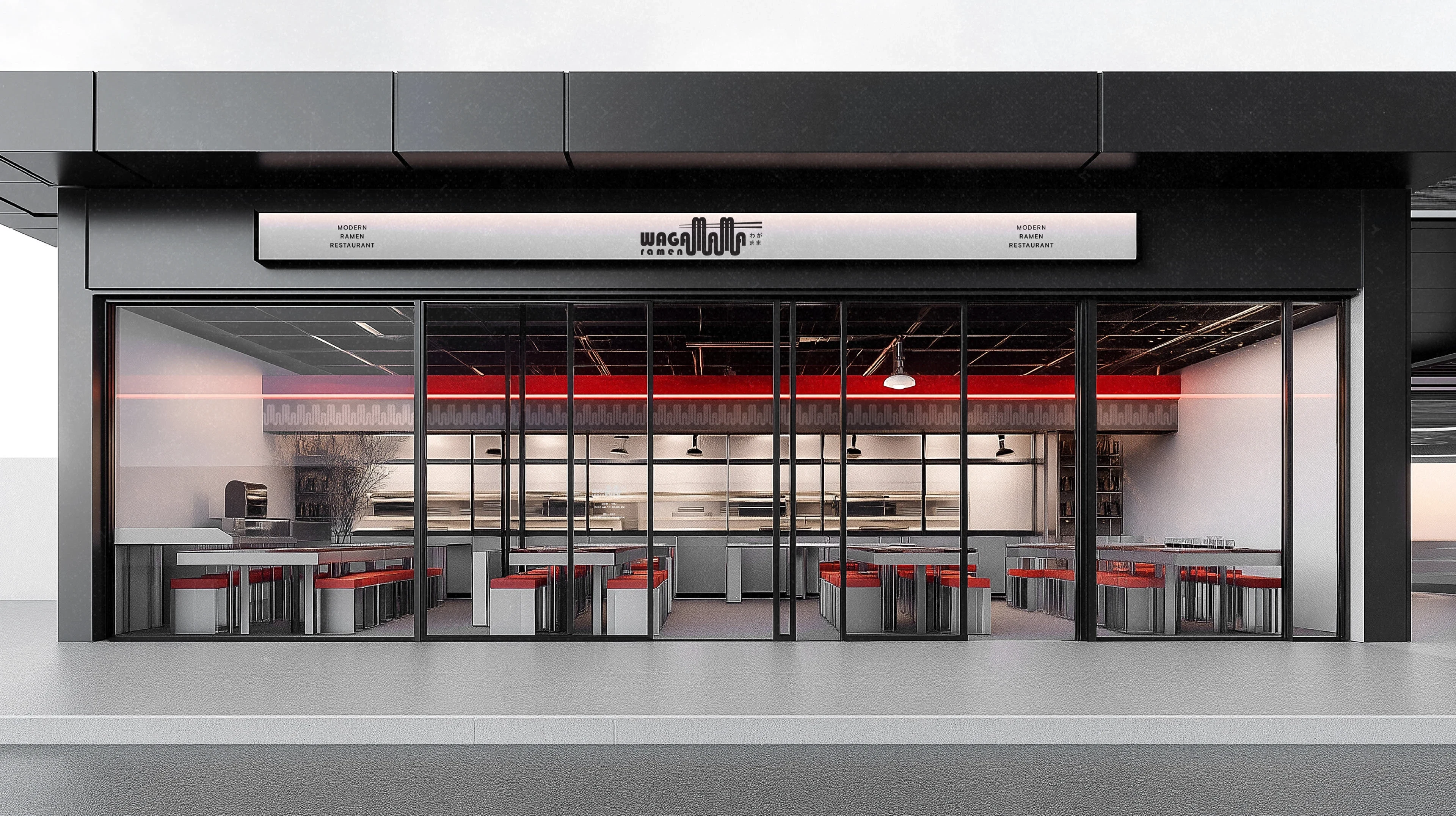
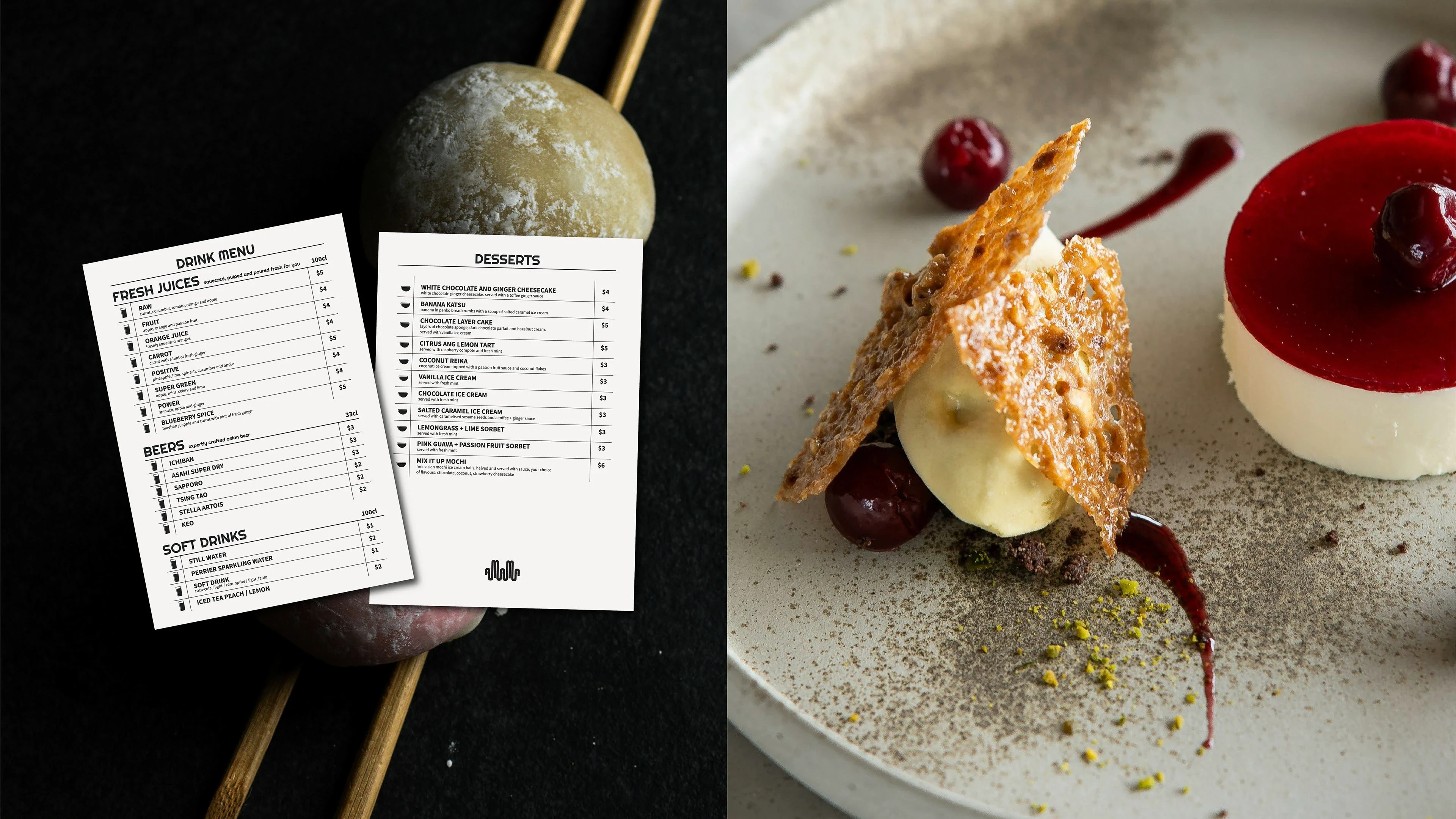
Wagamama - Ramen Restaurant
Daria Risukhina
Client's project goal: To convey the brand idea visually:
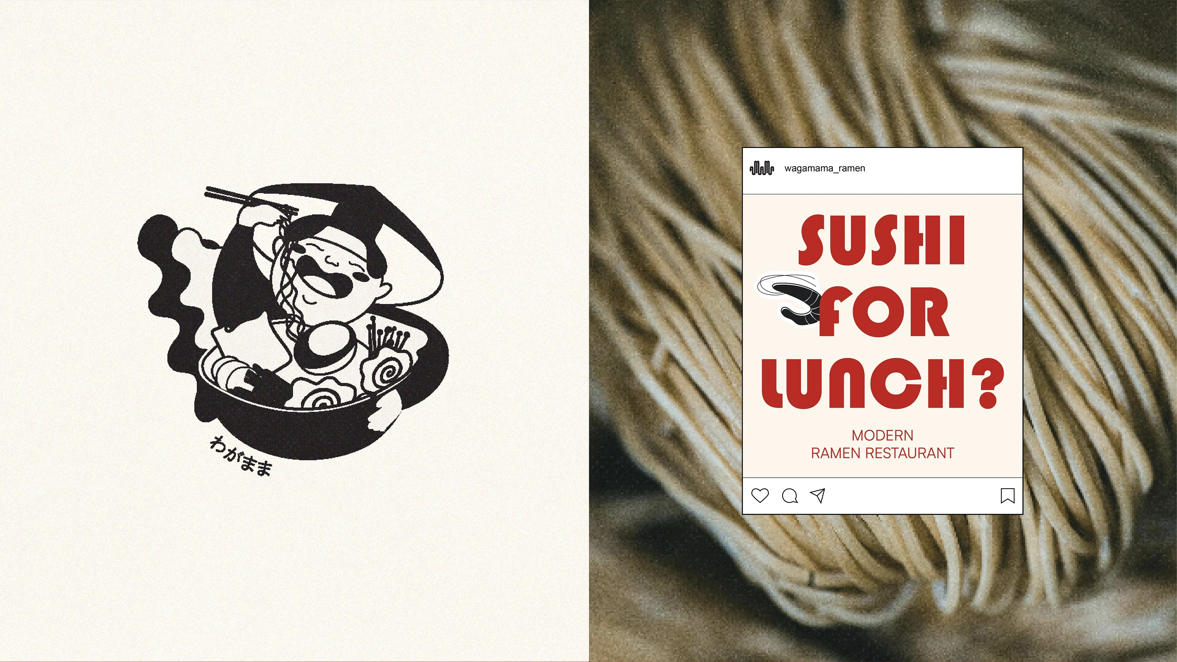
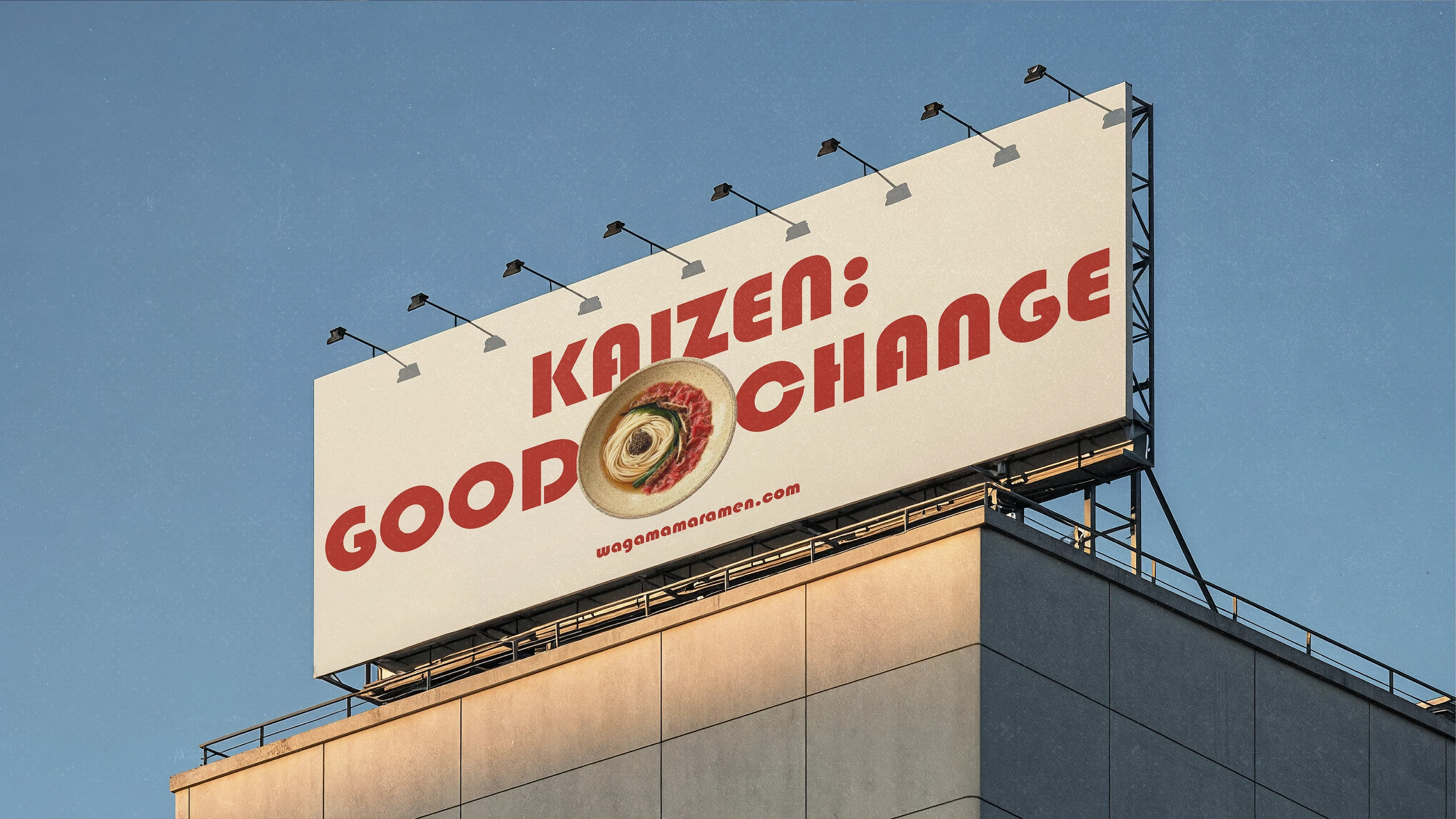
Wagamama meets Kaizen – the brand philosophy combines individuality and freedom (Wagamama) with continuous improvement and attention to detail (Kaizen). The restaurant celebrates both creativity and refinement: guests can enjoy ramen their way, while every detail of the experience is crafted with care, precision and modern style.
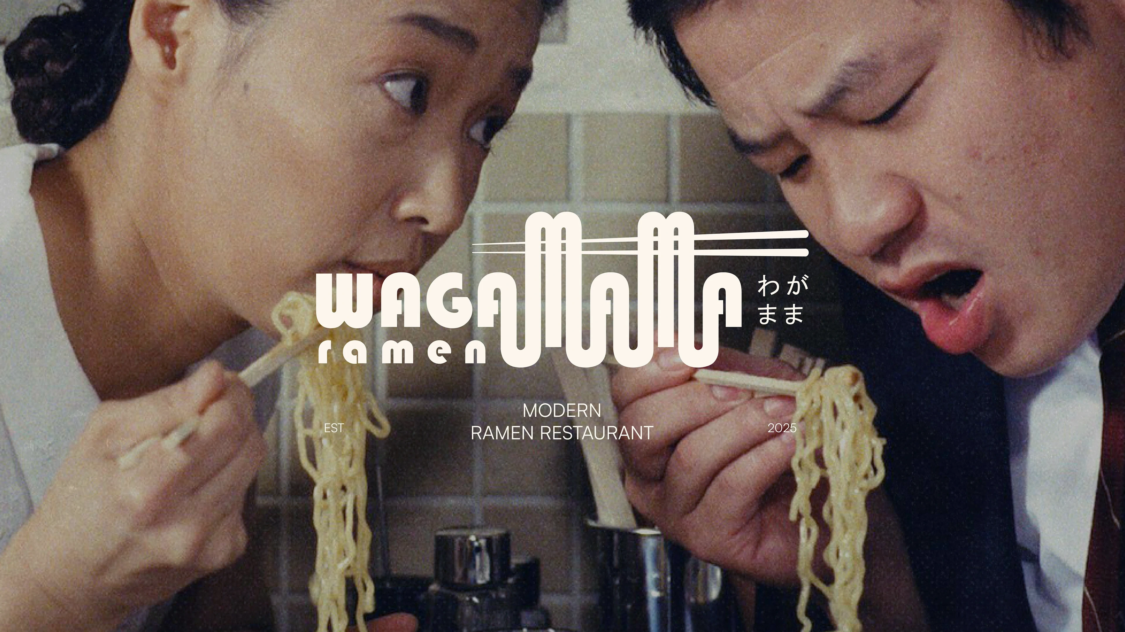
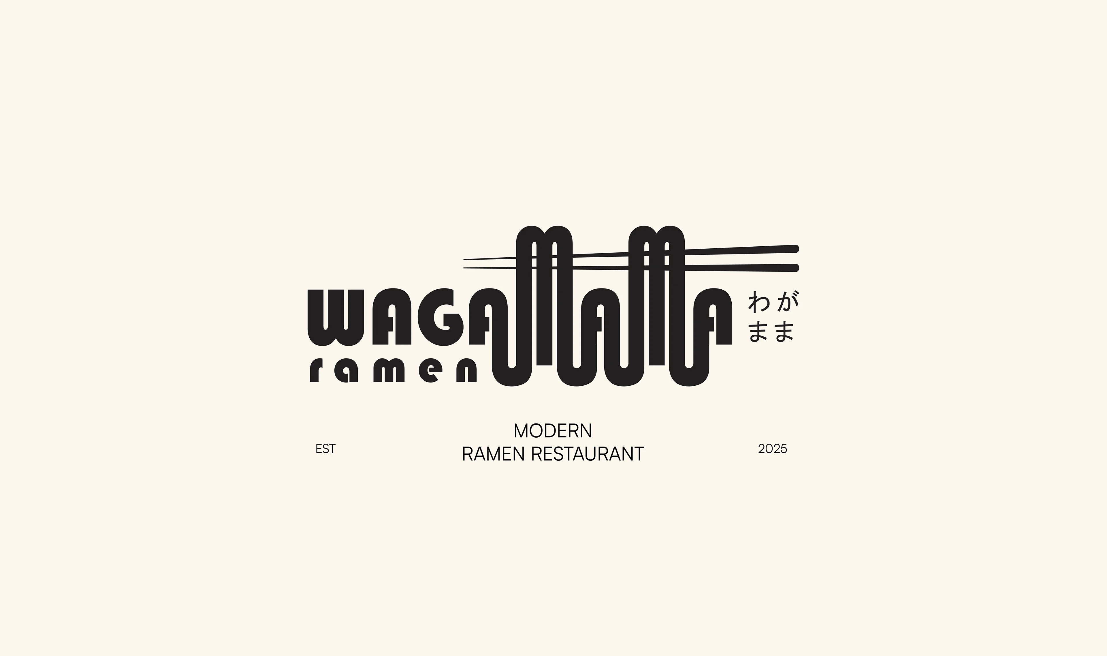
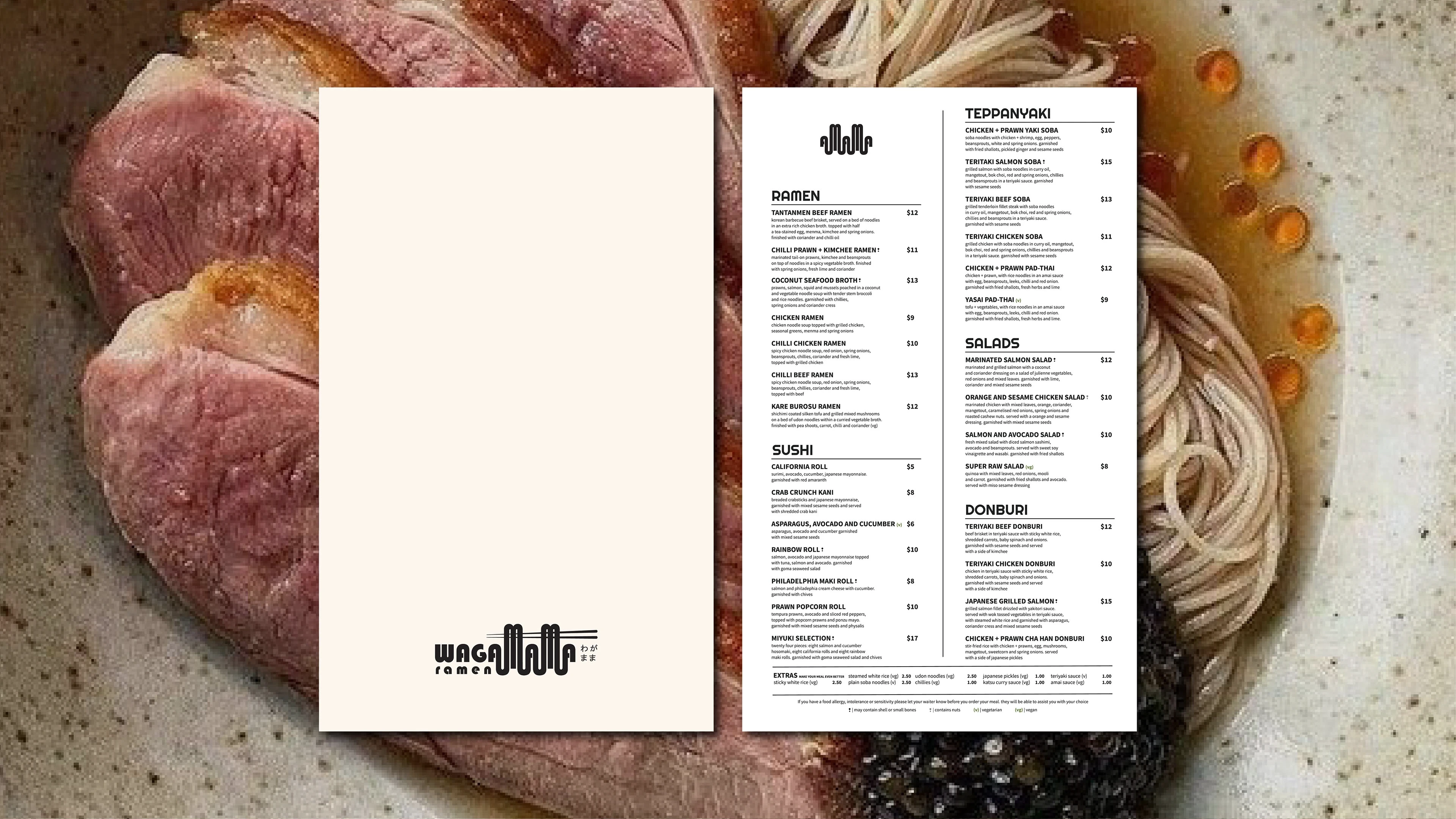
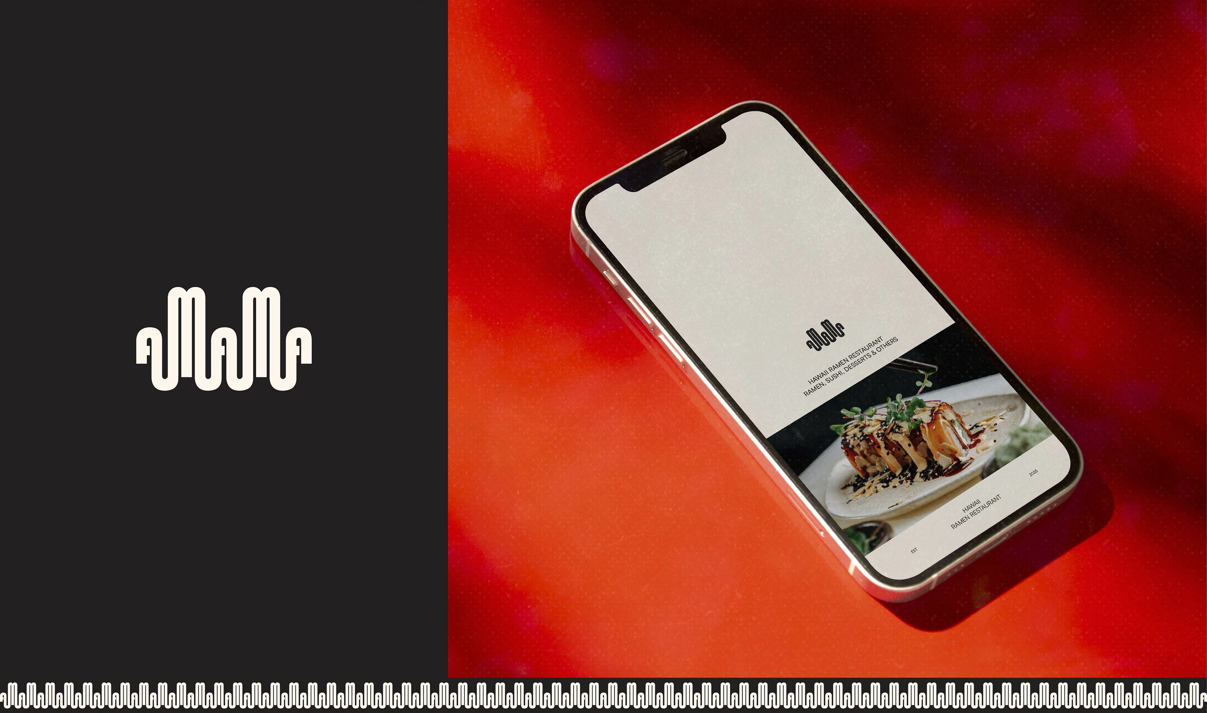
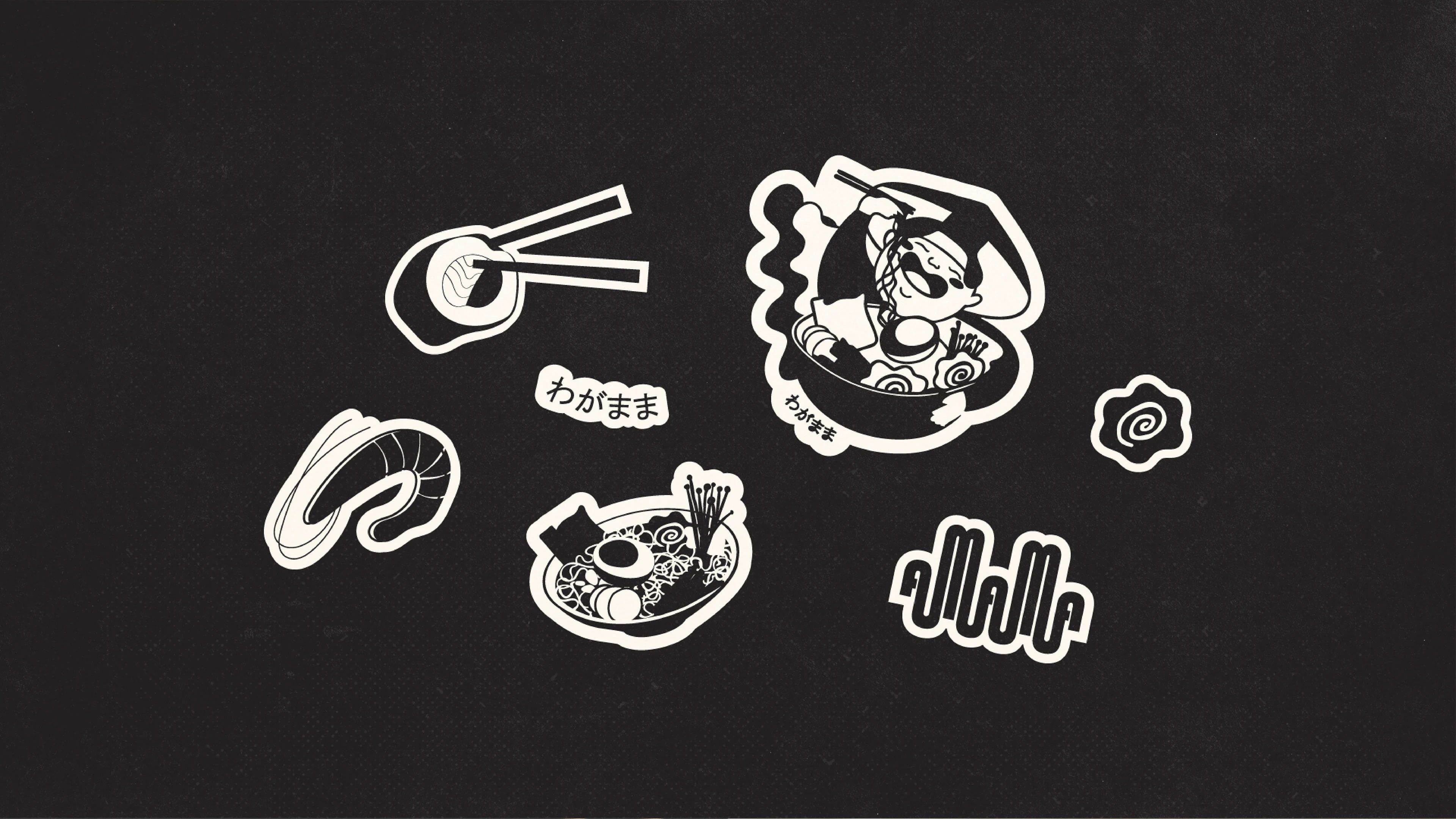
Solution: The logo reflects this idea visually. The word Wagamama transforms into ramen itself: the ending "-amama" is shaped like noodles, topped with a pair of chopsticks. This element not only makes the logo instantly recognizable as a ramen restaurant, but also becomes a key graphic motif, repeated across the brand identity.
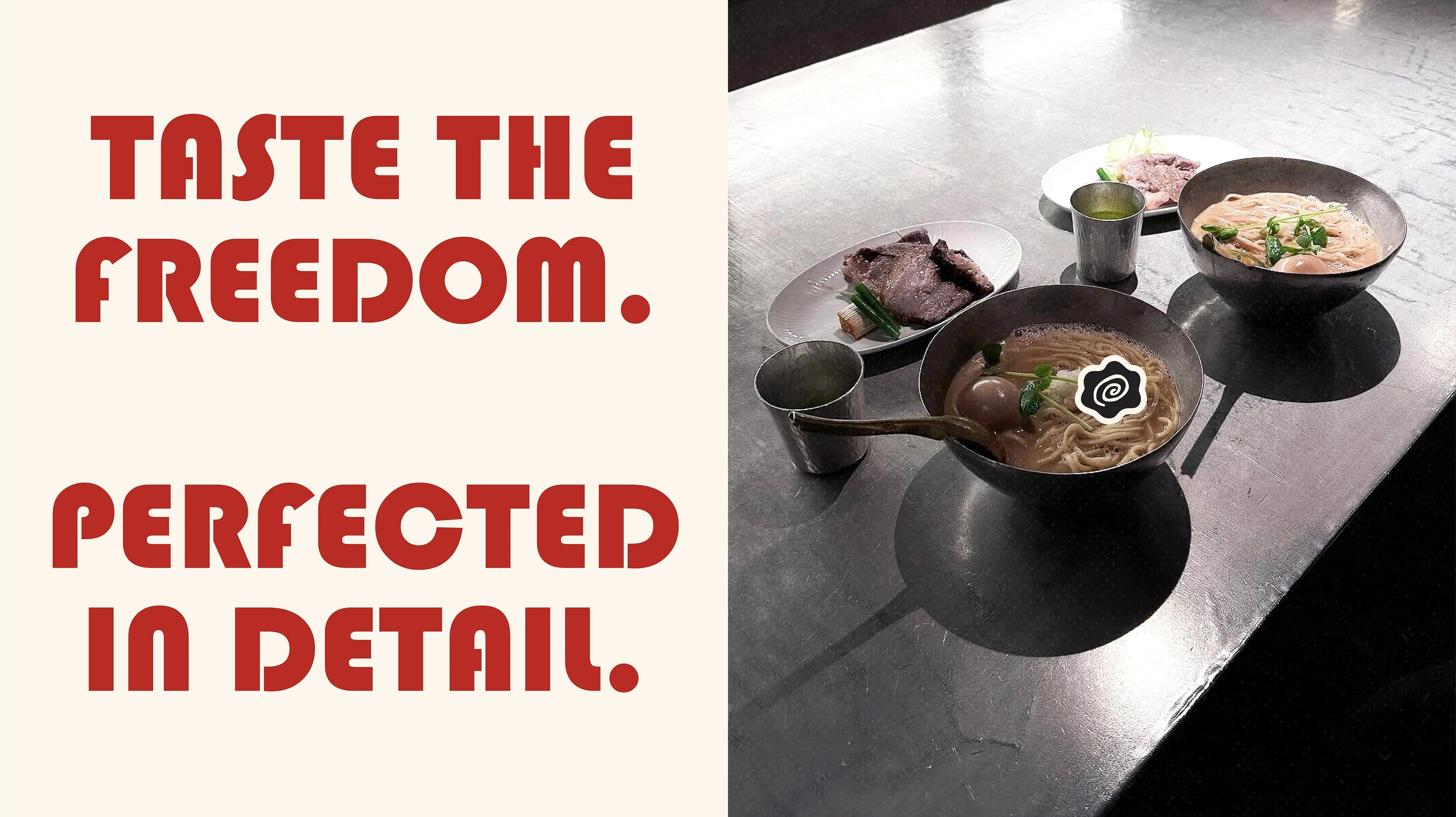
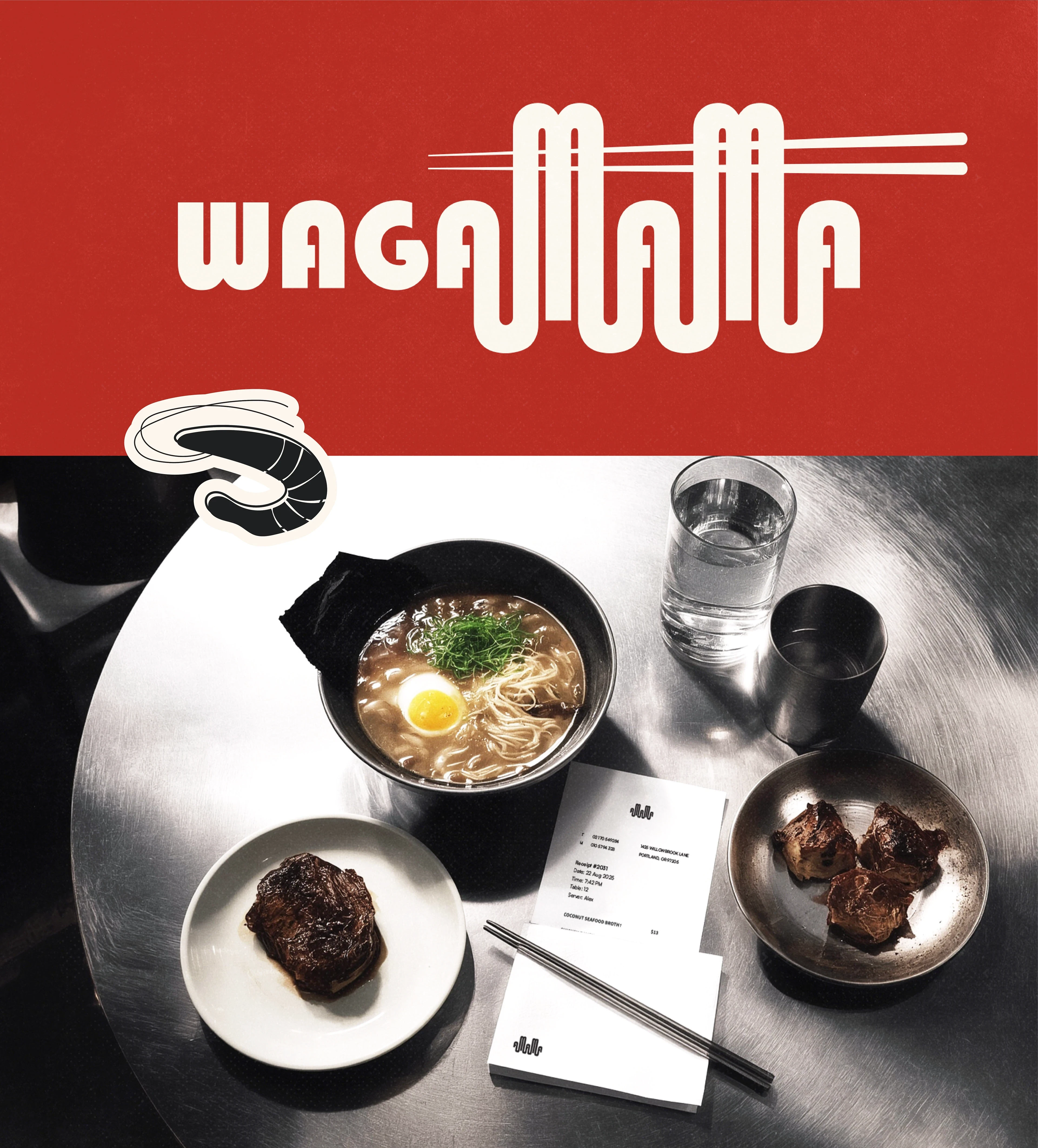
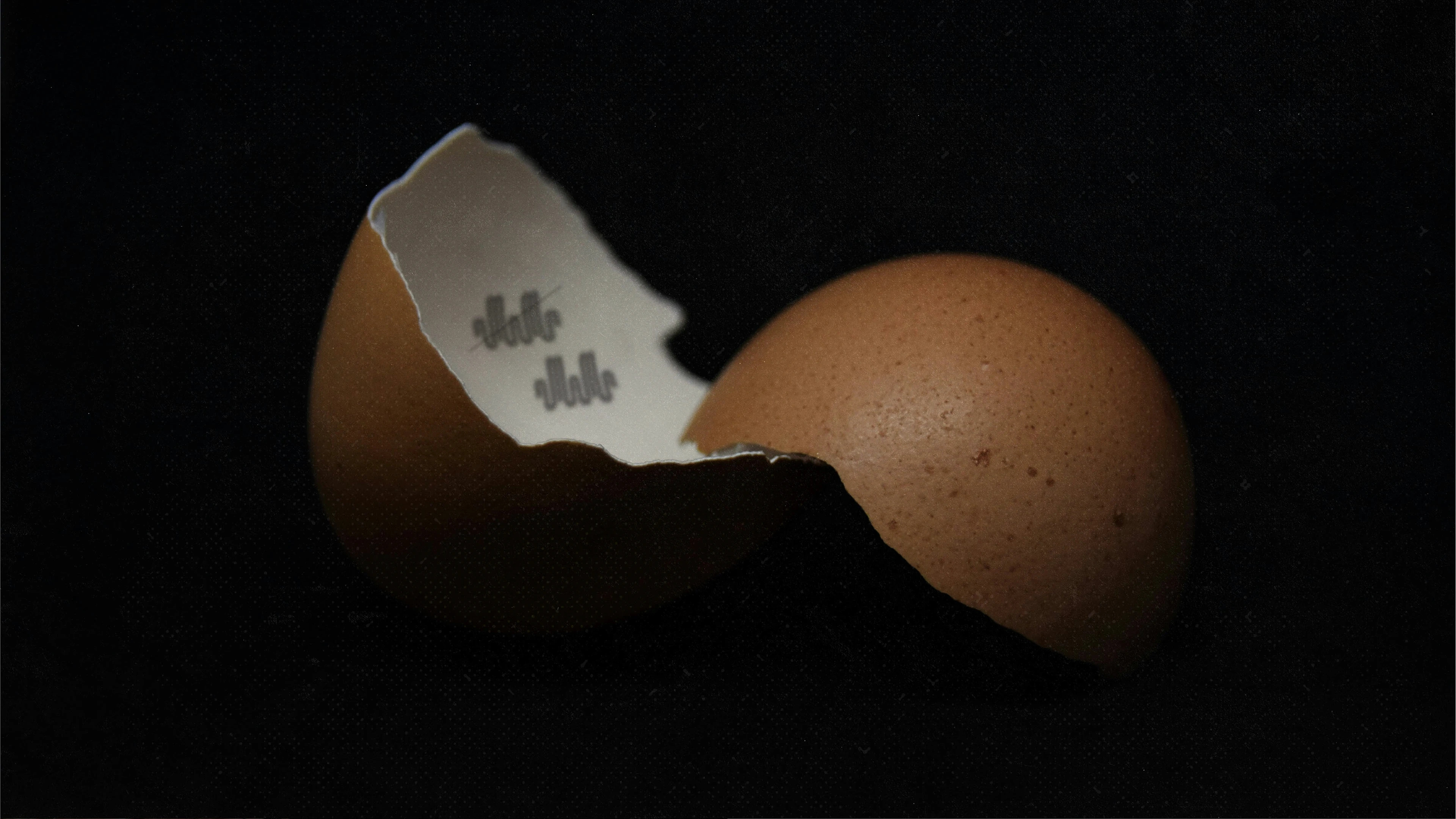
Even an egg can't wait to be served in Wagamama ramen :))
Thank you!
Like this project
Posted Nov 1, 2025
Branding, Logo Design, Illustration