Lendwill Fintech App Brand with Illustrations
Mary Delaney
1 collaborator
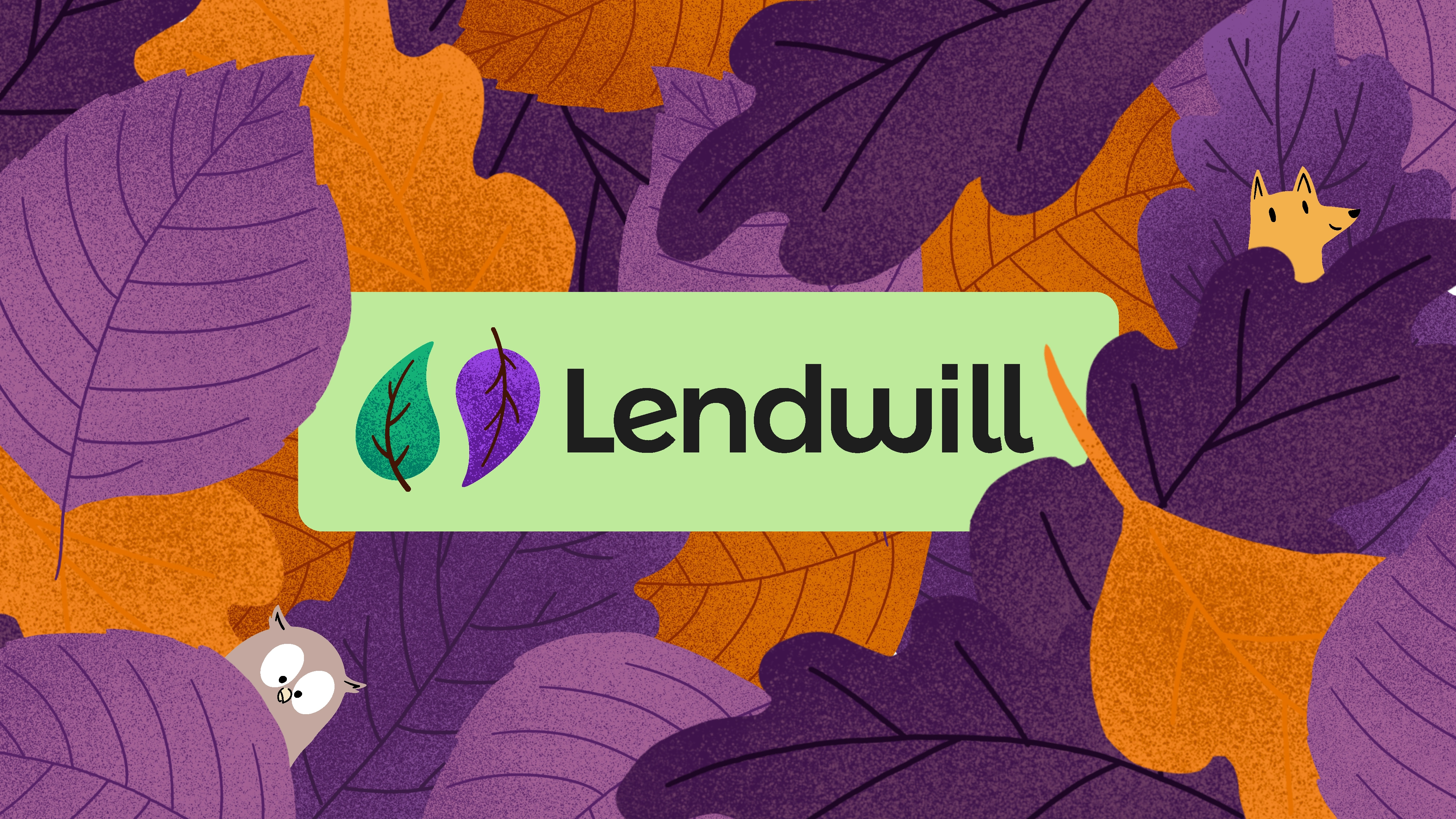
Lendwill is a female-founded fintech startup founded in Norway.
We designed a cute, appealing brand to help them stand out in a crowded market.
Can Fintech be Cute?
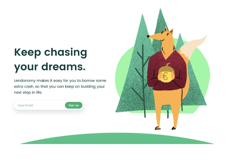
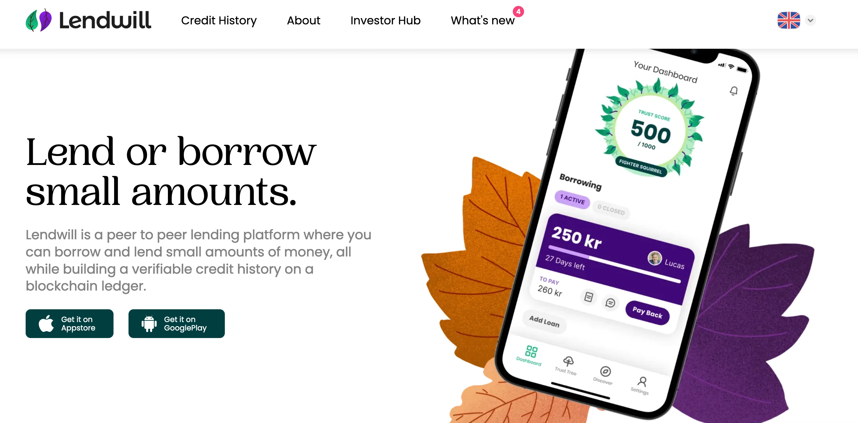
Lendwill needed a brand design for their fintech lending app targeted at students. Art Director Dario brought me on as an illustrator to give the app a premium feel with high quality illustrations, but first we needed to establish a direction. We wanted to make sure their brand felt reliable and safe, but we were tired of the typical "fintech app look". Especially since Lendwill provided services for students, it made sense to have a colorful and friendly brand design, and we wanted to buck the trend and dare make something cute.
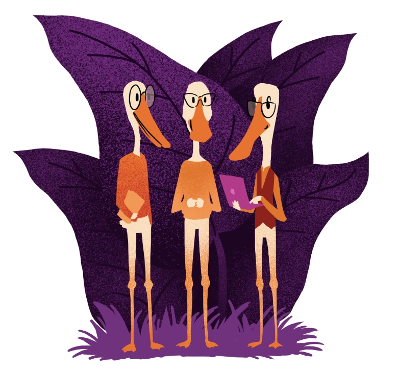
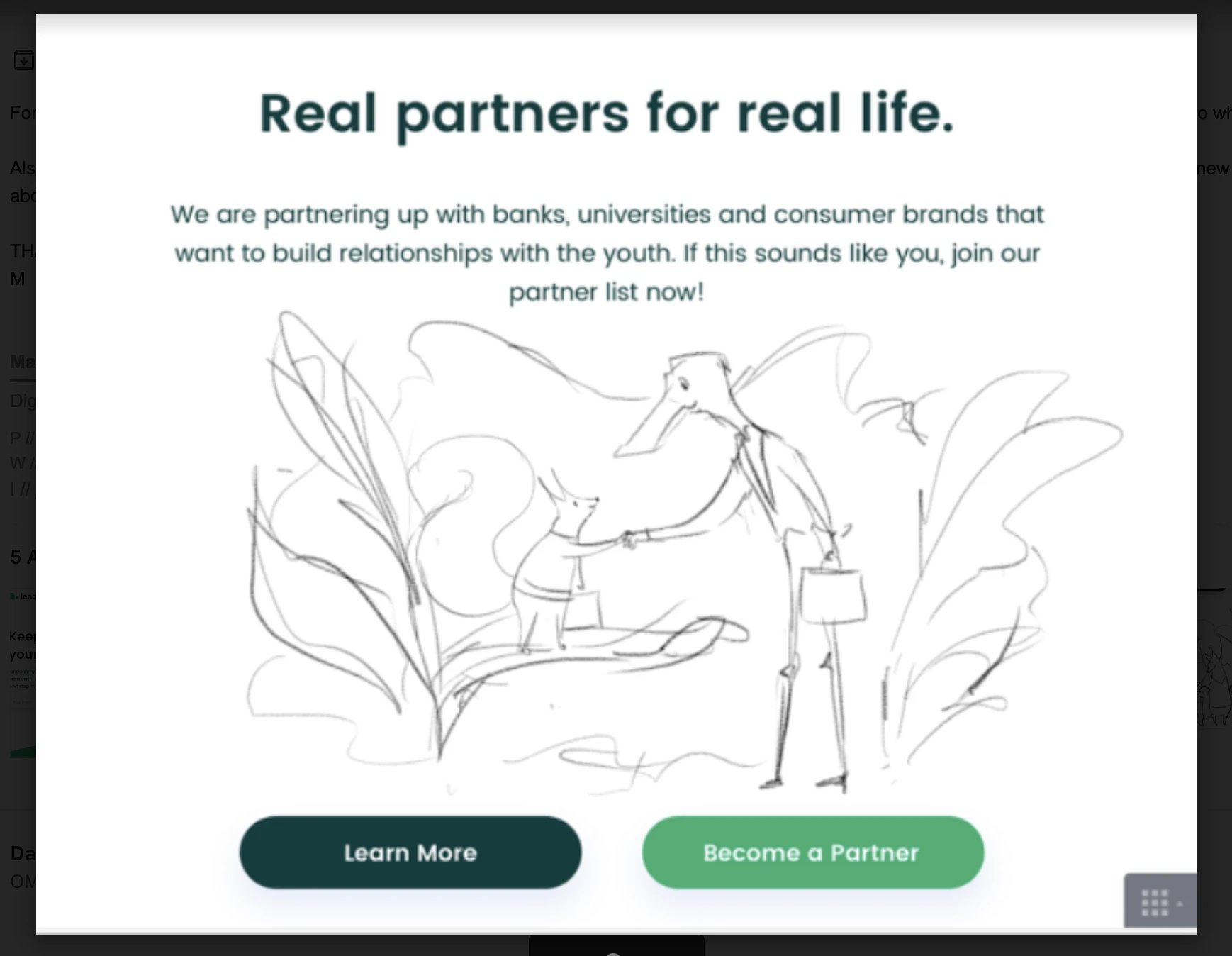
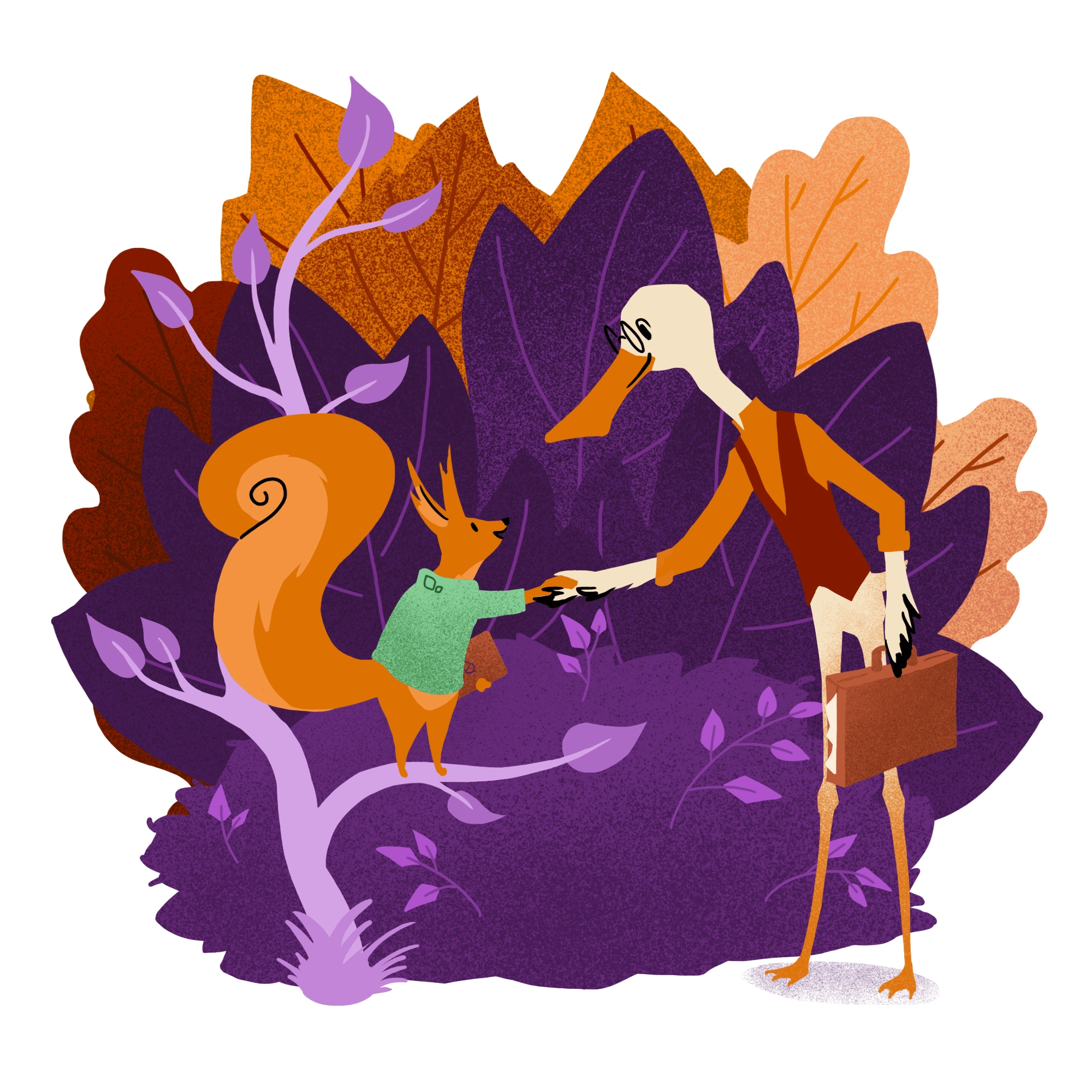
We had a rough idea for a forest universe, with various animals representing students and lenders. Red squirrels would stand for Lendwill, and Owls could be teachers. I did early sketches for hero illustrations that would fit in the web design Dario was already building.
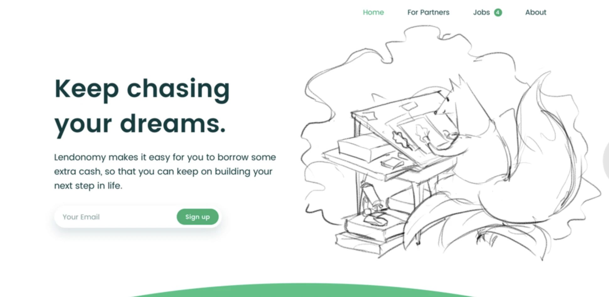
Sketch Phase
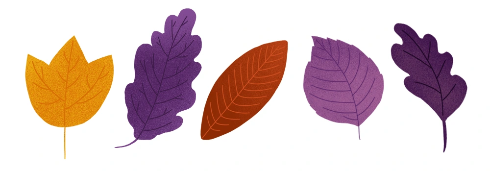
This was my first big collaboration with Dario, and he unleashed his art director superpowers by creating an inspiring mood board of styles and colors we wanted to incorporate. We were seeing illustrations around the web that incorporated rough digital texture combined with hard vector edges, mimicking the look of construction paper collage. We wanted to bring the texture into our illustrations, so for me that also meant doing some research into texture brushes that I could use in Photoshop. In the end, I created custom texture brushes for this project.
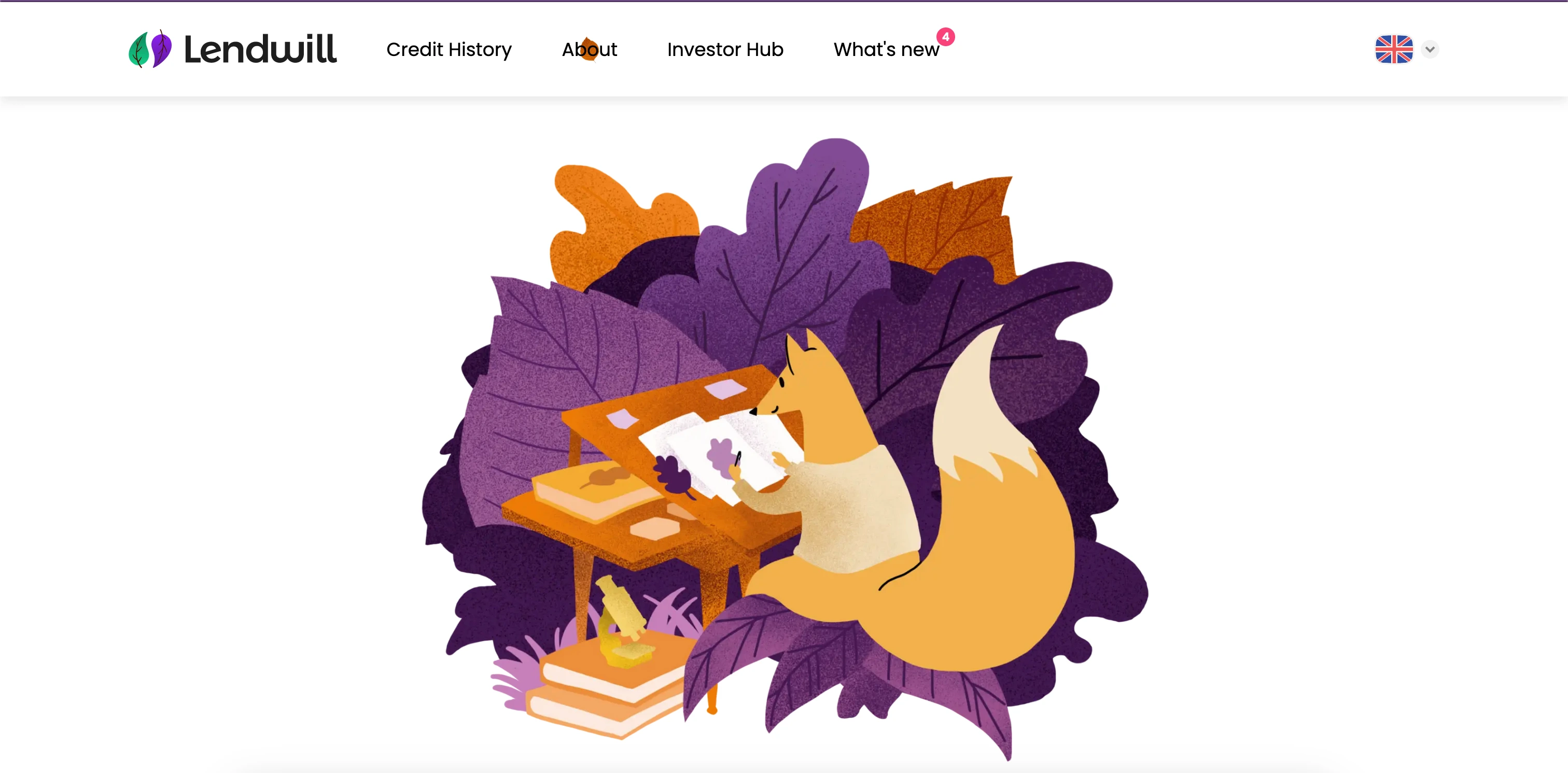
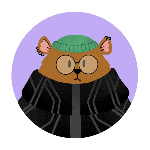
We also worked out the actual design of our characters. They needed to represent students, and we wanted them to be able to use laptops and other human accessories. I wanted to incorporate clothing to give them a sense of personality and modernity, and keep the brand from straying too much in a fantasy direction.
Investor Ducks
I started doing more experiments with different kinds of animals to figure out how the style would actually work. In my capacity as a professional illustrator, I don't have a fixed visual style, so some of the work of creating these illustrations was me learning the rules of the style.
For example, the texture became overpowering and busy when I applied it everywhere in the illustrations. In the end, I decided that the natural scenery (leaves and trees) would receive texture, while the animals' bodies would mostly stay as solid shapes. I wanted to keep the animals' bodies as flat areas of color, which meant I needed to use dark lines in some places to indicate depth. I kept those to a minimum though, which helped me focus on strong, iconic silhouettes. As someone used to working with outlines, this was a stretch for me and meant I needed to think about contrast early on.
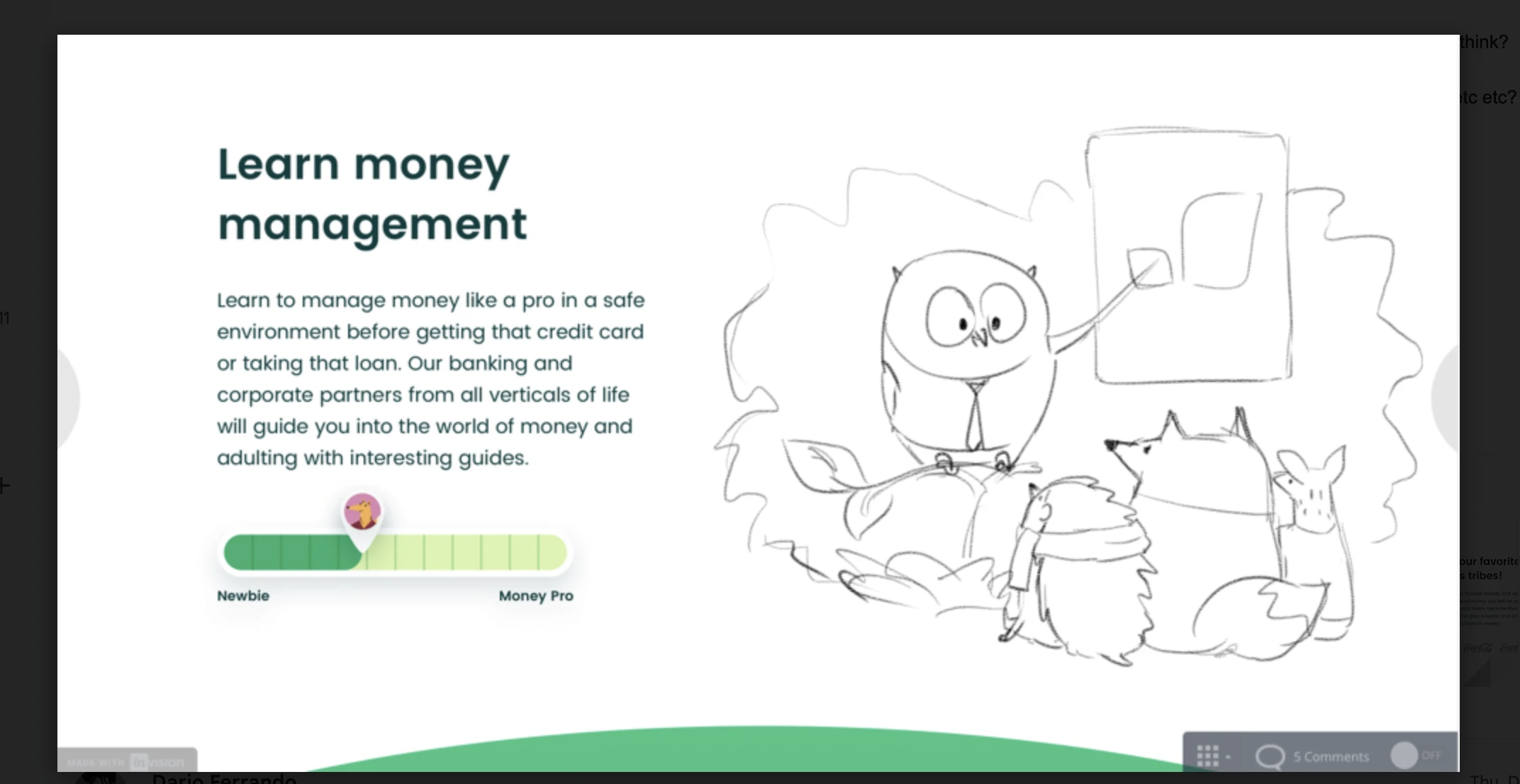
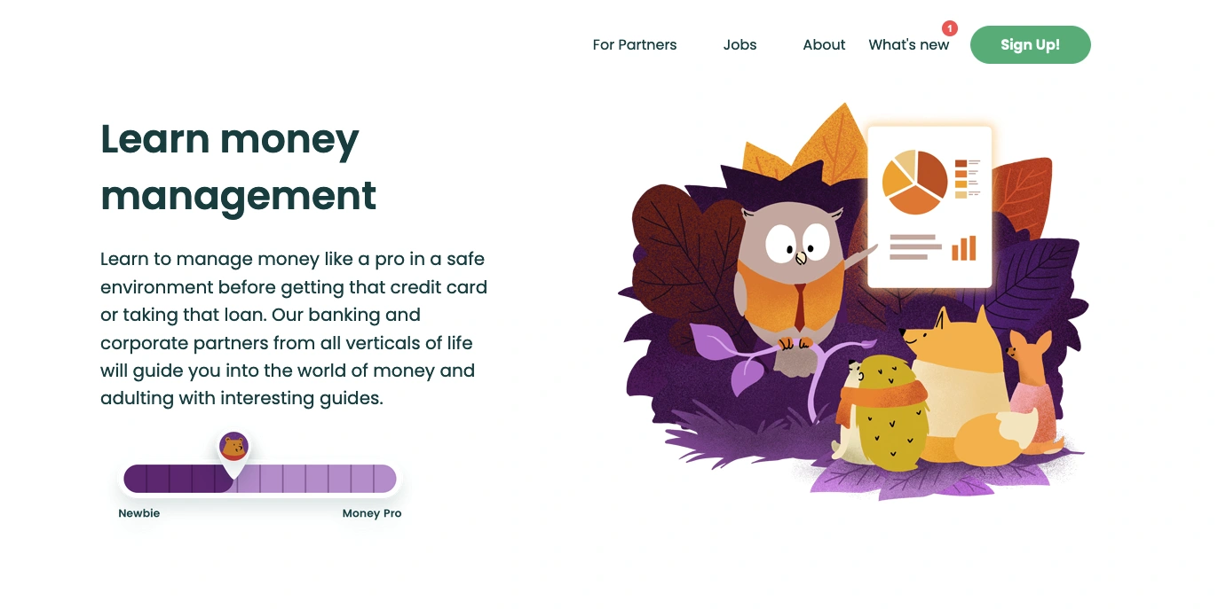
teacher owl explaining finance terminology to baby animal students
Full Color
I started to feel more confident with the Lendwill illustration style, so we were ready to nail down specifics with the client. They decided to start with a few key illustration for the website, with the understanding that we would follow up with more illustrations for the app as their business grew.
Like this project
Posted Jul 17, 2025
Brand design created for Lendwill, a female-founded Fintech startup.
Likes
3
Views
16
Clients
Lendwill
Collaborators