Brand Identity and Website for a B2B Digital Agency by Anna AvevnBrand Identity and Website for a B2B Digital Agency by Anna Avevn

Brand Identity and Website for a B2B Digital Agency

Anna Avevn

Anna Avevn

Branding and Web Design for a Digital Agency.
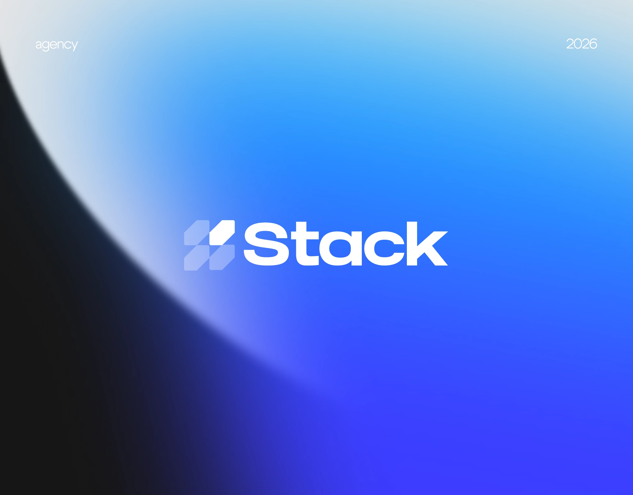
xStack is a branding and web design concept for a digital agency built around one idea: focus.
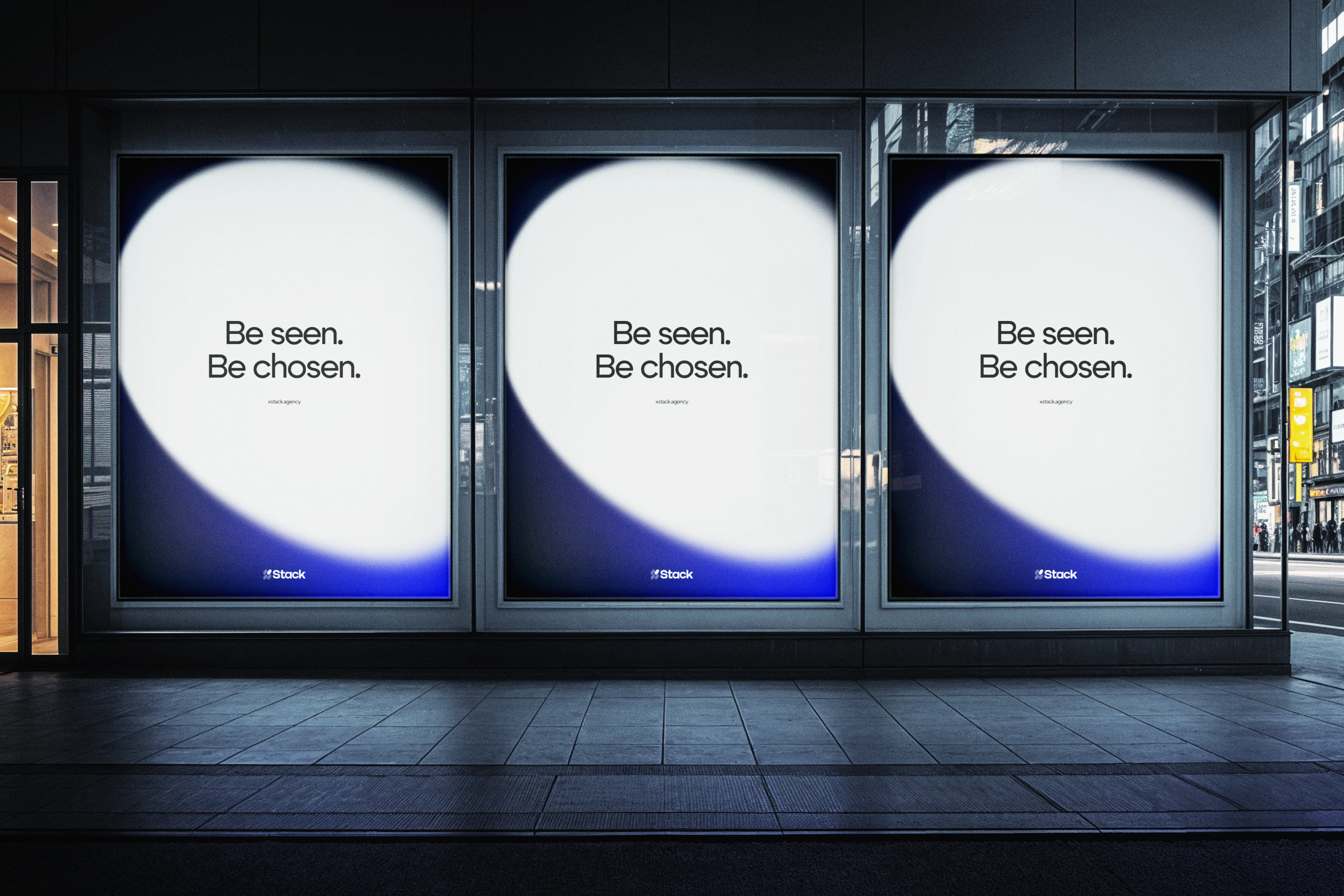
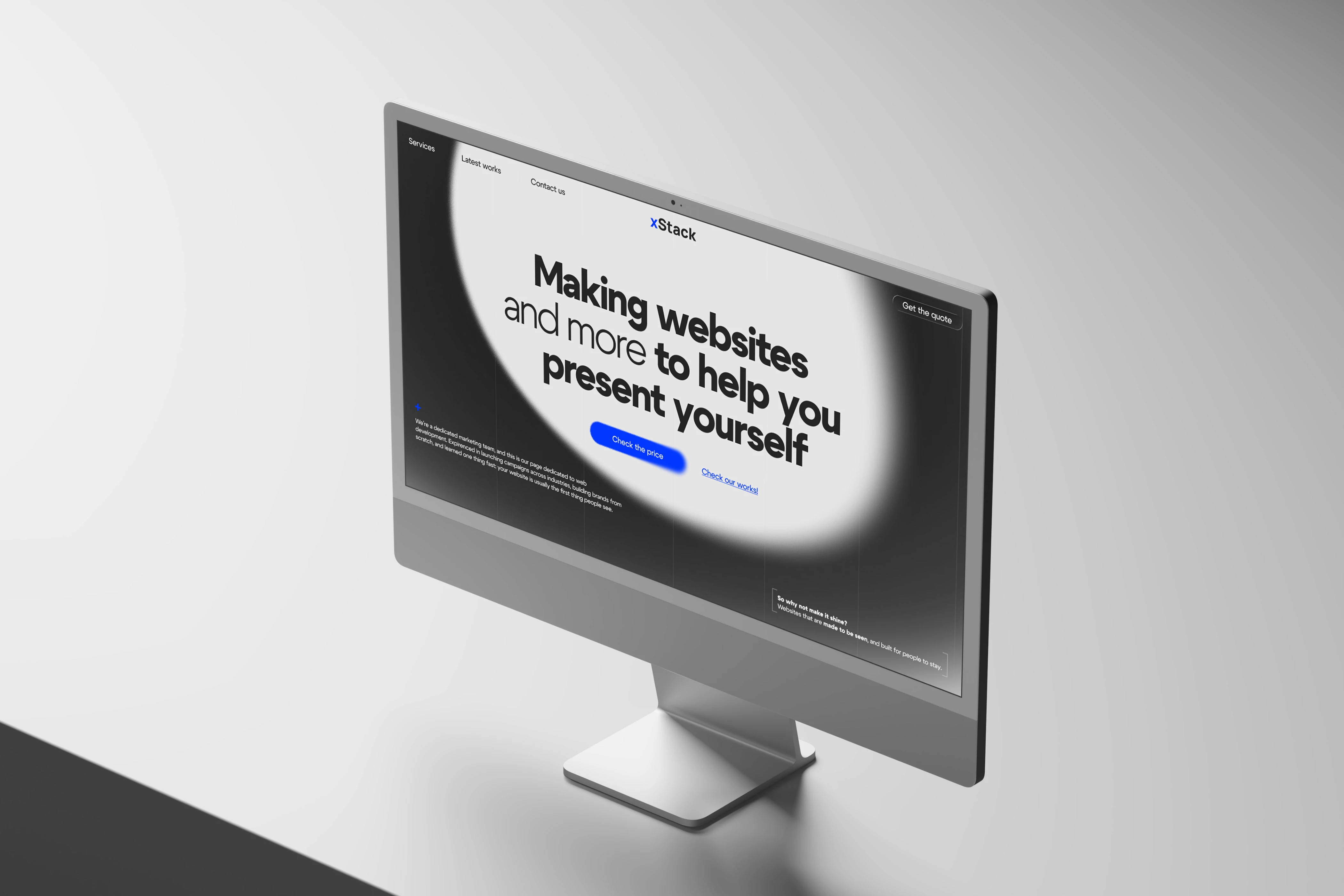
The visual system uses a spotlight-like shape to frame attention, reveal key content, and create a clear path through the brand. For an agency, this became a direct metaphor for the value behind the work. xStack helps brands come into view, hold attention, and present themselves with clarity.
Branding
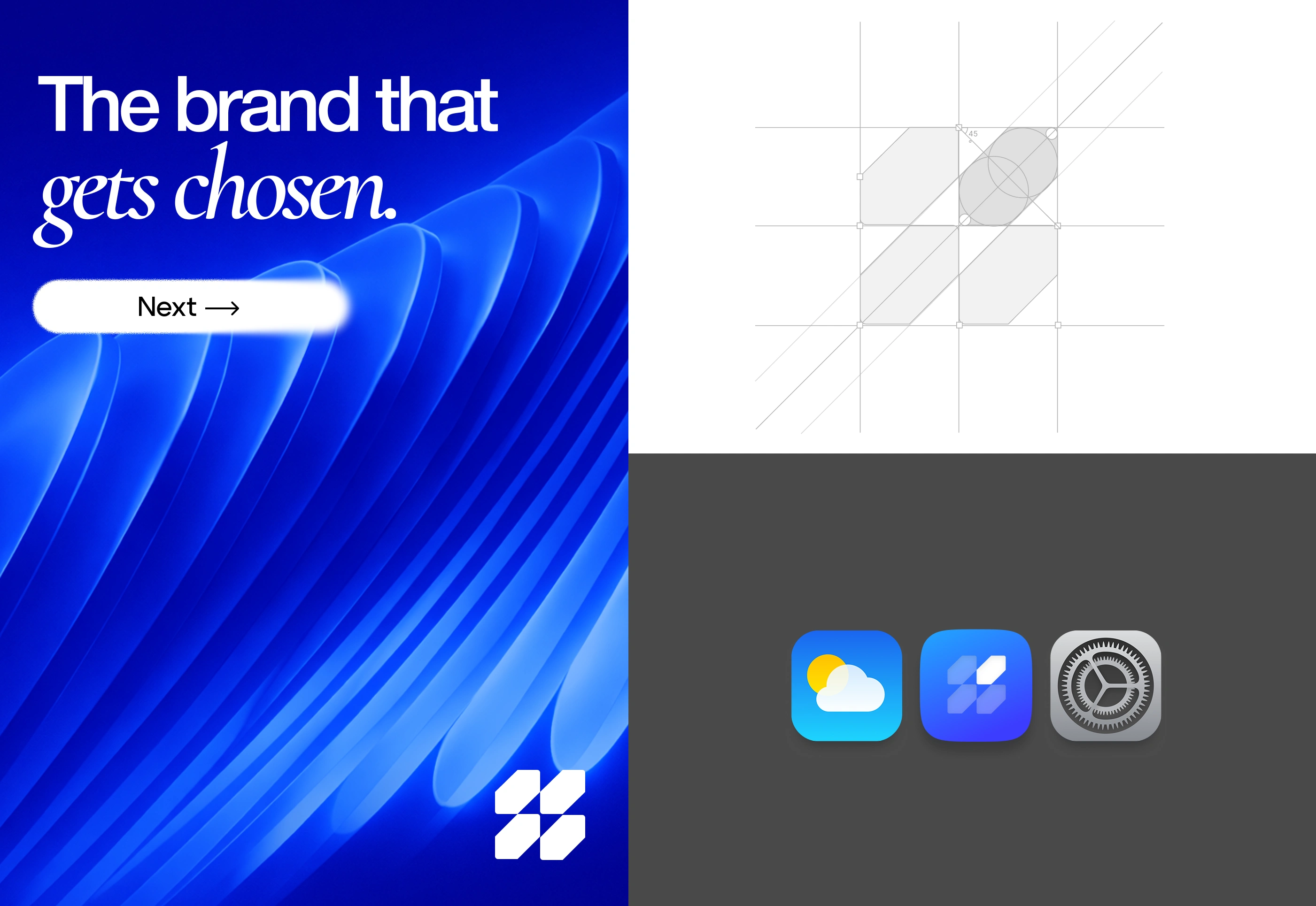
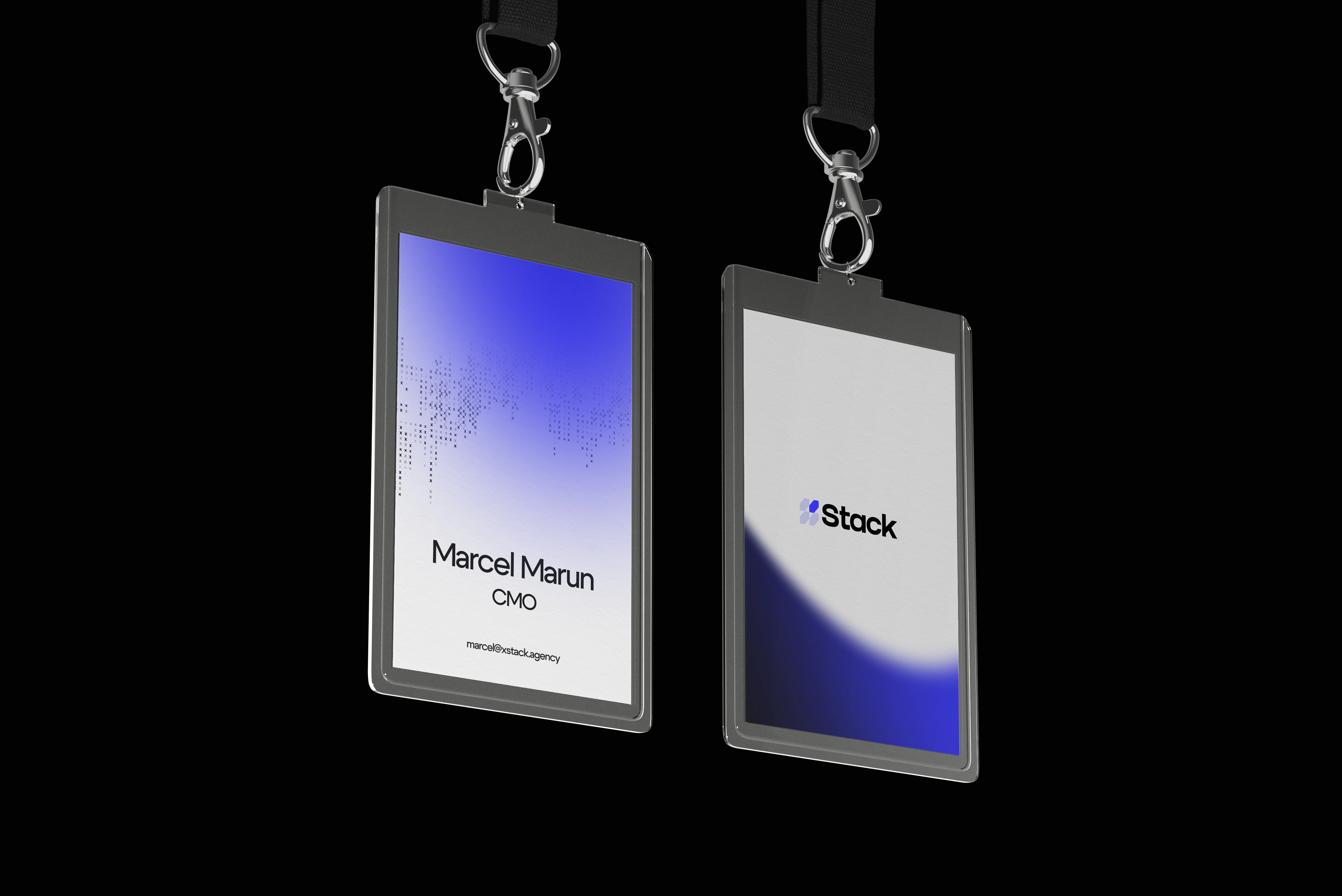
The identity is built on a soft light form that moves through the system as a core graphic device. It creates hierarchy, adds rhythm, and gives the brand a recognizable signature across hero compositions, presentation materials, badges, and supporting graphics.
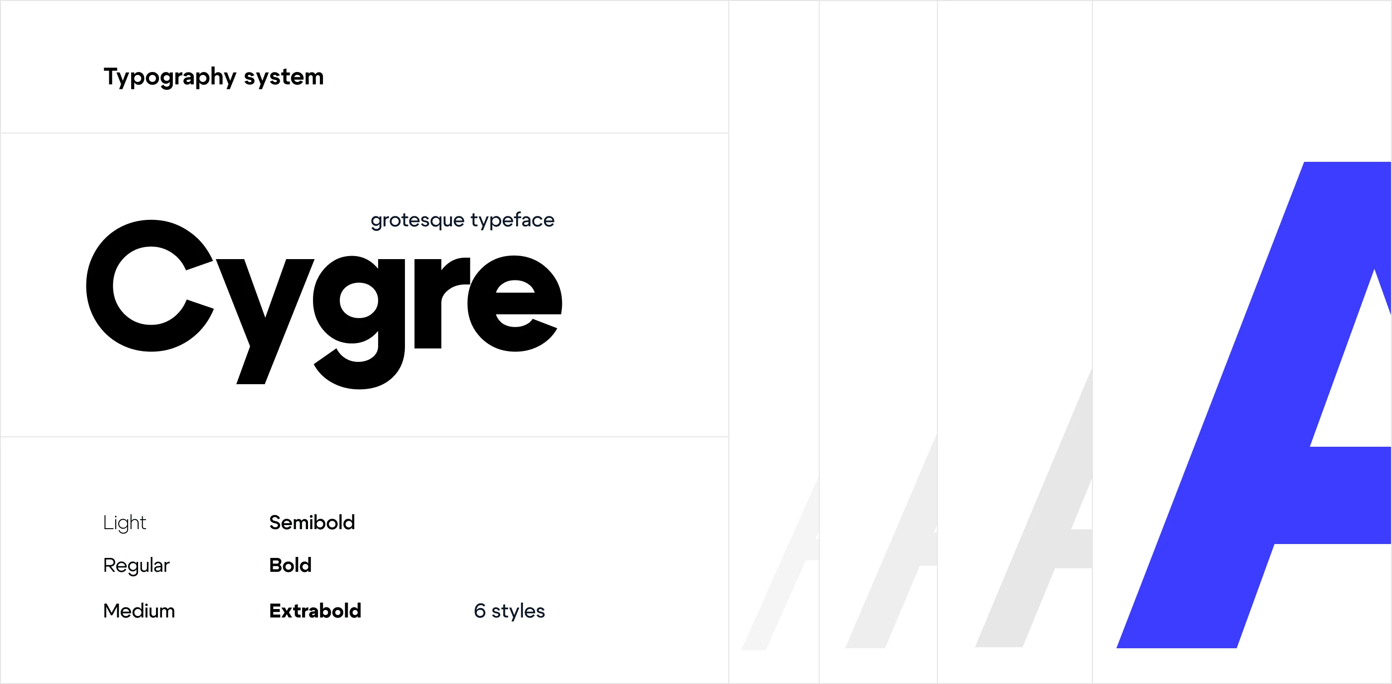
Typography follows the same logic. A modern grotesque typeface was chosen for clarity, control, and presence. Large headlines carry confidence. Smaller text stays clean and readable. Together, these elements shape a visual language that feels precise, contemporary, and easy to recognize.
Digital Experience​​​​​​​.
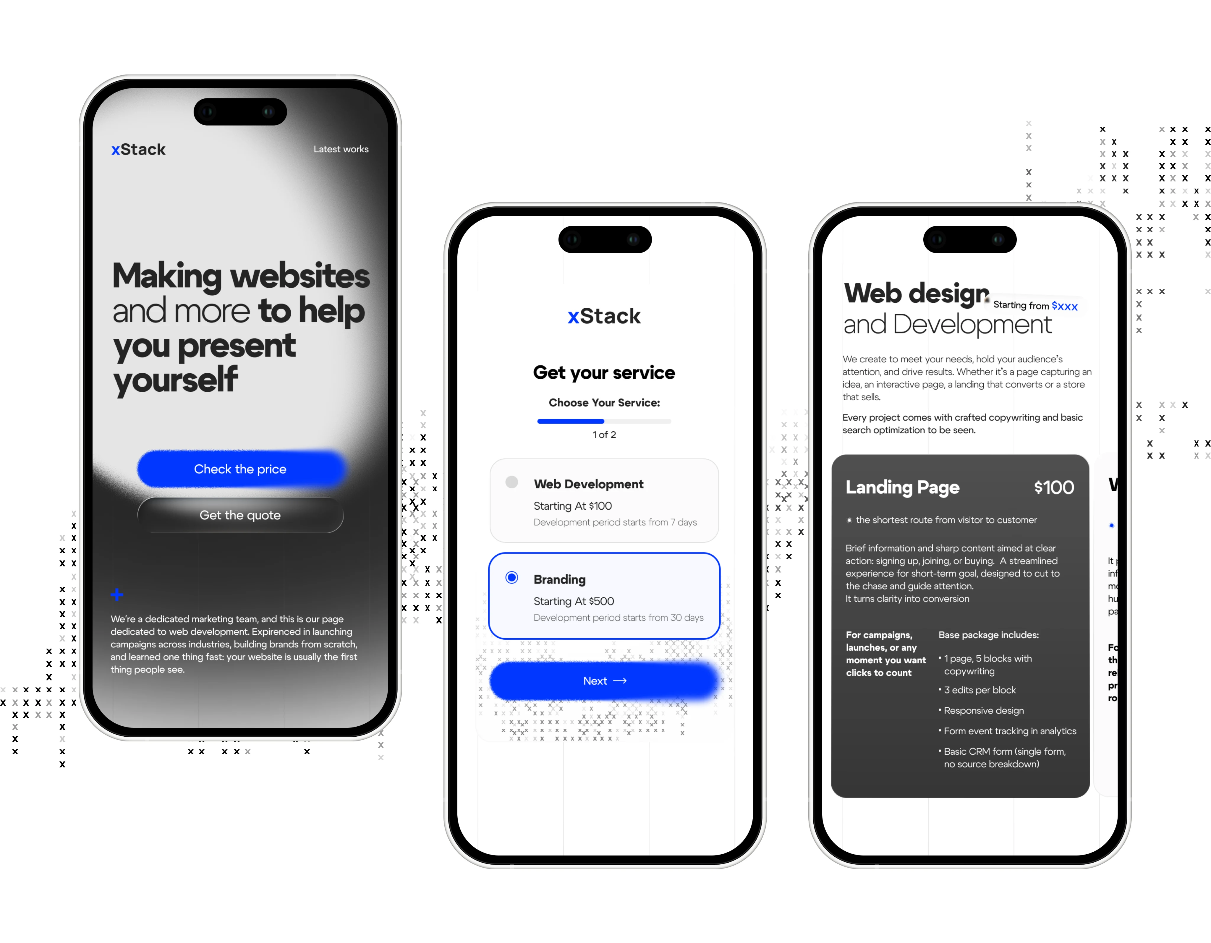
The website translates the identity into a focused digital experience. The spotlight form moves from branding into the interface, framing the hero message, guiding attention to service blocks, and creating a clear rhythm across the page.
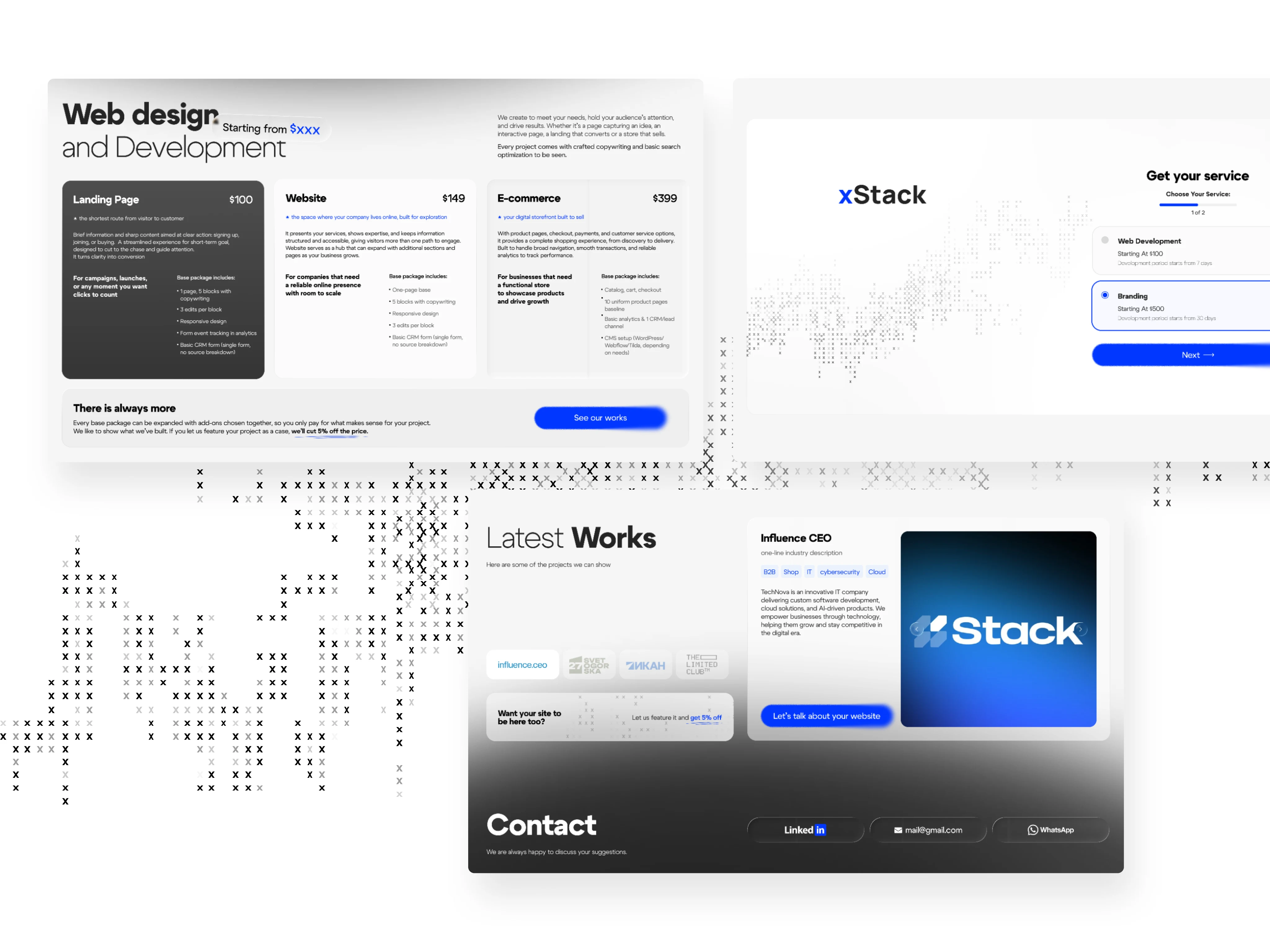
The structure was built to help a client understand the offer fast: visible pricing, short service descriptions, portfolio proof, and a direct path to contact. Large white space, bold typography, dark content cards, and electric blue accents keep the interface sharp, readable, and commercially clear. On mobile, the same logic becomes more direct through a guided, step-based flow.
Like this project

Posted Aug 26, 2026

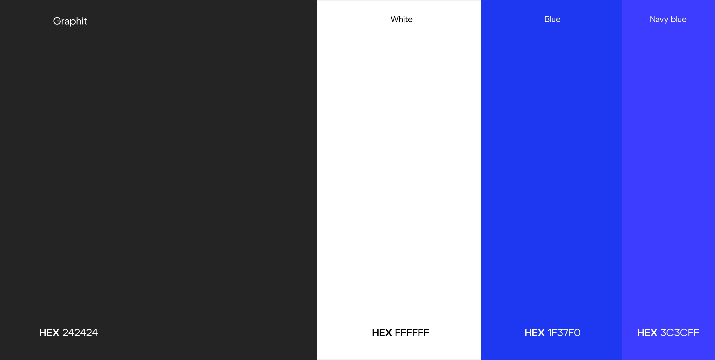
xStack is a brand identity and website design concept for a B2B digital agency. The system is built around a spotlight-like graphic device that cuts through the layout, isolates key content, and controls hierarchy across the visual identity, UI design, and web interface. It is not a decorative element. It is the core idea of the brand: sharper positioning, clearer communication, and a stronger digital presence. The identity combines a modern grotesque typeface with a restrained color system of graphite, white, and electric blue. Graphite gives the brand weight, white creates space and contrast, and blue carries emphasis across the website and brand applications. The web design follows the same logic through structured layouts, service-focused architecture, and a direct user flow designed for B2B presentation. Together, the branding and digital experience form one controlled visual system built for visibility, recognition, and business clarity.