Radxu - Web3
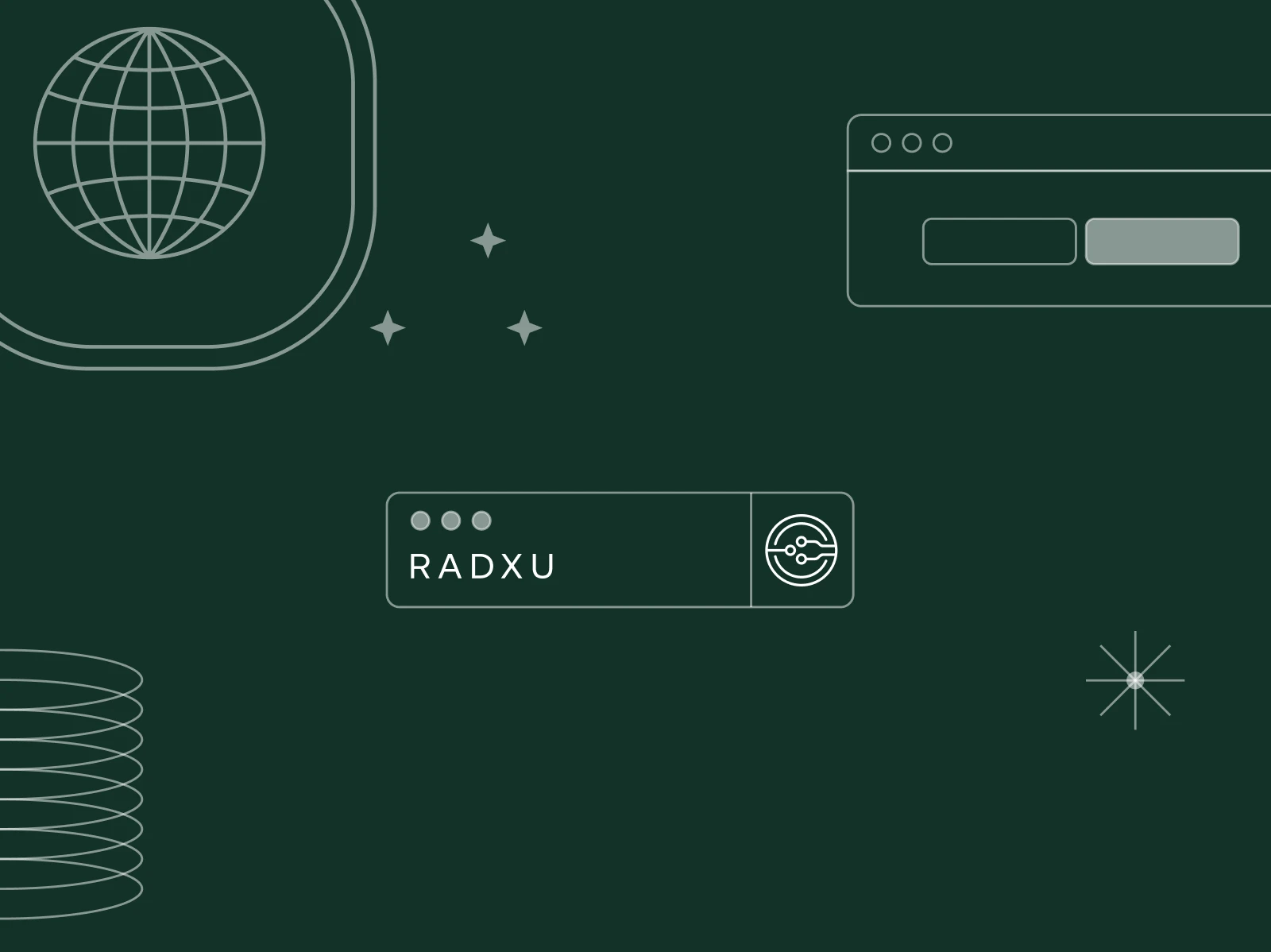
The Radxu Foundation aims to showcase how a community can crowdfund its development instead of relying on external investment. They tasked the designers with creating a new branding linked to the parent brand Audicity that is scalable and consistent with similar foundations. The resulting design incorporates elements from circuit boards and features a scalable logo and website design.
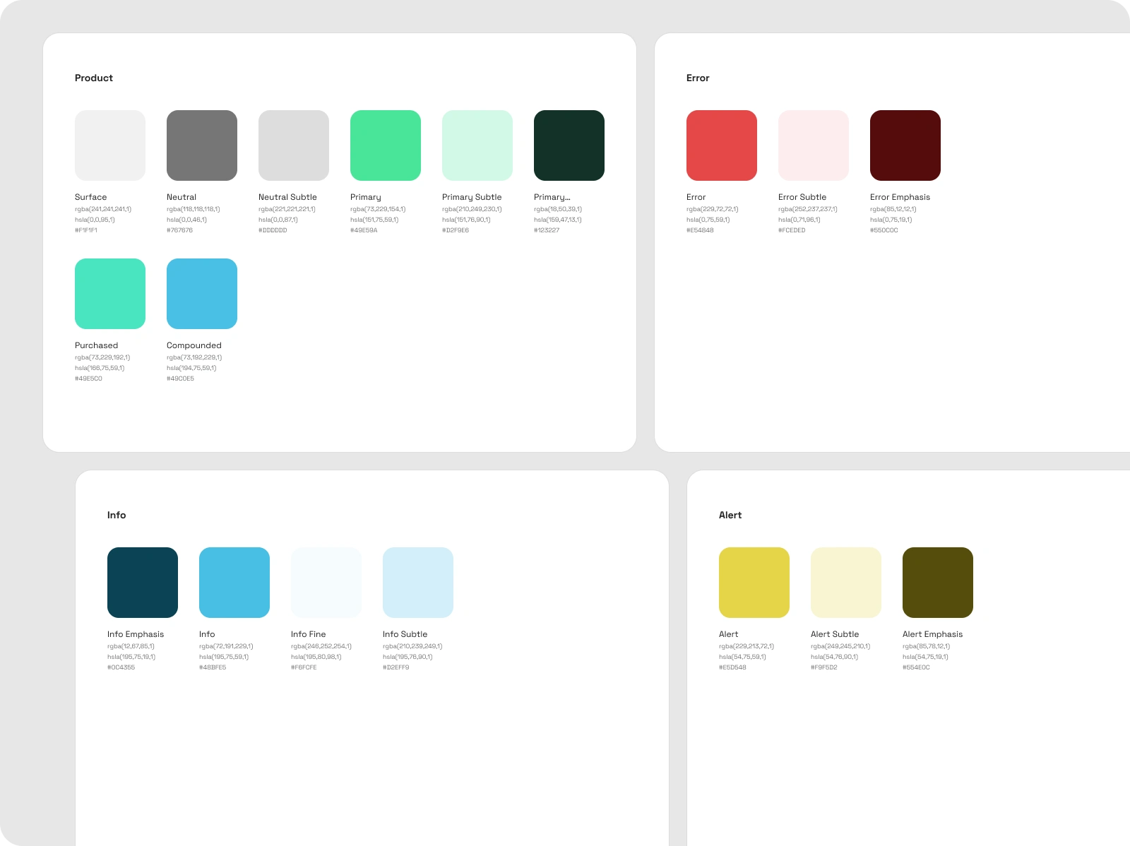
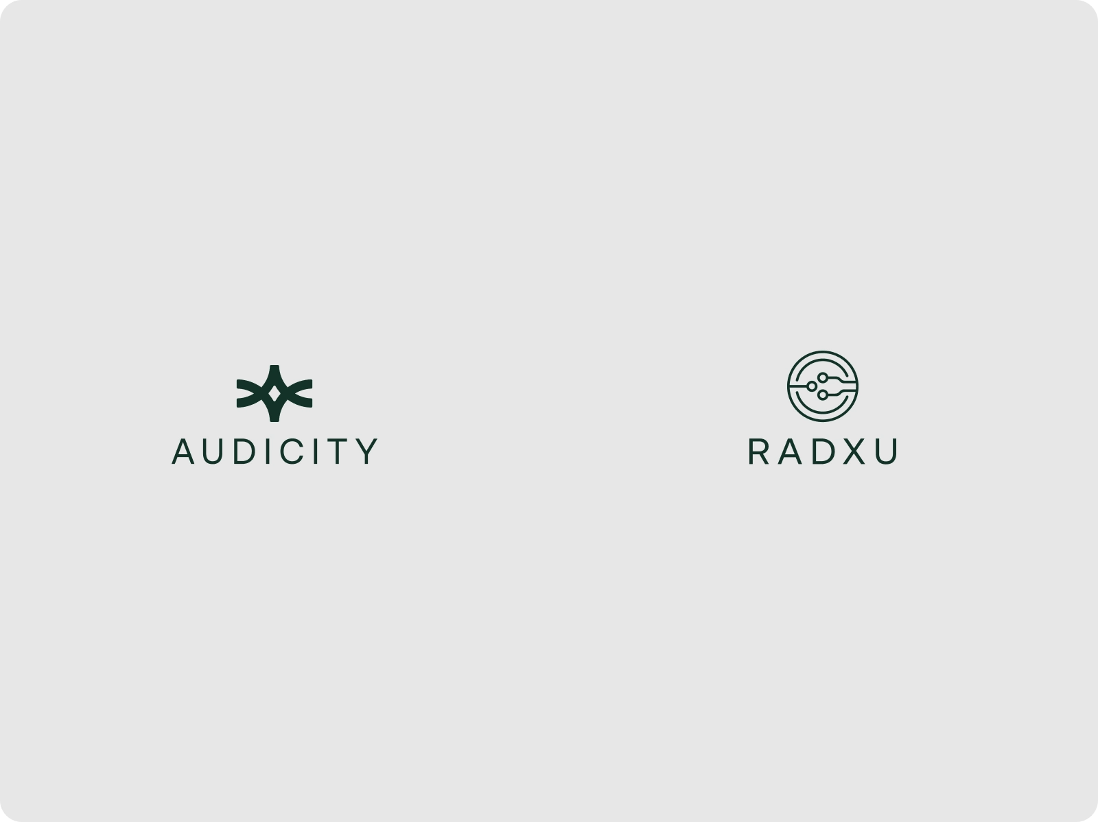
Our challenge was to create a seamless system for both RadXu and Audicity. We started by defining common foundations, primarily typography and colors, which would work well for both brands. After much experimentation, we achieved a typography style that created a sense of unity between the brands. On the other hand, we designed unique monograms for each brand using the same color palette (but inverted) to differentiate them.
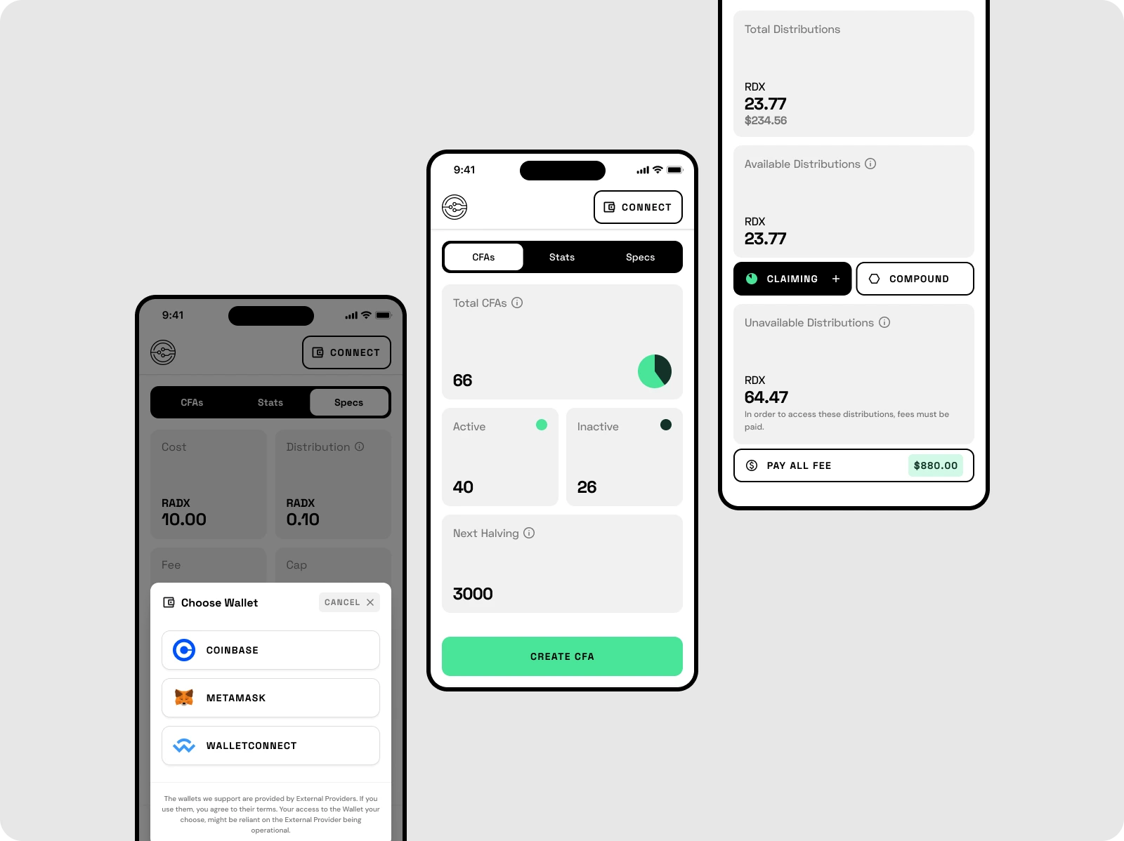
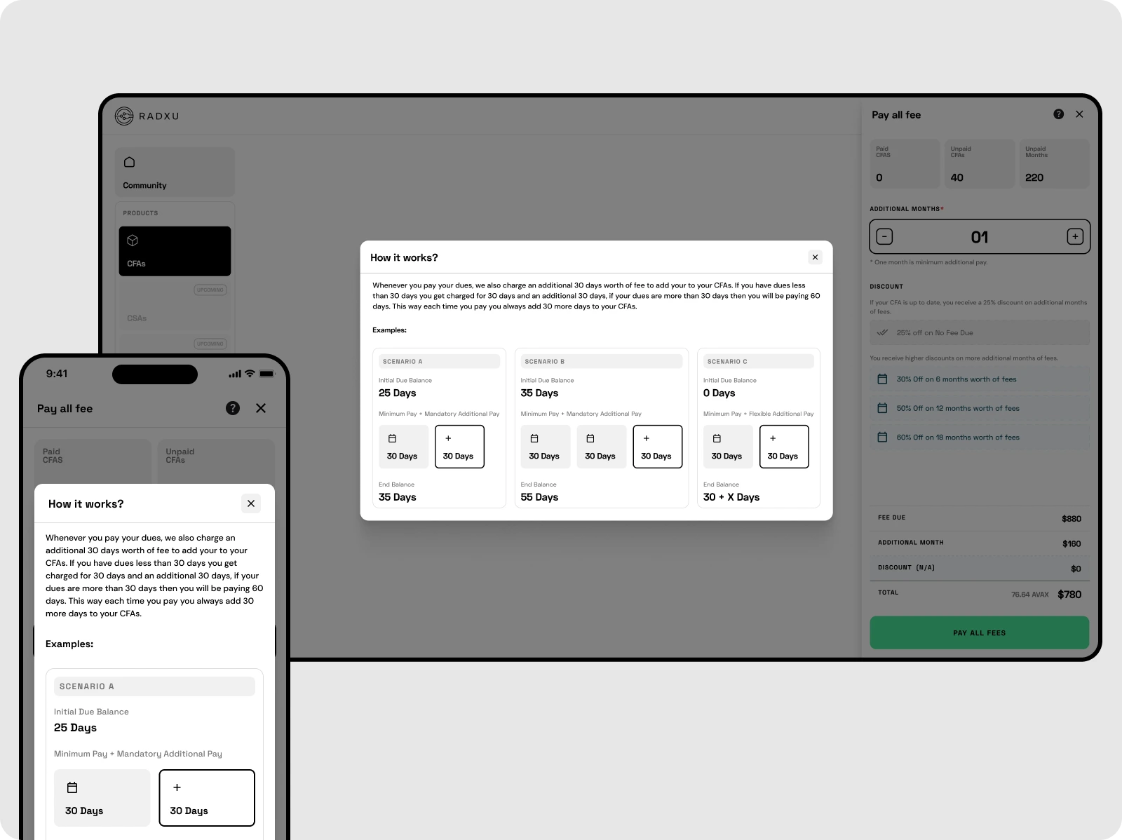
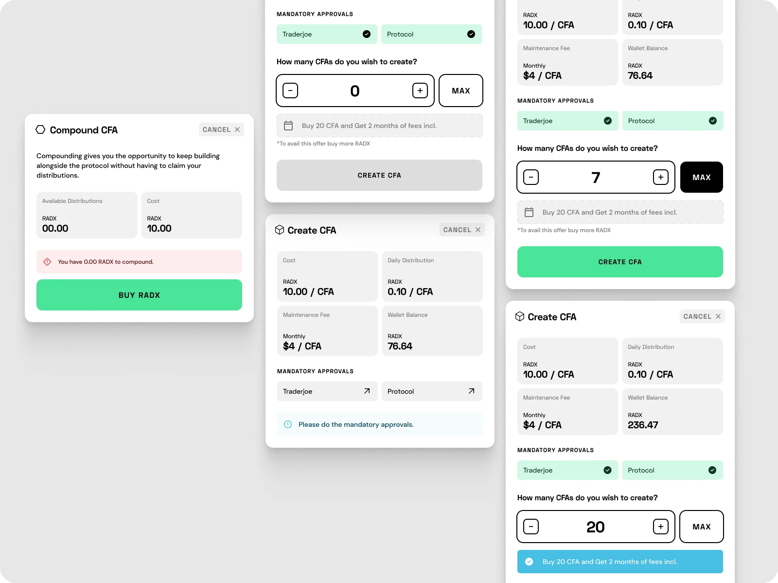
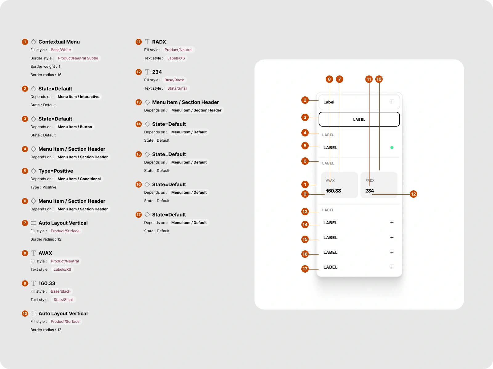
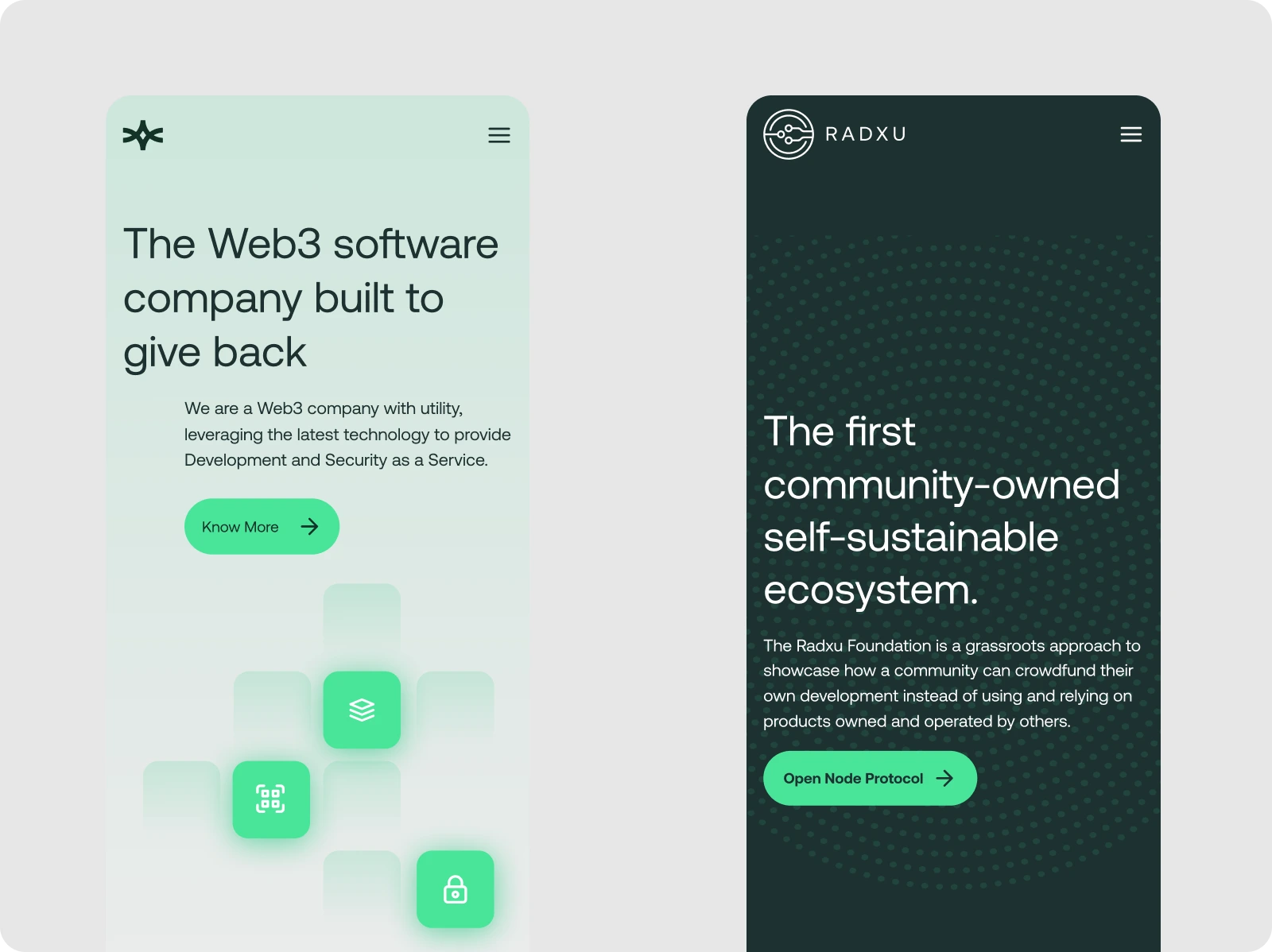
Branding and web design were next on our priority list. We used the same typography for both brands but used different font sizes and styles to differentiate them. We wanted to create logos aligned with their unique identities but still consistent with the overall system. We placed unique monograms on the website to create a strong visual identity for each brand. Finally, we developed a dashboard that would work for RadXu. The dashboard's design incorporated a modular design approach, making it easy to customize according to each brand's unique needs. We created a user-friendly design that was easy to collaborate with teams and effectively manage projects.
Designing two companies' branding, website, and dashboard system is an exciting challenge. It requires a strategic approach to ensure a cohesive system while giving each brand a unique identity. We recently took up such a challenge for RadXu and Audicity, and we want to share our journey with you.
Next Project
Turning your vision
into our version
Like this project
Posted Jan 25, 2024
The Radxu Foundation aims to showcase how a community can crowdfund its development instead of relying on external investment. They tasked the designers with c…
Likes
0
Views
14

