Bonang Matheba: Website Landingpage Redesign
Type: Conceptual
Timeline: 1 week sprint
Team: Solo
Responsibilities: Branding Analysis, Competitive Analysis, Style guide, UI design, sketching, Wireframing, Prototyping
Objective
The current design of the website exhibits an outdated aesthetic, marked by a complex layout and intricate information architecture. Consequently, this website is overwhelming upon initial interaction, with a lot of visual and navigational complexity to contend with.
The primary objective of this redesign project is to enhance the website's visual appeal, streamline the navigation experience, and effectively convey the brand and identity of Bonang Matheba to viewers.
Brand Personality Assessment
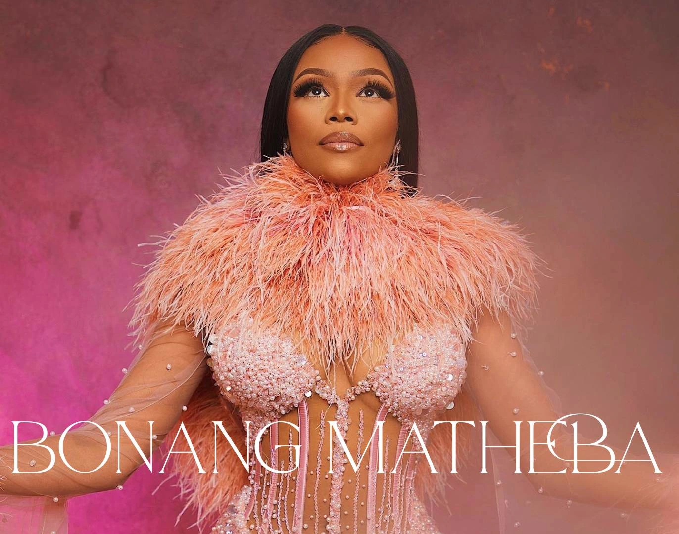
Meet the dynamic Bonang Dorothy Matheba, a South African luminary celebrated for her award-winning talents as a television host, radio maven, actress, and a captivating presence on social media. With a dash of flair and a signature voice that's instantly recognizable, Bonang's journey to stardom began on the vibrant stage of SABC 1's iconic music show, LIVE (now known as Live Amp), catapulting her into the limelight. She's not just a trailblazer in the entertainment world; Bonang proudly holds the distinction of being the first Black South African to grace the pages of numerous esteemed magazines, leaving an indelible mark on the industry.
To kickstart this project, I conducted a comprehensive analysis of the website's current personality and voice, with a specific focus on evaluating the aesthetics and user experience of the existing user interface. It's important to note that, for this specific redesign initiative, I did not conduct user interviews. My primary focus was on refining the existing design rather than introducing entirely new products or features.
Prior to immersing myself in the actual design process, it was important to gain a profound understanding of Bonang Matheba's brand personality. This knowledge serves as the bedrock of my design decisions, ensuring that I consistently uphold and reflect this personality throughout every phase of the project's evolution and design execution.
Current Website Analysis
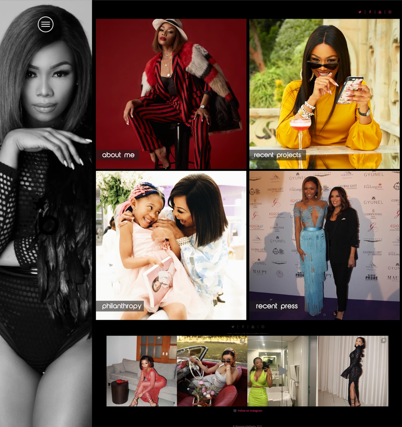
Let's dive right into the heart of the matter. The current website has a few substantial challenges, especially given its role as a platform for a celebrity like Bonang Matheba, who often attracts a high-profile audience. The central issue we're facing revolves around aesthetics, and this is a particularly important aspect to consider.
A Dated Look and Feel:
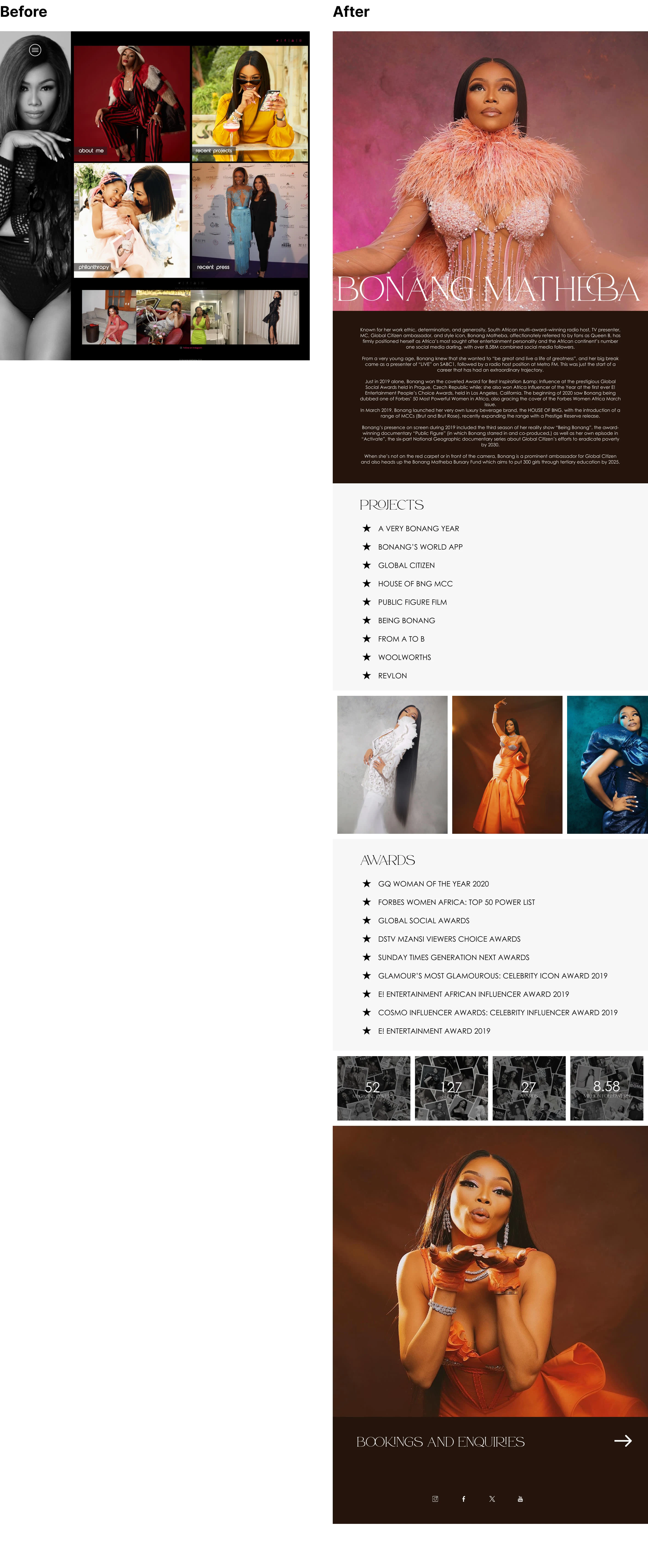
What you encounter is a design that feels outdated and has low-resolution images. It doesn't exactly roll out the red carpet for you. Instead, it exudes a rather conservative sensation. Not exactly the glamorous digital experience we'd expect from Bonang Matheba.
The Colour Palette:
Now, let's talk about colours. The palette currently in use is a bit like shades of black and grey - functional, yes, but missing the opportunity to inject some life and energy. This corporate colour scheme doesn't quite reflect the lively and engaging spirit of the brand.
Mission
My mission is to breathe fresh life into this digital space, infusing it with modern aesthetics, user-friendly navigation, and a personality that truly embodies Bonang Matheba's unique charm.
Competitive Analysis
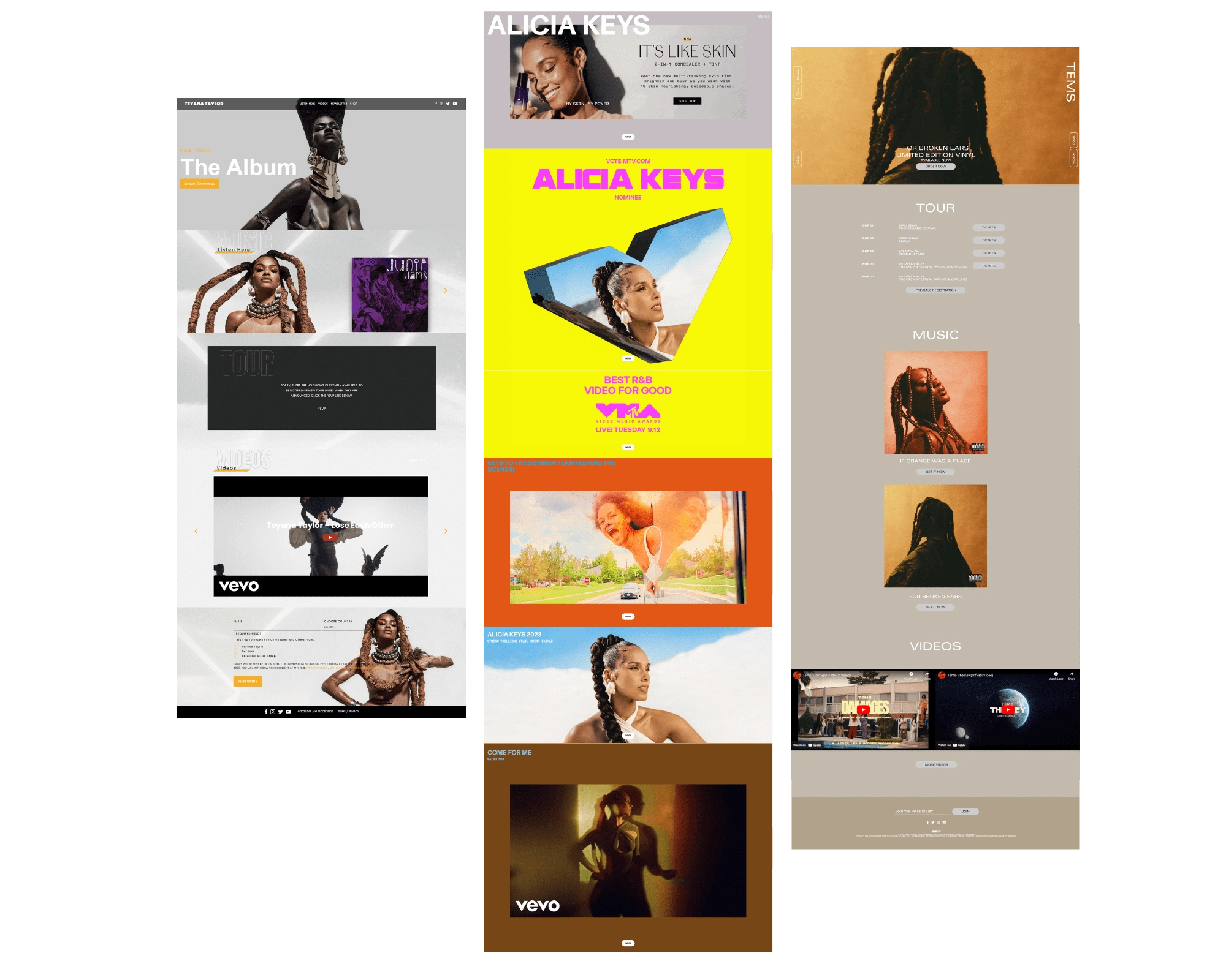
Looking at three competing celebrity websites — Teyana Taylor, Alicia Keys, and Tems— common UI design trends emerged. These sites prominently feature unique imagery and clearly convey the celebrity’s personality brand.
Key elements observed:
Welcoming hero section
Effective use of contrasting colours and appealing aesthetics
High-resolution images
Engaging visuals
Moodboard & Development
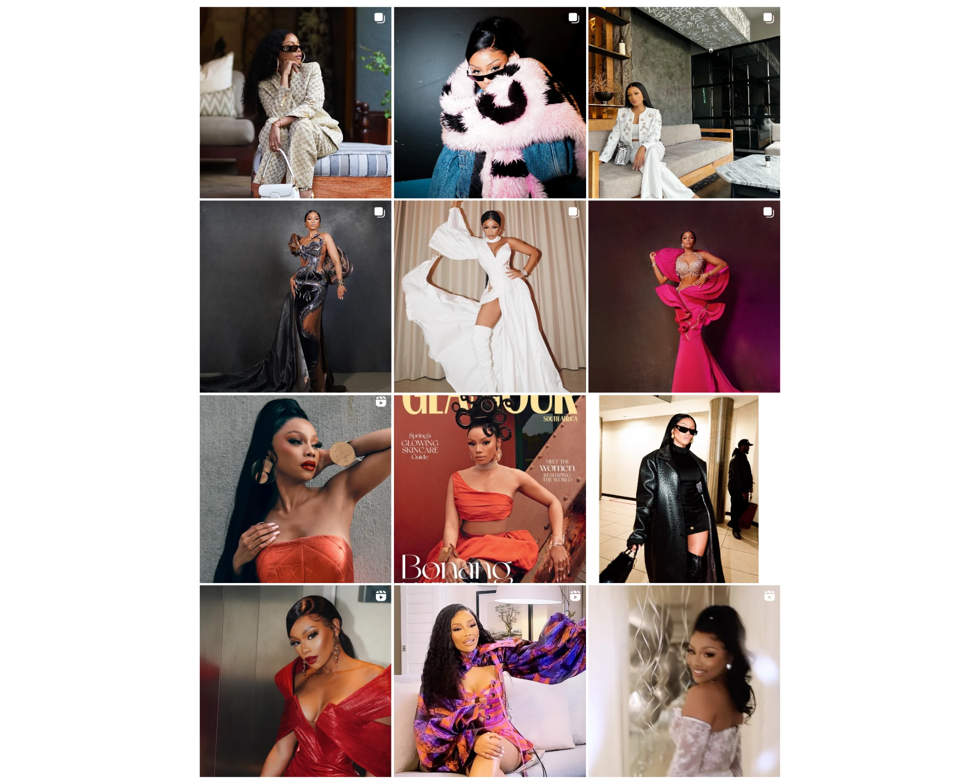
As we ventured into the design phase, my overarching objective was to inject sophistication, user-friendliness, and a timeless charm into the website. I envisioned a digital space that not only captures the essence of Bonang Matheba's vibrant personality but also exudes a level of creativity and expressiveness on par with her Instagram presence.
The goal is to create a seamless synergy between the website and her social media content, ensuring they harmoniously complement each other.
My vision was to craft a website that not only magnetizes high-end clients but also resonates with the legions of content creators who admire Bonang. I aimed for an aura of maturity, reflecting the elegance of Bonang's brand, all while accentuating her unique personality and style.
Incorporating Elements:
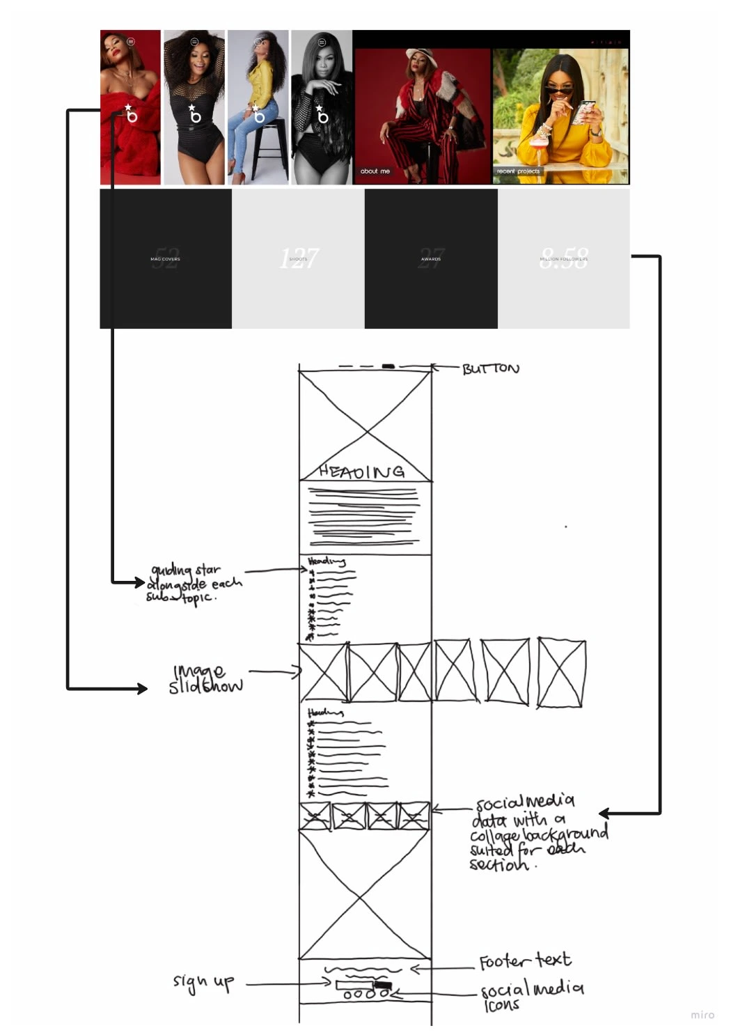
While it's undeniable that the current website is quite outdated, there were some hidden gems that I felt deserved a place in the revamped design. One striking aspect that emerged from Bonang's Instagram is the pivotal role that photoshoots play in her brand narrative. These captivating visuals are more than just snapshots; they are windows into her world. With this in mind, I chose to continue using the visually stunning slideshow featuring some of her most iconic photoshoot moments.
Another element that's impossible to overlook is Bonang's distinctive logo, adorned with a star. To enhance clarity and make the information easily digestible, I incorporated this star as a visual cue, alongside each sub-topic.
Mid-Fidelity Sketch
Next up I moved forward to create mid-fidelity wireframes. These wireframes serve as the design skeleton, helping me visualize how the website's content will adapt and perform on desktop computers.

Style guide
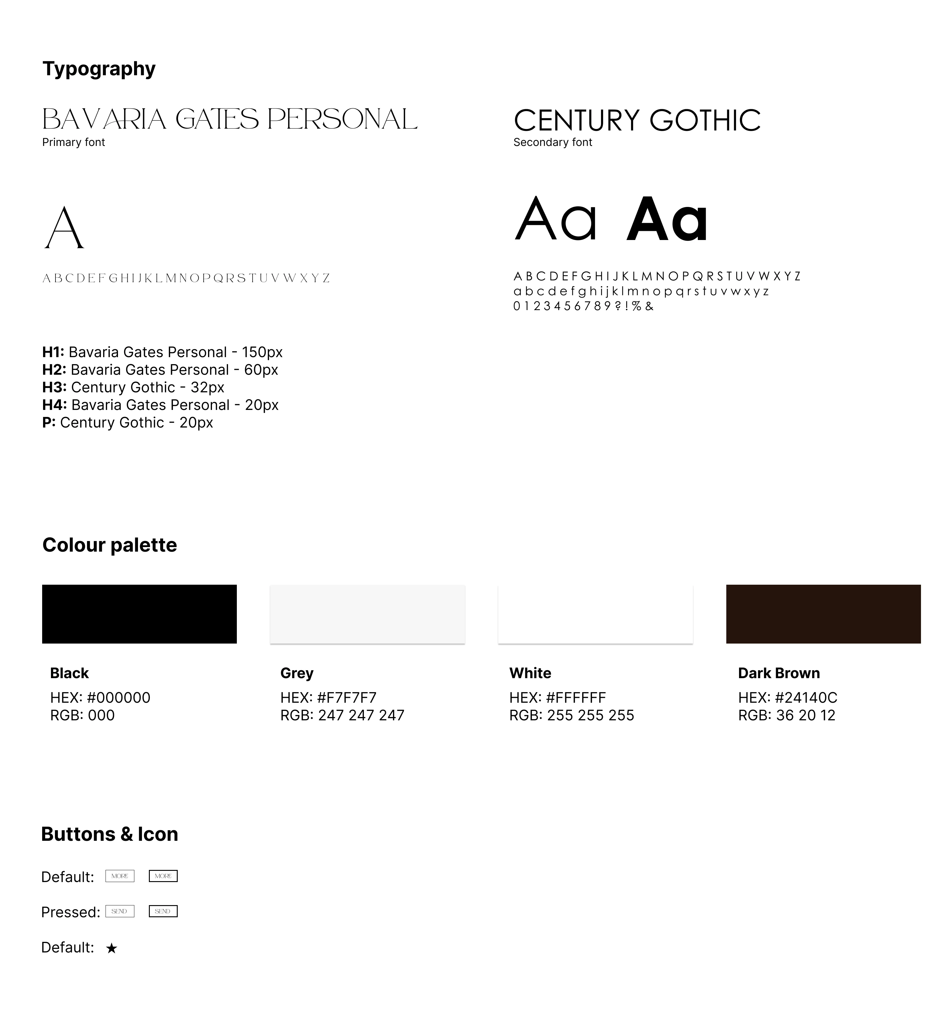
The choice of “Bavaria Gates Personal” and “Century Gothic” for typography reflects a balanced and engaging approach to the design. “Bravaria Gates Personal” offers a sophisticated character, while “Century Gothic” offers a clean and sleek approach, easy for one to read.
My focus was on crafting a colour scheme that strikes a balance. I gravitated towards a neutral palette, encompassing shades of black, white, grey, and dark brown. The goal here was to achieve a delicate balance, ensuring that the website doesn't swing into an area of darkness and monotony.
The reason behind this choice also stemmed from the fact that Bonang's imagery naturally harmonizes with these neutral tones. I aimed to create a flow between her captivating images and the colour palette, resulting in a design that not only captivates the eye but also maintains a sense of balance and sophistication.
Before & After Comparison and High-Fidelity Design
When comparing both the previous and redesigned websites, I'm confident that I've effectively translated Bonang's distinctive brand personality to resonate with the visual style she curates across her social media platforms. While the colour palette leans towards neutrality, it's far from dull or overly dark. Bonang's vibrant imagery infuses the website with a perfect touch of colour and life.

Summary and Learning Keys
It's essential to maintain consistency with the brand personality and identity of the individual or entity the website represents. Bonang Matheba's brand personality and social media aesthetic served as guidelines throughout the design process.
I believe there's room for improvement in terms of button sizes, which could be more compact without compromising usability. Additionally, the legibility of the social media data section may need some fine-tuning for a smoother reading experience.
To explore these enhancements further, I have implemented this project using Framer. This has allowed me to assess its functionality and appearance on tablet and mobile screens, ensuring optimal performance and user-friendliness across all devices.
In conclusion, this project exemplifies the importance of merging UX design principles with a deep understanding of the brand personality to create a visually appealing and user-friendly website that resonates with both high-end clients and content creators.
Like this project
Posted Sep 29, 2023
Take a look at Bonang Matheba: Award-winning TV host, actress, and trailblazing Black South African personality website landing page redesign.
Likes
0
Views
45
