Mom to Virtual Assistant: Website and Instagram designs

The main goal for Mom to Virtual Assistant was to make the website and Instagram a harmonious experience, using the same colours in the app mainly purple, pink, and orange, allowing users to seamlessly transition between the two. The current look and feel for both the website and Instagram is dull and not inviting. I've kept the design simple yet sophisticated, ensuring clear and easy navigation for clients and virtual assistants. The main objective is to create a user-friendly and visually appealing experience that makes you want to dive in, explore, and be a part of the Mom to Virtual Assistant journey.
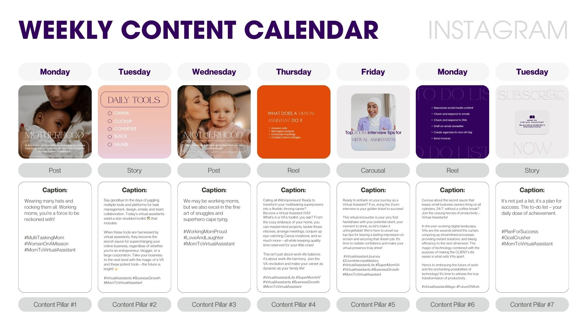
Take a look at the comparison of the current and new designs for both the website and Instagram feed as well as a preview of an Instagram monthly calendar.
Before and After Website Landing page
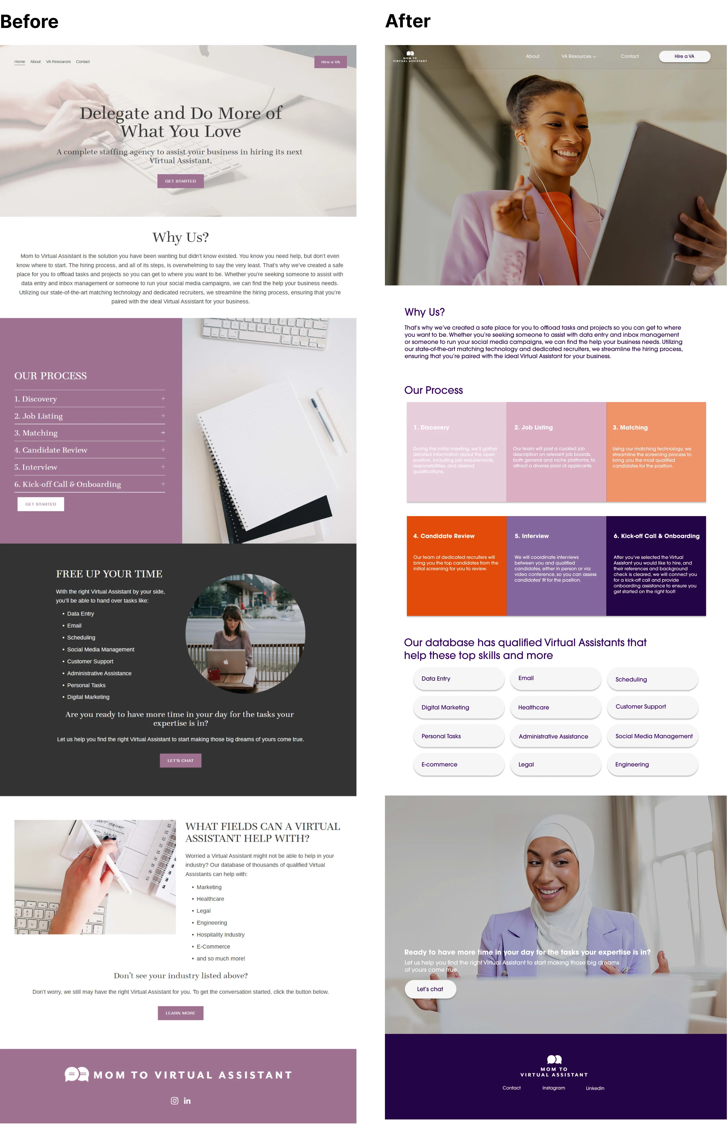
Website Landing page Redesign

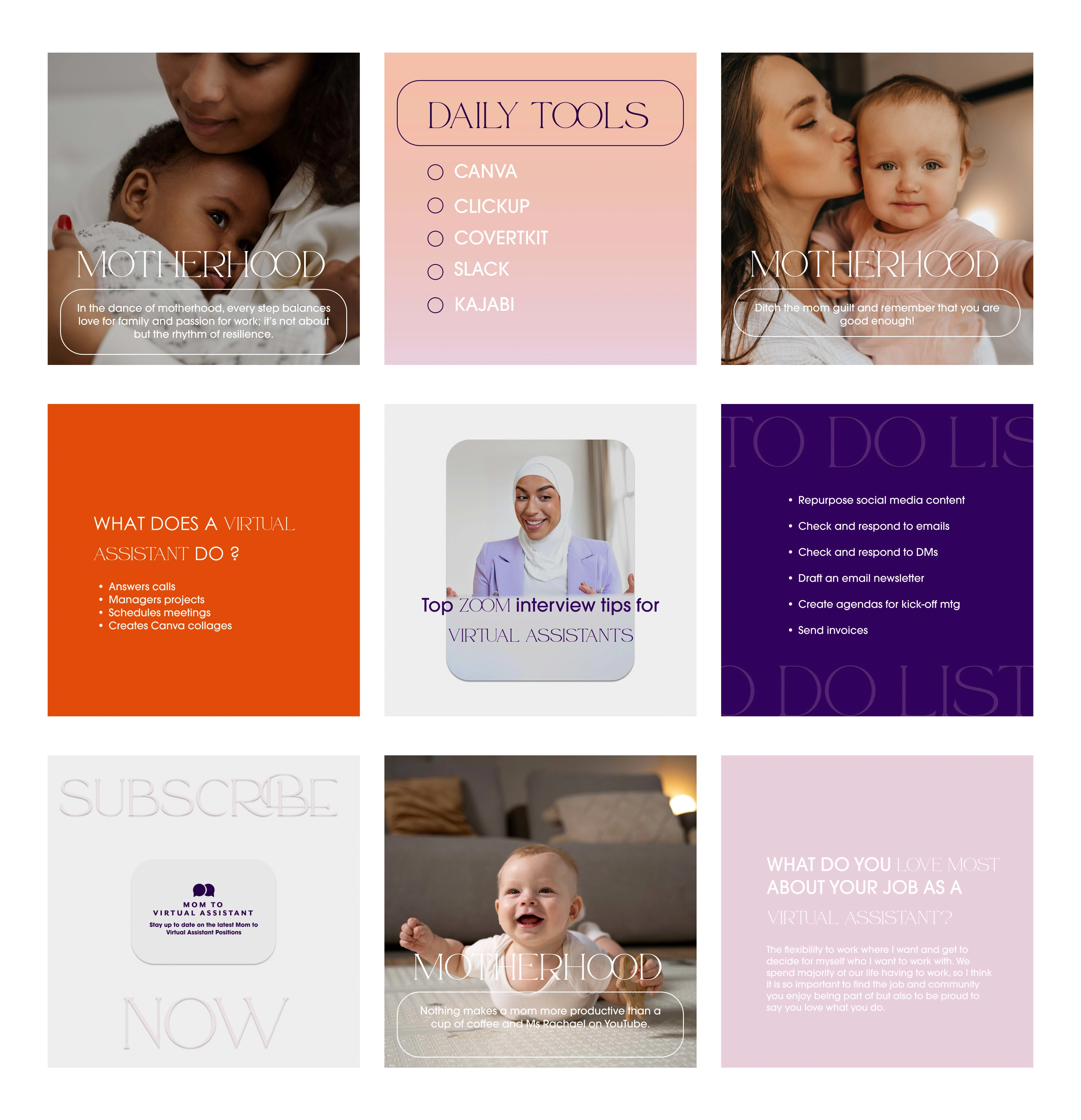
Before & After Instagram Feed
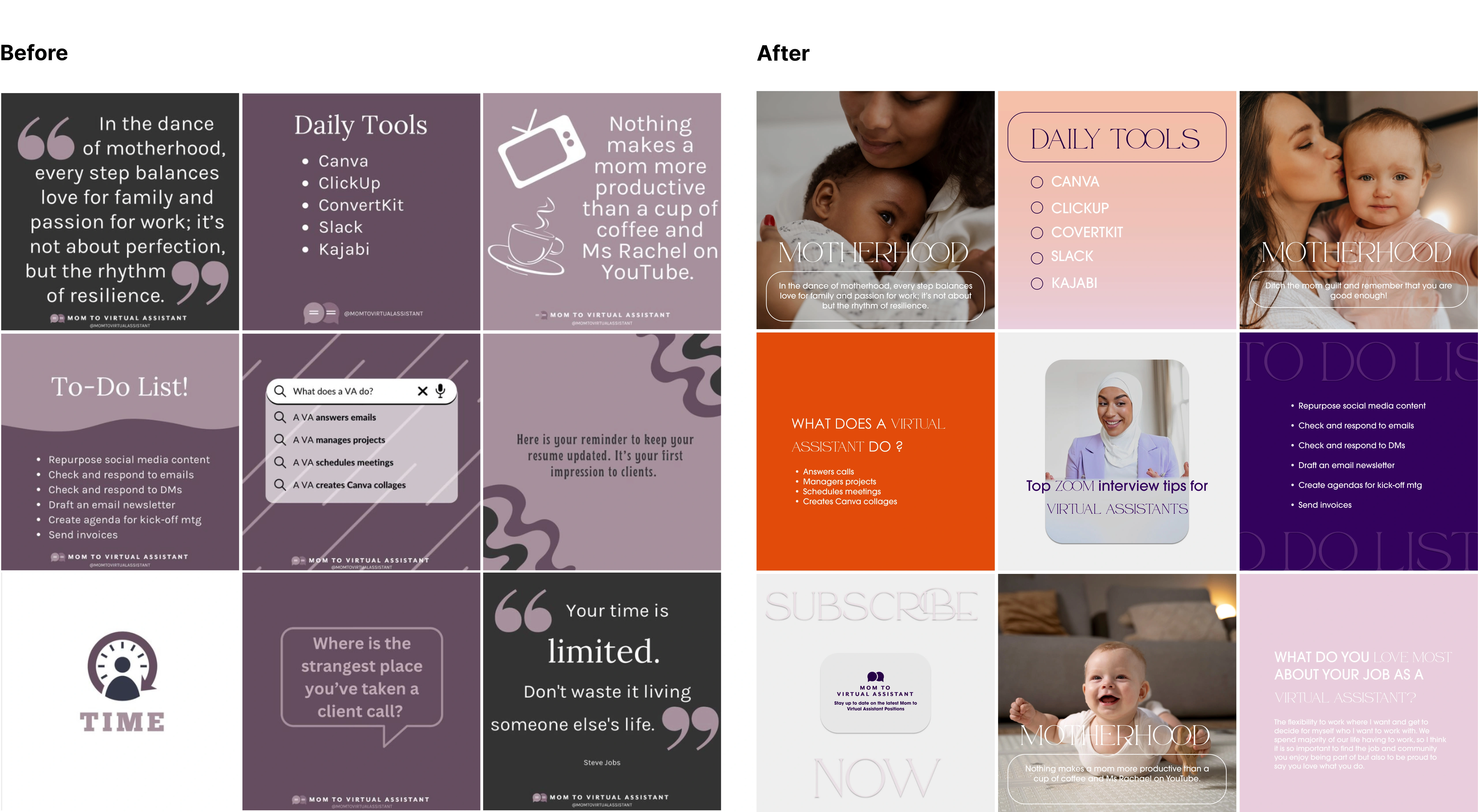
Redesigned Instagram Feed
Instagram Weekly Content Calendar
Like this project
Posted Oct 24, 2023
Take a look at Mom to Virtual Assistant: Finding a Virtual Assistant in every mom.
Likes
0
Views
20
