Business Card Design - Vitrag & Tulasyam

Hitarth Nayak


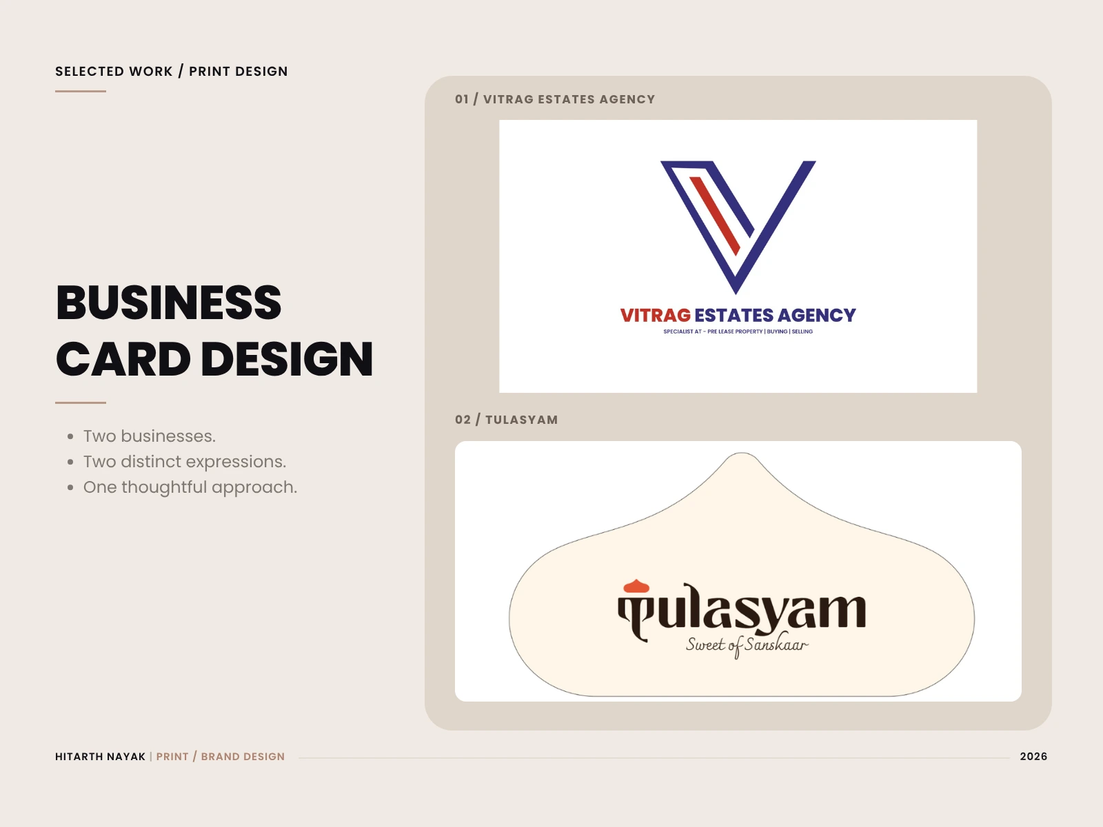
A business card is a small introduction to a business. Its layout, colours and shape help communicate the personality behind the name.
This collection brings together two visiting card projects: Vitrag Estates Agency, a real estate business and Tulasyam, a sweets brand specialising in laddoo.
Vitrag takes a structured approach through bold typography and angular graphics. Tulasyam explores a warmer, more expressive direction through colour and a custom silhouette. Both designs aim to balance a distinctive brand presence with clear contact information.
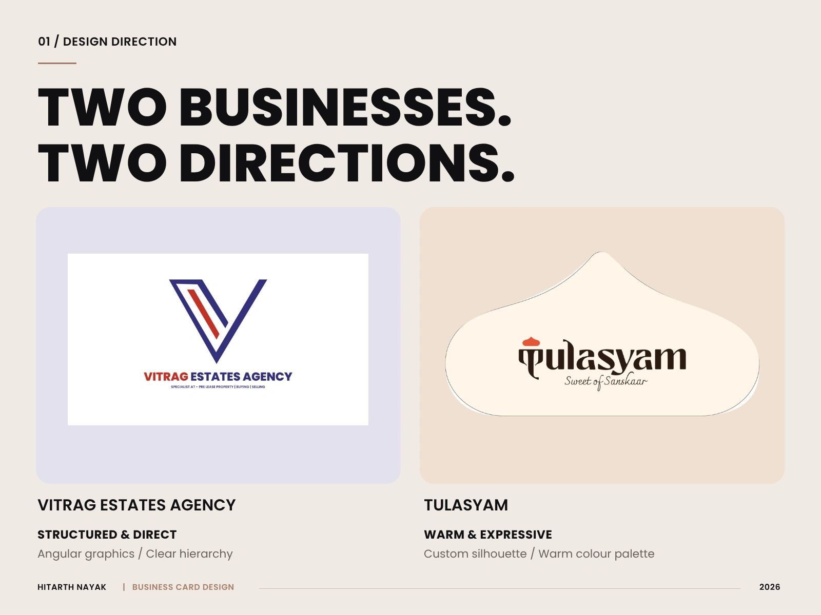
01 - Two businesses, two directions
Vitrag Estates Agency takes a structured visual direction. Its rectangular format, angular logo and navy and red palette create a direct, professional introduction to the business.
Tulasyam’s sweets business inspired a warmer approach. The custom silhouette, expressive lettering and cream and orange palette make the card’s shape part of its personality.
The shared principle is simple: each card should feel connected to the business it represents.
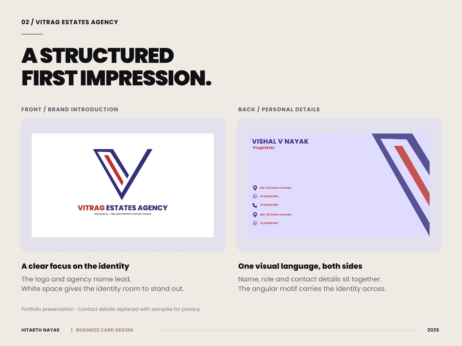
Contact details shown have been replaced with samples for privacy.
02 - Vitrag: A structured first impression
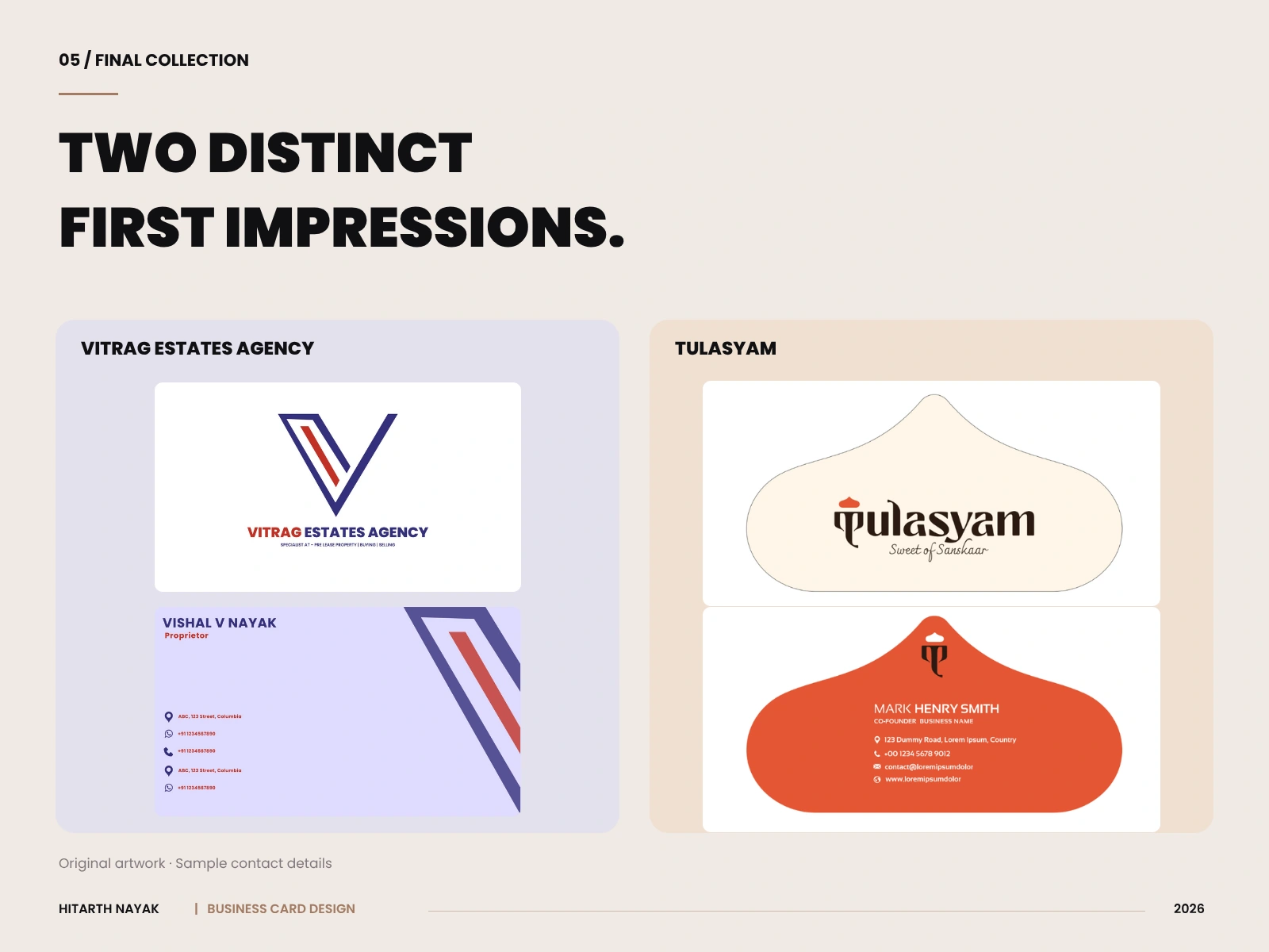
The front gives the logo and agency name the main focus, with white space around the identity and a short service line beneath.
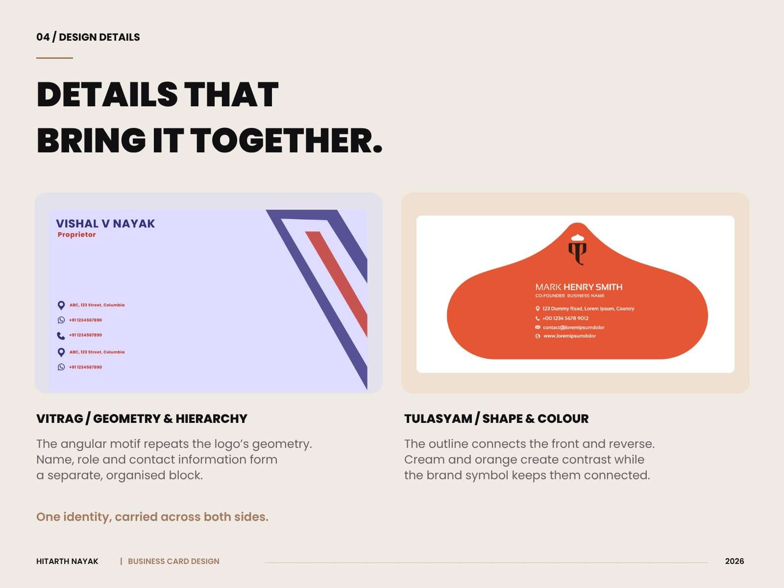
On the reverse, the individual’s name and role sit above the contact information. An enlarged angular motif repeats the geometry of the logo, connecting both sides through shape and colour.
The front introduces the agency, the reverse carries the personal details.
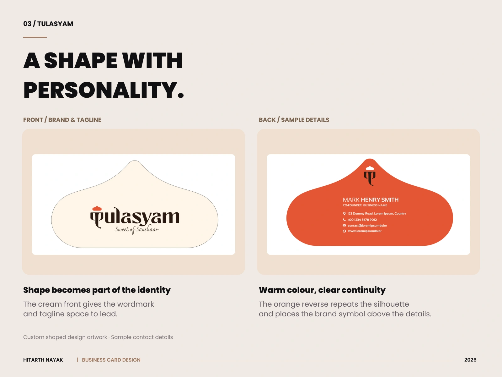
Contact details shown have been replaced with samples for privacy.
03 - Tulasyam: Personality through form
Tulasyam’s sweets business informed the direction of the card. The custom outline makes the shape itself part of the brand expression.
The cream front gives the wordmark and tagline room to stand out. The orange reverse creates a stronger colour field, with the brand symbol placed above the contact information. Repeating the silhouette ties the two sides together.
The custom shape is presented as design artwork. Production specifications would be confirmed with the printer before printing.
Contact details shown have been replaced with samples for privacy.
04 - Details that connect the two sides
Both projects give the brand introduction and contact information separate spaces. Selected visual elements repeat across the card to make the two sides feel connected.
For Vitrag, that connection comes through angular geometry and colour. For Tulasyam, it comes through the custom outline, brand symbol and warm palette.
Each element has a purpose: establish recognition, organise information or reinforce the business’s personality.
05 - Final collection
The completed designs bring together two distinct approaches: a structured rectangular card for Vitrag Estates Agency and an expressive custom shape for Tulasyam.
These projects show how typography, colour, layout and form can adapt the same everyday item to different businesses.
Looking for a business card that fits your brand? Explore my Business Card Design for Print & Digital service or message me on Contra with your requirements.
Like this project
Posted Sep 12, 2026
Business cards for Vitrag Estates Agency and Tulasyam, combining clear information hierarchy, distinct brand colours and a custom sweets inspired silhouette.