Ochre & Oak - Social Media Visual System

Hitarth Nayak


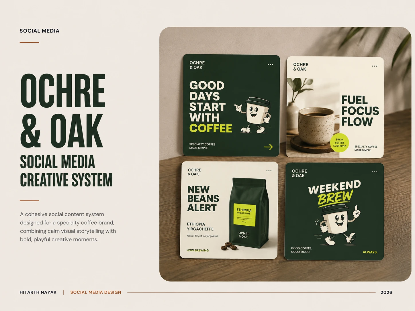
Ochre & Oak
A social media visual system designed for Ochre & Oak, a specialty coffee brand built around slow mornings, thoughtful coffee and a modern, approachable identity.
The direction balances calm editorial composition with bold, Instagram native moments, using a restrained earthy palette, expressive typography and a distinctive coffee-cup mascot.
The goal was to create a recognizable content system that feels warm, intentional and contemporary without becoming overly polished or corporate.
01 - THE BRAND
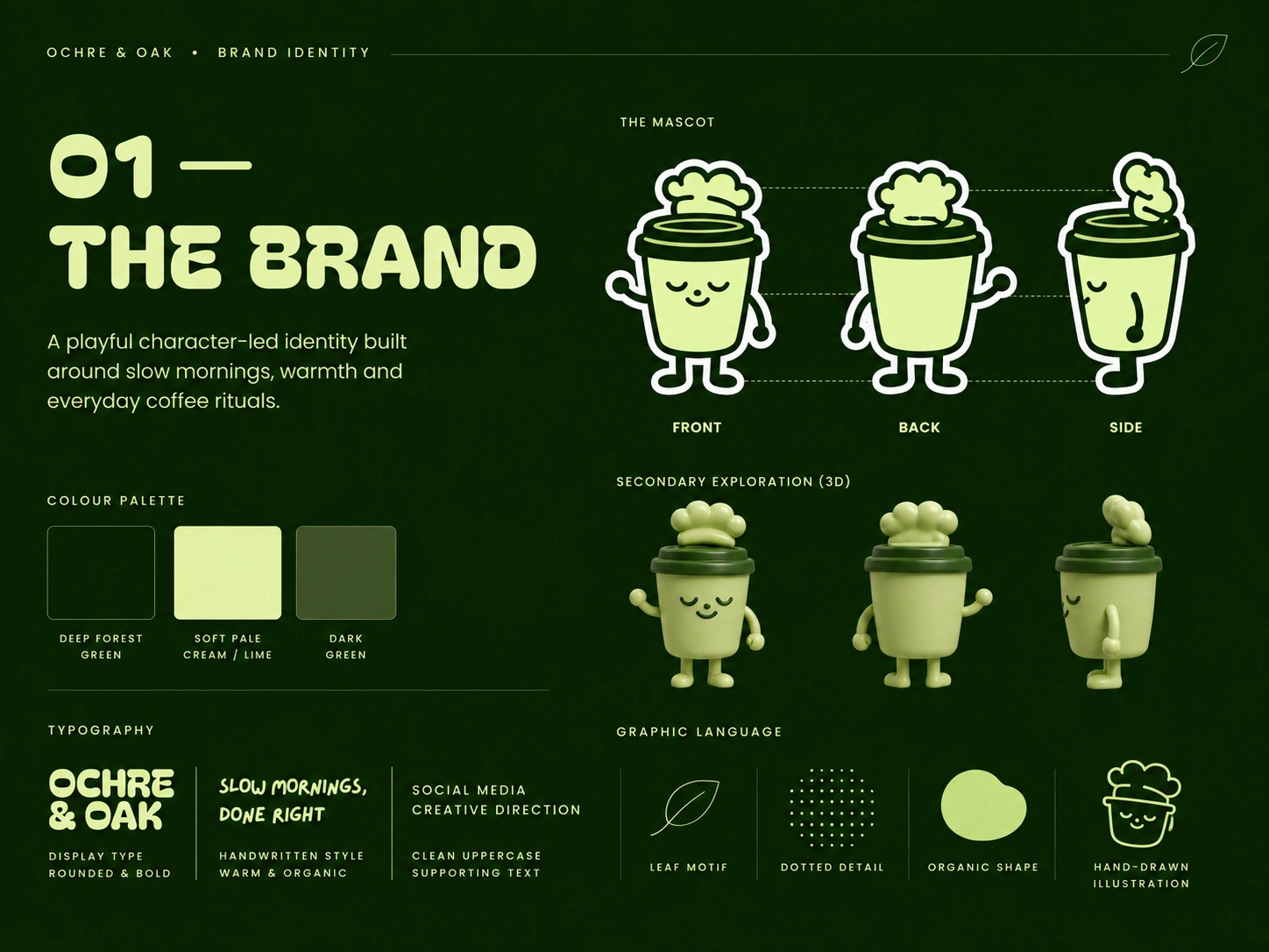
Ochre & Oak’s identity is built around warmth, personality and everyday coffee rituals. The visual direction combines a deep forest palette with soft, expressive typography and a distinctive coffee cup mascot, creating a brand world that feels approachable, playful and contemporary.
02 - VISUAL DIRECTION
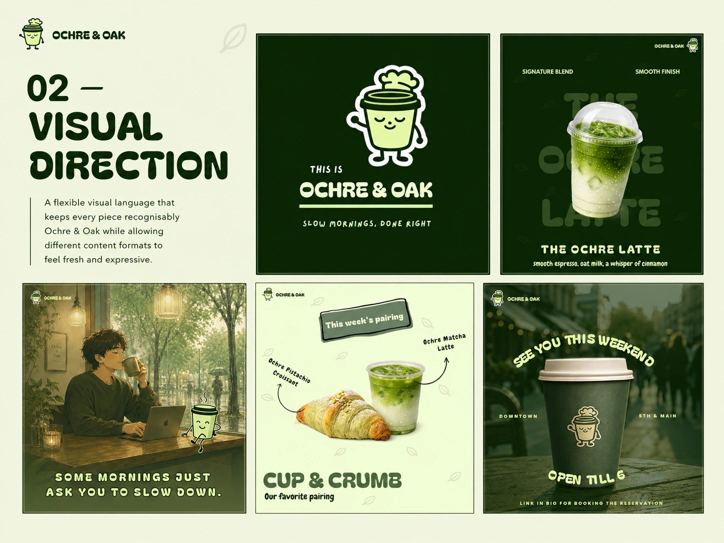
The visual direction combines expressive typography, organic graphic details, warm imagery and a consistent green-and-cream palette. Each piece serves a different content purpose while maintaining a recognisable Ochre & Oak personality.
03 - SOCIAL MEDIA SYSTEM
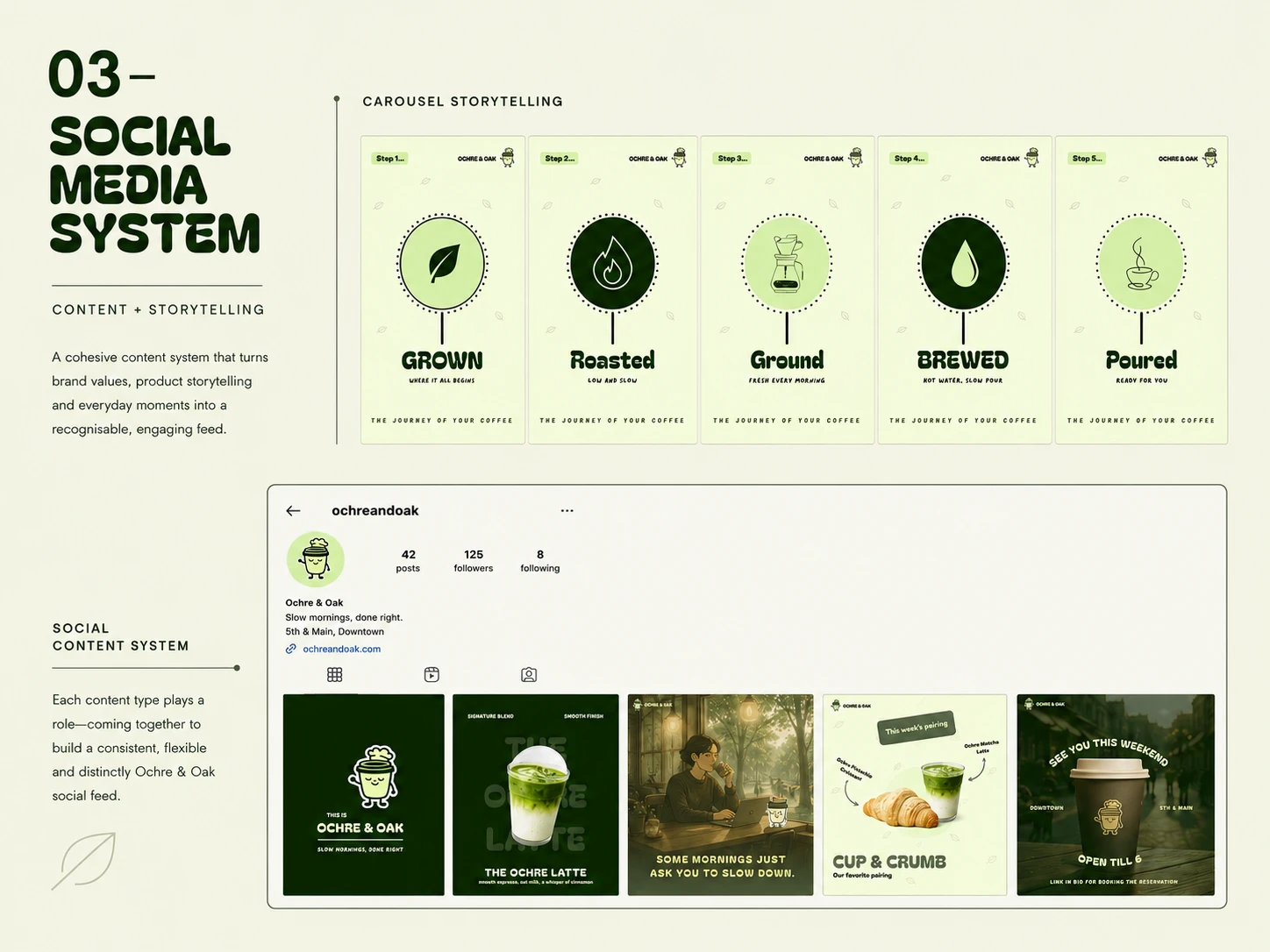
The social system was designed to give Ochre & Oak a consistent visual presence across different content formats. The five-part carousel introduces a clear storytelling structure, while the supporting posts extend the same visual language across product, lifestyle, pairing and promotional content.
04 - CREATIVE APPLICATIONS
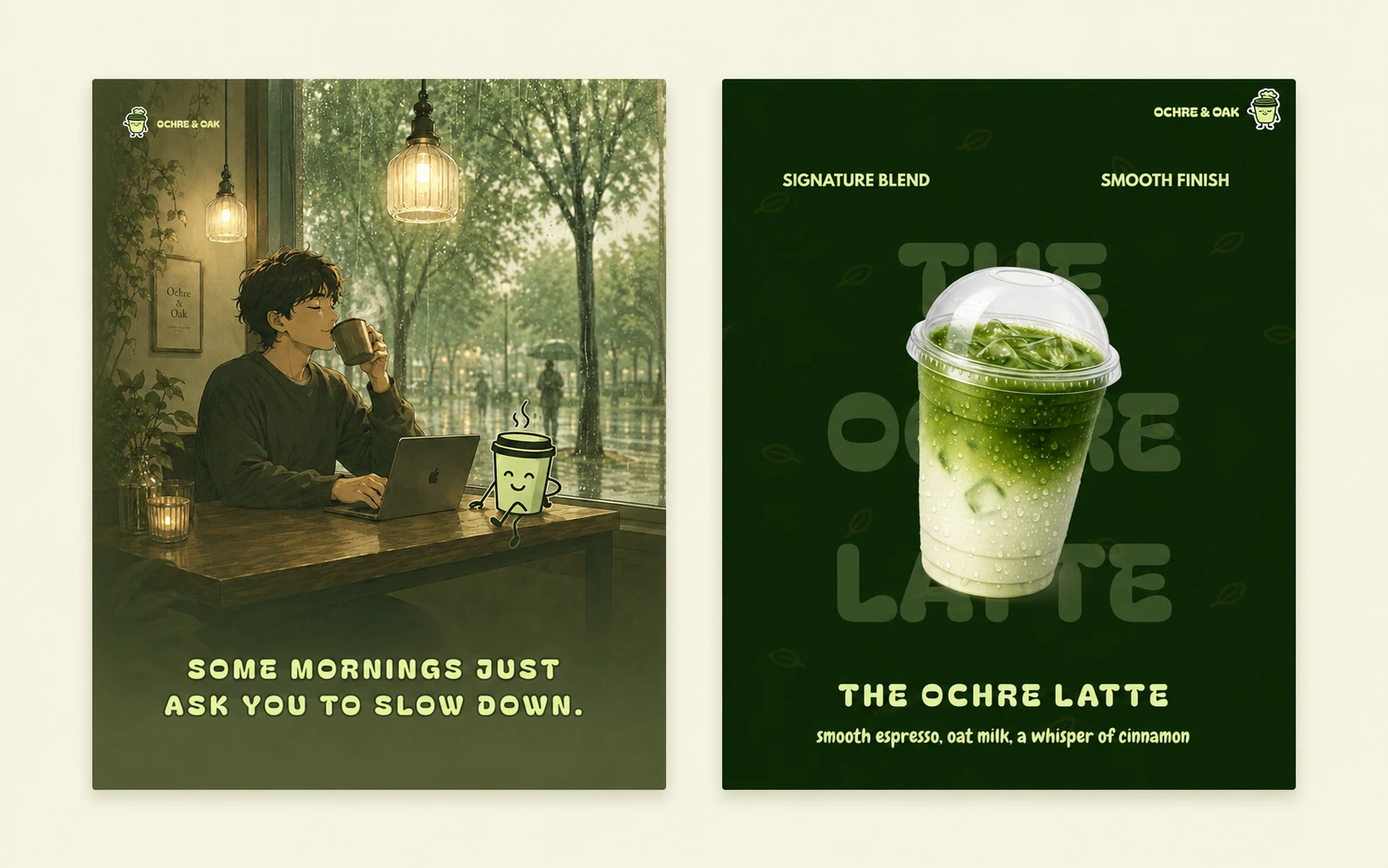
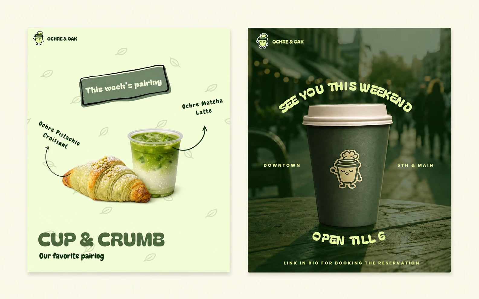
Each creative was designed around a specific communication goal while staying connected through the same visual language, typography, colour palette and character led personality.
05 - FINAL SOCIAL PRESENCE
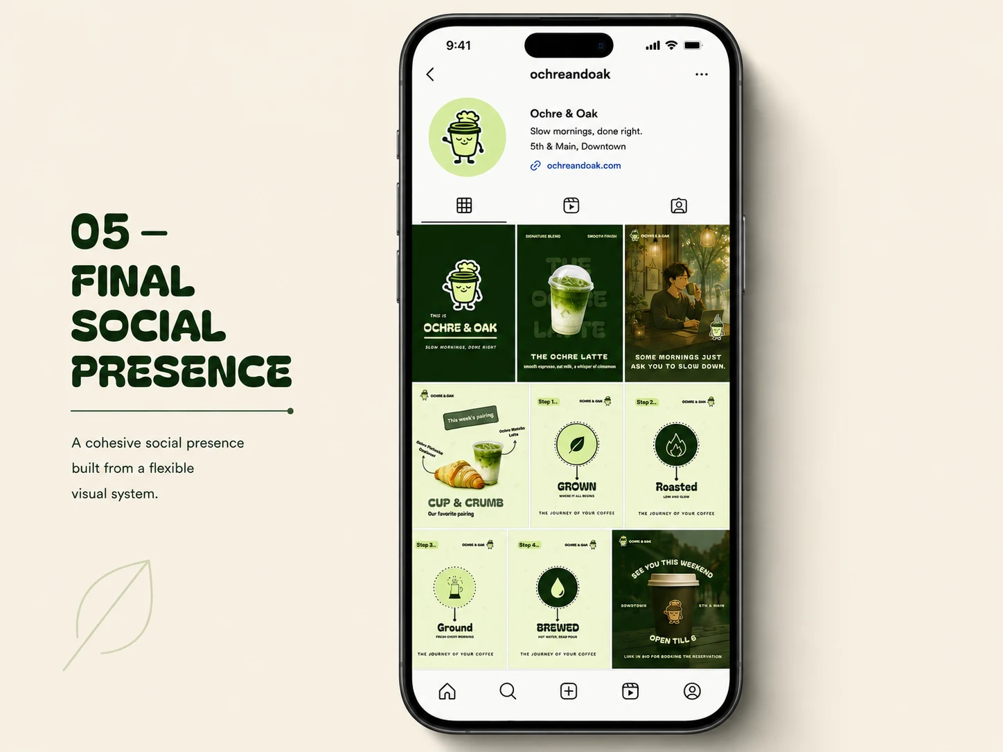
The final system brings the visual language together into a cohesive Instagram presence, balancing product, lifestyle, storytelling and promotional content while keeping Ochre & Oak instantly recognisable across every touchpoint.
06 - OUTCOME
The result is a cohesive social media system that gives Ochre & Oak a distinctive and recognisable visual presence. From brand storytelling and product communication to lifestyle and promotional content, each creative works independently while remaining connected to the same visual language.
Slow mornings, done right - expressed through a brand built to feel just as warm, playful and intentional.
Like this project
Posted Aug 25, 2026
Created a cohesive social media visual system for Ochre & Oak, combining brand identity, content direction, storytelling, and a character-led visual language.