EL PATIO — A Brand for Coffee & Conversation
Matias Lucero
1 collaborator
A contemporary reinterpretation of Argentine café culture in New York.
EL PATIO is a coffee brand conceived as a meeting point. A space where conversation carries the same weight as the cup.
The project reinterprets Argentine café culture in New York through attitude and gesture rather than obvious symbolism. The identity is shaped by everyday details. The way things are served. The music. The tone of the atmosphere.
Familiar in spirit. Contemporary in execution.
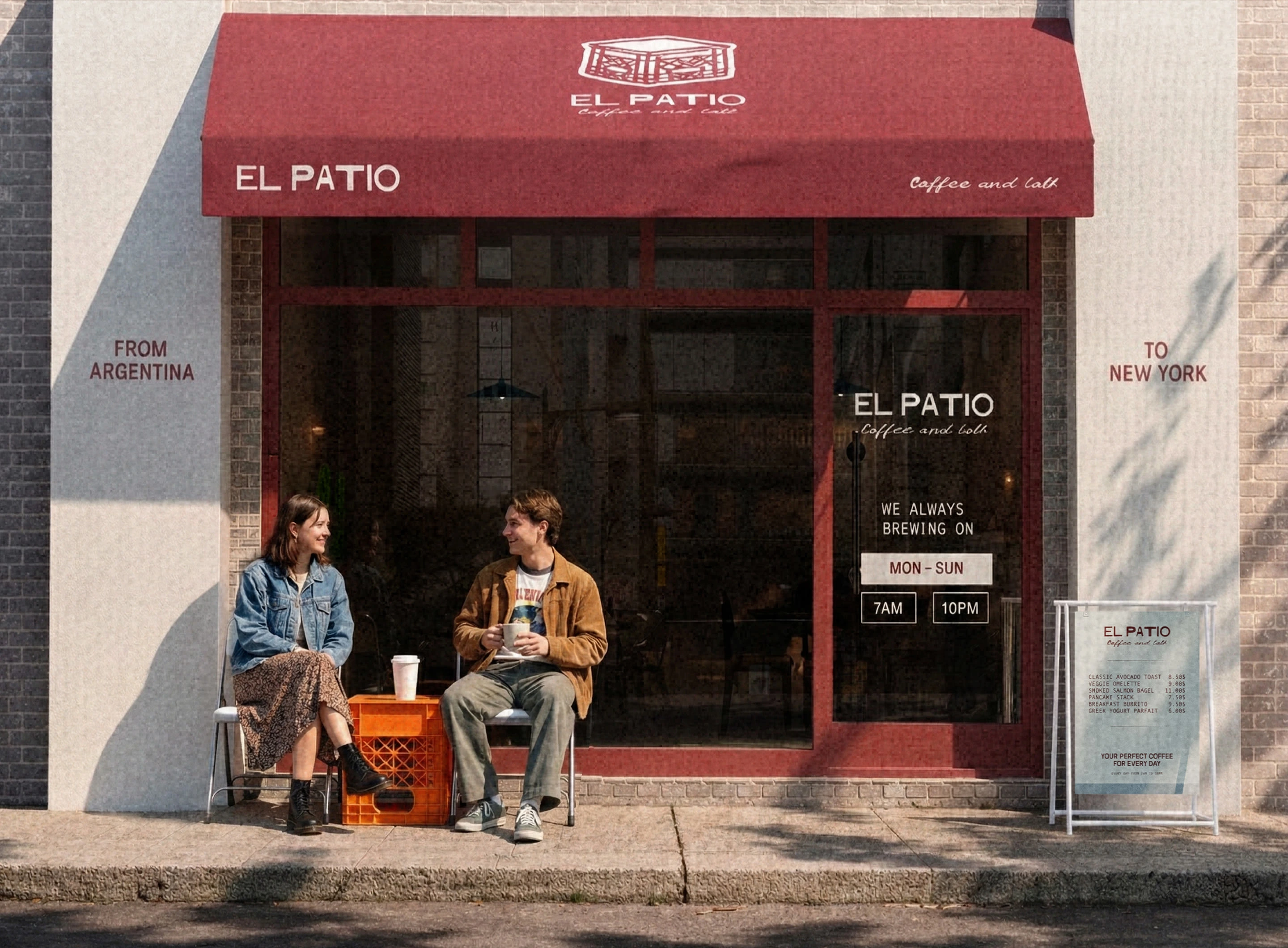
Storefront
New York’s coffee scene is saturated with aesthetic repetition and cultural clichés.
EL PATIO was designed to introduce Argentine café culture without nostalgia. The goal was not to replicate tradition, but to translate it.
Instead of decoration, we focused on behavior. Instead of symbols, we focused on gesture.
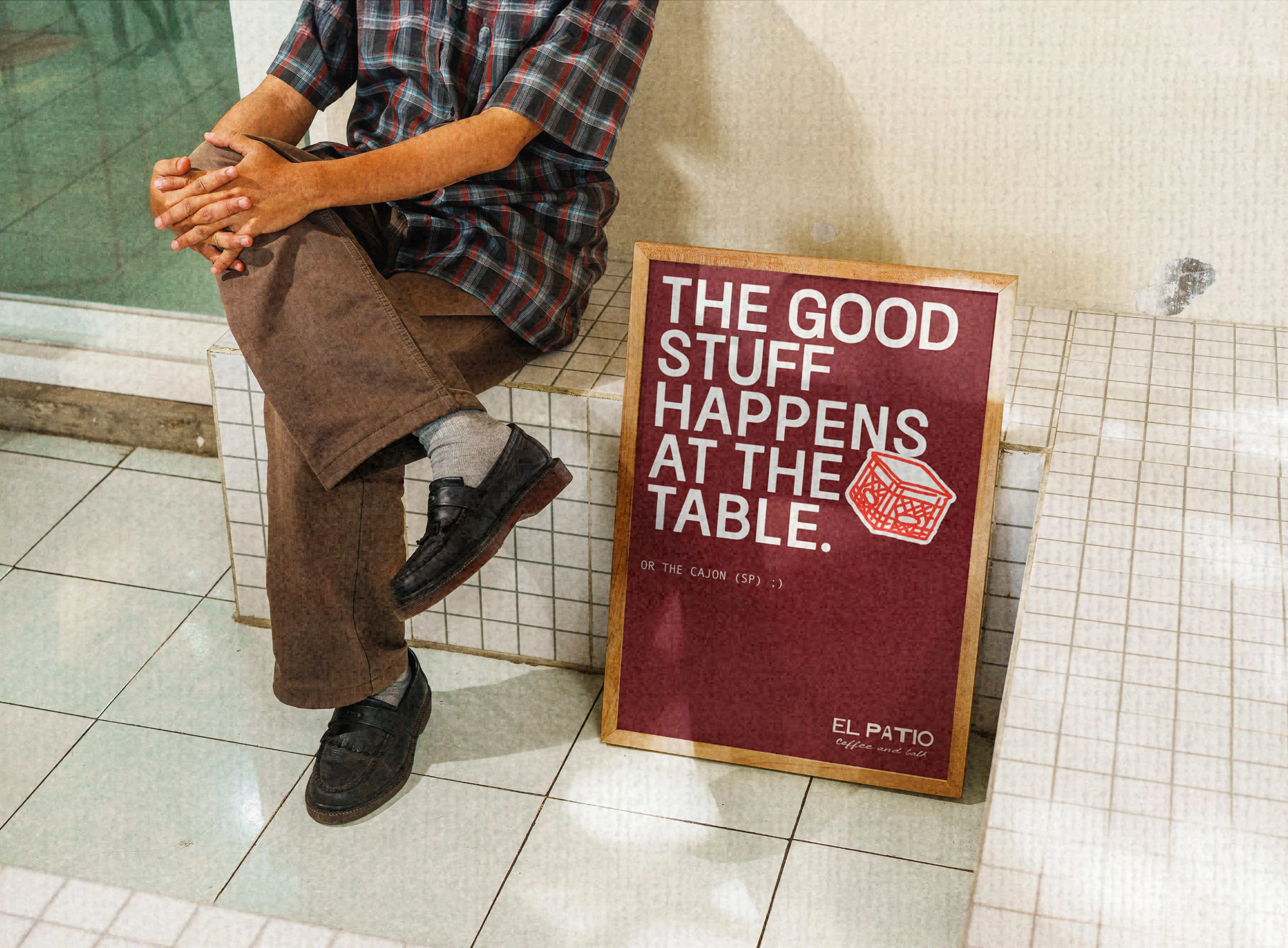
The primary icon draws inspiration from a plastic produce crate turned upside down. A common object transformed into a table.
A simple gesture.
Functional. Unpretentious. Intentional. It captures improvisation and shared moments without relying on literal references.
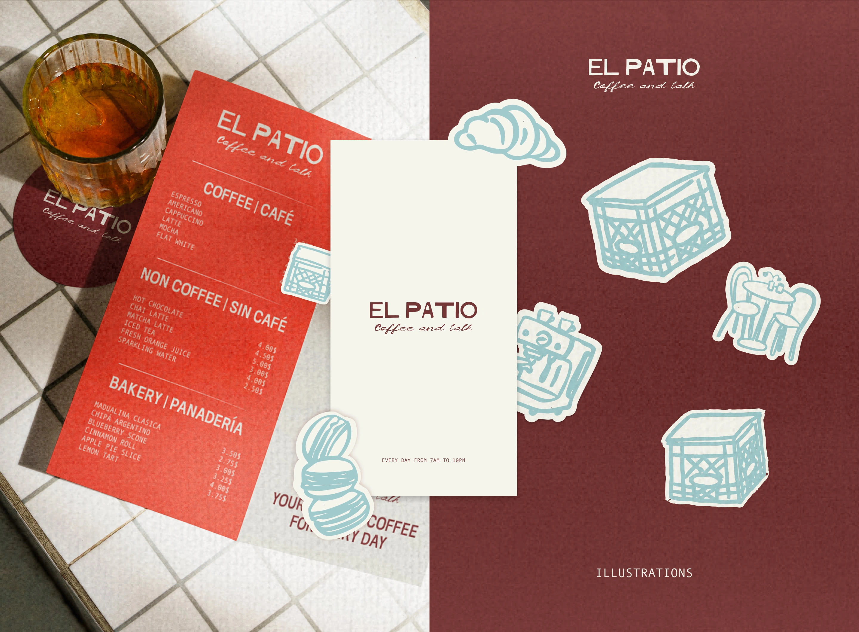
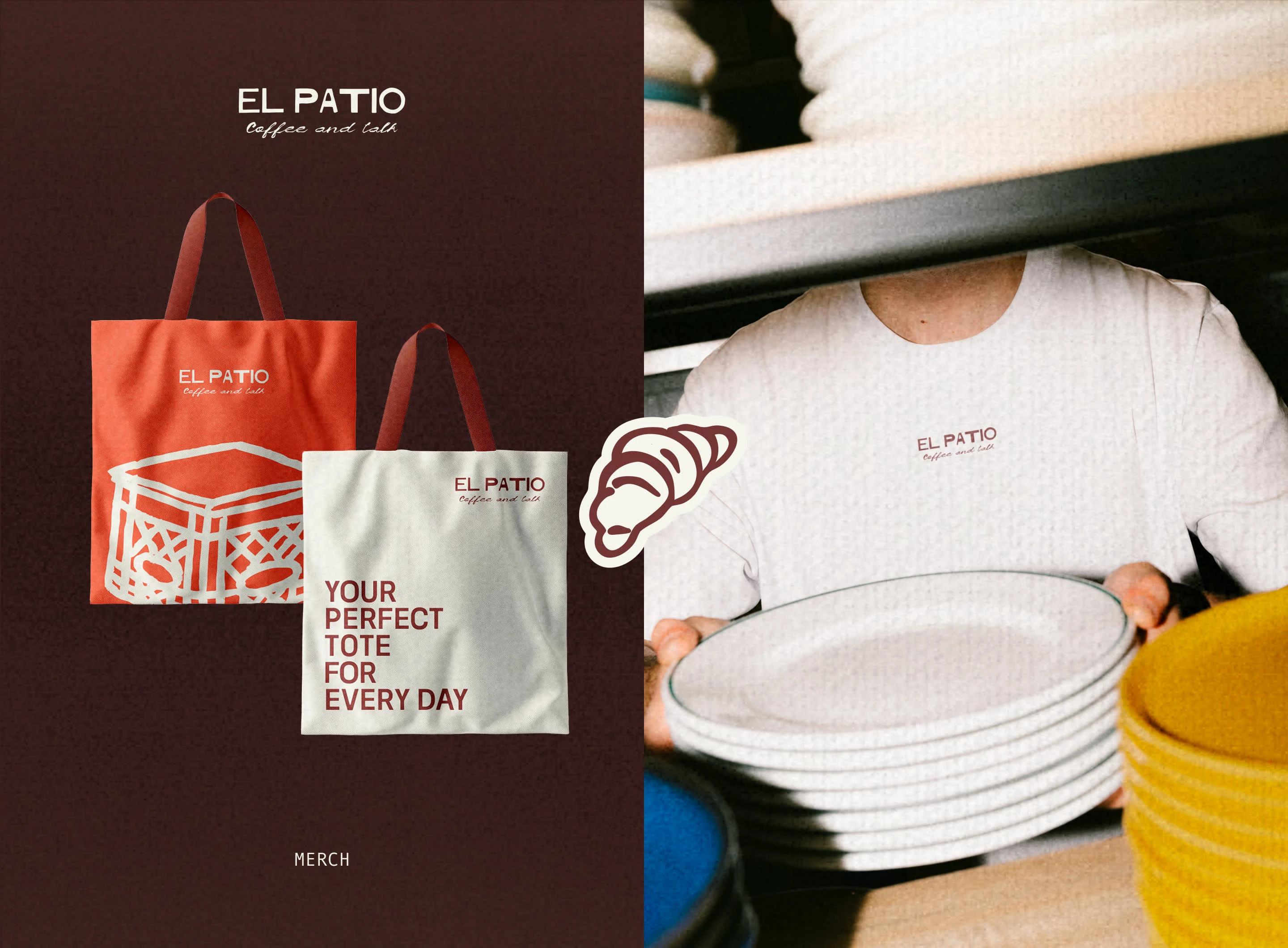
The visual system is restrained and adaptable.
Clean typography provides structure. A warm, grounded palette introduces depth. A flexible graphic language supports illustrations and direct statements.
The result feels urban, approachable, and quietly confident.
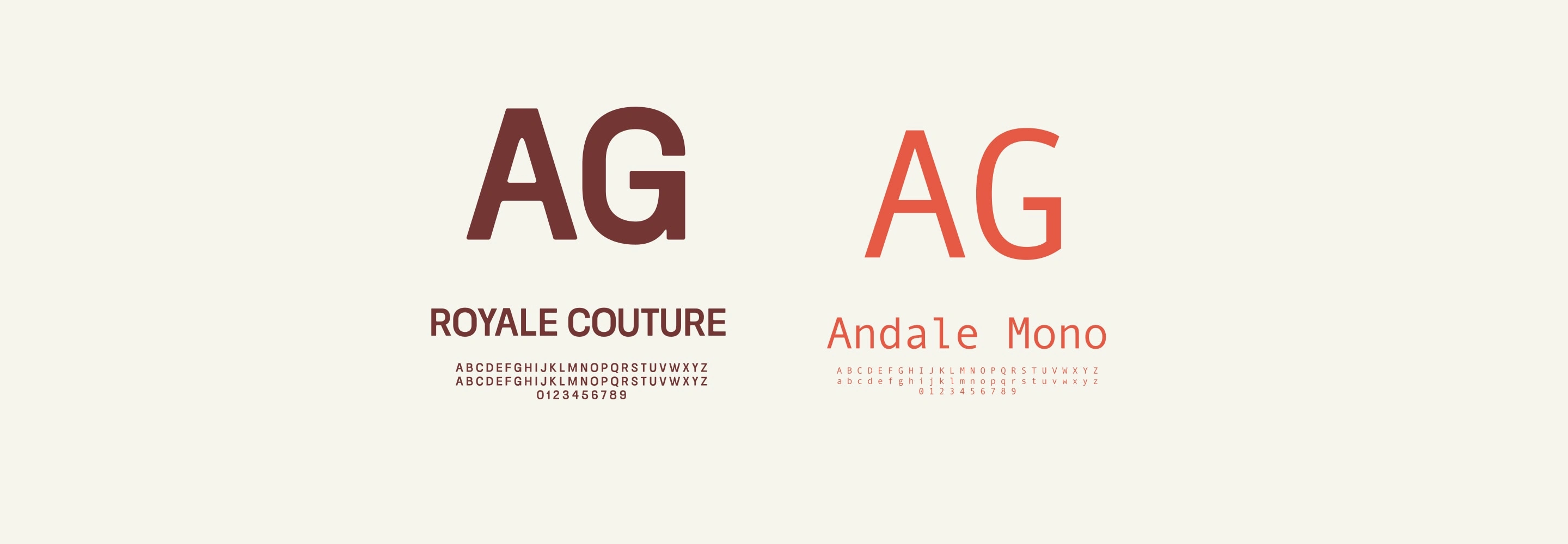
Royale Couture brings presence and character. Andale Mono introduces rhythm and utility.

Grounded neutrals. Deep burgundy. Muted teal. Confident coral.
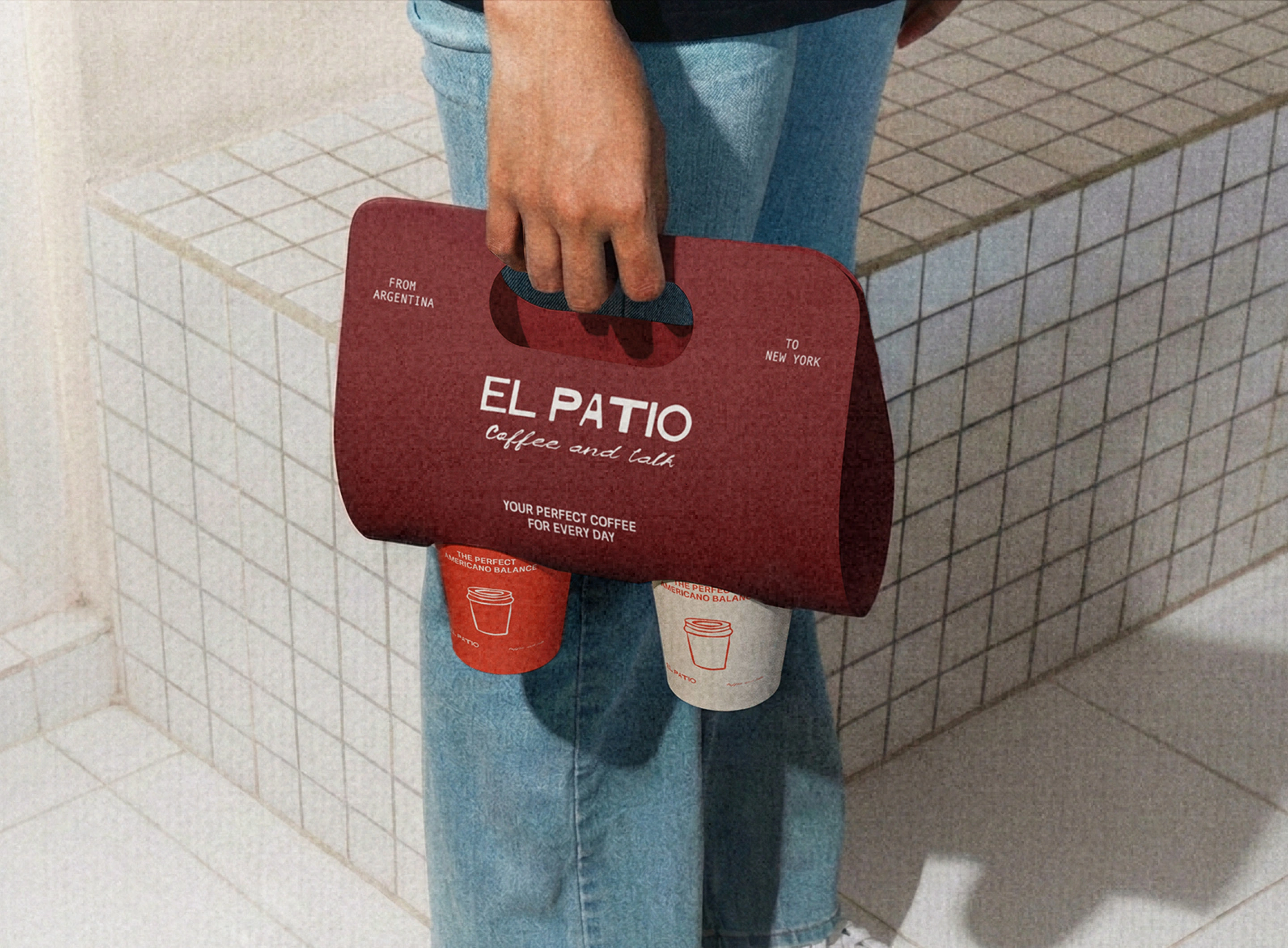
The identity extends across storefronts, packaging, merchandise, and printed materials.
Each touchpoint reinforces EL PATIO as a cultural intersection between Argentina and New York.
EL PATIO is not built on nostalgia. It is built on ritual; a space for conversation. A brand rooted in everyday gestures.
Like this project
Posted Feb 19, 2026
A contemporary reinterpretation of Argentine café culture in New York.
Likes
21
Views
600
Collaborators