Built with Framer
Afromakedoniki Website Redesign & Framer Development

Georgia Tsiouli


Afromakedoniki Website Redesign — From Static Wix to a Custom Framer Experience
Who They Are
Afromakedoniki is a family-run foam cutting and trading business based in Evosmos, Thessaloniki, with over four decades of operation since 1982. The company caters to both individual customers and trade professionals — supplying precisely cut foam for a wide range of applications including seating and furniture, sleep and mattresses, and industrial or commercial uses.
As a workshop-first business, Afromakedoniki operates exclusively from its premises: customers bring their requirements and collect their orders on-site. There is no delivery service. This model places particular import
What the Owner Wanted to Achieve
The brief was rooted in a very practical frustration: too many phone calls. Visitors had no way to self-serve basic information, so every question — from product options to operating hours to how to prepare for a visit — ended up as a call to the owner. The redesign needed to fix that at its root.
Reduce Unnecessary Phone Calls Give visitors enough information online that routine questions — what foam types are available, what applications they cover, how the process works — no longer require a phone call.
Clarify the Visit Process Clearly communicate that the business operates on-site only (no delivery), and explain exactly what customers should prepare before arriving — namely, bringing a sample piece and having their dimensions ready.
Showcase Products & Applications Properly Move beyond a gallery of scattered finished-work images and present foam use cases in a structured, intuitive way — seating & furniture, sleep & mattresses, professional/industrial — so visitors immediately understand what's available and relevant to them.
Build a More Professional Web Presence Replace the static Wix site with a custom-designed, visually refined experience that reflects the quality and seriousness of a business with over 40 years of expertise.
Improve Discoverability Implement basic on-page SEO to improve search rankings for local foam-related queries in the Thessaloniki area.
What Was Wrong with the Old Site
The existing Wix website had several structural and informational gaps that compounded into a poor user experience — and a significant drain on the owner's time.
Information Gaps
No FAQ section — every common question had to be fielded personally over the phone.
No explanation of the foam types offered, their qualities, or their typical applications beyond a few scattered photos of finished items (sofas, pillows, sunbeds).
No mention that the business does not offer delivery — a crucial operational detail missing entirely.
No pre-visit guidance: customers didn't know to come prepared with dimensions or a sample piece, leading to incomplete orders and wasted trips.
Design & UX Problems
The layout felt static and dated — it didn't project the expertise or longevity of the business.
Content was disorganised with no clear hierarchy, making it hard to scan or navigate quickly.
No clear call-to-action directing different types of visitors (DIY homeowners vs. trade professionals) toward relevant information.
The site lacked any SEO foundation — no structured metadata, no semantic headings, weak local relevance signals.
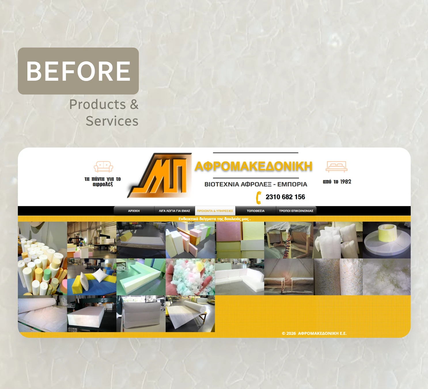
Old Products & Services Web-page
The Solution
The project ran in two phases: design in Figma followed by development in Framer. The guiding principle throughout was clarity — ensuring that every piece of information a visitor might need was surfaced proactively, reducing friction and eliminating the most common reasons for an unnecessary phone call.
Information Architecture
Restructured the site into clearly defined sections: Products (by use case), Services, FAQ, and Visit Us — each addressing a distinct visitor intent.
Dedicated FAQ page covering the most-asked questions: foam types, pricing approach, turnaround, what to bring, and the no-delivery policy.
Explicit "Before You Visit" guidance presented prominently — bring a sample if replacing existing foam, have your dimensions ready, plan to collect on-site.
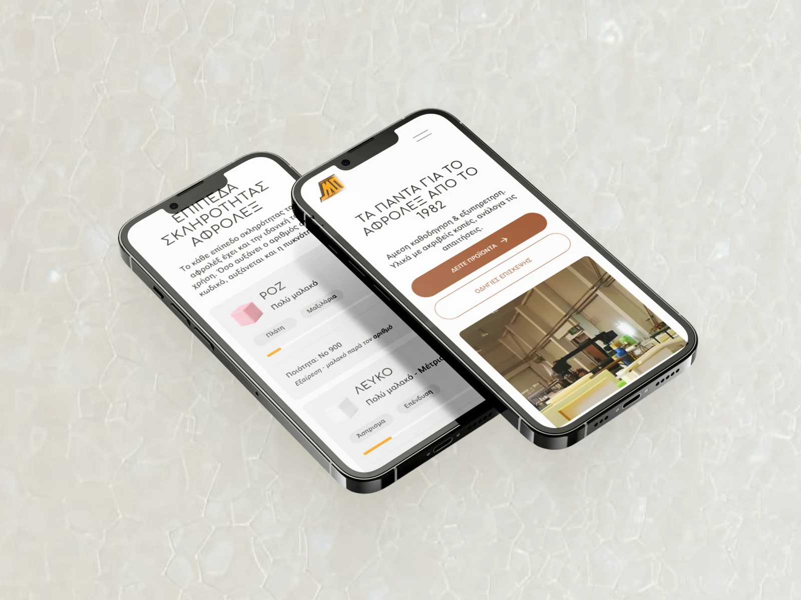
Clear, category-led product structure: Seating & Furniture / Sleep & Mattresses / Professional & Industrial — with real descriptions, not just images.
Visual Design (Figma)
Light, minimal aesthetic with a neutral palette and generous whitespace — conveying precision and professionalism without industrial heaviness.
Clean typographic hierarchy to make the site highly scannable, whether on mobile or desktop.
Before/after photography of real replacement jobs integrated to demonstrate the quality and transformative value of the service.
Smooth, purposeful animations in Framer to add polish without distracting from content.
Technical & SEO
Developed entirely in Framer for a fast, modern, fully responsive output without relying on a legacy page builder.
Basic on-page SEO: semantic heading structure, meta titles, meta descriptions, alt text, and local relevance signals (Evosmos, Thessaloniki).
Clean URL structure and proper page organisation to support long-term search visibility.
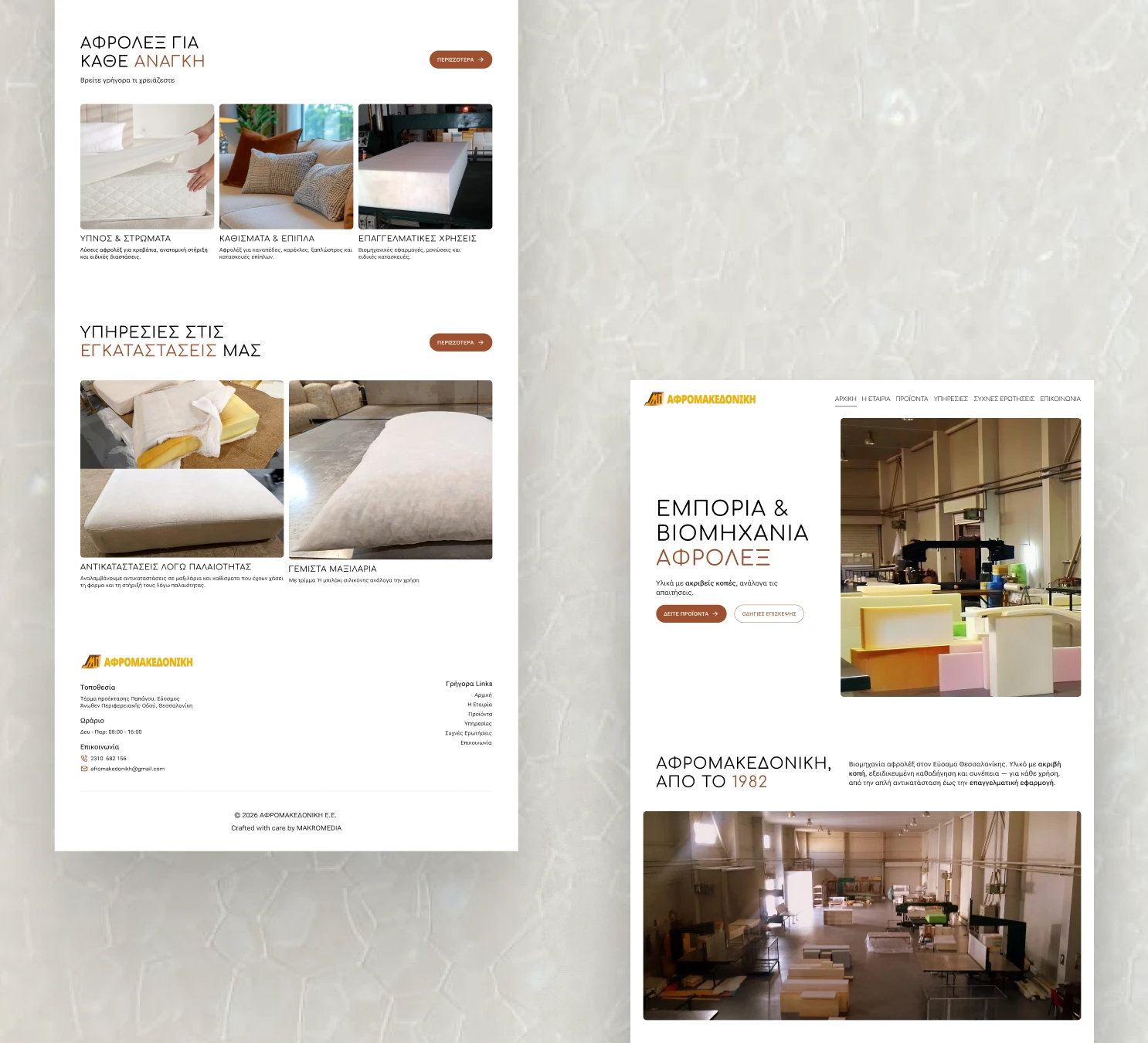
New Homepage
Like this project
Posted May 23, 2026
Wix-to-Framer redesign for a Greek foam industry. Solved a real problem: too many calls, not enough info online. Custom design, FAQs, SEO, clear UX.
Likes
0
Views
8
Timeline
Mar 13, 2026 - May 23, 2026