Built with Webflow
Zencastr: three platforms, one website, three days to launch
Portfolio project

Verified paid workView completed work
Zencastr came to me with a complicated setup: they hosted their homepage on Lovable, blog on a separate platform and the rest of the pages on Webflow.
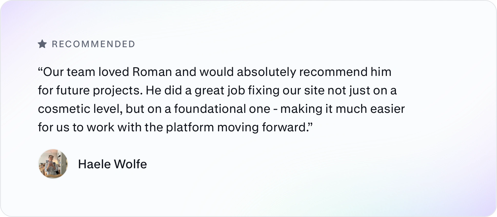
They had 3 days before the launch to tie it all together and build new landing pages. This is their review:
The brief
Zencastr’s designer had laid out the new pages in Figma: twelve feature pages in two styles, a blog feed and a blog post. Their marketing team would fill in the content. My job was to turn the designs into Webflow landing pages the team could fill in themselves. That meant building inside a Webflow site that was already live, in time for a launch the following Tuesday.
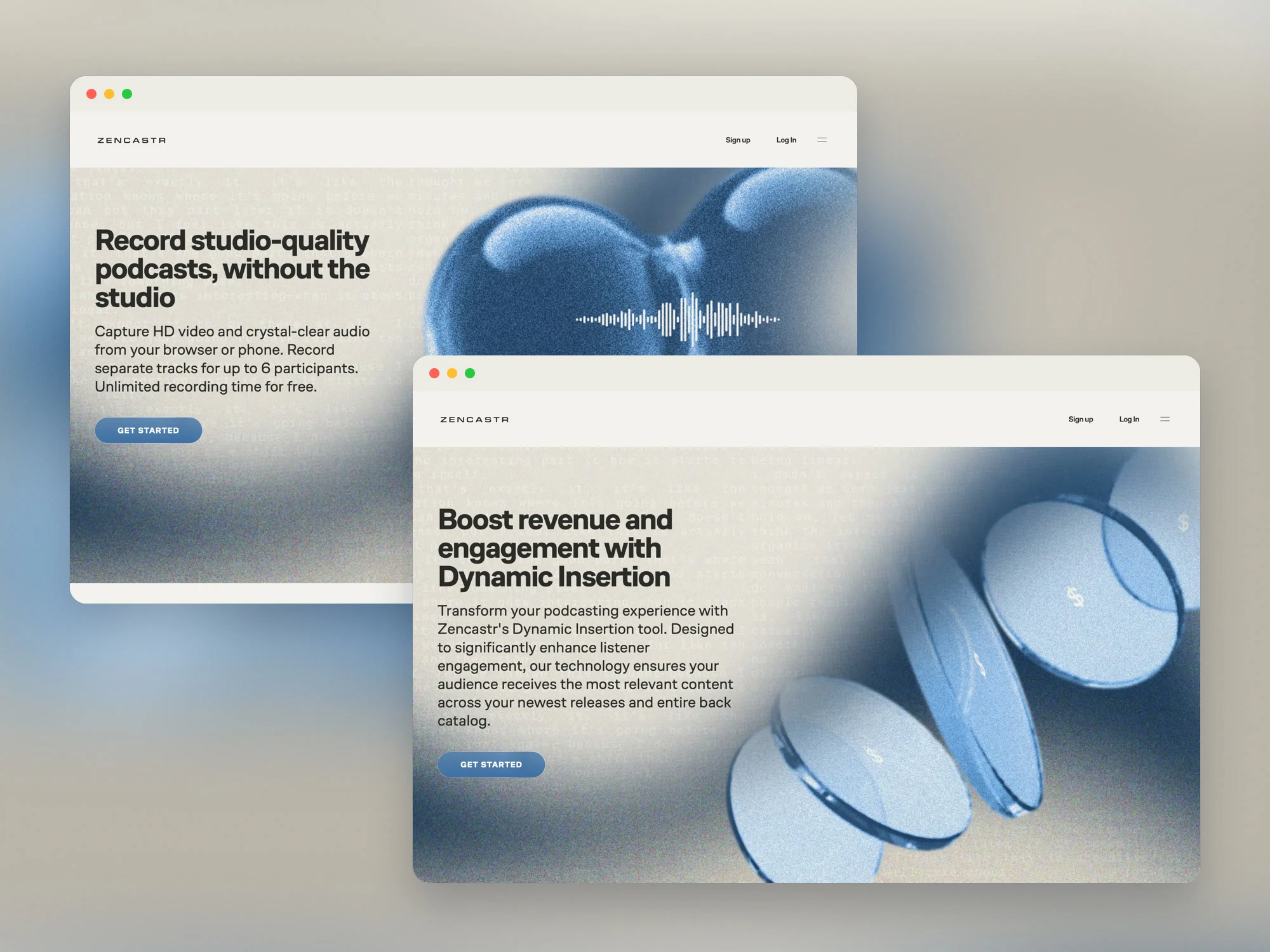
Building inside a live site
The hard part wasn’t the design, it was the site underneath it. Webflow styles are class-based, so a change on one page can show up on another. Before building anything, I learned how Zencastr’s site was put together.
The feature pages were tangled: two page styles shared one CMS collection without being properly separated. I untangled them, so each page shows only the sections it has. Key Features, for example, appears only on the pages that have key features.
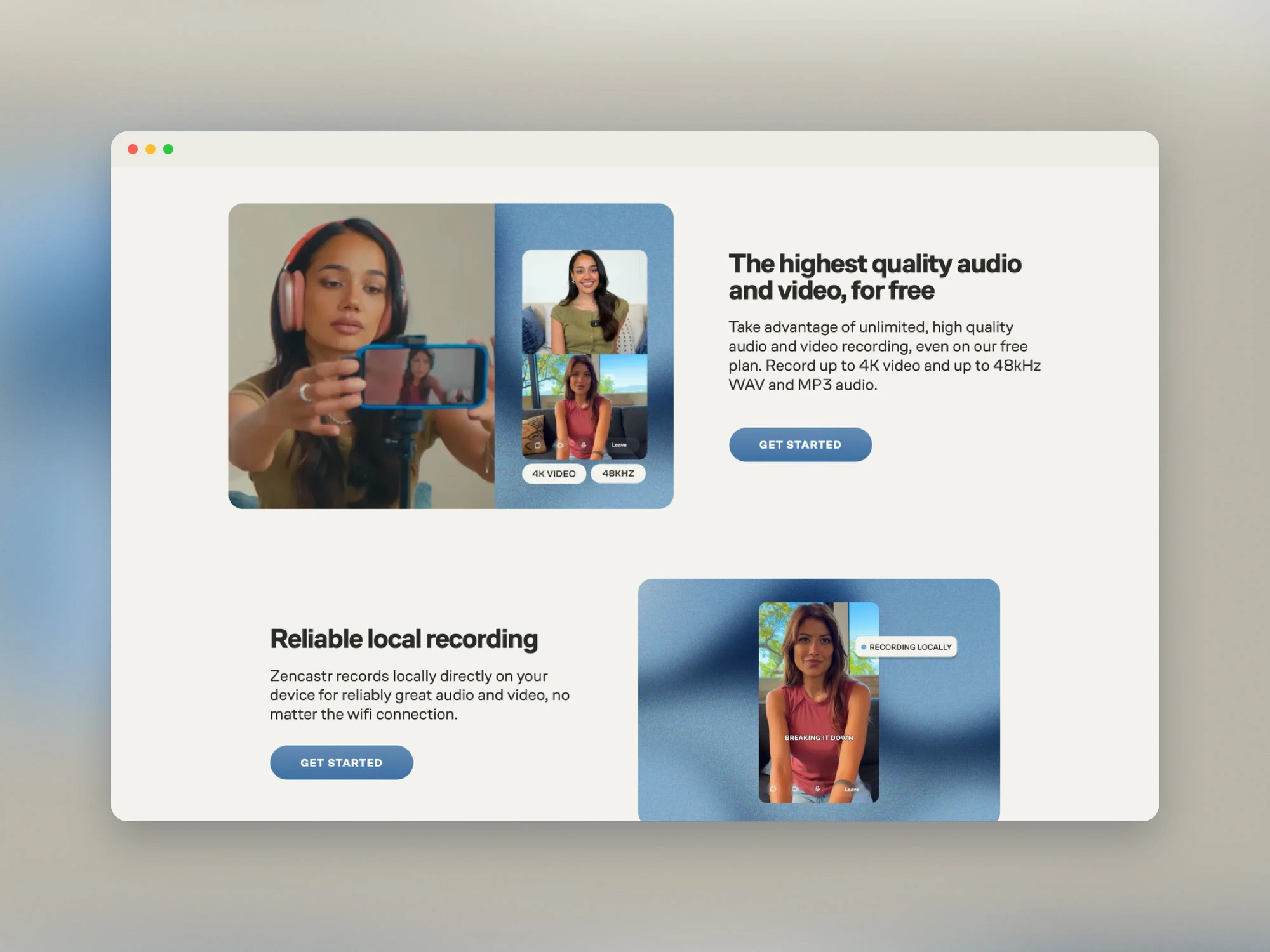
Feature rows filled in from the CMS
I built the templates to the same standard as my Webflow Marketplace templates, so the marketing team can edit them without a developer. When I handed them over, I sent the team a link to every template and a video walkthrough with my questions for them.
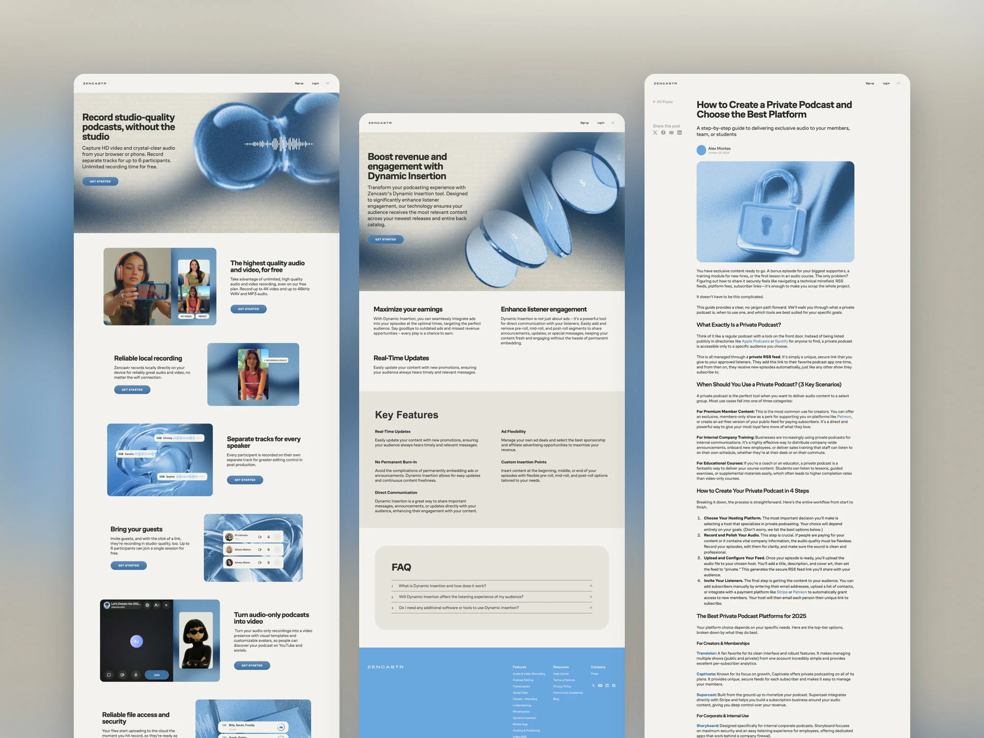
One page from each template, top to bottom
Making three platforms feel like one site
Visitors move between the homepage, the feature pages and the blog without knowing they’re on three platforms, so the details had to match:
A new header and footer across the Webflow site, with the logo and buttons sized to match the homepage.
The new menu, built from the designer’s layout. Six main features appear as image cards, with links to every other feature and the company pages, on desktop and mobile.
A white header on every page except the homepage, matching the blog.
New favicons for light and dark mode.
Subtle entrance and hover animations. I added them to a few pages first, and once the team liked them, across the whole site.
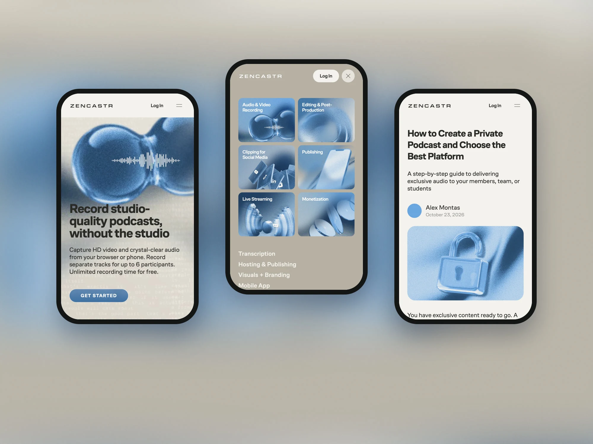
Launch-week fixes
As the team reviewed the site, new items kept coming, and I worked through them the same day:
Feature cards that all pointed to the same page.
A “Live streaming” link that went to a 404.
An “All Posts” link that led nowhere.
Hero buttons renamed to “Get Started”.
Footer links put in the team’s order.
Blog header images that didn’t scale and left white edges.
One puzzle was a navigation bar that appeared twice on some pages, but only at certain screen widths. It turned out one of the two “headers” was part of the hero image.
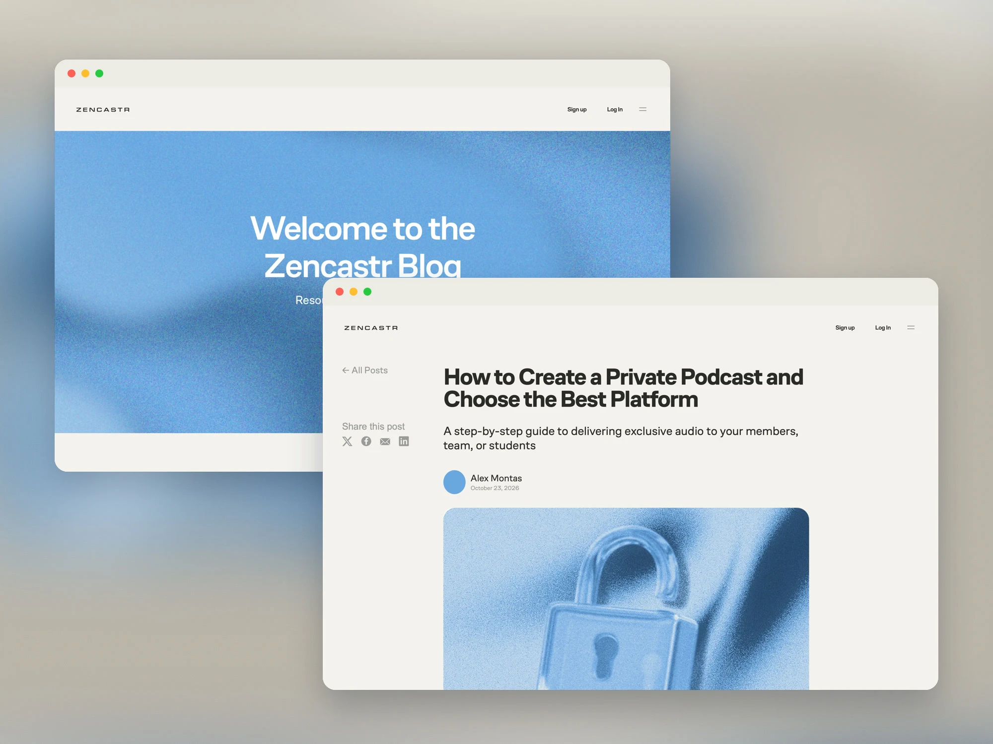
The new blog feed and post templates
2 likes · 3 views · Nov 13, 2026
Webflow landings for Zencastr’s new feature pages and blog, built in three days and tied to a homepage on Lovable and an old blog on Squarespace.
Timeline
Aug 4, 2026 - Aug 11, 2026
Tags


What the client had to say
Roman is prompt, professional, and so easy to work with. He got our website totally fixed and was able to make it easier to navigate and work with. I completely recommend him as a contractor!

Haele Wolfe
Aug 20, 2026, Client