Built with Framer
Matter+Dash: built in Webflow, true to every breakpoint

Roman Avshalumov
Verified



Matter+Dash is a strategic consultancy founded by Angela Walseng. It works with foundations, nonprofits and leadership teams on ideas that aren’t fully formed yet: a mandate that’s big but unclear, a program that needs rebuilding, a story nobody has managed to land. Angela needed a website as considered as that work.
The design is Liz Merchant’s: the brand, the layouts and every illustration on the page. She drew the geese, the flashlight, the people pulling each other through portals and the plant growing out of a rain of data. She also drew the little hand-drawn plus that joins Matter and Dash, standing for data and dialogue. Nothing about this site looks like a template, and that’s all her.
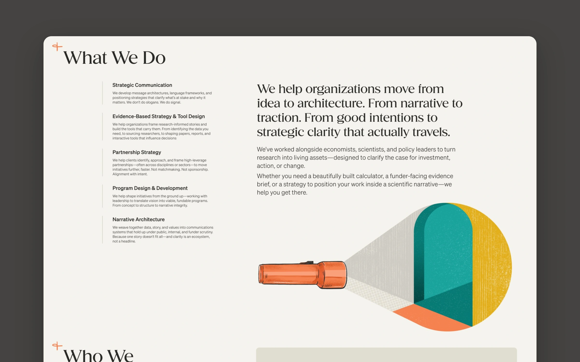
Illustration by Liz Merchant
Why a one-page Webflow site was difficult
On paper it’s a single homepage and a contact page. In practice it’s a layout that ignores the usual grid on purpose, designed by someone who notices a two-pixel drift. Liz designed the homepage at 375, 768, 1440 and 1920 pixels, plus an extra-wide screen, and every one of them had to match.
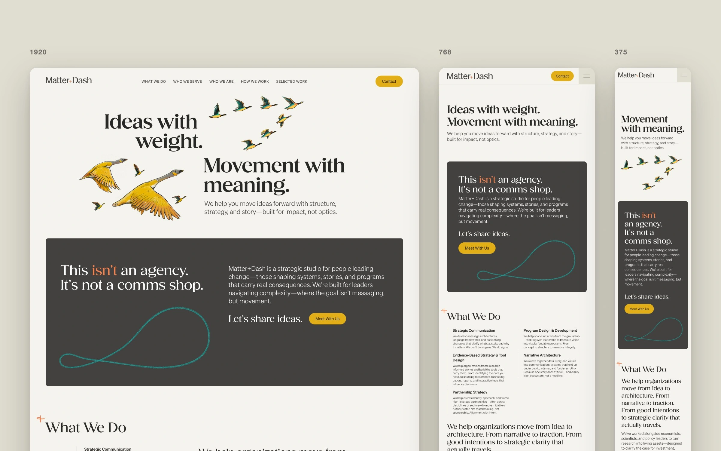
One page, designed at every size
1. An off-grid headline, recomposed at every breakpoint
“Ideas with weight.” sits right-aligned on the left; “Movement with meaning.” starts where the first line ends and drops below it. Two flocks of geese fill the gaps: a large pair under the first line, a small V above the second. Nothing shares an edge, yet everything has to hold its place as the screen grows, and the composition is rebuilt at each breakpoint rather than simply scaled. On mobile, where there’s no room for both, Liz storyboarded a sequence instead: the first line arrives with one big goose, then gives way to the second as the flock flies off.
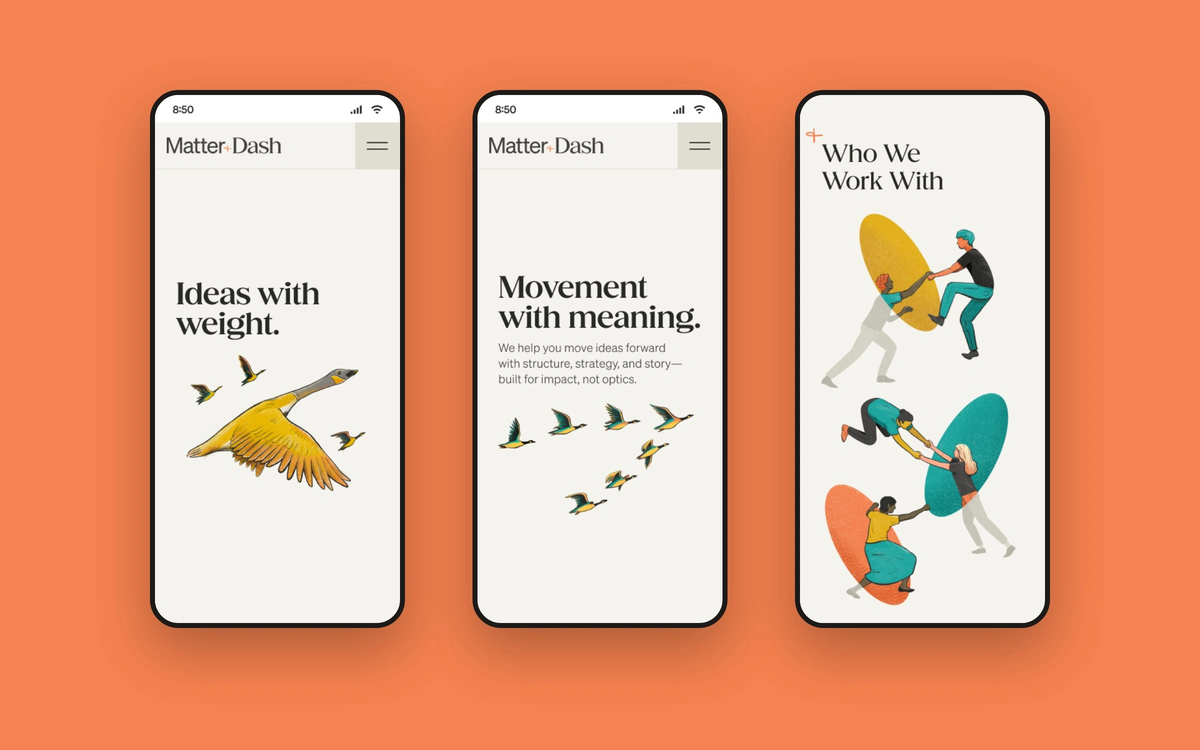
The mobile hero sequence
2. Full-bleed images that let go on wide screens
The team photo and the Selected Work images run off the left edge of the screen while the text beside them stays on the grid. Corners are rounded only on the side that isn’t touching the edge. On very wide screens the content stops growing, the images lift off the edge, and all four corners round. The menu does the opposite and keeps spanning the full width. Small rules, and easy to get wrong at the in-between sizes nobody designs.

3. Fluid margins for the widths nobody designed
A design at 1440 and 1920 says nothing about 1659. Liz checked anyway: she laid a 12-column grid over a staging screenshot at that width and marked every margin that had wandered. I set the type, spacing and grid as Webflow variables taken from her Figma styles, with fluid margins between the designed widths, so the page holds its shape on any screen, not just five of them.
4. Textured illustrations that still load fast
Every section leans on one of Liz’s illustrations, with grain, texture and soft printed edges. Compress them too hard and they look like clip art; leave them heavy and the page crawls. Each one got the format its job called for: SVG where the art allowed it, WebP for the textured pieces, eager loading for the hero and lazy loading for everything below it. Their positions change at every breakpoint too: beside the text on desktop, above it on mobile, never crowding a headline.
5. CMS sliders Angela can update herself
Selected Work and the testimonials are both sliders driven by the Webflow CMS, so adding a project or a quote doesn’t touch the layout. The testimonial slider shows its neighbours peeking in at both edges, each in its own patterned frame, and both sliders share custom arrows with a numbered indicator.
Design QA: staging beside Figma at every size
We reviewed staging side by side with the design at every size. Liz marked up screenshots in Figma, down to which corners should round and where a margin had drifted, and I fixed each one. Her eye for detail is the reason the site looks the way it does. The build’s job was to keep up.
Building a designer’s Figma file in Webflow
Matter+Dash is the kind of project I take on as a build partner: the design is finished, and it has to reach Webflow intact. Here’s what that took:
Type, spacing and the grid set up as Webflow variables, taken straight from the Figma styles.
Each designed width (375, 768, 1440, 1920 and extra-wide) built as its own composition, not a scaled copy of the desktop.
Fluid margins between those widths, so the sizes nobody designed hold their shape too.
Every image in the format its job needs: SVG where the art allows, WebP for textured pieces, the hero loaded first.
Content the client changes, like projects and testimonials, in the Webflow CMS instead of the layout.
QA on staging, side by side with the design at every size, until every mark-up was fixed.
If you’re a designer with a Figma file that needs to reach Webflow unchanged, send it over.
“Roman is excellent, skilled, knowledgable, responsive - and equally important - he cares about the work.”
Angela Walseng, Matter+Dash
Like this project
Posted Nov 8, 2026
I built the Matter+Dash website in Webflow from Liz Merchant’s design: one page for Angela Walseng’s strategy consultancy, matched at every breakpoint.
Likes
1
Views
0
Timeline
Oct 19, 2025 - Nov 27, 2025
Clients
Matter + Dash