Built with Framer
A new website for a nonprofit with a 30-year history

View completed worknature-sacred.framer.website
The old Nature Sacred website had more than 2,500 URLs. Behind them were decades of work with local communities, research on how nature affects health, and personal stories from people for whom a small garden or park had become a meaningful place.
Nature Sacred helps communities create and care for these spaces. The goal of the redesign was to make it easy for visitors to understand what the nonprofit does and find what they came for, while preserving the depth of the material the team had gathered over the years.
Rebuilding navigation around what visitors came to do
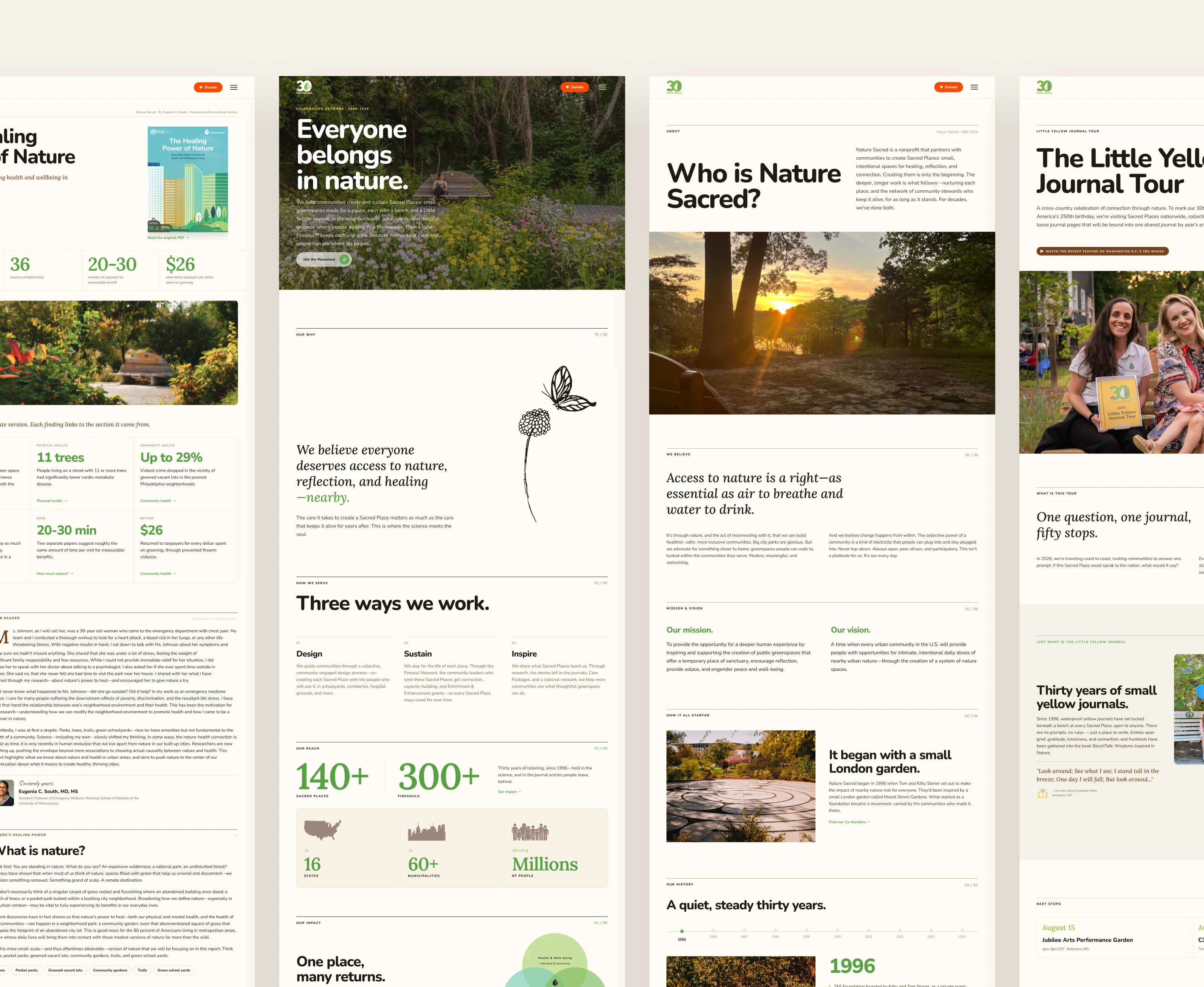
Together with the Matter+Dash team, we reworked the site structure. Learning from the nonprofit’s work, finding a green space nearby, and figuring out how to create one in your own neighborhood are three distinct goals. Each needed a clear path through the site.
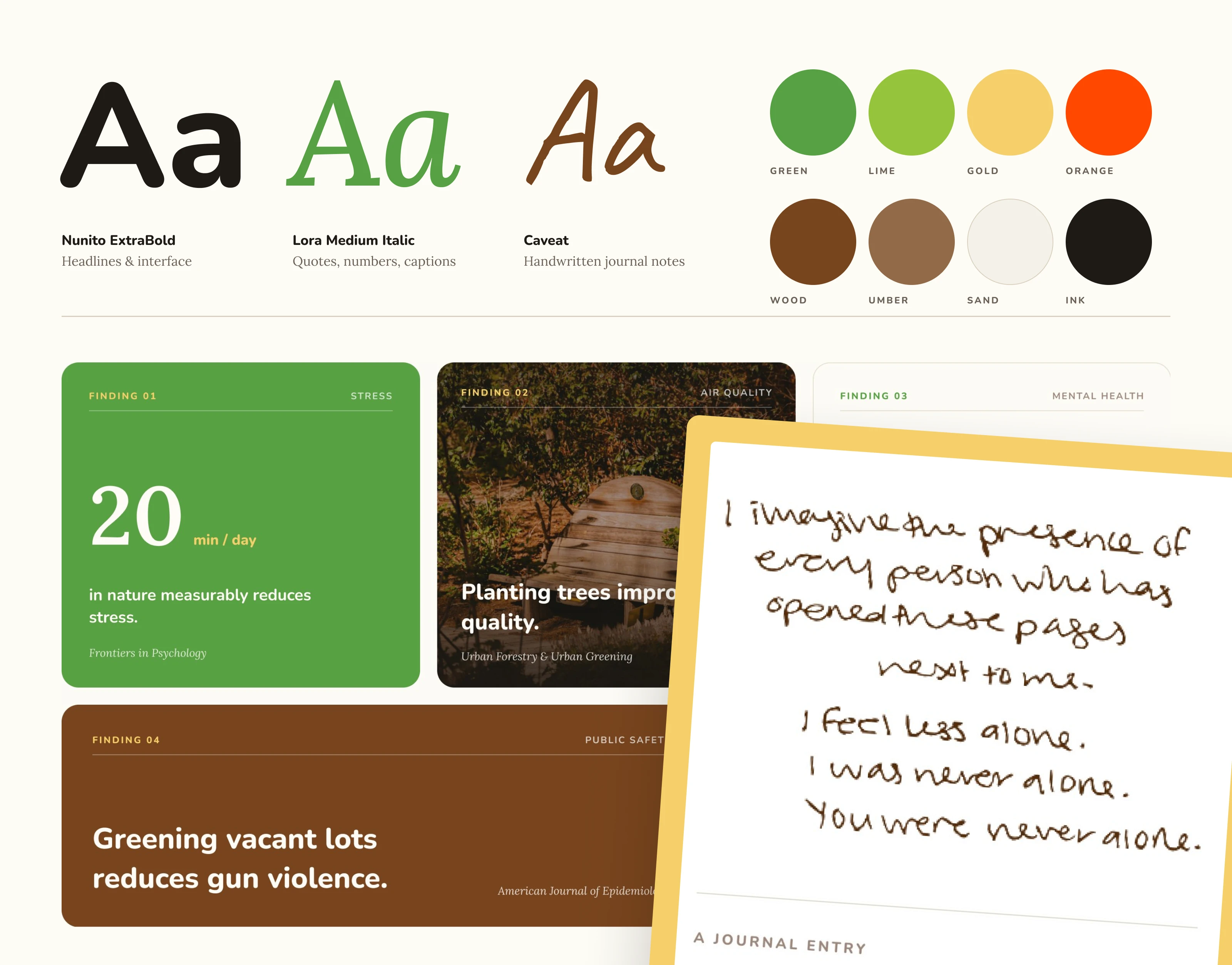
The Sacred Places map gives visitors a quick overview and lets them narrow their search by type of space and its features. Each place has its own page that tells a deeper story: who created it, how neighbors got involved, and what changed for the community. We gave research and reports a dedicated section so visitors could go straight to them. The directory, stories, and research all have a distinct role within the same site.
Turning a visual direction into a design system
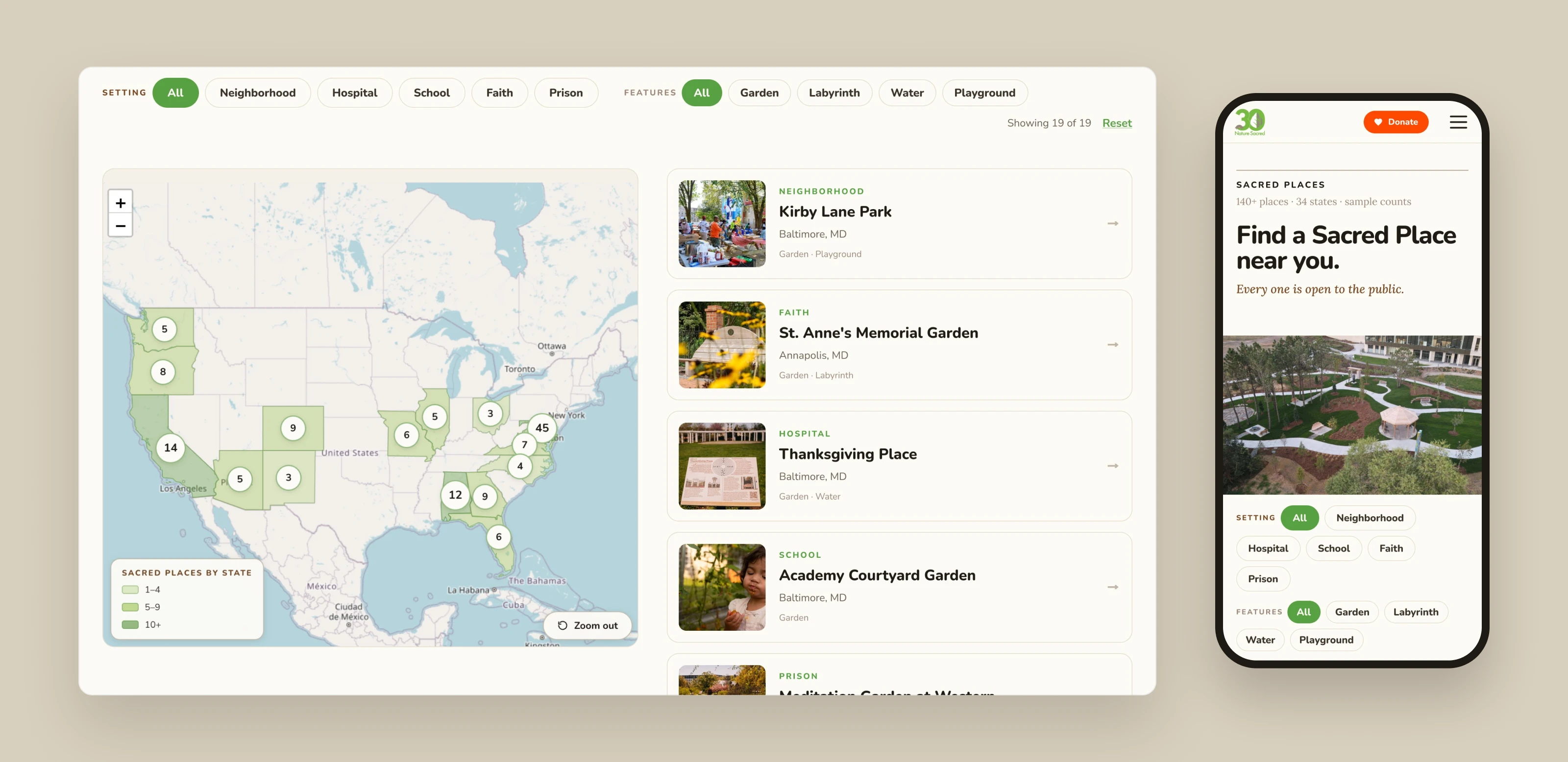
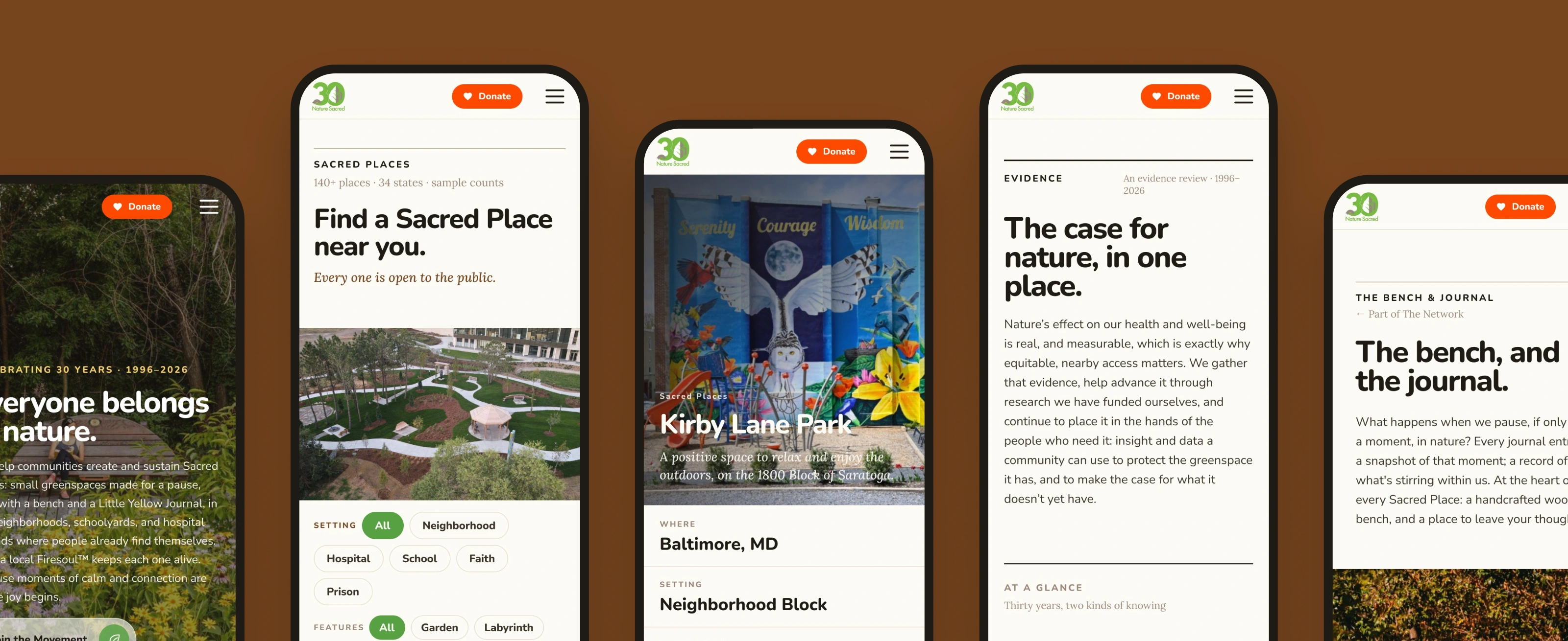
The Matter+Dash team set the visual direction and created the initial mockups. I reviewed them from a UI and UX perspective, refining the content hierarchy and how interface elements behaved. I then extended that approach across pages with different needs, from a filterable directory to long-form content with charts, quotes, and photography.
Large typography and clearly defined sections make longer pages easy to scan. Warm, natural colors, photographs of the spaces, and handwritten journal entries bring out the nonprofit’s character. That comes through especially clearly in the Impact section, where numbers and research sit alongside words from the people who spend time in these gardens and parks.
One visual language for different stories
I designed several pages from scratch using the nonprofit’s existing materials. For each one, I decided what visitors should see first and how the story should unfold from there.
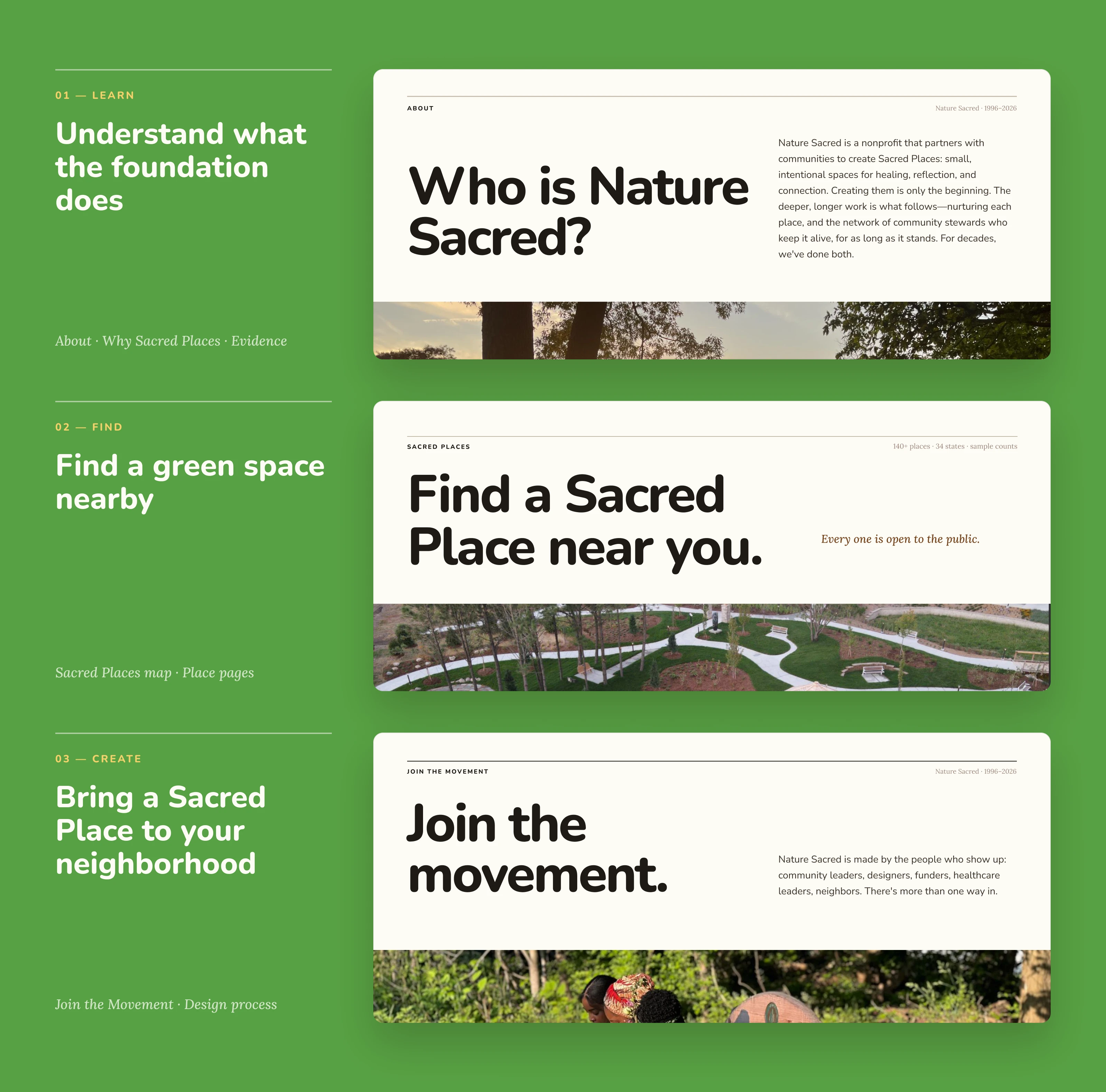
From mockups to a working site in Framer
I built the new site from start to finish in Framer. A visitor can now start with the map, find a place, and read its story. A researcher or partner can go straight to the section they need. Each path serves a different purpose, and every page feels like part of the same Nature Sacred website.
Roman is excellent, skilled, knowledgable, responsive - and equally important - he cares about the work.
Angela Walseng, Matter + Dash
What the client had to say
Roman is excellent, skilled, knowledgable, responsive - and equally important - he cares about the work.


Angela Walseng, Matter + Dash
Nov 4, 2026, Client
2 likes · 0 views · Nov 10, 2026
A redesign of the Nature Sacred website in Framer: 2,500 old URLs turned into clear paths to learn about the nonprofit, find a green space nearby, and create on
Timeline
Jun 16, 2026 - Nov 4, 2026