Greenback
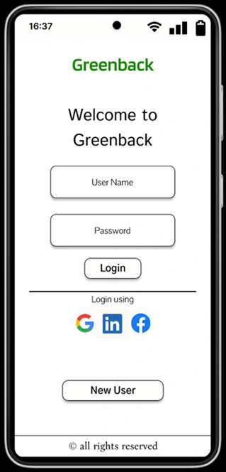
In this project, I prioritized user experience (UX) design, ensuring the app is easy to use and navigate. Simultaneously, I focused on creating a sleek and visually appealing user interface (UI).
The challenge of balancing UX and UI considerations was significant, but my efforts have resulted in a product that is both user-friendly and aesthetically pleasing.
To experience the app's UX and UI firsthand, click below to try my prototype.
Log in to Figma to view this file
No account?
Problem
Managing multiple clients and projects is a part of running a business as a freelancer. However, sometimes clients don’t pay on time. The problem is to find a solution for freelancers to keep track of payments from their clients and ensure they receive payments from clients promptly for every project.
Solution
Based on user research, many freelancers are using an app to help them keep track of payments from their clients. Having said that, many of them also said that their app could be more user-friendly. Freelancers that don't use an app, claim they will use one if it is easy to use. The solution then is an app that will be friendly for technology wiz, as well as for people who are afraid of technology.
Design process

Research
As the first step of the project, I defined a research strategy that involved giving freelancers a questionnaire to understand their pain points and needs for an app like this. This would help me to better understand the potential users and their requirements.
Based on the 12 responses I have received, I have concluded that the following features are crucial for the app:
1. Hourly rate tracking: The app should track the hourly rate of the freelancer, as well as the total number of hours worked and the total amount of money earned. This will help freelancers keep track of their earnings and ensure they are paid fairly.
2. Direct chat with clients: The app should allow freelancers to chat directly with their clients from within the app. This will make communication more accessible and more efficient, as it will eliminate the need to switch between different apps.
3. Activity tracking: The app should track the freelancer's activity while they are working. This could be done by having a calendar or a box where the freelancer can mark when and for how long they have worked on a particular task. This information could then be used to generate reports that can help freelancers to track their productivity and to identify areas where they can improve.
Empathy Map
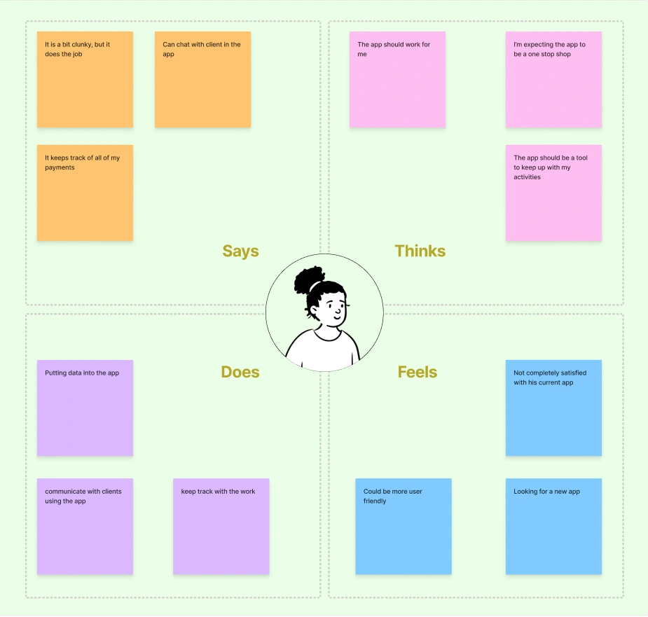
To get a better understanding of the users' needs, I organized the survey results into an aggregate empathy map. I used quotes from the surveys to avoid initial biases based on my interpretations of the answers. Then, I followed up with my assumptions on how these experiences translate into useful observations for my design decisions.
Personas
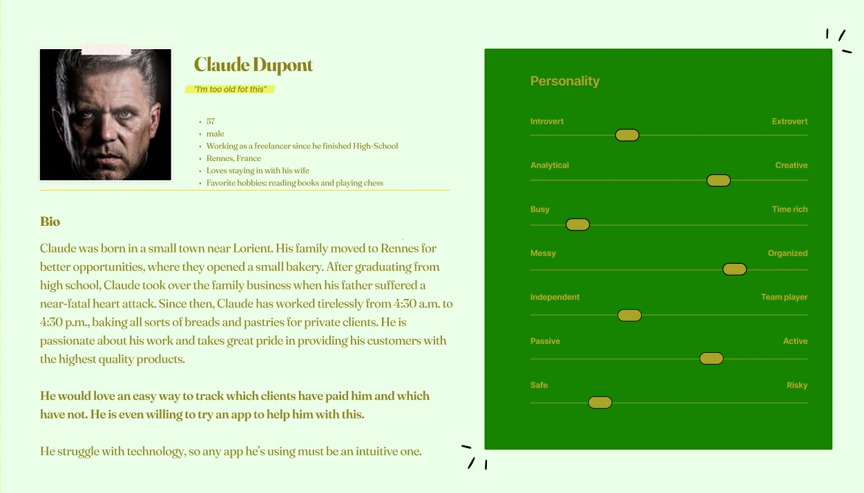
To get a better understanding of the users' needs, I created a persona. The persona was a fictional character that represented the needs and goals of a specific user group. I used the persona to illustrate the different user groups identified based on the interviews. This helped me to keep the design human-centered and ensure that the app met the needs of the users.
User Journey Mapping
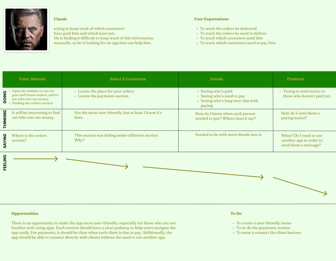
I created a user journey map based on the survey answers to identify possible pain points in the design decisions. This way, even though the app I am designing is imaginary, the journey will be as close to reality as possible. In the end, I could identify the areas of the design that needed the most attention.
Competitor Audit
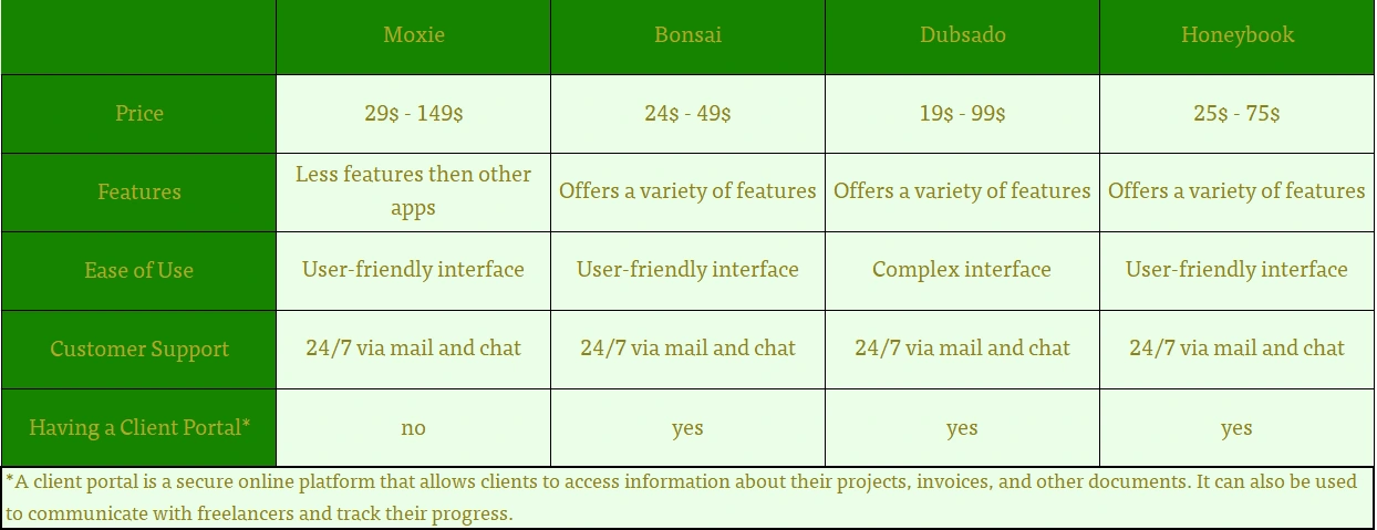
To better understand the app I should design, I conducted a competitor audit of four apps offering similar services to the proposed application.
Here are my findings:
1. Most apps offer similar services, but they differ in their interface and how they offer their features.
2. Some apps may offer features that can be found in other apps, but they may do it at a lower level.
3. The client portal can be crucial to some users, especially if there is a need for a more secure connection between the supplier and the client.
Ideation
At this point in my project, I started to think about the app I wished to build to solve the following
Problem Statement:
As freelancers, it is vital to track the payments you are getting. In order to do so, the app should be straightforward and user-friendly, including for first-time users.
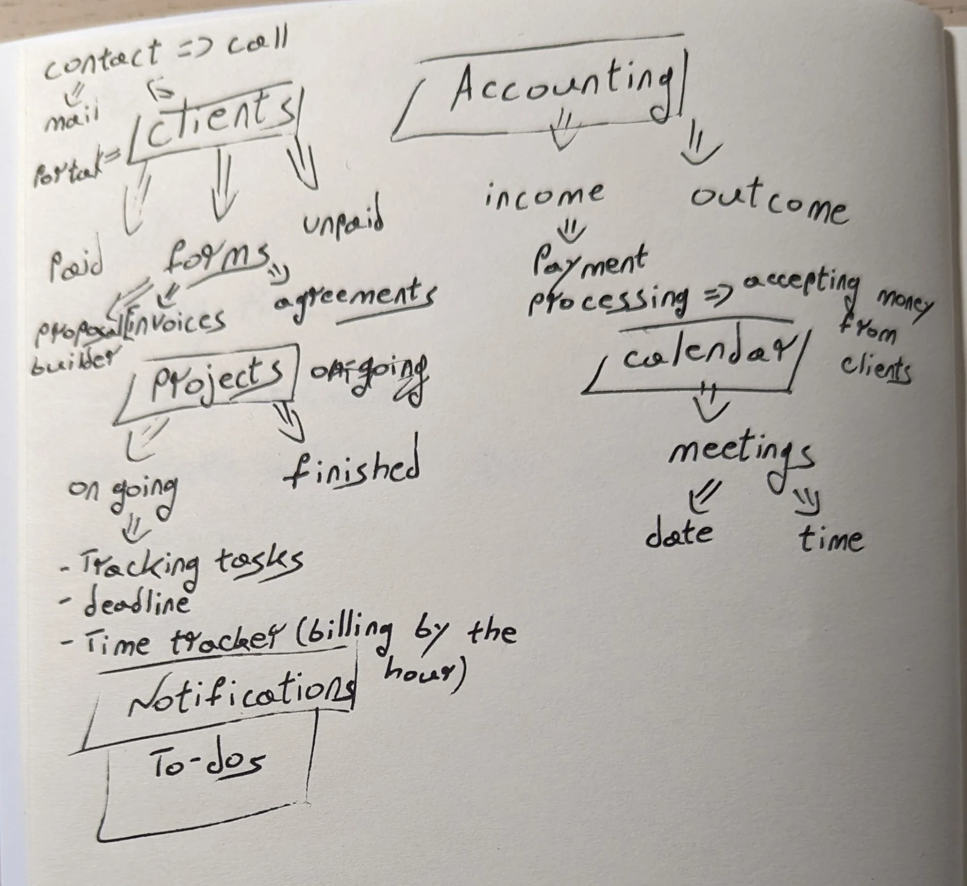
The next step was to start thinking about how to solve the problem. I did it using mind mapping
User Flow
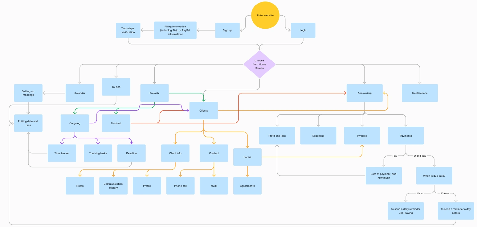
Based on my mind map, I created a user flow chart. The chart provided a roadmap for the app, including how many wireframes I should create, the elements, and the interactions that would be in the working prototype.
Design
Wireframing
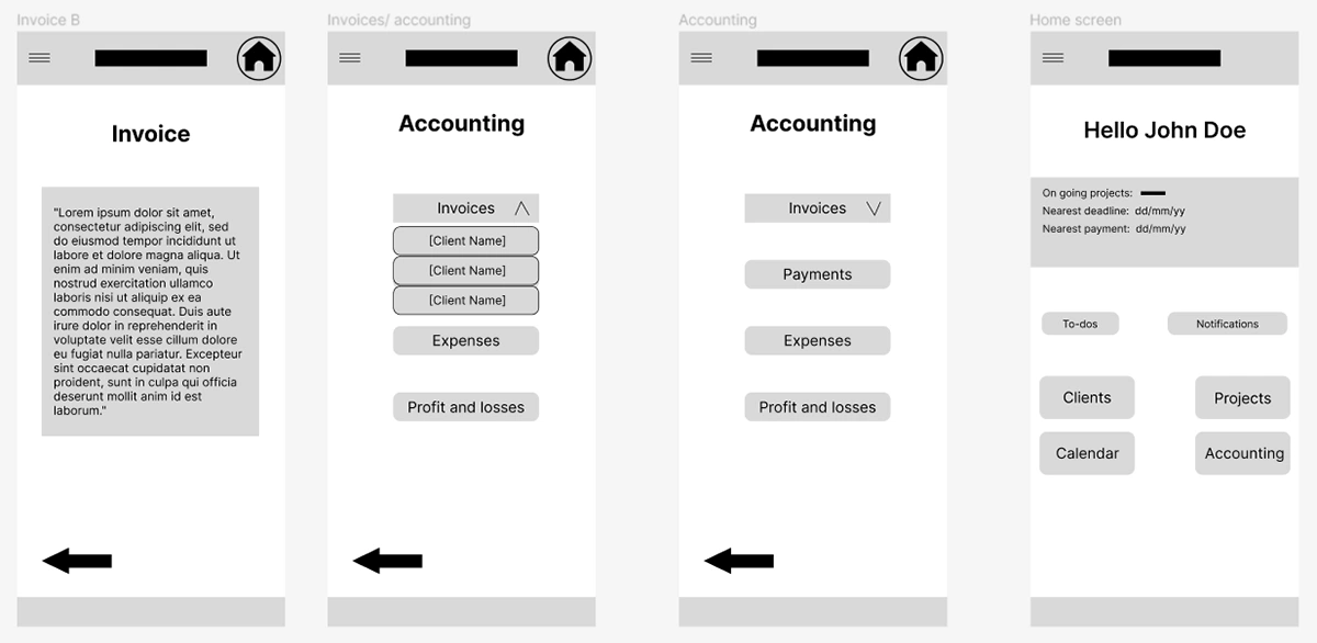
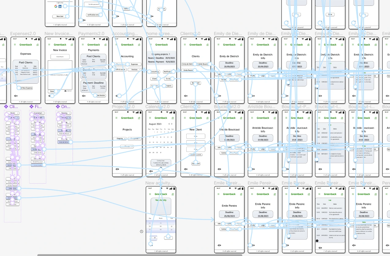
After completing all the stages so far, I created a wireframe that met the requirements, with user-friendliness as the top priority. Other requirements were based on the 10 Usability Heuristics for User Interface Design, such as the visibility of system status (using headlines on every screen), aesthetic and minimalist design (not putting too much data on each screen), and all other rules.
Usability Test 1.0
After completing my lo-fi wireframes, I set up a usability test using Maze.co. Eleven participants took part in the test. Since the app is an all-around app for freelancers, there is no single "final goal" that I want users to accomplish (the main idea when starting the app was to make it easy for users to track who has paid them and who has not, but the app should also help with all other aspects of being a freelancer). My main goal for this test was to see how much time users spent on each screen. I assumed that if users spent a long time, it was not clear enough; if they spent a short time on a screen- it was clear. As can be seen in the photos below, the average time on screens was 14.5 seconds, which is a good amount of time.

High-fidelity Prototype
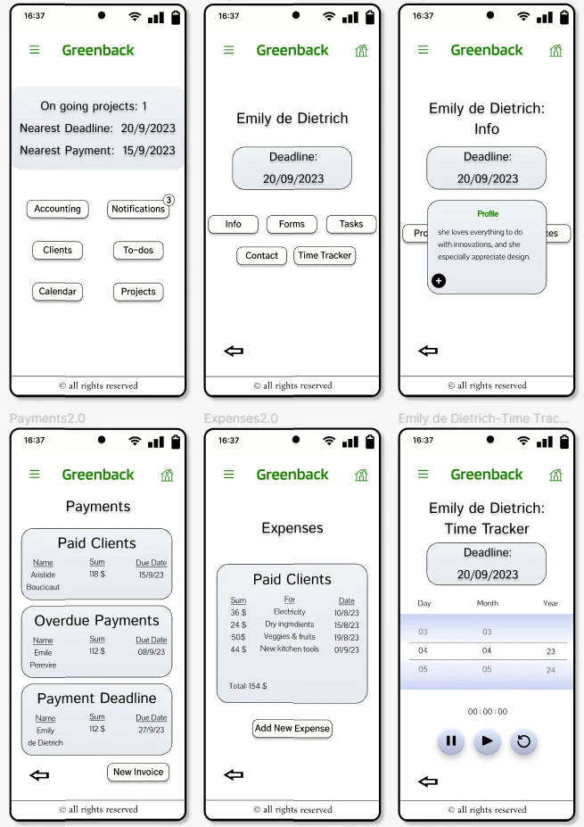
After completing my low-fidelity and all of my frames and components, I began working on the app's high-fidelity (hi-fi) version. Please try the prototype at the top of the page.
Down here, you can see a video of the working prototype and some of the screens I made after that.
Usability Test 2.0
After finishing the prototype, I conducted a second test to get feedback on the app's final design, focusing on user-friendliness and design issues.
I followed Nielsen's Group's advice to use no more than five participants to discover usability errors.
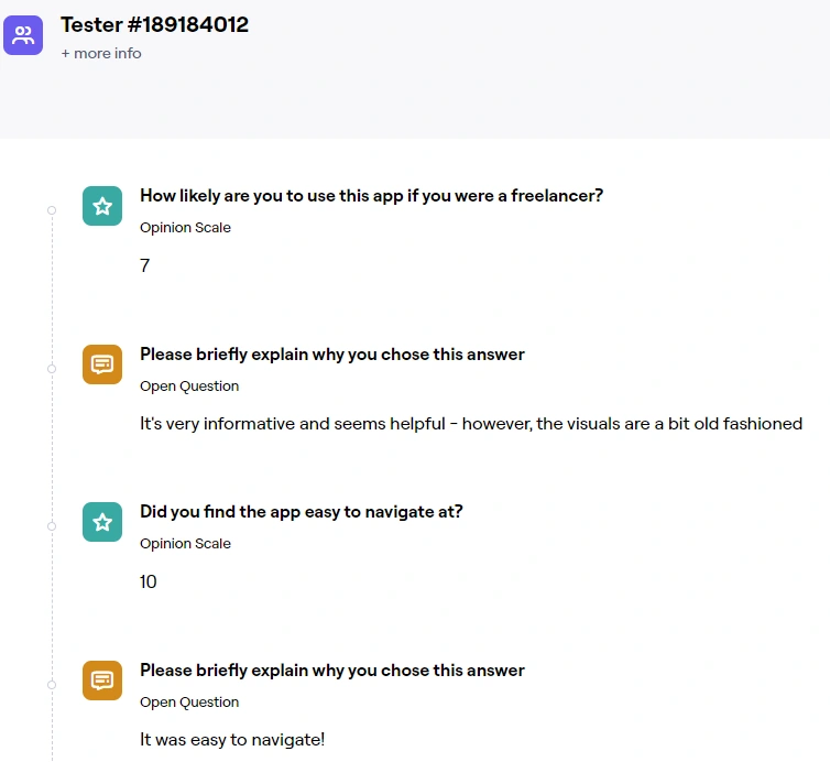
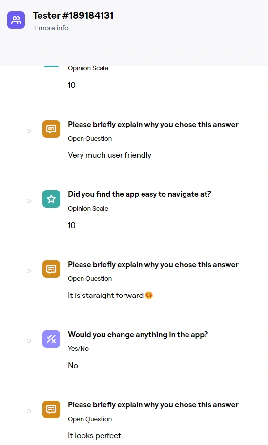
All five participants agreed that the app is very user-friendly. However, the design received mixed feedback. Some participants said it is old-fashioned, while others said it is perfect as it is.
Based on this feedback, I conclude that the app is functional and easy to use, but the design could be improved for some users. I need more data to determine whether the people who dislike the design are in the minority or the majority.
I took this assignment to enrich my portfolio, thinking it would be an excellent opportunity to make a fintech app. I had yet to learn how complicated it would be. In hindsight, I am very glad I chose this assignment. I proved to myself that I can handle a complex app with many functions and more than a few screens (54 screens in the wireframe stage). It was undoubtedly a challenge, and at times, I wondered why I was putting myself through it. But the answer is simple: I enjoy the satisfaction of knowing that I can do it. And I know that I will be able to do it again in the future.
Like this project
Posted Nov 19, 2023
A concept app for freelancers
Likes
0
Views
2


