Cinema Paradiso
A movie theatre app with a twist
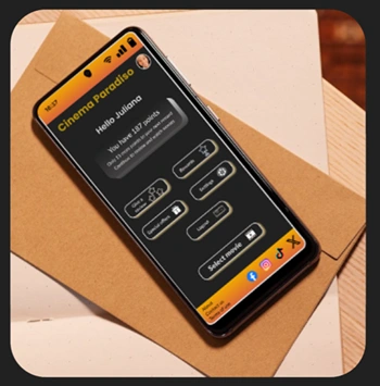
As a movie lover, I would like an app that will allow me to have my profile, and as a return customer, It will know how to give special offers. So I decided to design an app that will do precisely that, and a few more things on the way.
The road for this app had a few turns and curves (a note to self: next time, design the dark mode as the last thing), but I can be proud of the end result.
I hope you will enjoy trying the app as much as I enjoyed designing it.
Please try the prototype below:

Problem
Going to the cinema should be a seamless and enjoyable experience. The first step is to pick a movie, which often involves reading about it and sometimes buying a ticket in advance. However, if the process of finding information about a movie or purchasing a ticket is unpleasant, the entire experience can be compromised.
Solution
To create a more enjoyable experience, we need an app that lets users quickly find information about movies and purchase tickets without searching for a specific button.
Design Process

RESEARCH
As the first step of my project, I conducted user interviews with seven people, ages ranging from 18 to 67.
I began by asking them general questions about their movie-going habits (e.g., how often they go to the cinema) and then moved on to questions about their favorite apps and what features they would like to see in a movie theater app.
Based on these interviews, I identified the following key takeaways:
1. The app should be simple and easy to use
2. Users love to personalize their apps
Empathy Map
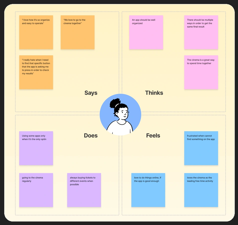
To better understand the users' needs, I organized the interview results into an aggregate empathy map. I used quotes from the interviews to avoid initial biases based on my interpretations of the answers. Then, I followed up with my assumptions on how these experiences translate into practical observations for my design decisions.
Persona
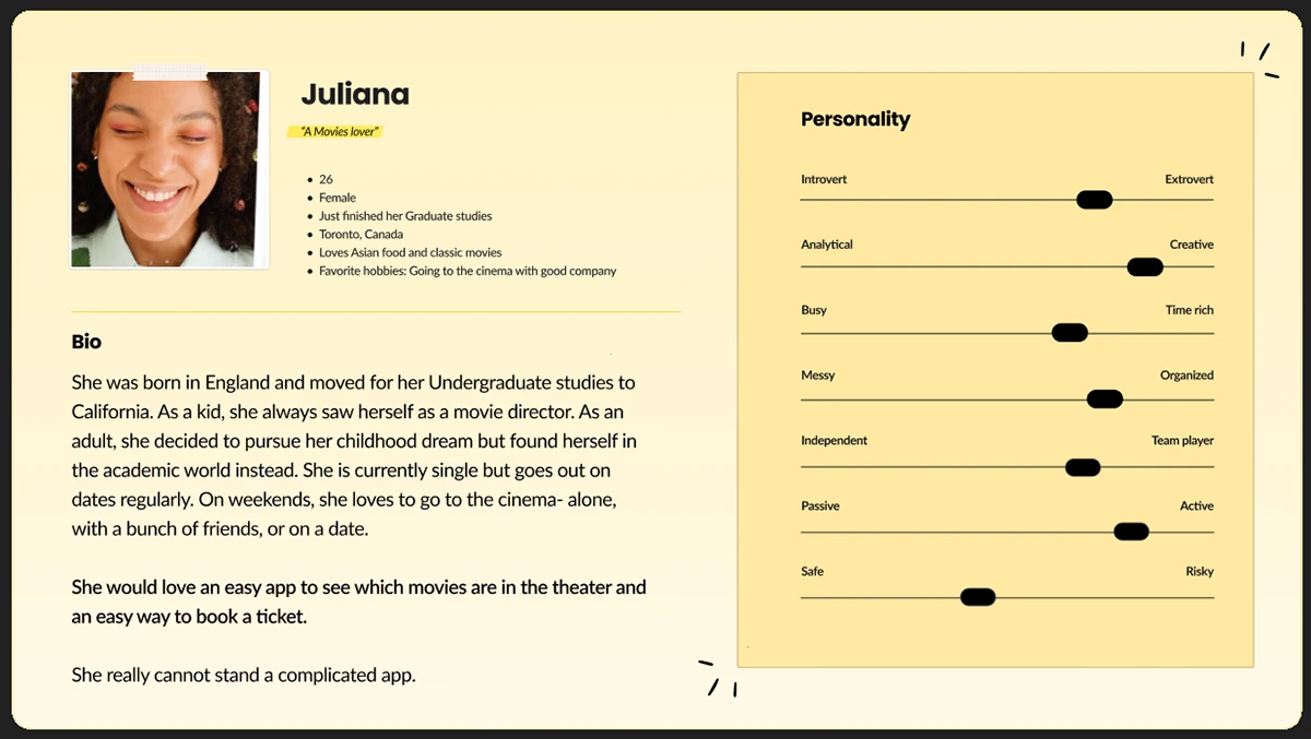
To get a better understanding of the users' needs, I created a persona. The persona was a fictional character that represented the needs and goals of a specific user group. I used the persona to illustrate the different user groups identified based on the interviews. This helped me to keep the design human-centered and ensure that the app met the needs of the users.
User Journey Mapping
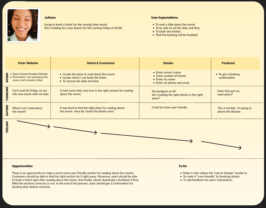
I created a user journey map based on the answers I got through the interviews to identify possible pain points in the design decisions. This way, even though the app I am designing is imaginary, the journey will be as close to reality as possible. In the end, I could identify the areas of the design that needed the most attention.
Competitor Audit
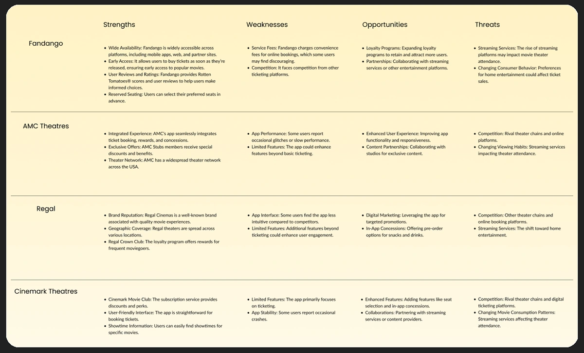
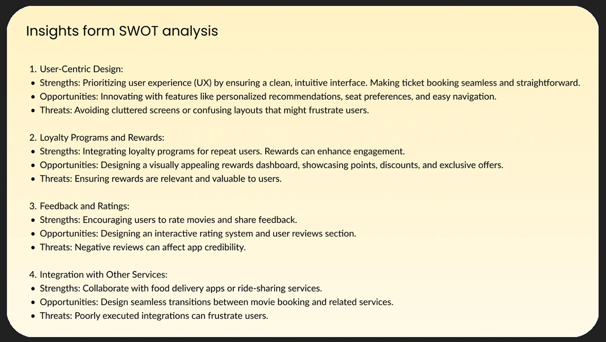
I conducted a competitor audit of four apps offering a service similar to the proposed application using a SWOT analysis methodology. After the analysis, I came up with a few insights, which can be seen below as well.
In order to make the best analysis I made use of an AI system - Microsoft Bing Copilot.
Ideation
At this point in my project, I started to think about the app I wished to build to solve the following
Problem Statement
Movie theater apps should provide users with an easy and efficient way to find information about movies and purchase tickets in advance. The app should be simple to use and navigate, with a clear path to purchase.
_____________________________________________________________________
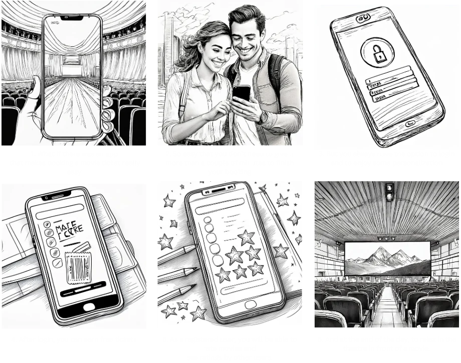
The next step was to start thinking about how to solve the problem. To show my solution, I used a
storyboard
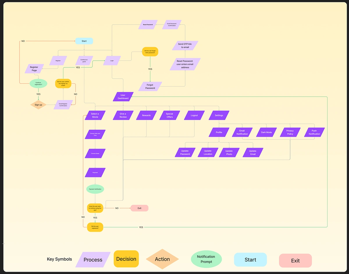
User Flow
DESIGN
Wireframing
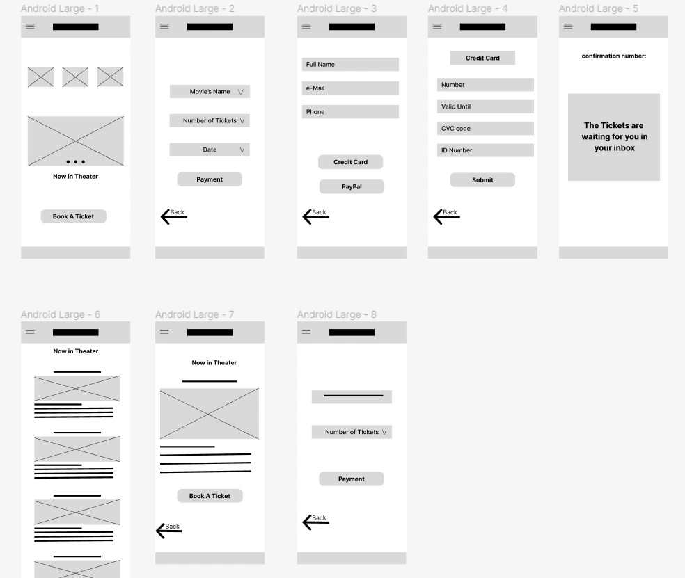
After completing all the stages, I created a wireframe that met the requirements, with user-friendliness as the top priority. Other conditions were based on the 10 Usability Heuristics for User Interface Design, such as number 3: user control and freedom, which, in my case- is the freedom to buy a ticket without the need to search for a specific button.
Design Guide
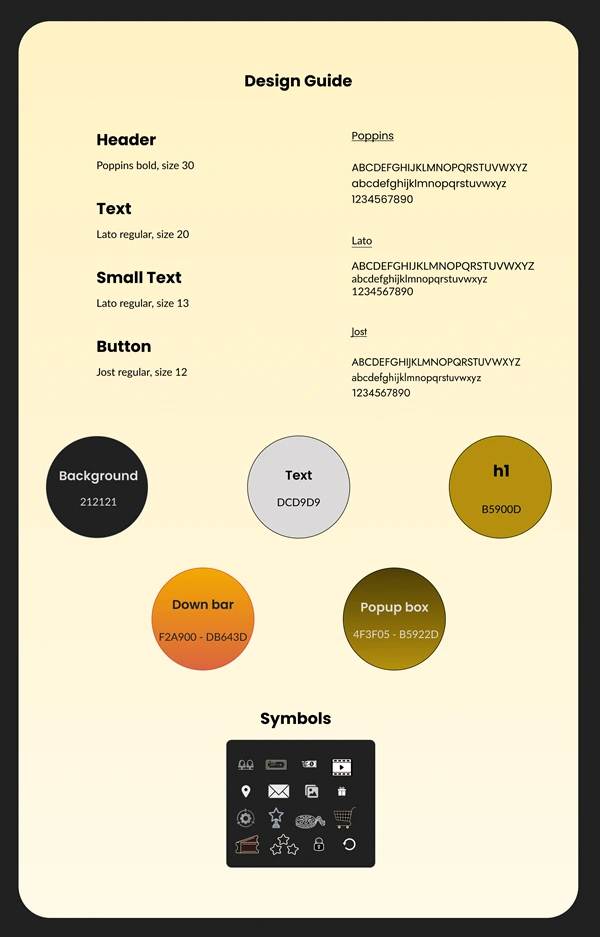
I created a design system that helped me stay systematic across my screens.
I chose the font Poppins for my header since it pops out. Using this font, I gave the app's name —
Cinema Paradiso — the respect it deserves.
I chose the font Lato since it is a modern font that users will feel comfortable with. Last, I chose the font Jost because it is similar to Lato, so it will not confuse users but still be different enough to show it is something else.
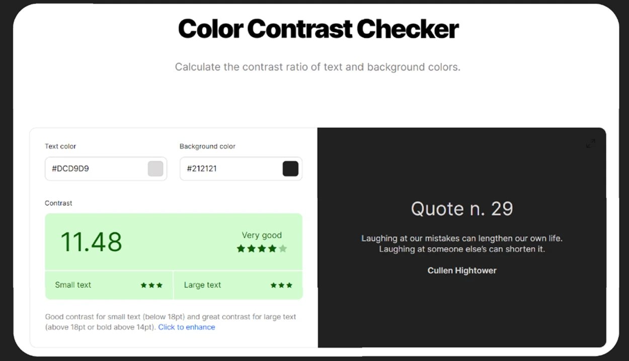
For the background, I chose a shade of black that is easy on the eyes and promotes a comfortable viewing experience. To enhance readability, I selected a shade of grey as the text color. The 'Color Contrast Checker' validated this choice and rated it as 'very good'.
High-Fidelity Prototype
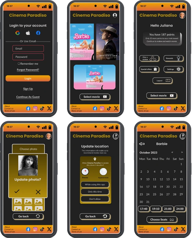
After completing my design guide and gathering all of my frames and components, I began working on the app's high-fidelity (hi-fi) version. Please try the prototype at the top of the page.
Down here, you can see a video of the working prototype.
CONCLUSION
While making the app, I encountered a few setbacks — from choosing the suitable color scheme for my "dark mode" app to finding the most logical way to reach different options (changing profile photo, reading about the movies, etc.). Each problem became an opportunity to learn something new - working on dark modes, the best button for a specific action, making typography right, and so on.
Furthermore, this app may seem simple at first glance — just another app for booking movie theater tickets.
Alas, "behind the hood" hidden a complex system of components. Using those components, I have learned how to use them properly and have become better at using Figma.
Powered by Adobe Portfolio
Like this project
Posted May 5, 2024
A movie theatre app with a twist
Likes
0
Views
4


