Landing Page Design for Nexova
Akinkunmi Ayo
Overview
This project explores a modern landing page concept for Nexova, a technology platform focused on cloud infrastructure, AI analytics, and enterprise solutions.
The goal was to design a high-trust, visually striking interface that communicates technical expertise while remaining clear and easy to navigate.
Instead of overwhelming users with information, the experience focuses on structured storytelling and controlled visual depth.
Design Goal
Create a strong, memorable first impression
Communicate complex services with clarity
Establish a premium, enterprise-ready visual identity
Guide users toward action with minimal friction
Key Design Decisions
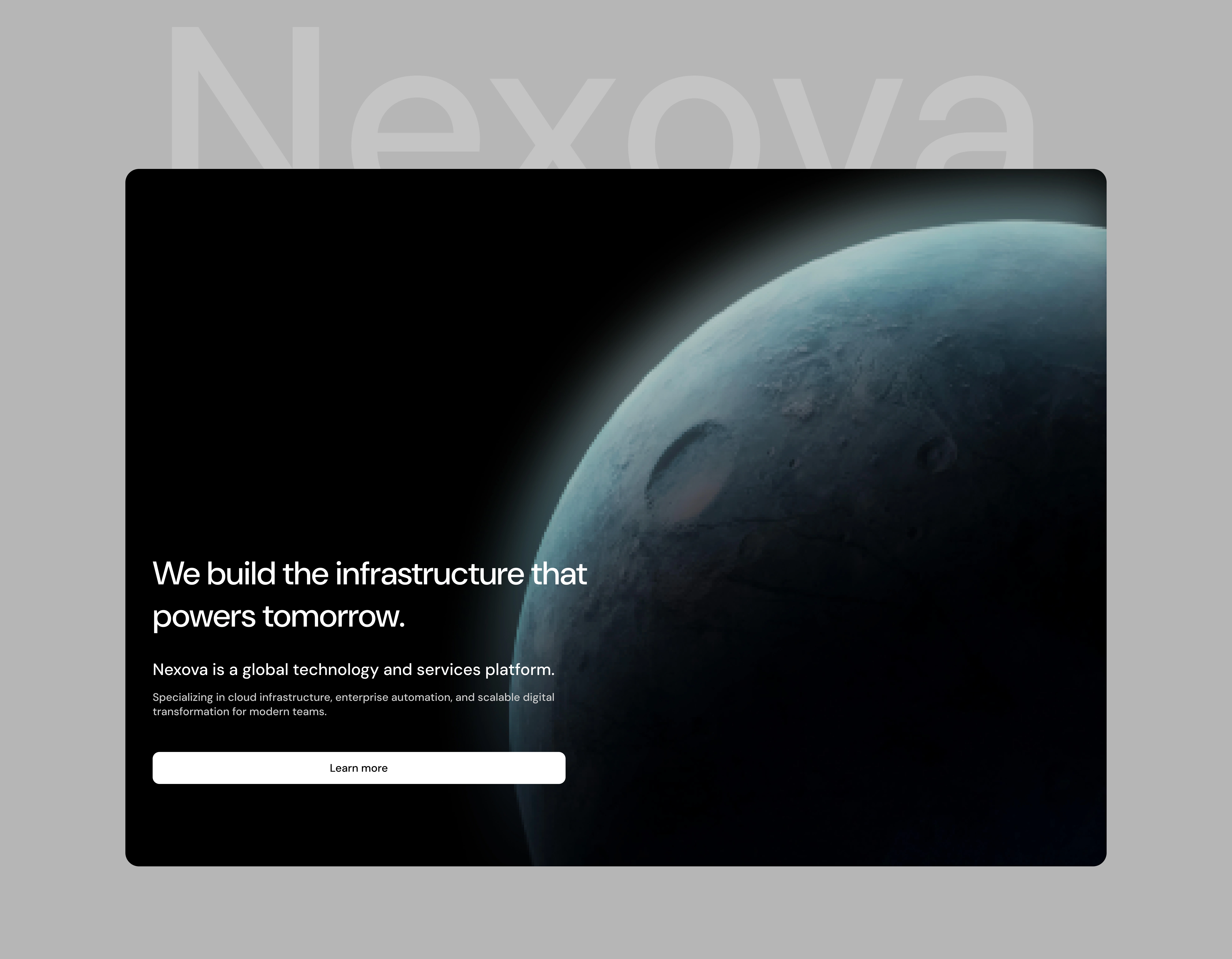
High-Impact Hero Section
The hero uses a planetary visual with dark gradients to immediately signal scale, innovation, and global capability.
Minimal text to avoid cognitive overload
Strong headline to anchor the message
Single primary CTA to focus user attention
Structured Service Grid
Services like Cloud Infrastructure, AI & Data, and Security are presented in a clean grid layout.
Numbered structure improves scanability
Consistent spacing creates rhythm
Short descriptions keep it digestible
👉 This helps both technical and non-technical users quickly understand offerings.
Visual + Context Sections
The mid-section combines imagery with labeled themes like reliability, precision, and efficiency.
Breaks the monotony of pure text
Adds emotional context to technical services
Reinforces brand perception visually
Proof & Credibility Layer
Metrics like 340+ clients, 98% retention, 24/7 support are placed prominently.
Builds trust without requiring deep reading
Positioned after introduction to reinforce confidence
Conversion-Focused CTA Block
The CTA section uses a distinct background and curved pattern to stand out.
Clear action: Schedule a call
Isolated visually to reduce distraction
Positioned after value has been established
Clean, Scalable Footer
The footer is structured for clarity and expansion:
Organized navigation (Product, Company, Resources)
Minimal but functional layout
Subtle branding to close the experience
Design Approach
The overall direction focuses on:
Clarity over clutter
Hierarchy over decoration
Confidence over noise
Every section is intentional—designed to move users from curiosity → understanding → trust → action.
Tools
Figma (UI design, layout system, prototyping)
Outcome
A visually distinct, enterprise-grade landing page concept
Clear communication of complex services
Strong visual hierarchy and user flow
A scalable foundation for a full product website
What This Project Demonstrates
Ability to design for technical SaaS products
Strong sense of layout, spacing, and hierarchy
Understanding of conversion-driven design
Capability to turn complex ideas into clear user experiences
If your product is powerful but your website doesn’t reflect it, you’re losing trust before the conversation even starts.
I help teams design interfaces that communicate value instantly and convert attention into action.
Like this project
Posted Apr 16, 2026
Designed a distinct, enterprise-grade landing page for Nexova.