Wack•A•Doo Hot Sauce Branding & Packaging
Emaline Wiles
Branding & Product Packaging
The Snapshot
BRAND: Wack•A•Doo Hot Sauce
I OWNED full design concepts and creation, packaging material recommendations
TIMELINE: 4 weeks
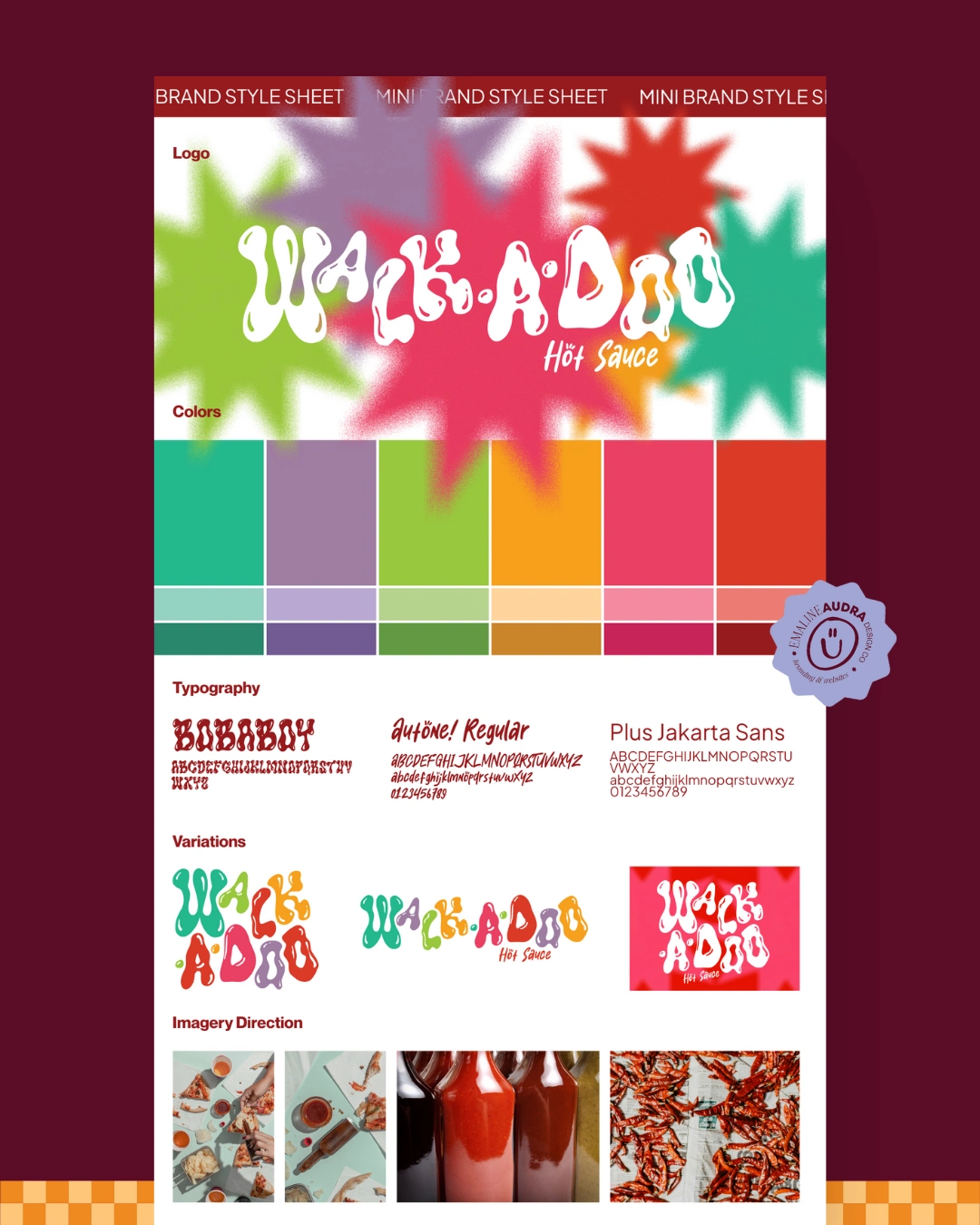
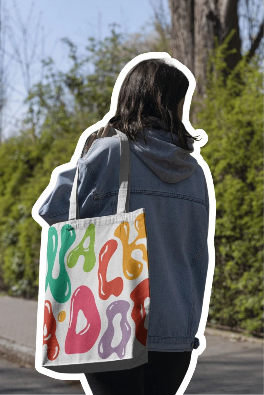
DELIVERABLES: Logo suite, color palette, font choices, visual direction, 6 hot sauce label designs, 2 hot honey label stickers, business cards, mockups
The Challenge:
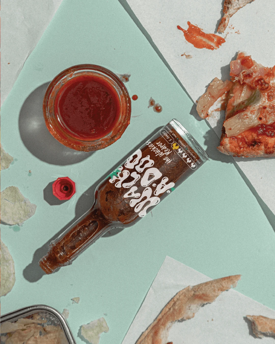
Wack-A-Doo Hot Sauce came to me ready to jump in to the artisnal hot sauce market. They needed a brand identity that could hold its own at a crowded Farmer's Market while still feeling approachable and fun. The challenge was to capture their bold flavors, small-batch authenticity, and playful personality in a way that would instantly grab attention and create a lasting impression.
The Approach:
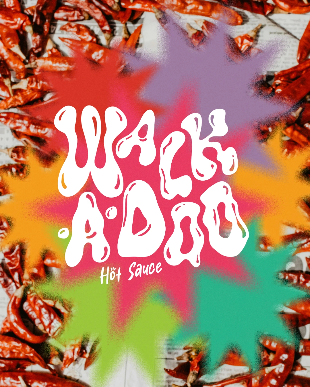
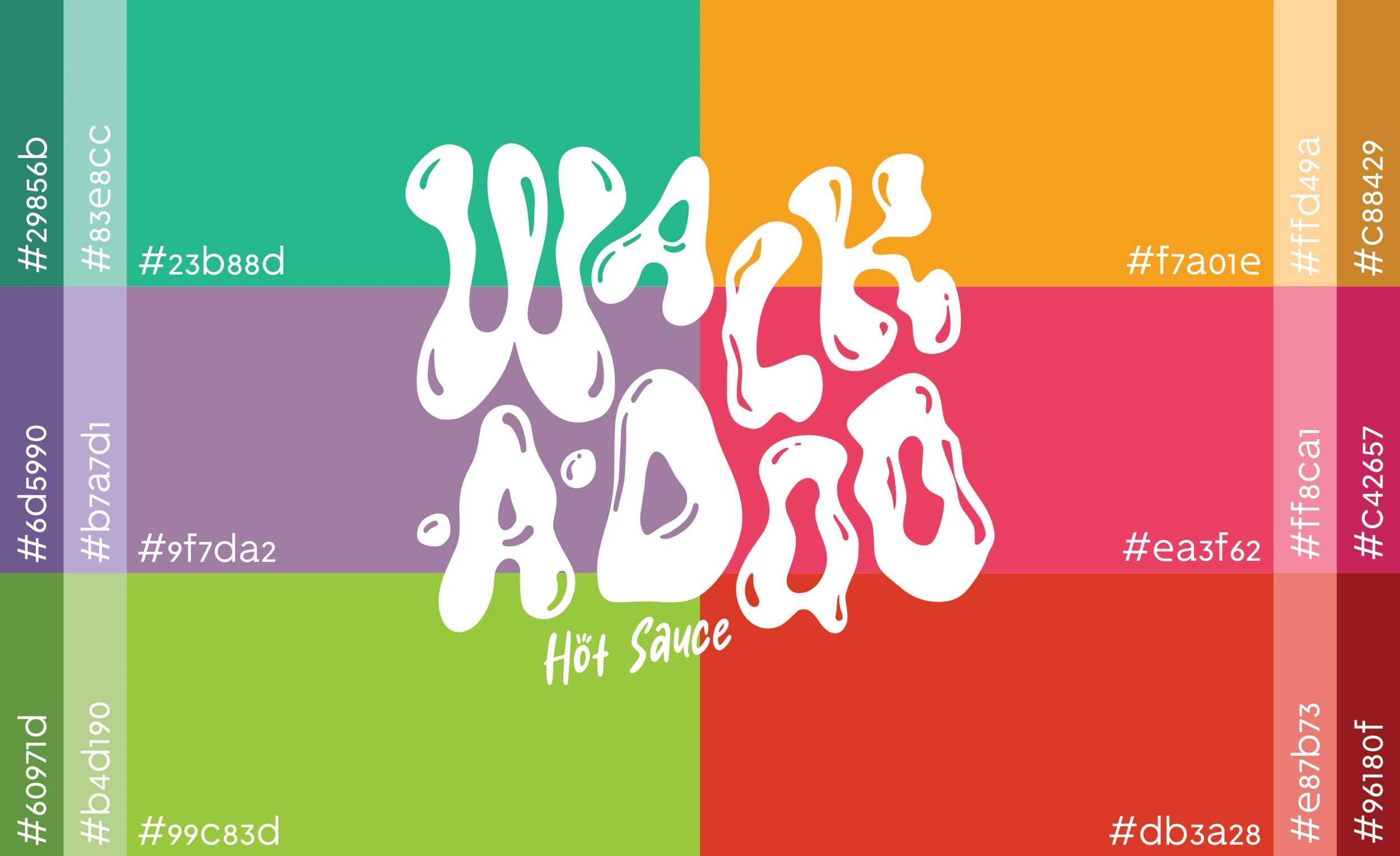
The Wackadoo Hot Sauce brand is all about flavor that surprises and the design brings that same energy. Inspired by the fluid shape of hot sauce in motion, the custom logotype was hand-crafted using five different liquid-style fonts to create something totally unique and full of personality. The color palette was chosen with intention: bold, vibrant hues that not only complement the sauces themselves but also make the transparent labels pop at the market. A diffused star element adds the finishing touch, symbolizing the unexpected burst of flavor in every bottle and the playful, wacky vibe at the heart of the brand. It’s a full-flavor, high-energy suite made to stand out.
The Results:
The final branding sprouted a strong visual identity that feels unmistakably Wack-A-Doo. At their first Farmer's Market appearance they were able to completely sell out of hot sauce. With the revenue, they were able to expand their product line to include two hot honey flavors through partnering with a local beekeeper.

Like this project
Posted Aug 17, 2025
Created brand identity and packaging for Wack•A•Doo Hot Sauce.
Likes
10
Views
41