Tasklify SaaS Project Management Dashboard UI Design

Airzon Agency


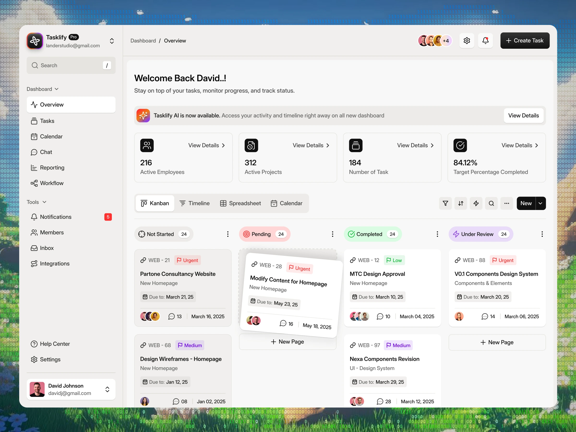
Tasklify – SaaS Project Management Dashboard UI | Figma Case Study
Client Inquiry
"We need a clean, scalable Figma dashboard UI for our platform, Tasklify, to help teams manage projects easily, track KPIs at a glance, and drag-and-drop tasks across different views."
Problem
Complex project management tools suffer from poor data hierarchy, making it hard for managers to track overall KPIs alongside granular daily tasks without visual fatigue.
Solution
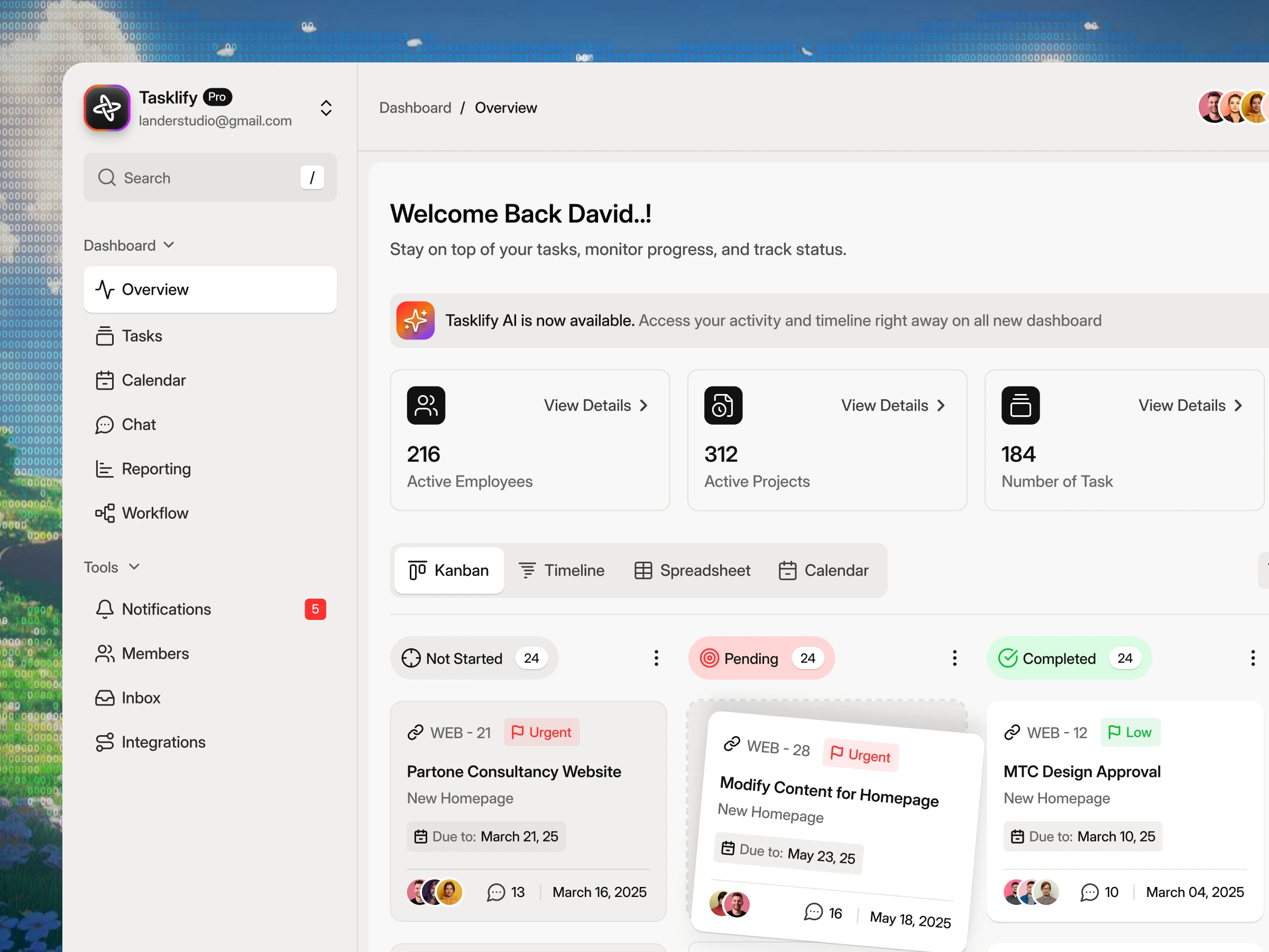
Structured Dashboard Hierarchy: Organized the interface into clear global navigation, high-level KPI cards (Active Employees, Projects, Tasks, Completion Rate), and a main workspace.
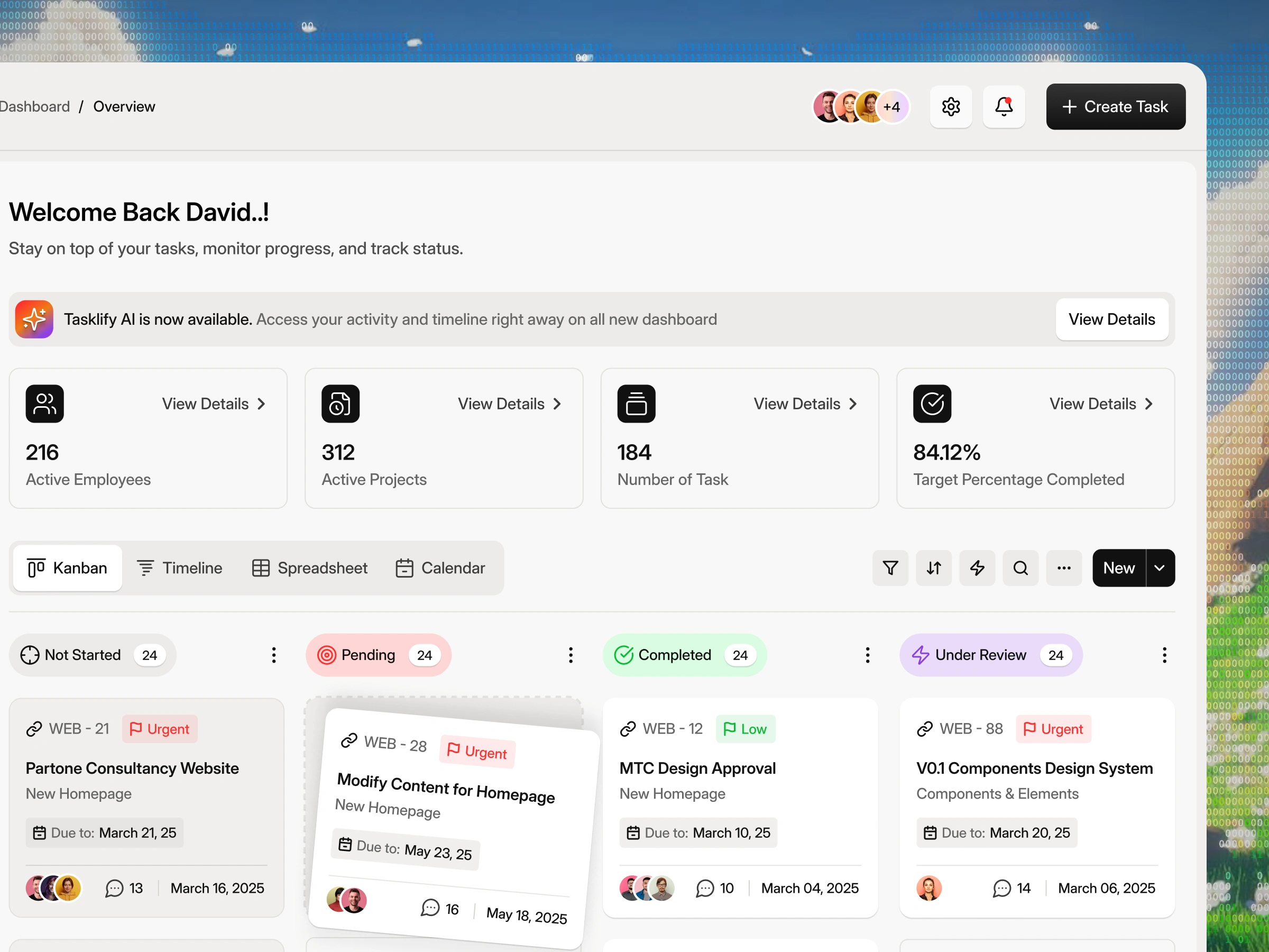
Interactive Kanban & Views: Designed color-coded task cards (Not Started, Pending, Completed, Under Review) with drag-and-drop states, priority badges, and quick-switch tabs (Kanban, Timeline, Spreadsheet, Calendar).
AI Banner Integration: Incorporated a highlighted notification module to promote Tasklify AI automated workflows directly within the layout.
Outcome
A modern, intuitive SaaS dashboard design system built in Figma that simplifies complex project tracking and enhances team productivity.
How do you optimize SaaS dashboards for high-density data? Let's connect! 🚀
#UIUX #CaseStudy #Figma #SaaSDesign #DashboardUI #ProjectManagement #ProductDesign #UserInterface #WebDesign #UXDesign
🟢 Hire us | We're Accepting New Projects
We help startups and growing businesses design and build better digital experiences.
Product Design · UI/UX Design · Figma Websites · Framer Landing Pages
🚀 Book a Call → Let’s Discuss Your Project
🌐 Explore Our Work → airzon.agency
Like this project
Posted Sep 1, 2026
Created a scalable Figma UI for Tasklify's project management dashboard.
Likes
0
Views
16
Timeline
Aug 28, 2026 - Aug 31, 2026