Built with Framer
Elevating a B2B SaaS Brand Through Strategic Web Design
Julia Ibri
Verified
Chata.ai Website Redesign
Redesign of a B2B SaaS website for an AI-powered data analytics platform.
OVERVIEW
The goal was to improve clarity, strengthen visual consistency, and create a more trustworthy and user-focused experience across the main pages of the site.
The Challenge
The website presented two main challenges.
On the UX side, the content was heavily focused on features rather than the primary audience.
While the platform targets data analysts, the messaging remained broad and did not clearly address their specific needs or expectations. This made it harder for users to quickly understand the product’s value.
On the UI side, the interface lacked consistency and structure.
The absence of a clear design system, combined with issues in hierarchy, spacing, and visual coherence, reduced the overall sense of credibility and trust.
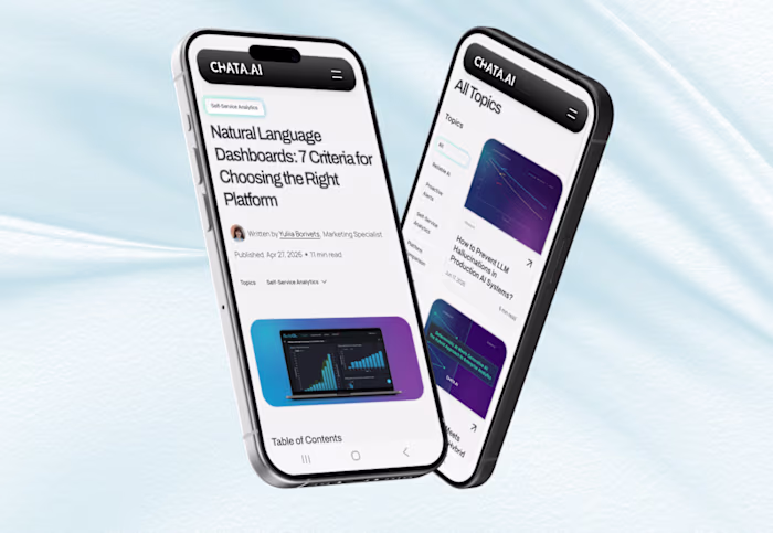
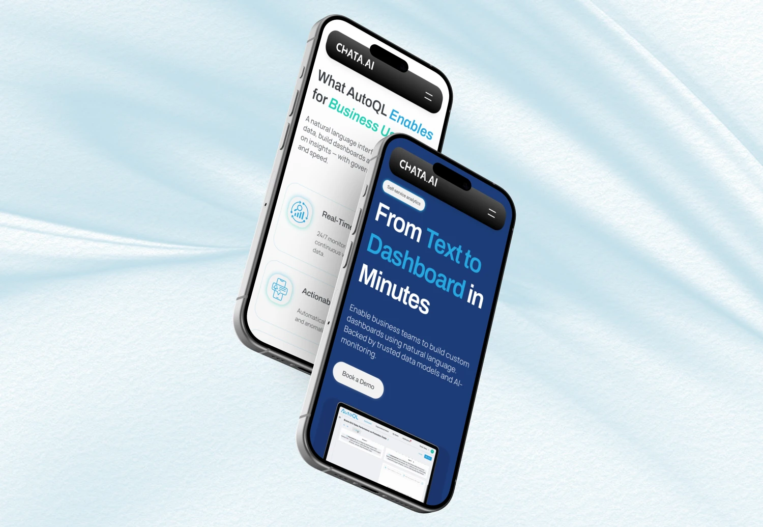
Additionally, the website was not optimized for mobile, creating friction across devices.
Strategic Approach
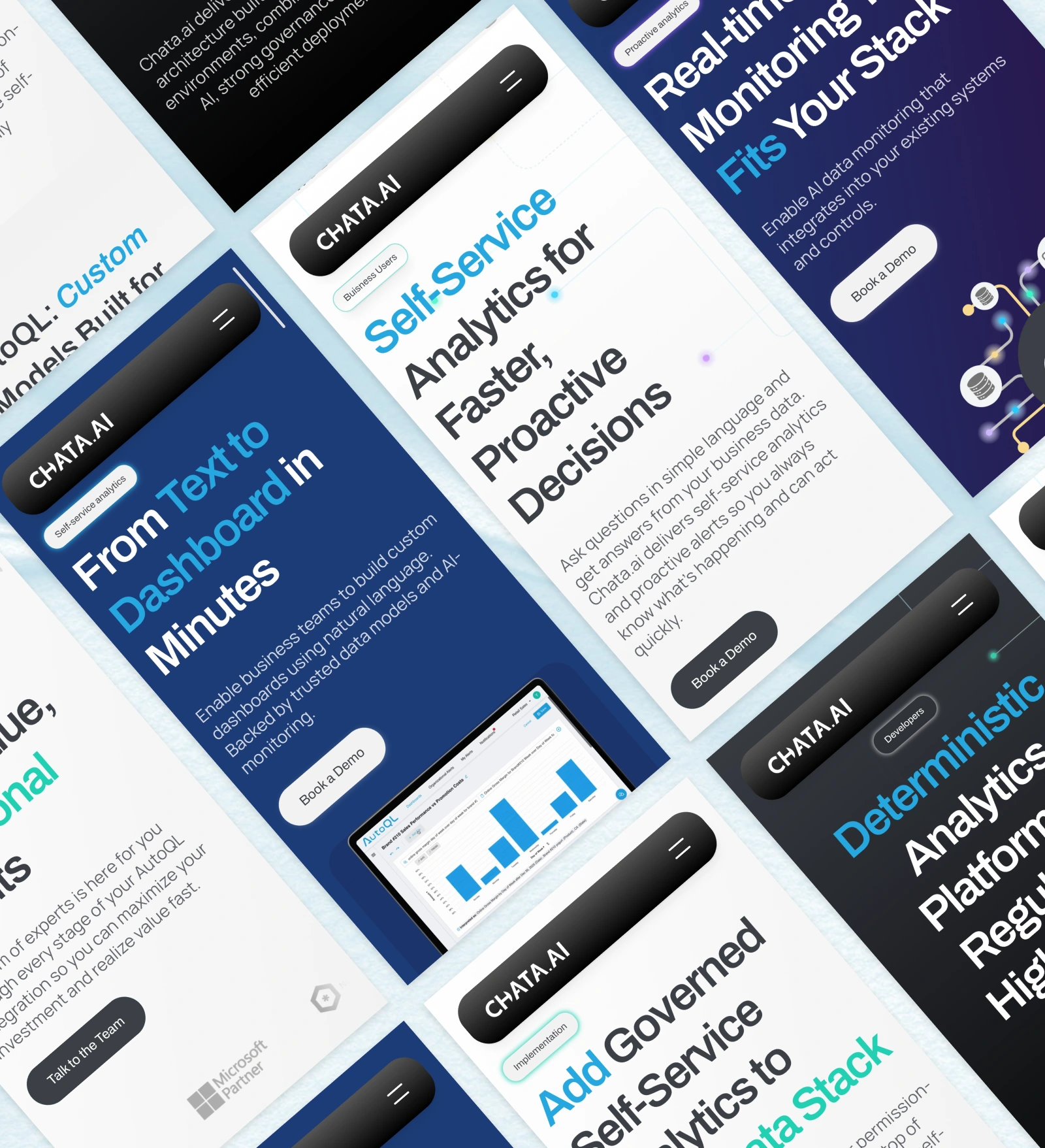
The project involved the redesign of the main pages of the website, including the homepage, platform pages, solution pages, and developer pages.
Working closely with the internal team, I built upon the existing structural work and contributed to refining the overall experience.
My focus was to bring clarity, consistency, and cohesion to the interface while supporting the existing content strategy.
This included:
analyzing internal UX research and proposed structures
suggesting improvements to content hierarchy and flow
designing a clear and scalable design system
ensuring a consistent experience across all pages and devices.
Solution
Building Trust Through Consistency
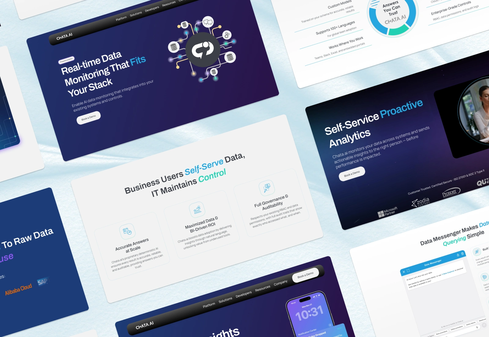
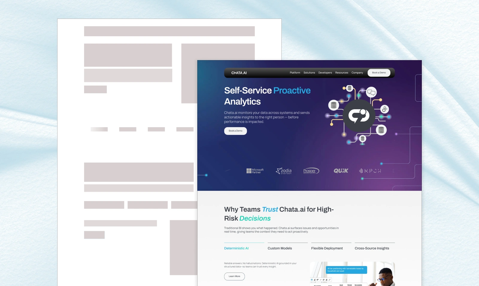
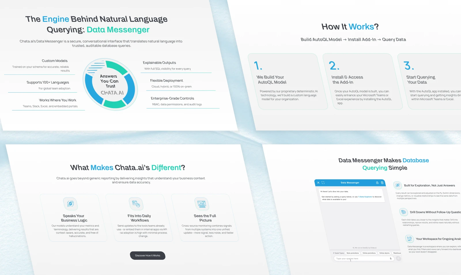
I designed a structured and repeatable design system to ensure visual coherence across the entire website.
This included defining clear rules for components, interactions, and color usage, allowing every page to feel aligned and consistent.
The result is a more professional and reliable interface that reinforces trust.
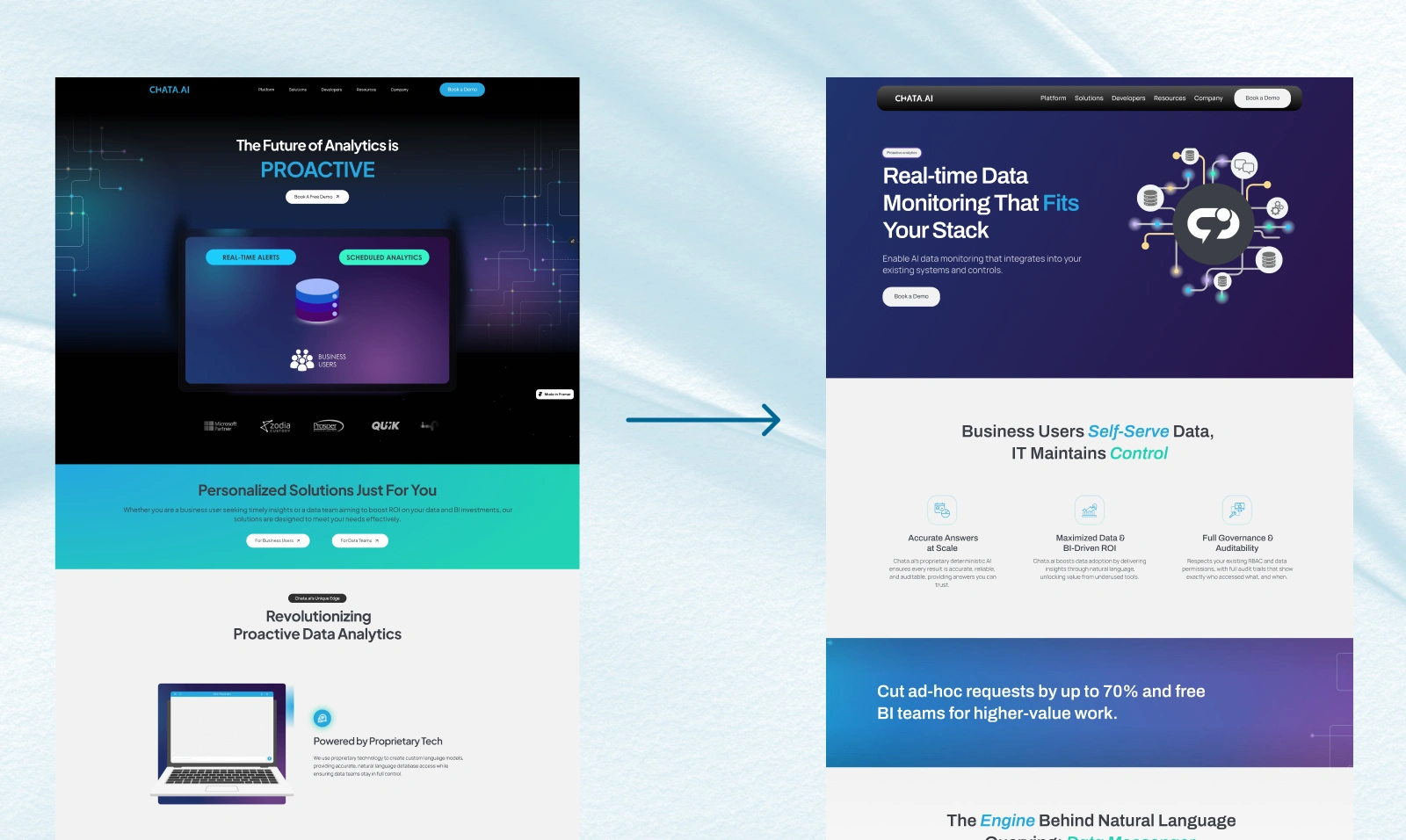
Simplifying the Visual Language
The original interface relied on multiple colors and heavy gradients, which created visual noise and reduced clarity.
I simplified the visual approach by reducing the color palette and using gradients more intentionally — mainly as subtle accents or to highlight key elements such as CTAs and important messaging.
This shift created a cleaner, more premium feel and improved overall readability.
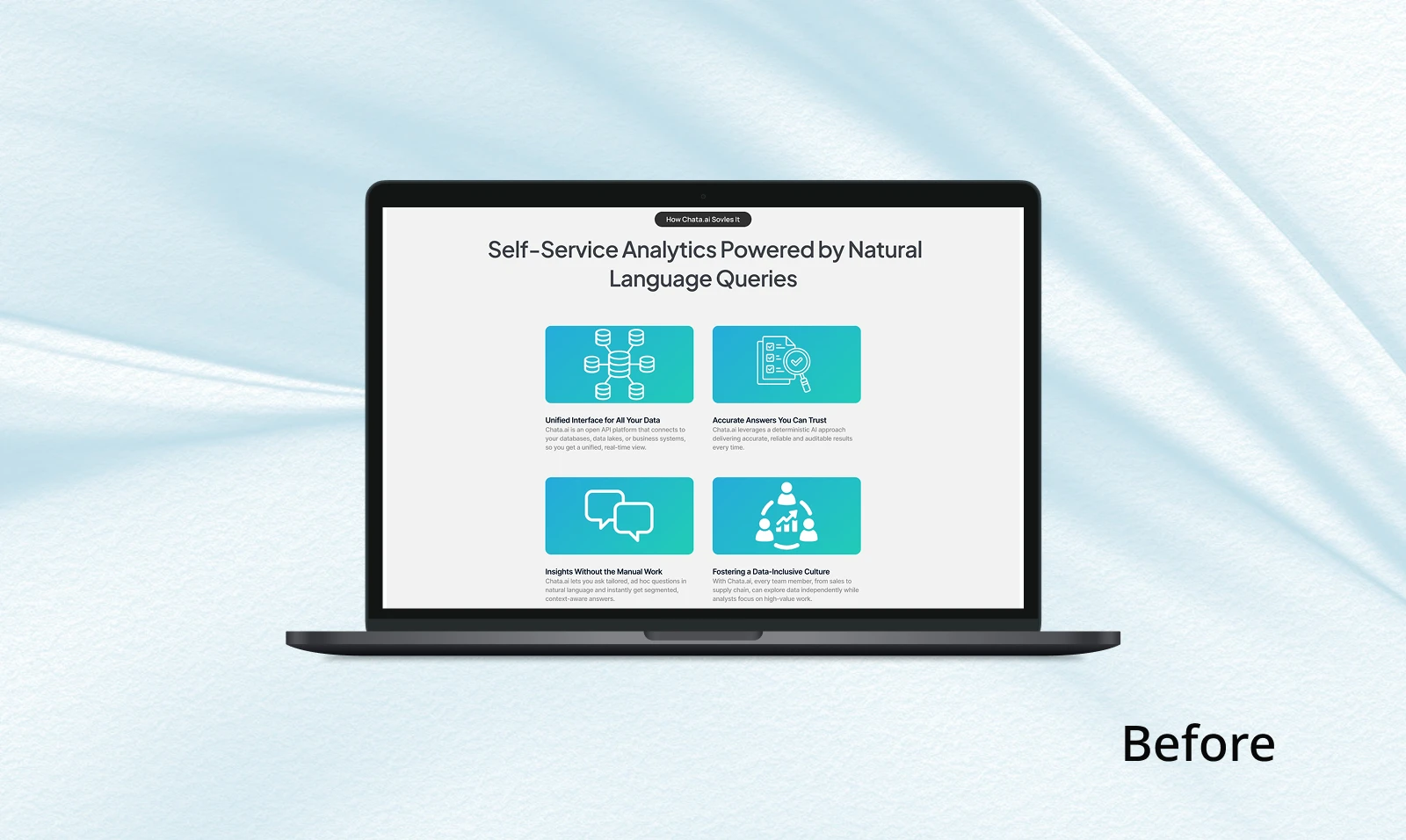
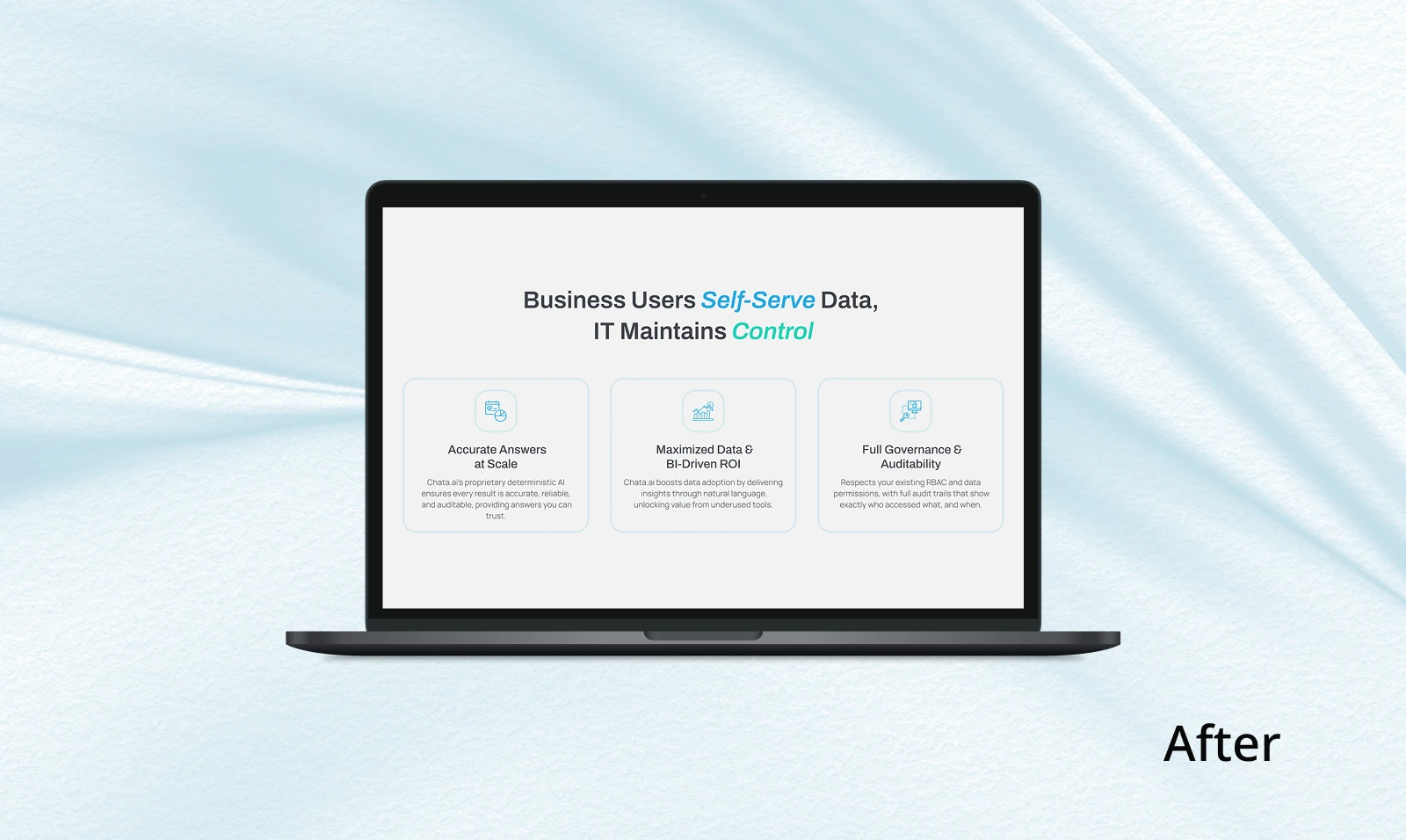
Strengthening Visual Hierarchy
I reworked the hierarchy to better guide user attention toward what matters most.
Key information such as headlines, metrics, and trust signals are now more clearly emphasized, while secondary elements remain more neutral.
Buttons were redesigned to be minimal and unobtrusive, with subtle interactions (such as gradient shadows on hover) to maintain a refined and controlled experience.
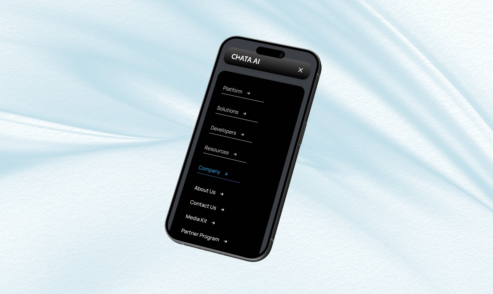
Improving Navigation Experience
I redesigned the navigation system to improve usability across all devices.
This included:
a fixed navigation bar for better accessibility
a more structured and immersive menu experience
improved mobile and tablet navigation
The goal was to make navigation more intuitive and reduce friction throughout the user journey.
Outcome
The result is a more structured, consistent, and user-focused interface.
The website now feels clearer, more reliable, and easier to navigate, helping users better understand the product and engage with the platform more confidently.
Key Improvements
improved visual consistency across all pages
stronger sense of trust and credibility
clearer hierarchy and readability
simplified and more intentional use of color
enhanced navigation across desktop and mobile
Like this project
Posted Apr 20, 2026
Optimized Chata.ai website: improved UX, refined layouts, reduced white space, built mobile navigation, and enhanced blog structure for better performance.
Likes
9
Views
284
Timeline
Oct 31, 2025 - Ongoing
Clients
Chata.ai