Redesign experience of Zoom - A video conferencing app
Vivek Purswani
About
Zoom is a video communications company that affords its users video conferencing remotely using cloud-based computing. It is a Software as a Service (SaaS) that provides you with an easy and stress-free platform to hold online meetings, mobile collaboration as well as video conferencing.
Project Overview
This Project was done during my time in School of accelerated learning where i was learning Ui/Ux Design. Time duration for this project was 1 month and was done in a team of 4.
Problem Statement
The current user interface (UI) of the Zoom desktop application is difficult for users to navigate the app efficiently as it looks very technical and Users have a hard time finding the specific features they need due to unclear labeling and disorganized layout. Additionally, there is a need for separate spaces within the app that cater to both business and education use cases. As Zoom is being widely used in these two industries.
Understanding the Problem
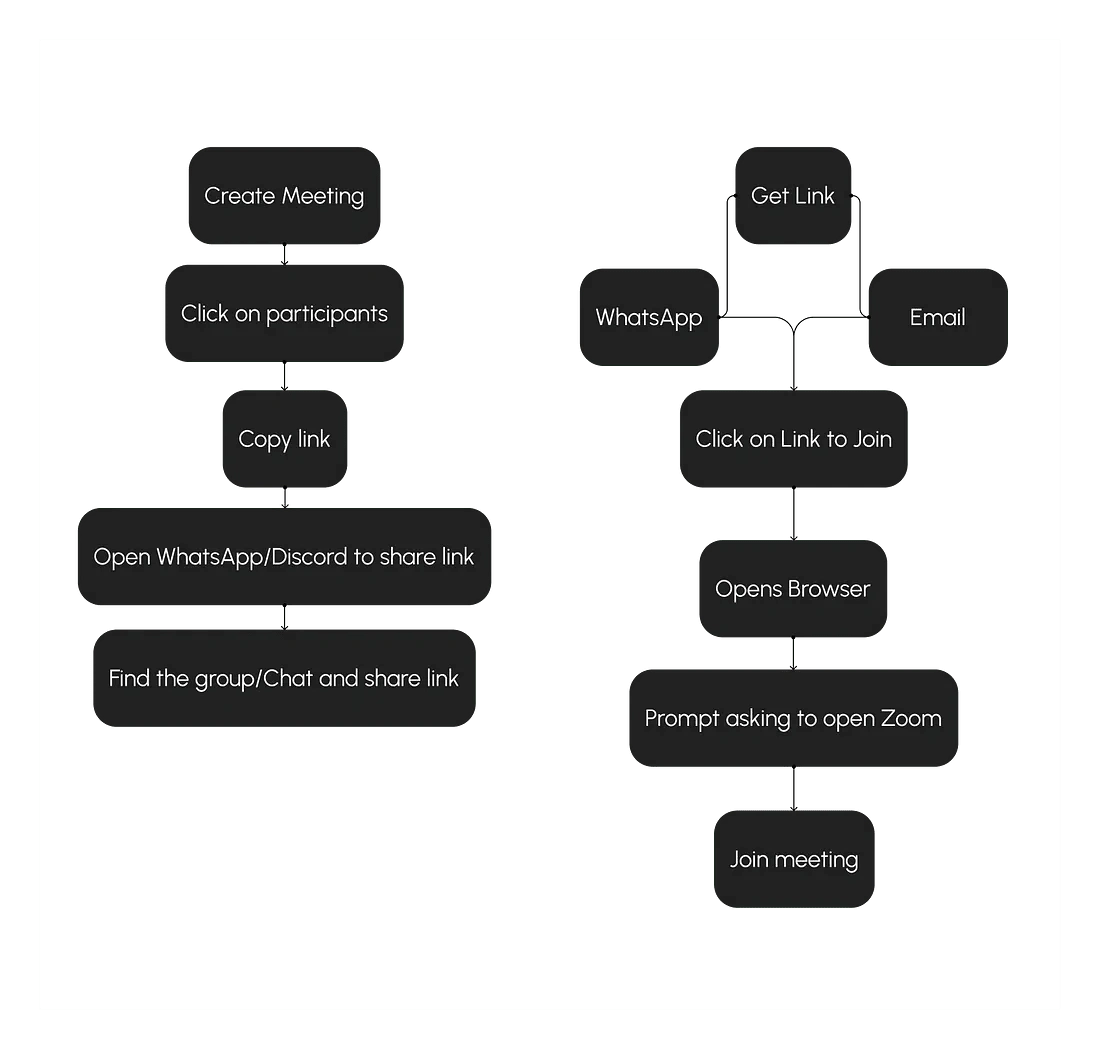
Zoom is widely used in corporate and Education sector to conduct meetings and take classes. But is it easy to manage work on multiple platforms? Meeting on one and documents on other and inviting for meeting on mails or sharing links on WhatsApp/Discord. Joining meeting is also a long process compared to the other apps in the market.
As Education is going online and Work from home is normalized Zoom is playing a major role and its subscription is not very affordable. Even if subscription is expensive Zoom provides a lot of things with it but are people using it all ? No, Most people are using just to take meeting and paying high price just to get rid off from 40 minutes time limit.
Design process and challenges
Research
We started by understanding the zoom first, we went through the and used every feature available so that we understand how zoom works and what all it has to offer apart from a video meeting and there was a lot of things that zoom is offering like the integrated apps for collaboration based on different industry needs and we saw that zoom is also offering multiple subscription plans based on needs. But very expensive.
We made some observation of our own like What feature are working and what features are not working, Was it easy to navigate and find what we were looking for.
After understanding Zoom we did a competitor analysis to see what all the other platforms are offering and how they work and in terms of features zoom was on top, Zoom is offering every available feature which is there for a video conferencing app.
So if zoom is offering everything why are not people using it ? It has a number of Integrated apps to work efficiently and collaboratively but still many people are using different apps and platforms. to understand the ‘why’ we started asking questions to know what is making them to not use zoom. So we Sent out a survey and there were total 39 participants
56.4% Students
7.7% Educators
35.9% Business/Job
After survey we took 10 interviews as well to understand the problem in detail we asked about the app that they were using and also about indirect competitors like WhatsApp, Discord and Instagram why they like it so we can understand what their want and we got a lot of insights and we did affinity mapping to filter the data and we identified the pain points.
Creating meeting and inviting people is a long task compared to other apps ( Google meet has a simple and short process to join meeting)
WhatsApp, Instagram and discord offers more flexibility and calling is much simpler
Ui and color is very basic and old
Zoom premium plans are expensive
Users use multiple platform to manage work ( Educators usually share a google drive folder with students to get the submissions of assignments and create a new folder every time or they use google class room which again works in a similar way)
Can not change the name of recorded meeting which gets saved in zoom cloud storage and its hard to find particular session later
Switch account works same as sign out. it does not give option to switch without signing out like Instagram does
Zoom is not beginner Friendly and is hard to navigate as it looks too technical
Define
After research was done and we had all the mixed pain points and wants from different user groups we started making personas of to define what each user group wants to get better understanding of what we have to make. and after that We created How might we questions to brain storm ideas.
We created 2 personas based on the audience of our survey and interviews and defined their goals and frustration
Education (Teachers/Students)
Their basic need was easy and better management
Goals
Want more engaging And Easy UI
Students don’t want to search WhatsApp groups and Want to find study resources easily
Teachers don’t want to share link everyday on a messaging app(WhatsApp/Discord)
Teachers don’t want to call/Video call students to provide feedback or suggest changes in the project/Assignment
Frustrations
Often submit the homework/assignment late because can’t find the Google drive link/Folder
Don’t remember what feedback teacher gave and what changes were suggested
Loose the track of what all work is done and submitted and what is Pending.
Looks too technical
Corporate
Their basic need was more efficiency in work
Goals
Easy meeting joining process
Wants button like Raise hand and invite people on the glance
Wants to Change name of recording to find them easily later
Want Affordable subscription plans
Frustrations
Creating meeting and sharing link Process is Time consuming
Joining meeting Process is lengthy as it opens browser first then ask to open zoom
Has to use different notes taking app while in the meeting
Freelancers or contract workers works with different clients and companies and every time they have to attend a meeting they have to sign out and sign in with different account given by company
How Might we
How might we improve the efficiency and Management in the app ?
How might we Make the joining process easy ?
How Might we Improve The UI and make it more informative ?
How might we Create different spaces for different purposes ?
Ideate
There was a lot of iteration even for every single screen and it was really challenging to simplify many features, change the ui, its color and introduce business and education profile. We started to experimenting with colors But we didn’t want to create a new brand identity so we stuck with blue but we played around with Hue in the range of blue and created multiple tints and shades.
We created all the screens from the joiners perspective as our primary focus and we did created all the extra elements and pop up that user will see while creating meeting and every thing that we have introduced in the app but it was not our primary focus so i will not show those elements here.
Goals
Clean and simple but professional looking UI with clear copy and labels
Introduce Business and Education profile
Simplify chat screen and make it easy to use like other apps(WhatsApp/Discord)
Optimize and introduce Small features like renaming recorded sessions, switch account and dark & light mode.
Introduce Notes feature so users don’t have to use another app to take notes
Iterations
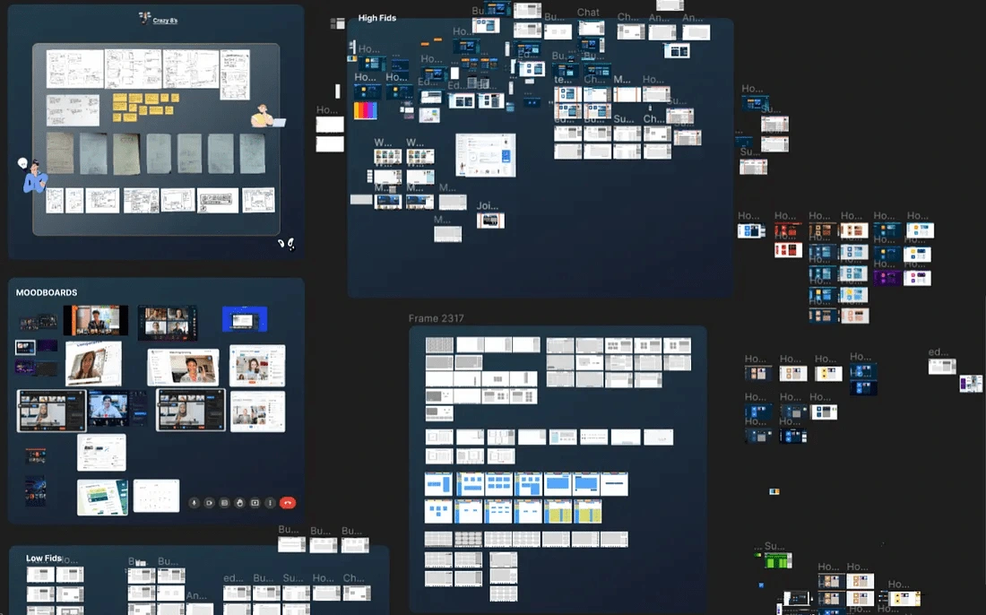
High Fidelities
We divided the Zoom in three spaces Personal, Business and Education as there were 2 specific use case. Majority of our audience using zoom is from education sector followed by corporate to give them more efficiency and management we created these spaces for them. We also refined features Like switch account, chat and meeting section with one added feature of taking notes.
Now here I will show the existing vs Redesigned Home, chat and meeting section and explain why we did what we did. We only redesigned these 3 sections because of time constraint as we had to introduce two new profiles Business and Education. Home and meeting section is the most used and people are not using chat much so we wanted them to use in app chat as well and not other application to make the communication easy and effective. so we redesigned 3 existing section and designed 2 new Profile.
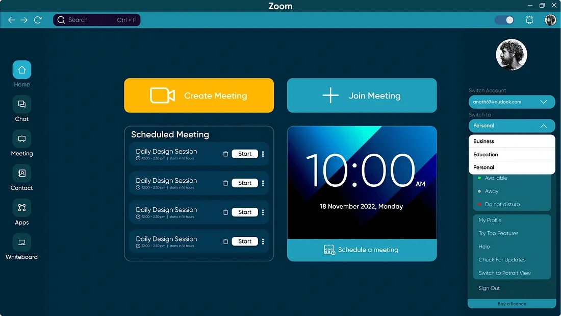
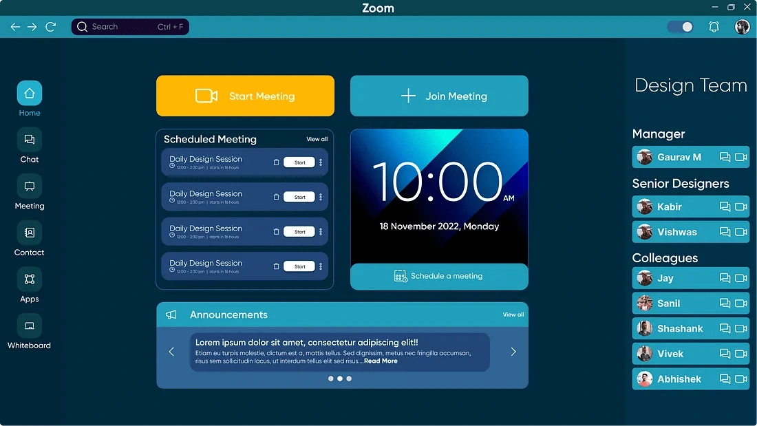
Home Screen
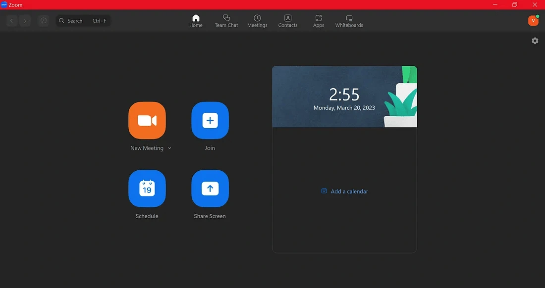
Old
Navigation is at the top mixed with other elements.
Chat label says Team chat which is slightly confusing.
Share screen button works same as join.
A lot of white space and small CTA’s.
Setting icon just placed in the corner which exist already if we click on profile icon or could be placed near profile icon as well.
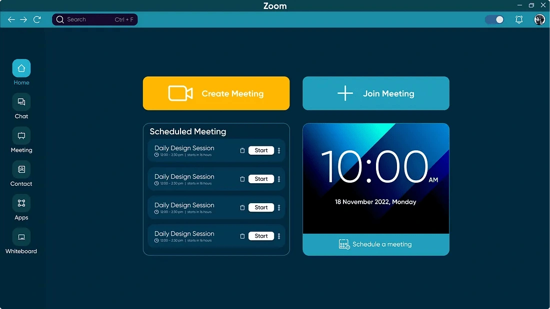
New
Navigation moved to left side with Dedicated section with better contrast, visibility and copy.
Removed Share screen button as it had no separate function.
Divided Calendar into 2 separate components. Schedule meeting attached to calendar and scheduled meeting are shown separately for better visibility and to balance the Design.
Removed the setting icon placed in the corner.
Easy dark and light mode Switch.
Chat Screen
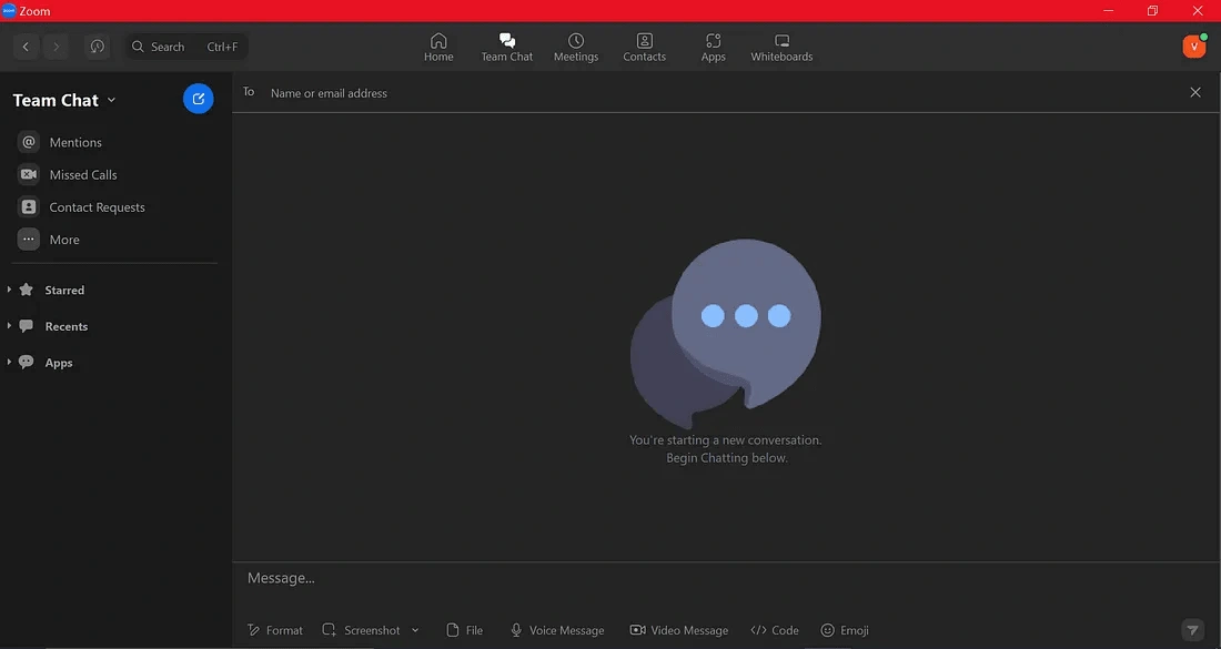
Old
If we look at the left side everything is confusing. So many labels that might overwhelm users as missed calls, apps and there is no clear way to add a contacts,
Contact requests only show request made by people who wants to add you so how can actually users add another user?
The label in the top navigation says team chat but now clear indication how to chat in team or group.
Missed Calls serve no purpose here as there is no option to make a video or voice call in the chat.
To see recent chats which is the main purpose of chat is hidden below.
So many options below message typing section which creates great possibilities of wrong clicks and send button is hardly clickable because of really small size.
New
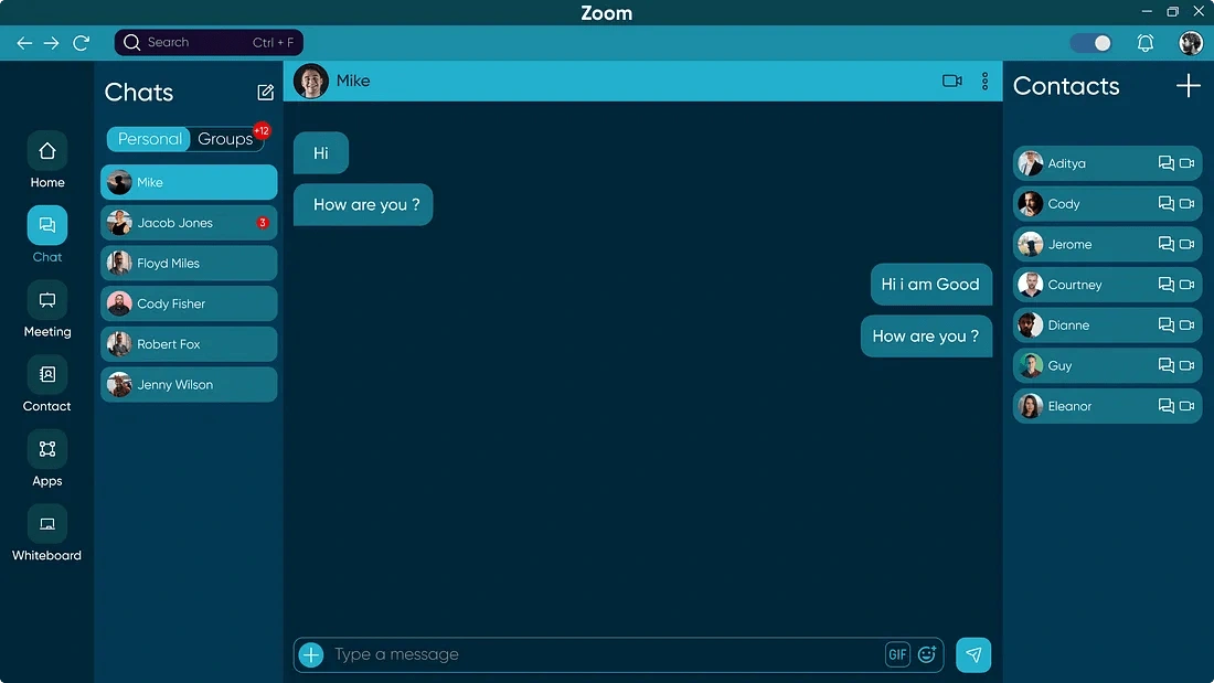
As most people are familiar with WhatsApp desktop and many use discord as well to communicate we took inspiration for those apps and designed the interface in a way that people are already familiar with.
Dedicated left section for all recent chats to easily check messages and switch between chats.
Right section was inspired by discord to show all the available contacts without any extra clicks and a clear button to add more contacts.
All the extra options below message typing area combined and given a dedicated button of plus to add media or attach files. Send button size big enough to click easily with additional GIF option
Business Profile
User can switch to business profile simply from the drop down in the menu
Business Home
This is from a employee perspective. Manager level or senior level people in the organization can add people in the dedicated team by their email, once the user has been added there is no need to share link of meeting as this section will work as how groups on WhatsApp or Instagram work. A meeting id will be set when team will be created as same meeting id/link can be used multiple times there is no need to create new every day, which can be simply used by clicking on start meeting and join meeting once the meeting is started employee can directly click on join meeting the person will enter in the meeting. without any additional steps.
Additionally as work from home is normalized and many companies are following it so if a new employee joins that person will know about who all are in the team who is senior and manager from the section on the right without asking anyone.
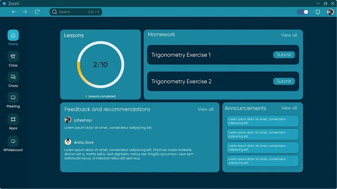
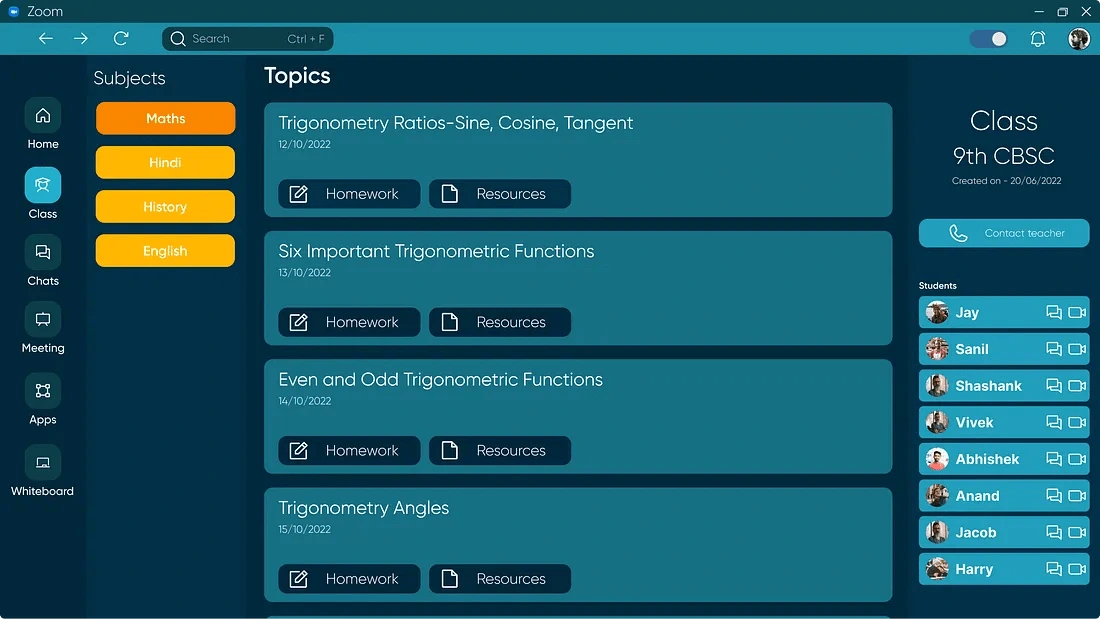
Education Home
Education profile can be accessed with the same steps as switching to business profile.
This is from students perspective.
For the Home screen we created a simple and short dashboard for students where they can track their progress, check homework, see announcements and also see the feedback from teachers
Class Section
On the left side Students can see all the class they have enrolled in other than school. This section will also work on the same concept as business one to join class without sharing link. Class timings are fixed and only teachers can start a class we removed the start meeting option for student instead we gave another space called subjects and on the right side students can see all their classmate and communicate with them.
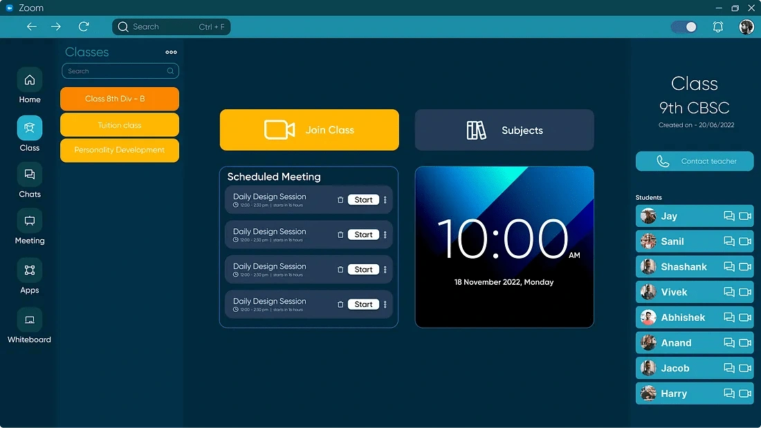
Subject section
Students can see all the homework of a particular subject and resources like YouTube videos or google website etc. as well.
In Meeting Screen
Raise hand feature has been moved out from the inside of Reaction button and as we observed the users none of them use reactions they only use raise hand option so we remove reaction button and added an extra feature called notes beside raise hand. So that when in meeting users can take notes without opening any other app and all the notes will be show in the meeting section.
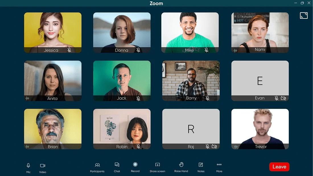
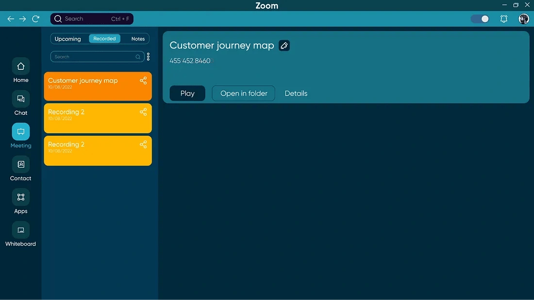
Meeting section
Introduced rename option for the recorded session to make it easy for users to find it anytime.
Notes will be shown here which users can view and edit as well any time
And that’s the wrap for this case study, Thanks for reading.
Like this project
Posted Nov 25, 2024
A 3 weeks Self initiated project. Complete redesign of zoom, From discovering the improvement area to user research to final design.
Likes
0
Views
11