Plenty Labs
Vivek Purswani
Plenty Labs
Overview
Plenty network is a platform where you can Trade, earn, govern and build on the leading decentralized exchange on Tezos.
Background
I joined Plenty Labs as Product Designer and i was there for 2 months, when I joined them they were about to roll out the final version of their product called Plenty V3. My role was to design a replay-able tutorial for the V3 to explain the new feature with animations and add few small things on the landing page that we will see in this project.
The Shift from V2 to V3
As the new version launch was near I was asked to create the tutorial for user who will migrate to V3 from V2, but what is V3 and what are the changes? Being new in the company these questions were obvious for me to ask and I did ask them and got answer and information i needed to design the tutorial. Let’s see what are those changes.
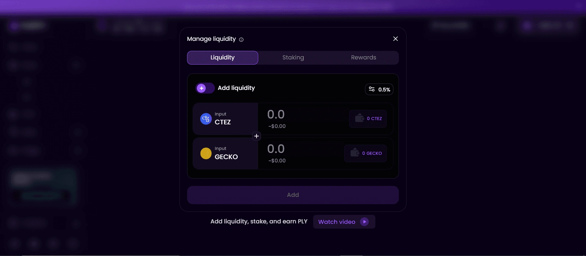
The key differences between V2 and V3 are as follow.
In Plenty V2, liquidity was uniformly distributed across the entire price spectrum, from zero to infinity. While this approach was straightforward, it was not the most efficient use of capital.
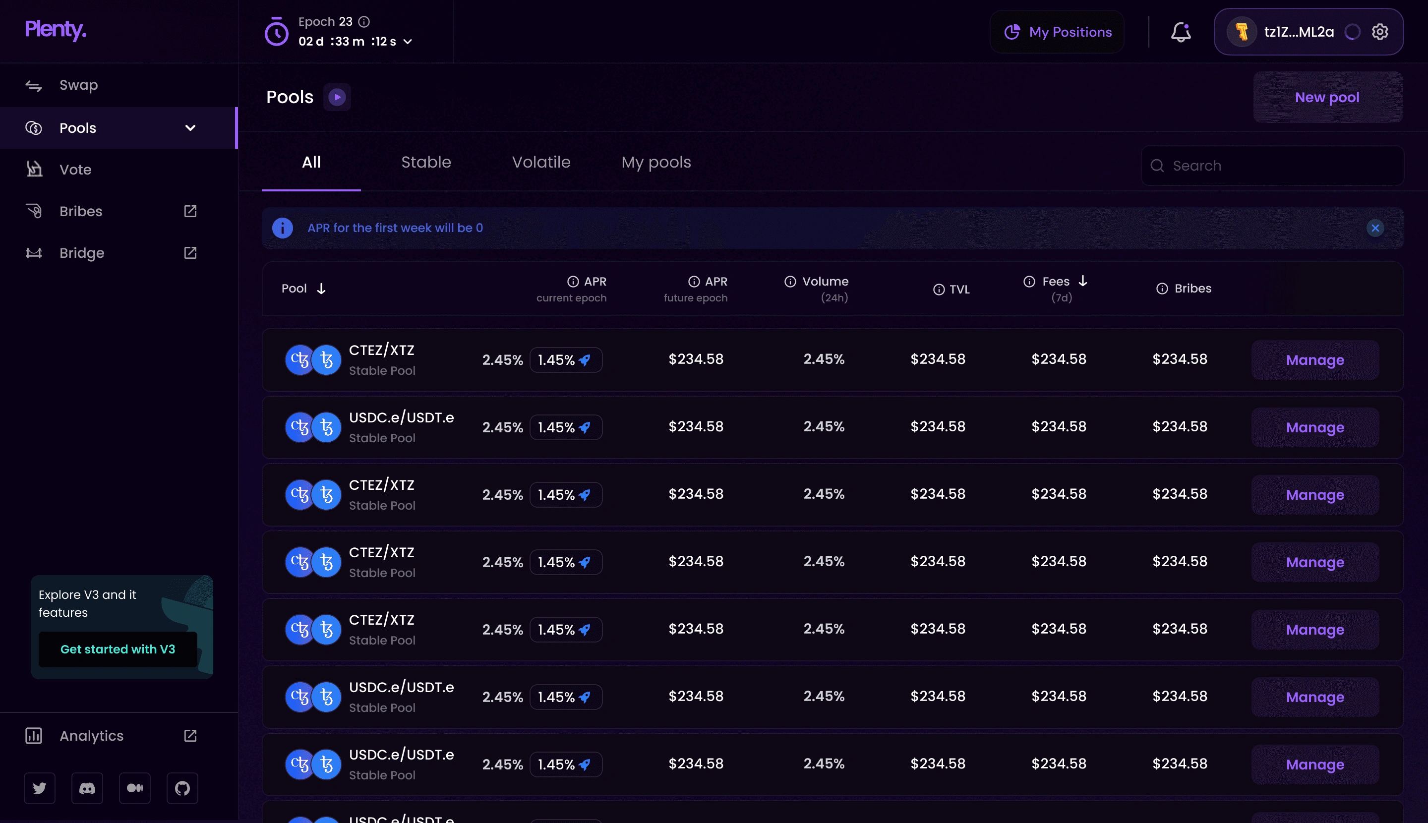
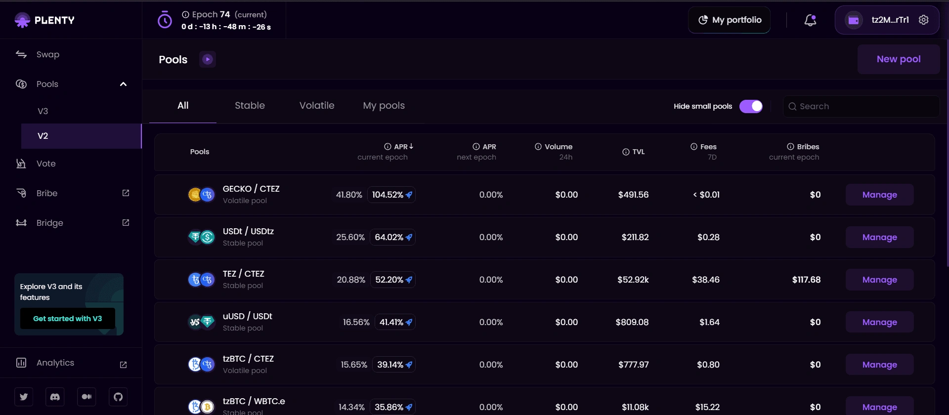
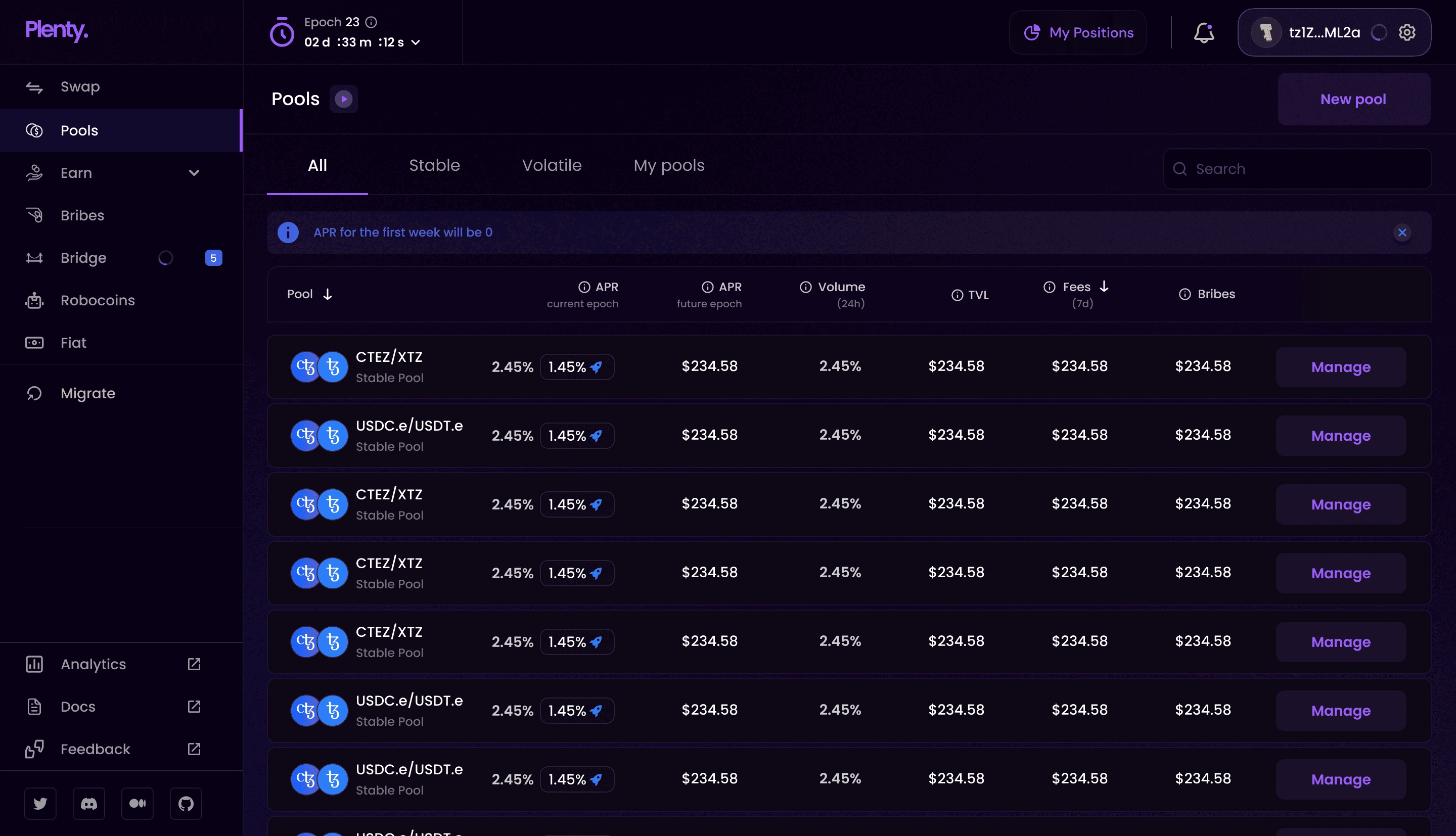
It is on internal level with similar navigation. Lets see V2 first.
Click on Manage
A Modal will open with option to add the amount and add your new position. It does not allow you to set price range and distributes your liquidity uniformly from 0 to infinity.
Also you can’t see your current position.
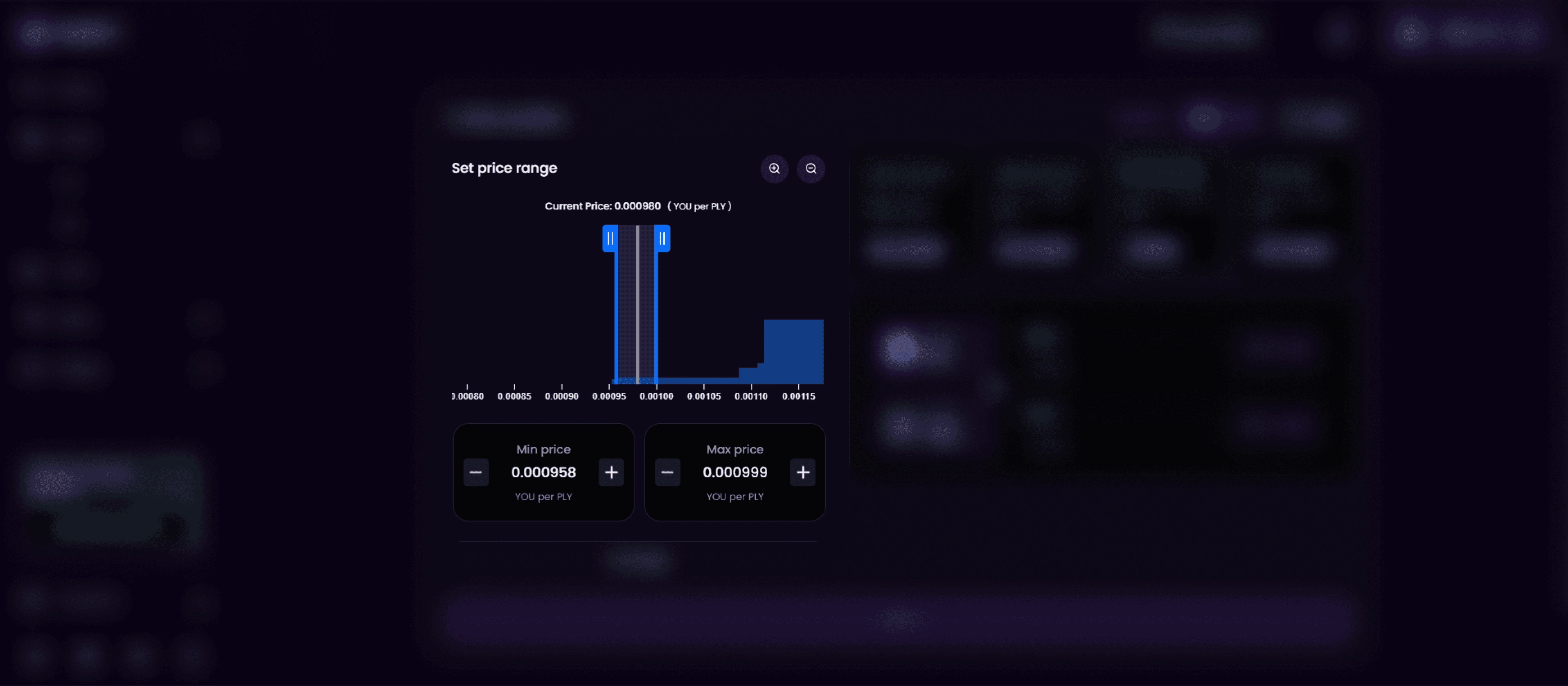
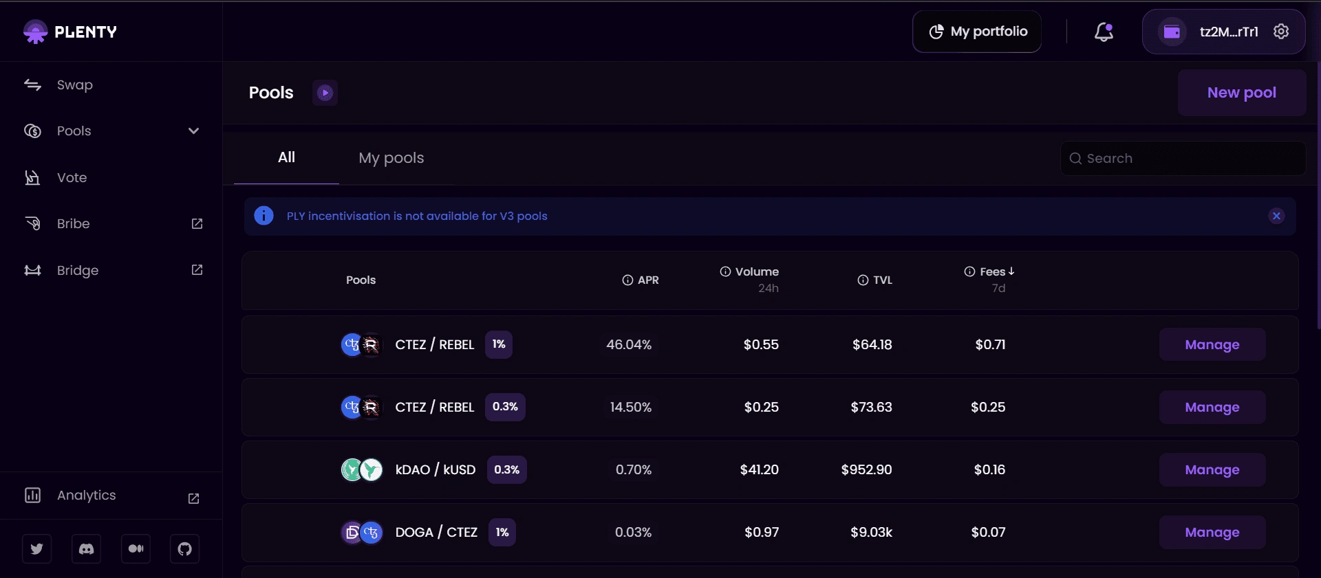
Lets see V3.
Plenty V3 allows liquidity providers to "concentrate" their capital within specific price intervals. This means that when you provide liquidity, you can choose a custom price range where you expect most trading to occur. This allows your capital to work more effectively, maximizing your returns.
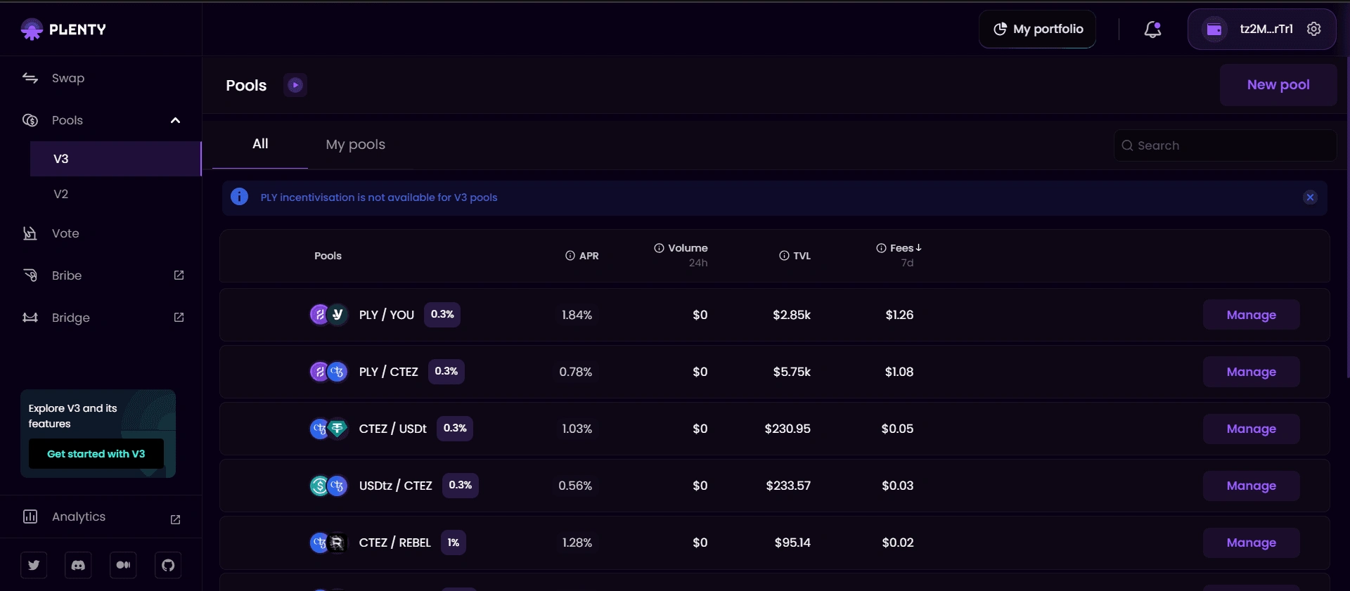
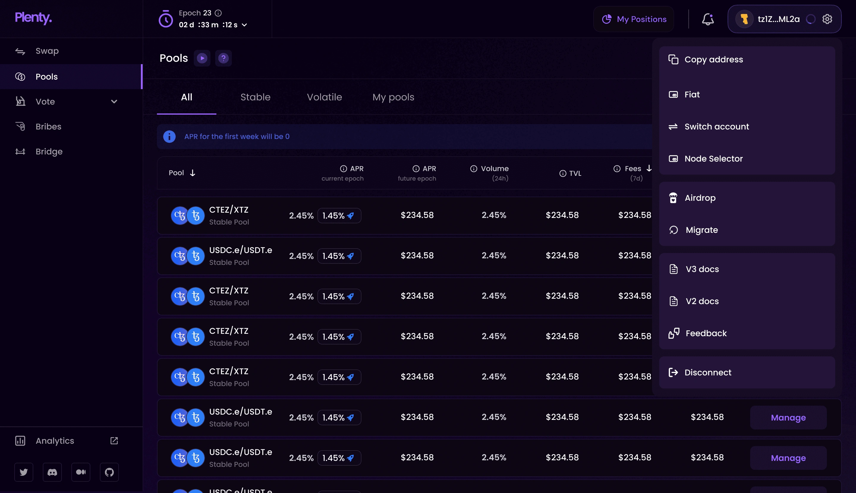
Click on Manage
A new Modal will open with different interface where you can see your current position if you have already provided liquidity and clear CTA about what action you can take.
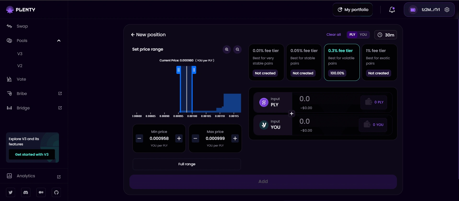
With V3 liquidity providers will be able to allocate their capital within a specific price range. Unlike traditional models where liquidity is spread uniformly across an infinite price curve
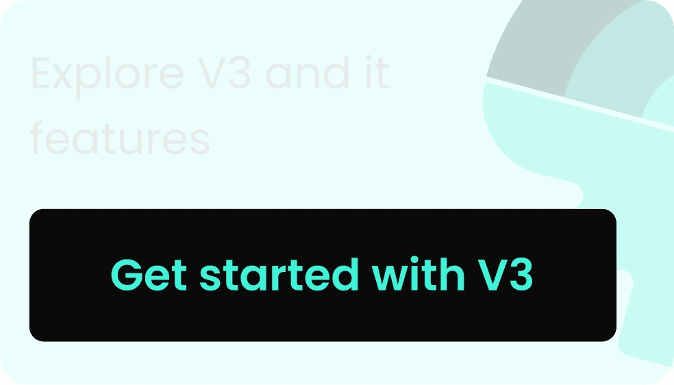
Now to explain this, I was asked to create a visual tutorial.
What Exactly is this ? Lets see
It is divided into 4 parts
What is concentrated liquidity?
With concentrated liquidity pools, we can now focus and consolidate liquidity around the current market spot price, greatly enhancing capital efficiency.
Track the current price in the market to form your strategy. where you want to trade.
Set the range in which you want to trade in.
Now you can pick a strategy that suits you. Passive strategies allows you to distribute a little bit across the entire span. You earn less, but never go out of range.
What is concentrated liquidity?
Short price range can get you more earnings but at the same time you will stop earning on swaps, if price goes out of the range you have set.
A more aggressive strategy will allow you to earn more, but is more likely to go out of range. Watch it closely and rebalance as needed. While out of range, you will stop earning on swaps.
What is concentrated liquidity?
When prices move, your investment turns into one asset. If the price goes out of your range, you'll have only that asset until the price comes back
As the price moves, assets are converted entirely into one of the assets in the pool. If your position goes out of range, then you'll have 100% of the other asset until the price re-enters your range.
What is concentrated liquidity?
The implementation of these animations was a challenge. These animations were created in Figma and can’t be implemented in code directly also I had no idea how to use Aftereffects and create them, The developer i was working with asked me if i can get these animations in json format. So I used Lottie animations and created json files of these animation which was implemented in the code.
The tutorial has been made but where’s is the entry point?
To be honest it was not easy to figure out where to keep the button to trigger tutorial, as this was something new there was a possibility that users might want to see thing again so we can’t just show it once when they enter in the V3 and vanish it.
Behind the scene of iterations before final version
Of course all of it was rejected because there was already a lot of button on the screen
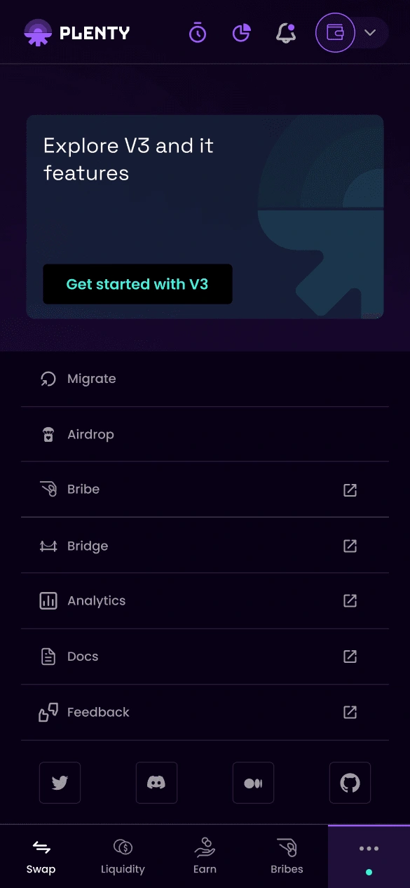
The final decision was to design a card and place it in the left navigation drawer, but there was an issue with that as well. On smaller screens, there was not enough space in the left navigation drawer to fit the card, as there were already many options in there.
So, I had to redesign it and move some options from the left navigation drawer to the menu on the right. This is the result.
This resolved the issue for smaller screens
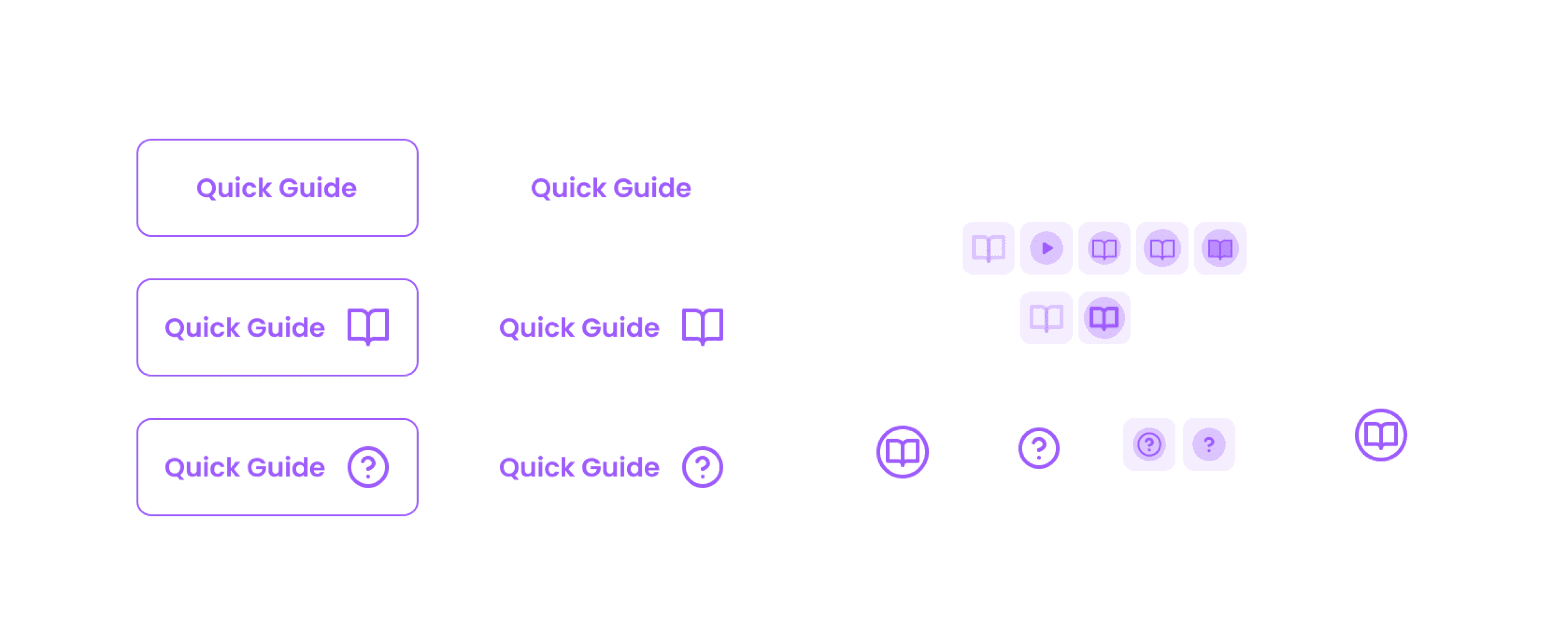
Now the design of the card.
Behind the scene of iterations
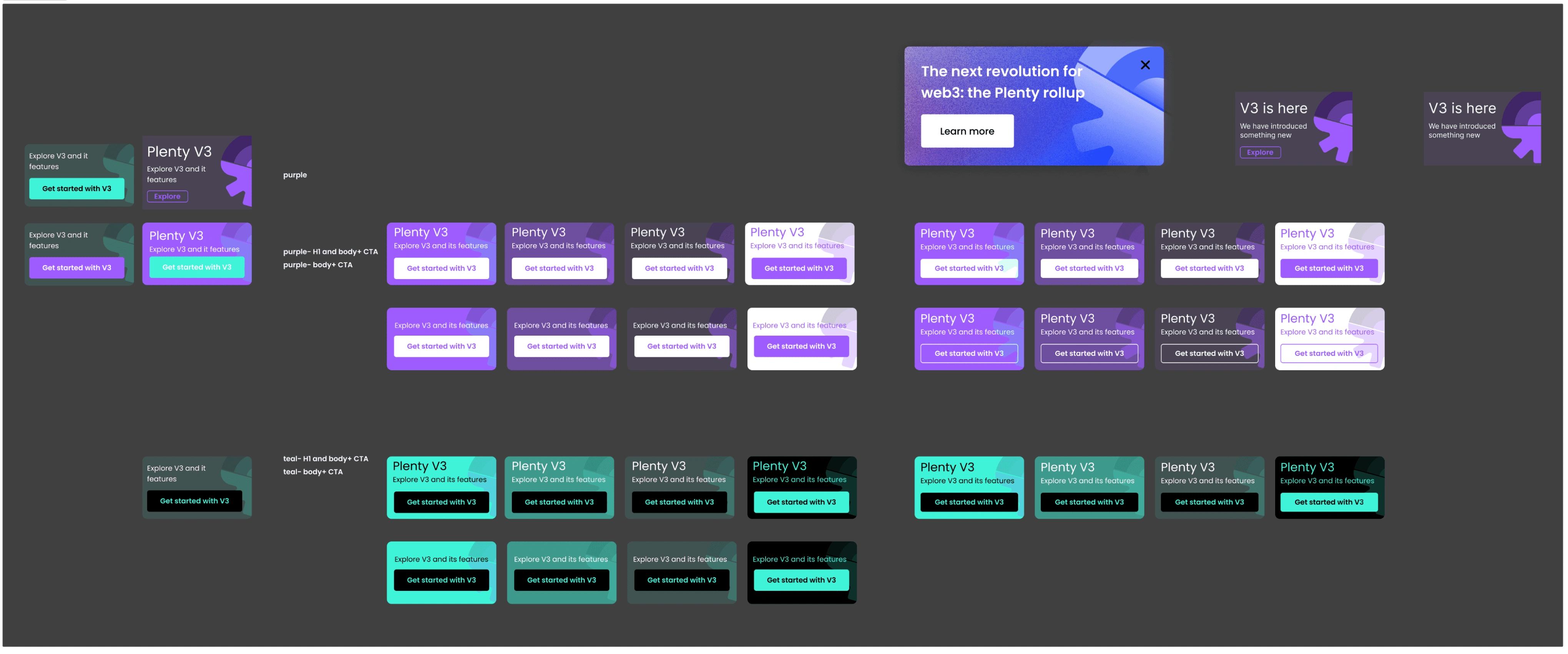
Final Design of the Card
The choice of color was Green as green was the secondary color and was used at very few places, so i went ahead with green as this was creating good contrast to grab attention and direct the users to V3. Once clicked on it the tutorial will open up and users can click on it as many times as they want to see the tutorial.
Final Design
Check out the live version - Plenty V3
That’s the wrap, Thank you for reading.
Like this project
Posted Oct 23, 2024
Created an animated tutorial to help people shift from V2 to V3 and understand new features.
Likes
0
Views
18