XX19 Lipstick Brand
현주 이
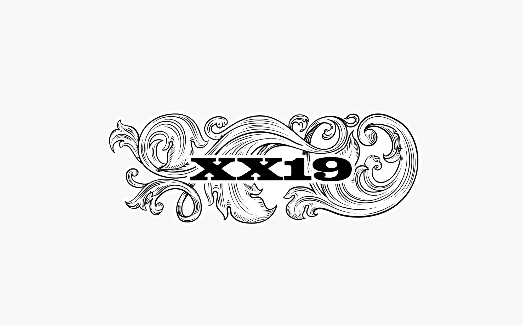
XX19
Brand Strategy, Brand Identity, Typeface Design, Brand Guidelines, Package Design System, Art Direction
2020
XX19 is a lipstick brand defined by bold energy and playful attitude, with its name at the heart of its identity.
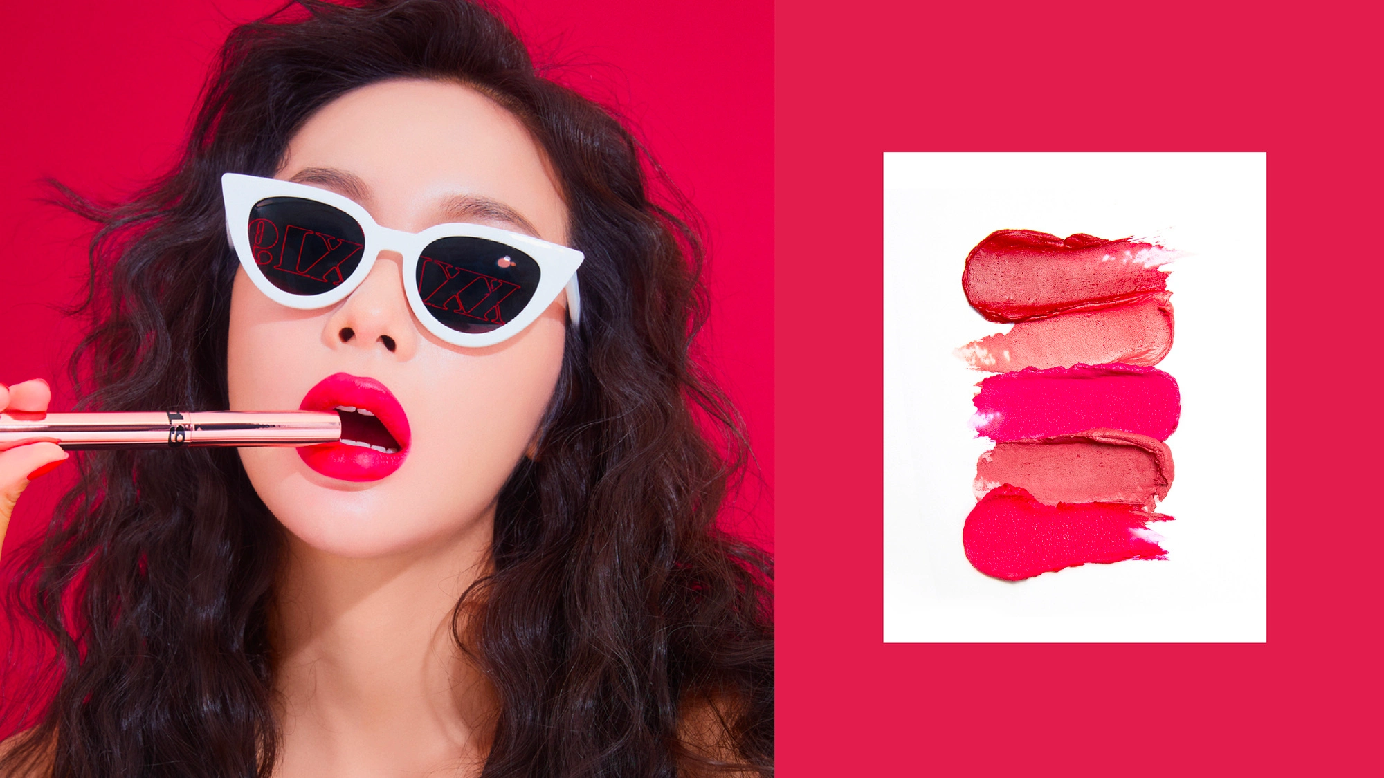
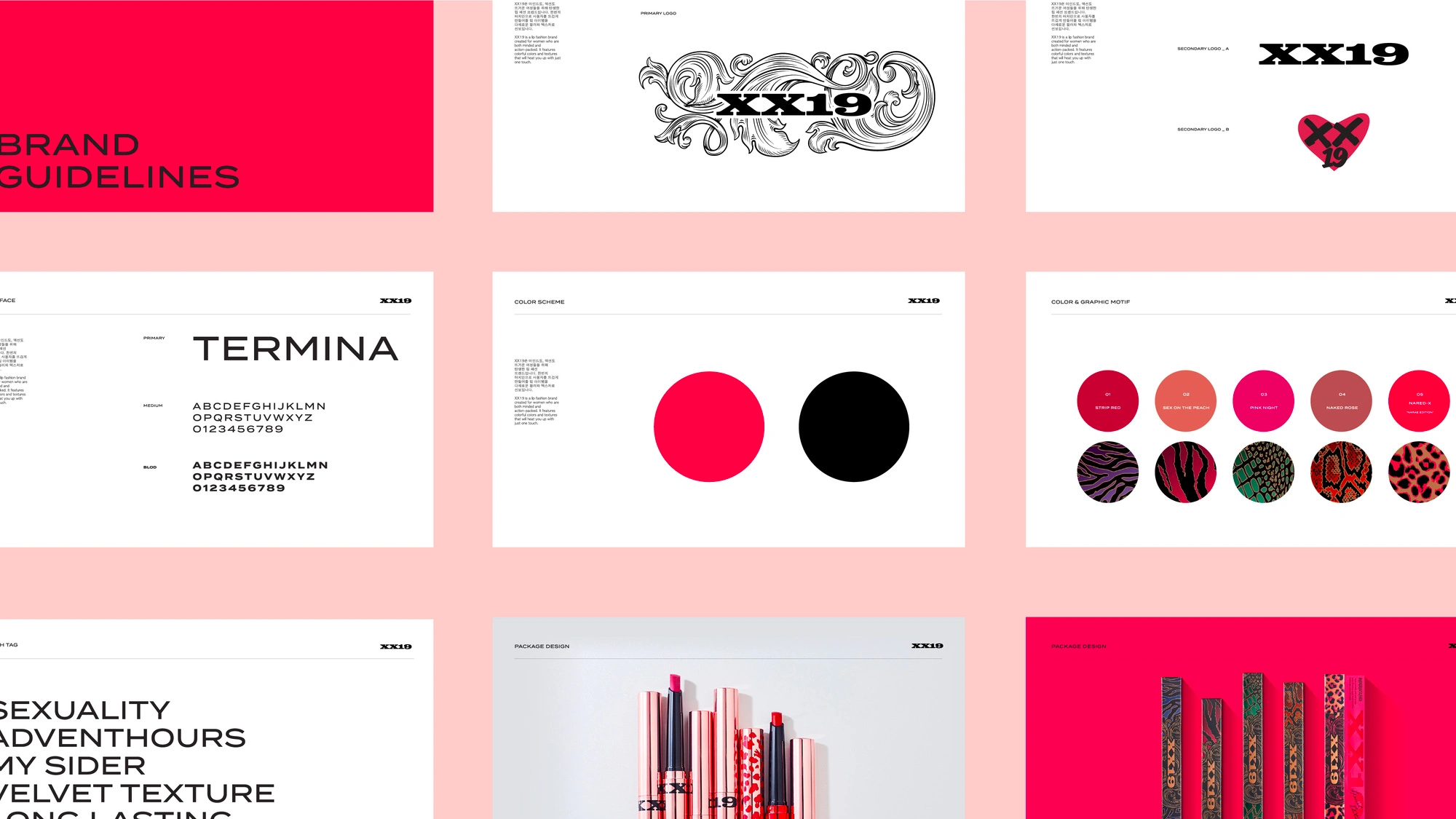
‘XX’ stands for femininity and sensuality, while ‘19’ hints at breaking taboos with confidence and wit. These ideas are visualized through cheeky graphics and a rhythmic, pop-inspired design system.
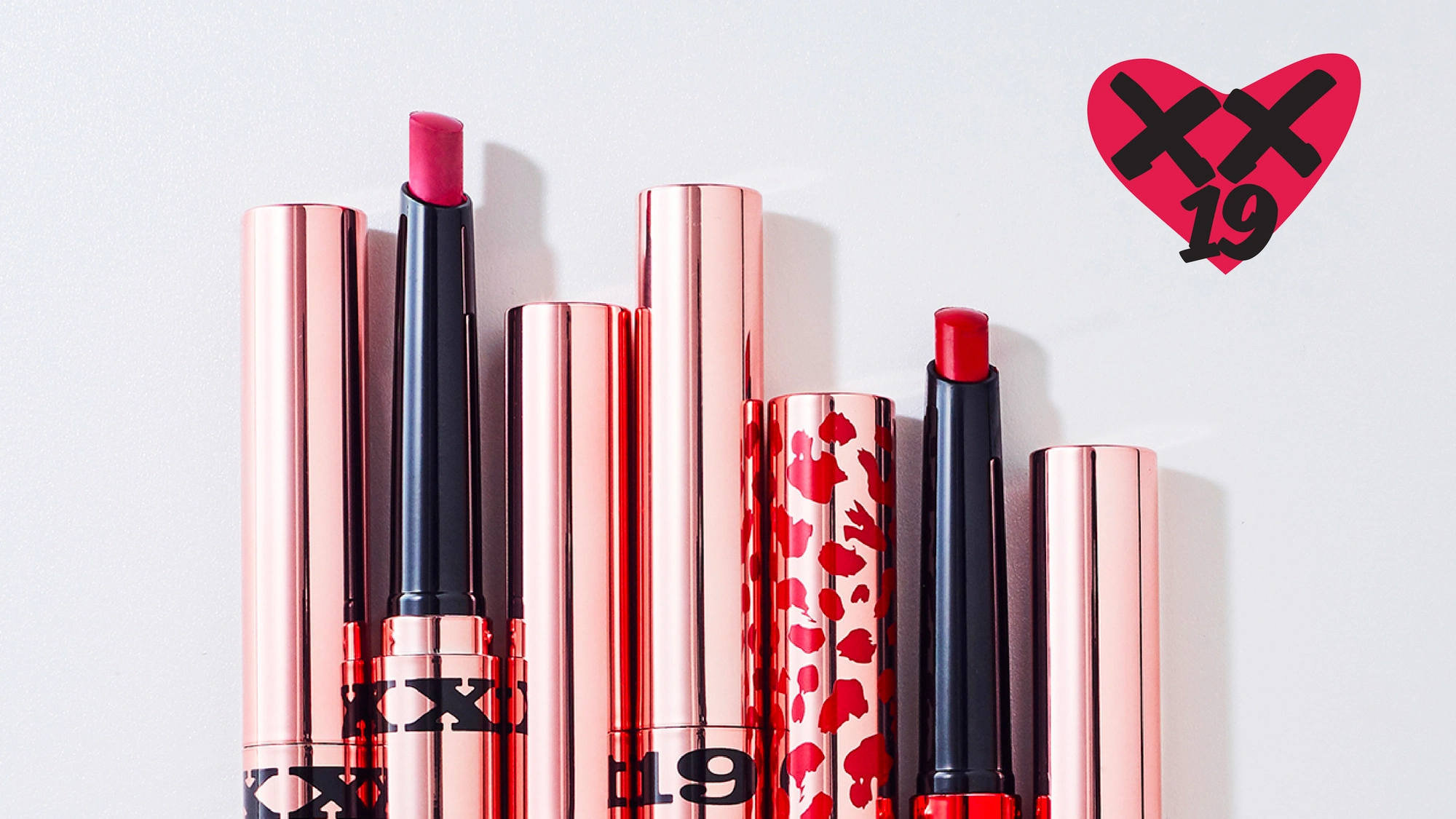
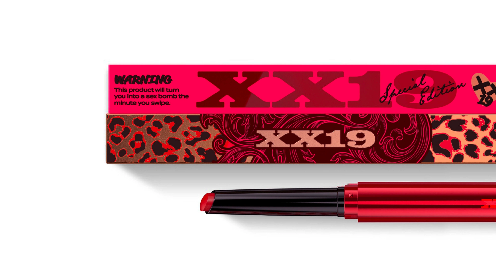
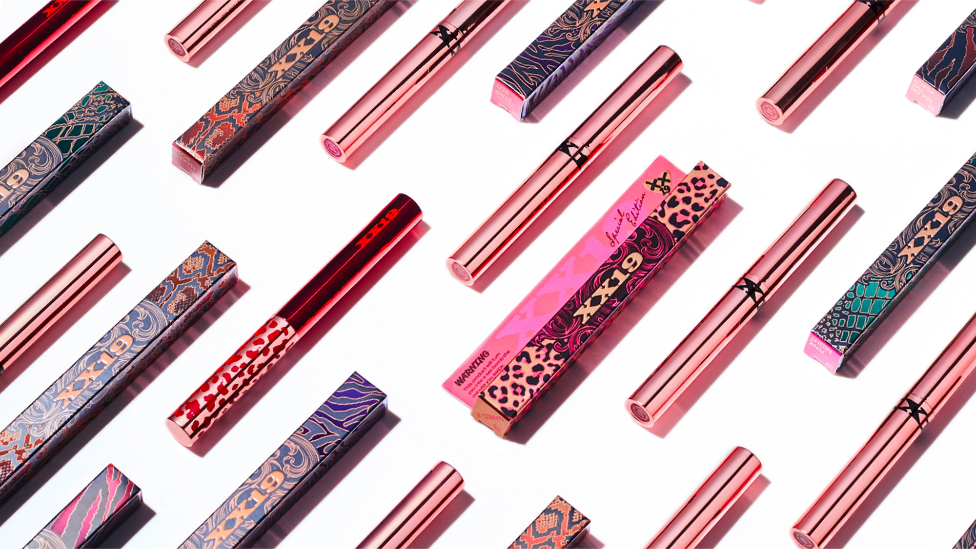
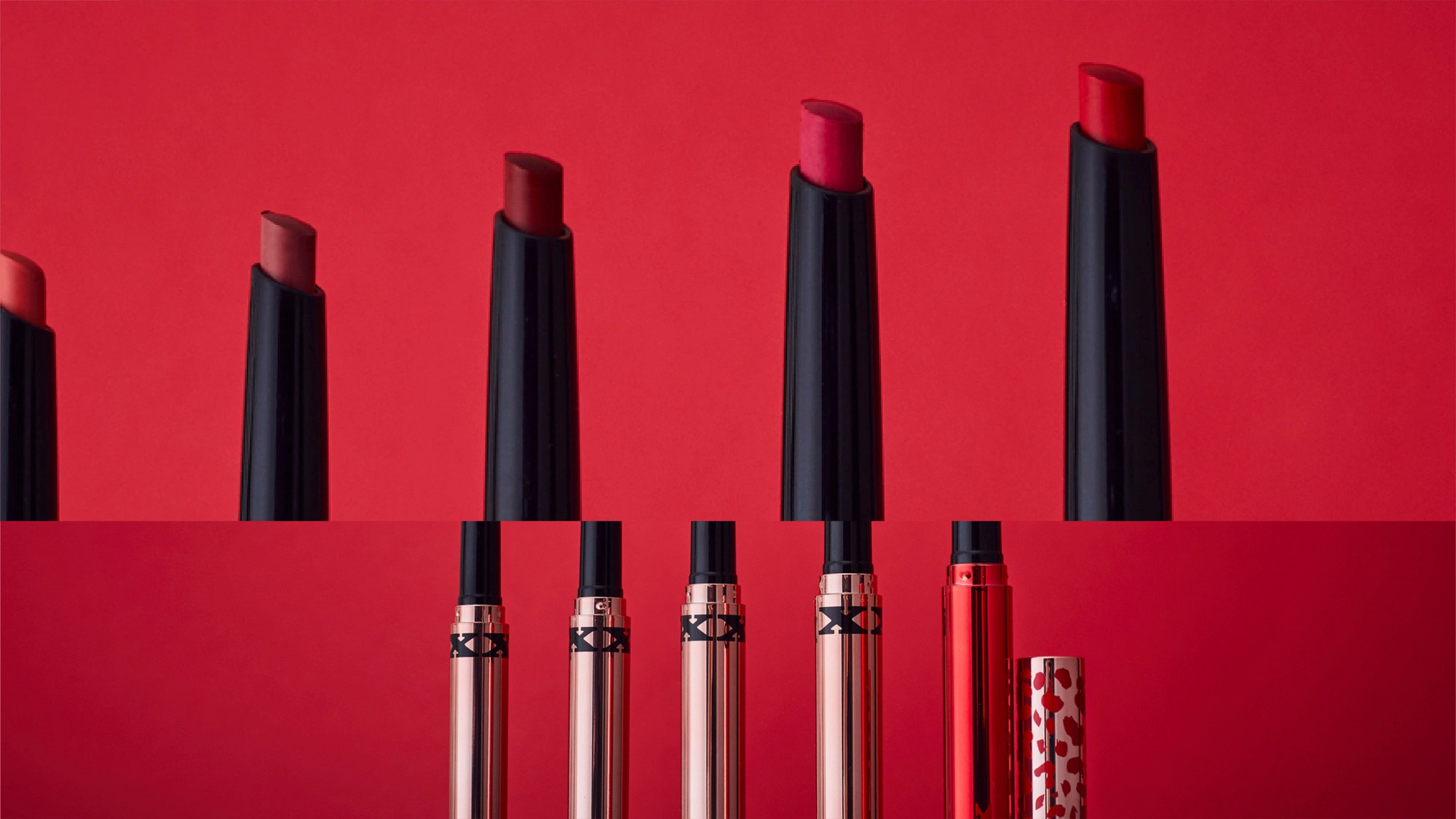
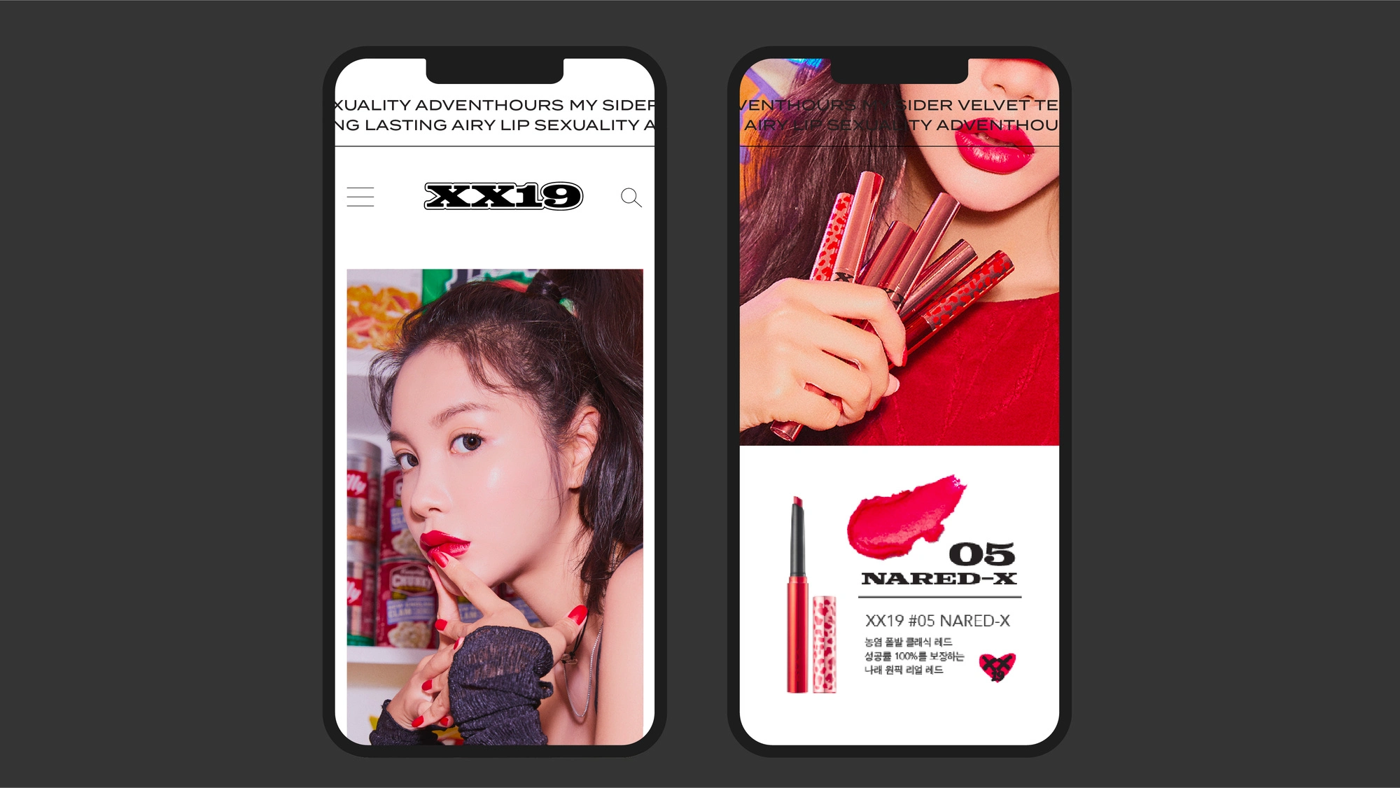
The brand’s visual identity combines dynamic patterns with the XX19 logotype, used flexibly across touchpoints. A heart-shaped icon featuring the XX19 mark adds a symbolic layer, highlighting the brand’s expressive personality. To break from traditional lipstick forms, a pen-type container was chosen to deliver a unique experience. Among the five SKUs, one was developed as a special edition to enhance collectibility and brand character. Each design features its own graphic pattern, reinforcing individuality and visual impact.
A brand guideline was also developed to ensure cohesive tone and consistency across packaging, digital platforms, and social media.
XX19는 대담한 에너지를 표현하는 립스틱 브랜드로, 브랜드의 이름 자체가 아이덴티티의 핵심 역할을 합니다.
‘XX’는 여성성과 관능을 상징하며, ‘19’는 금기를 깨고 도전하는 태도를 암시합니다. 이는 위트 있는 디자인으로 표현하였습니다.
브랜드의 핵심 자산은 생동감 넘치는 패턴과 XX19 로고타입의 조합으로 구성되며, 다양한 상황에 따라 함께 혹은 개별적으로 사용할 수 있도록 작업하였고, 특히 하트 아이콘 속 XX19는 익살스러운 표정으로 담아내어 브랜드의 캐릭터를 더욱 상징하는 기능을 합니다. 전통적인 립스틱 형태에서 벗어나 펜 타입의 용기는 새로운 사용 경험의 개성을 더하고, 다섯 가지 제품 중 하나는 스페셜 에디션으로 소장 가치와 희소성을 높이고자 했습니다. (패키지별 서로 다른 그래픽 패턴이 적용 - 개성과 표현력을 강조)
패키지를 비롯해 디지털 플랫폼, 소셜 미디어 전반에 걸쳐 일관된 톤앤매너를 유지할 수 있도록 브랜드 가이드라인 또한 진행하였고, 이를 통해 소비자 접점 전반에서 브랜드의 매력과 명확한 방향성이 일관되게 전달될 수 있도록 하였습니다.

Like this project
Posted Apr 3, 2026
Lipstick brand XX19 combines playful identity with bold design and unique packaging.