Rael Balance
현주 이
Rael Balance
Brand Strategy, Brand Identity, Packaging System, Typeface Design, Shooting planning, Art Direction
2023
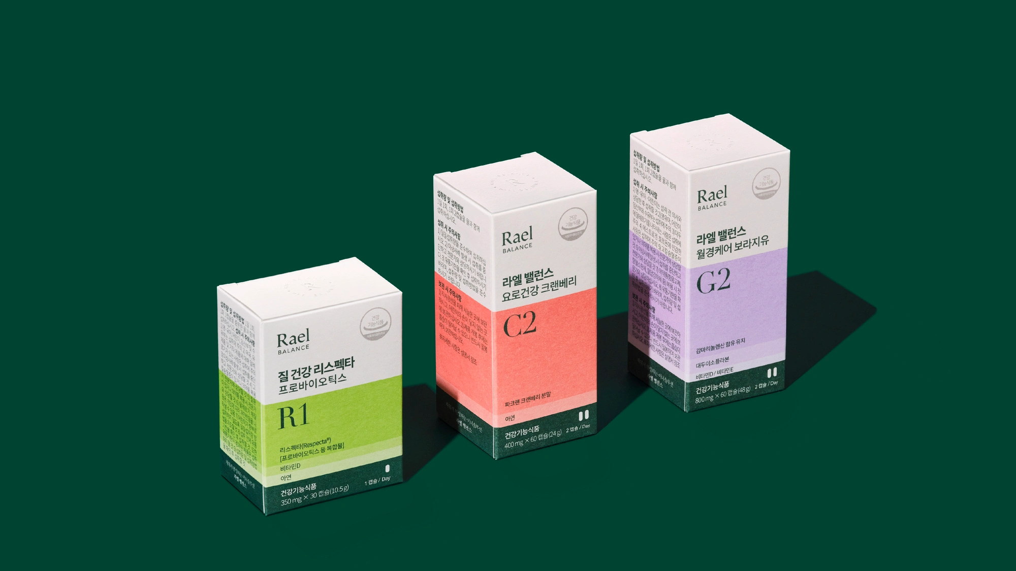
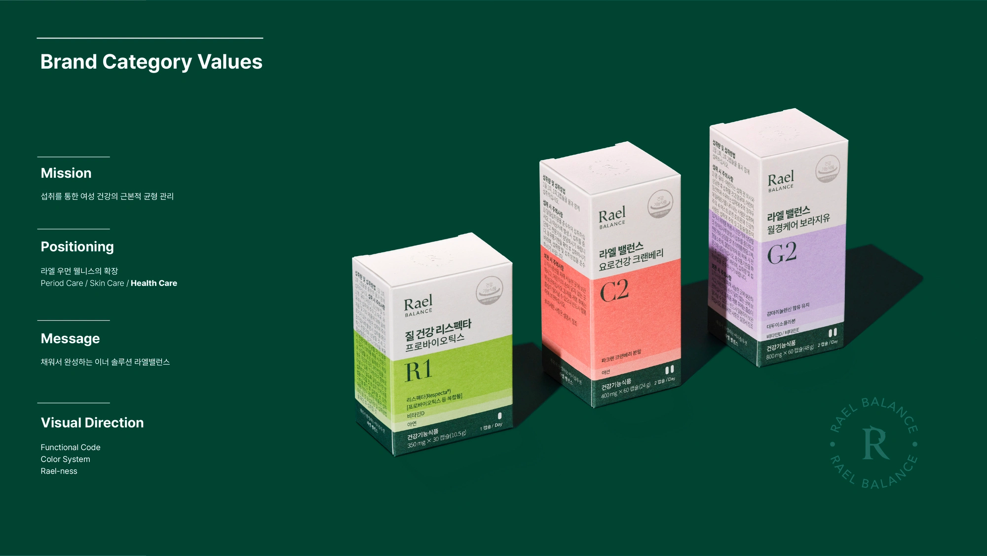
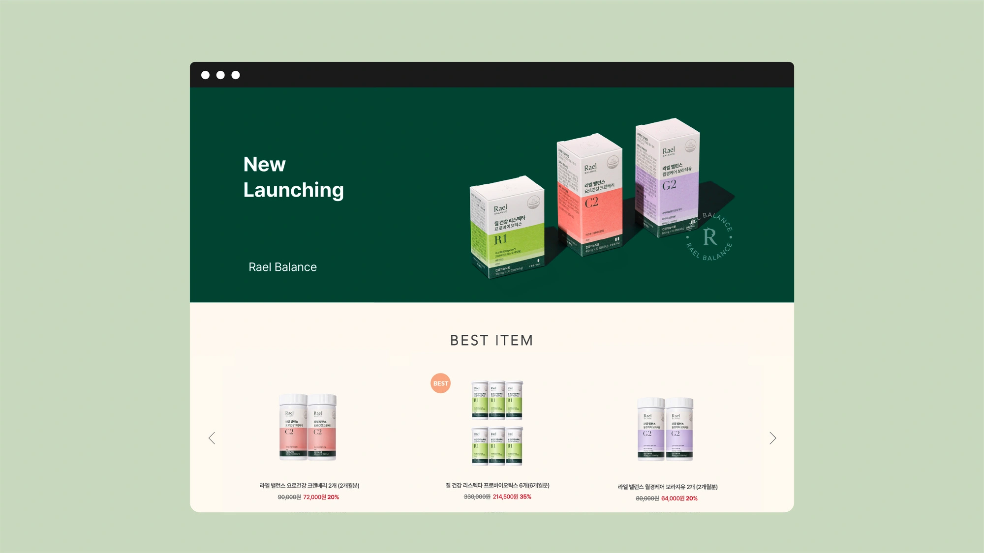
Rael Balance expands Rael’s existing wellness portfolio into the category of supplements,
focusing on fundamental inner care through daily intake.
Building on the trust established through period care and skincare,
Rael Balance introduces a new direction—balance management that begins from within.
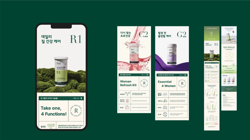
Under the message “An inner solution completed by what you add,”
the category is designed to support the everyday management of women’s health balance.
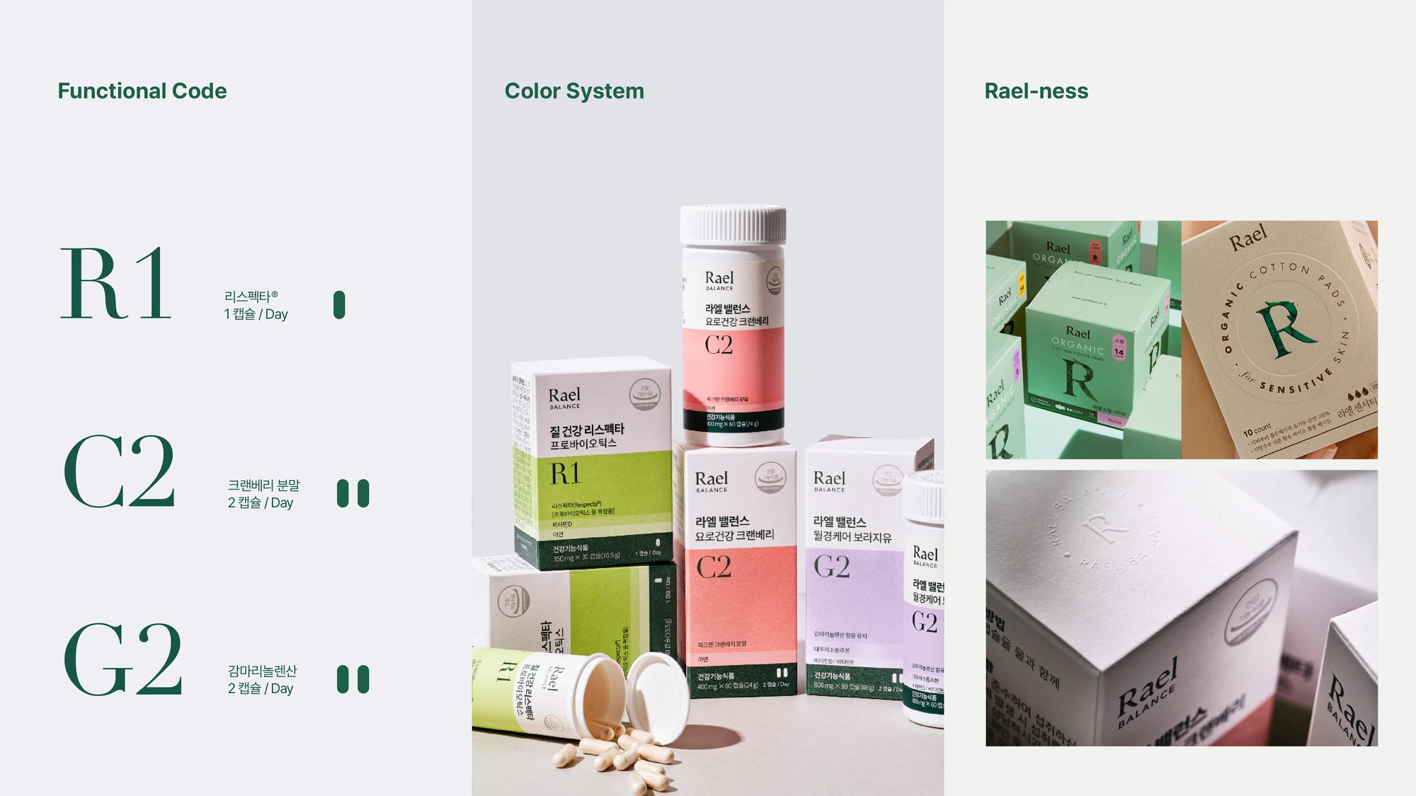
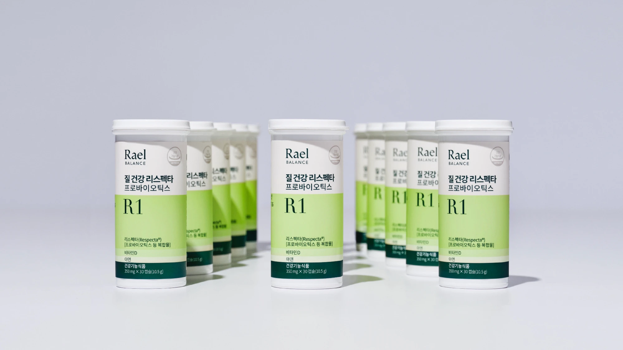
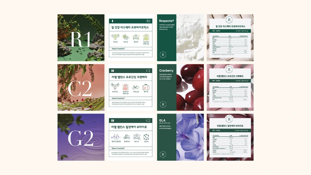
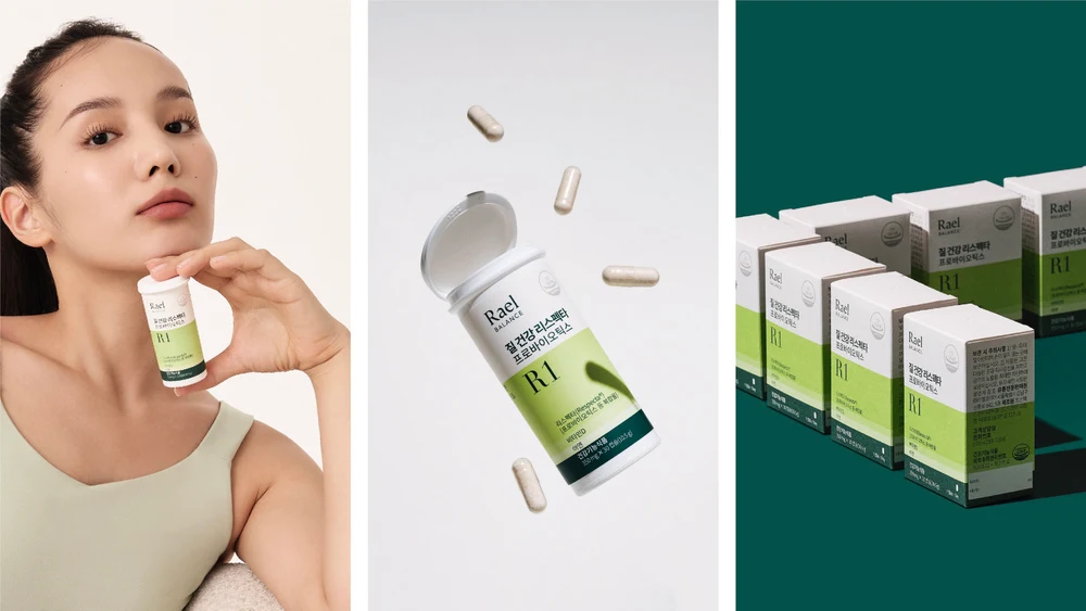
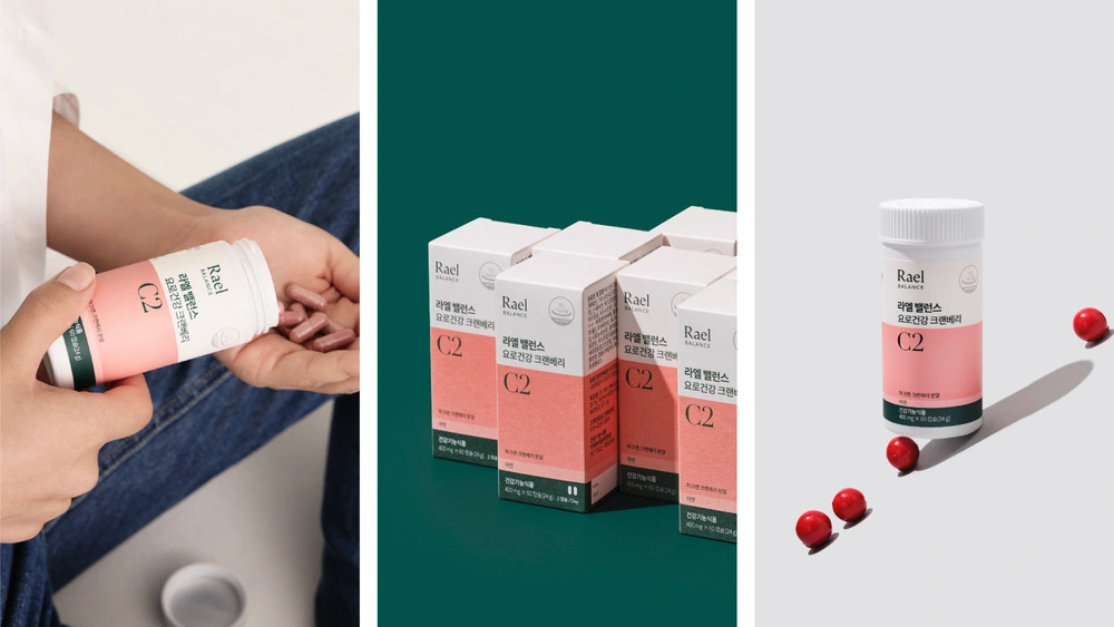
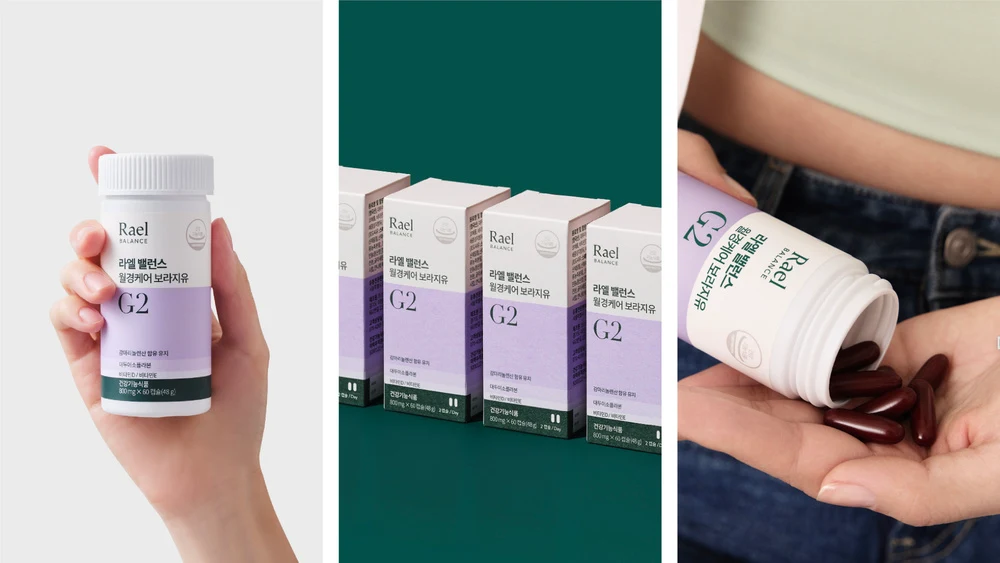
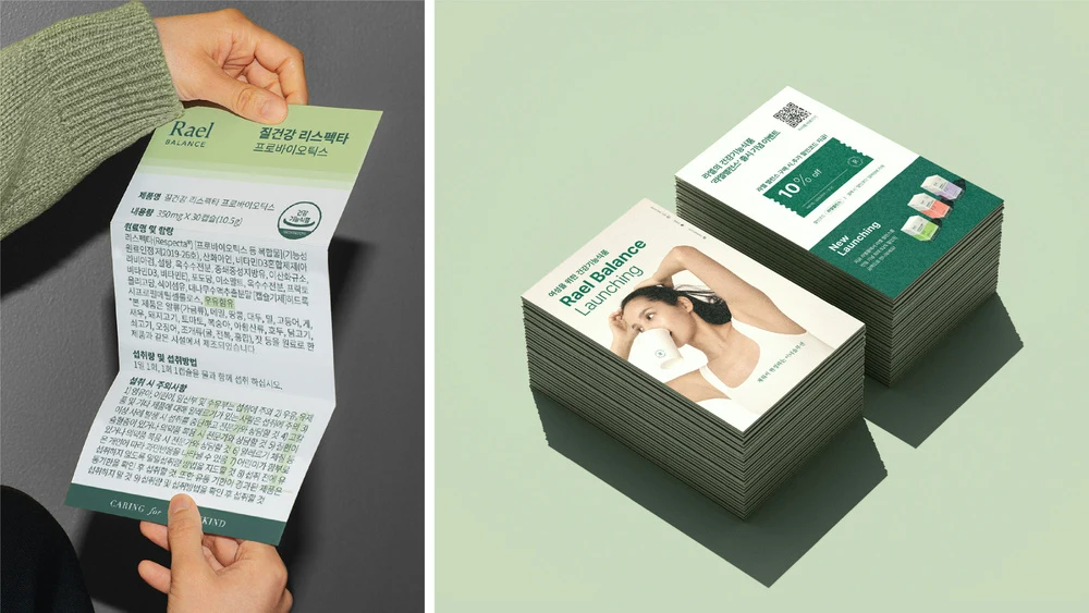
The packaging design was developed with a focus on clarity of information and brand continuity.
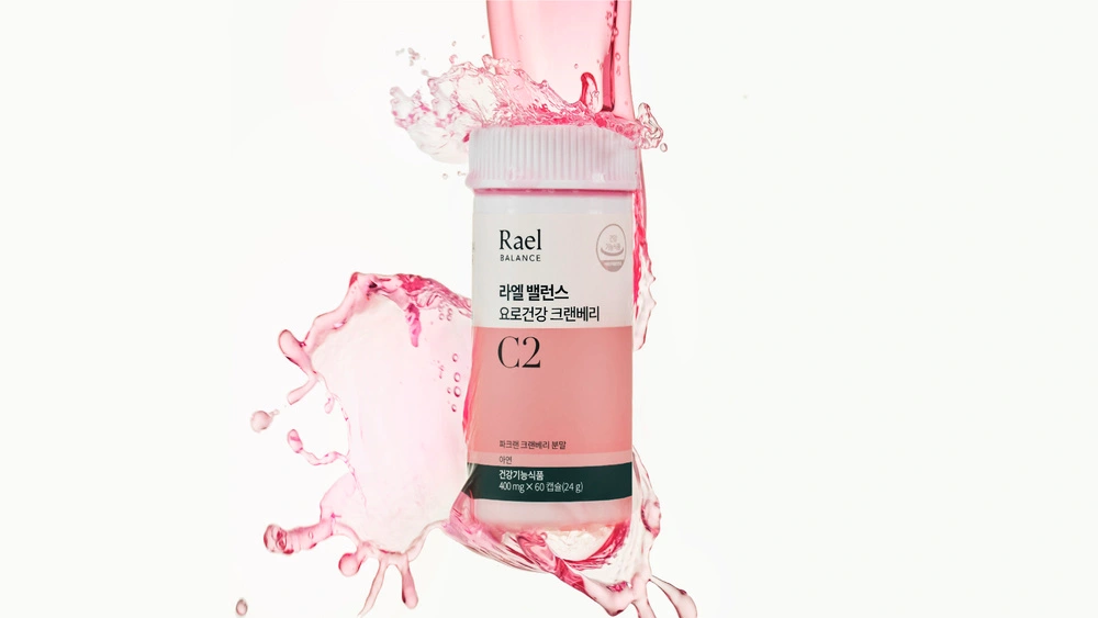
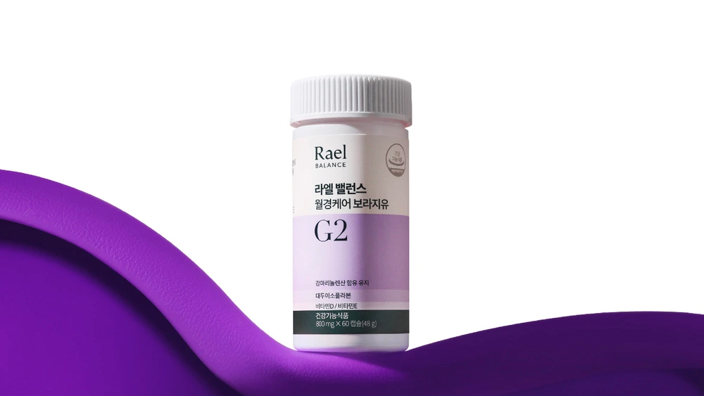
Front-facing color blocks vary according to the amount of key ingredients,
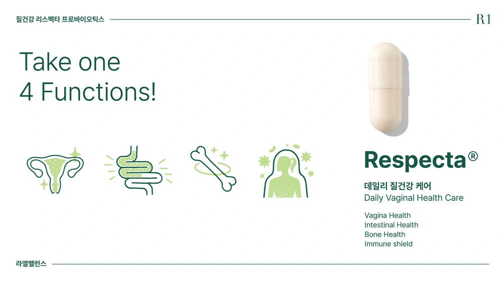
while a code system combining ingredient initials and daily intake (R1, C2, G2)
allows each product’s function and difference to be understood at a glance.
This system ensures a consistent and intuitive structure, even as the lineup expands.
Rael’s existing packaging system, including the signature info belt, is retained at the bottom,
while a balance circle embossed with Rael’s R logo is applied to the top,
allowing the brand identity to carry through seamlessly into this new category.
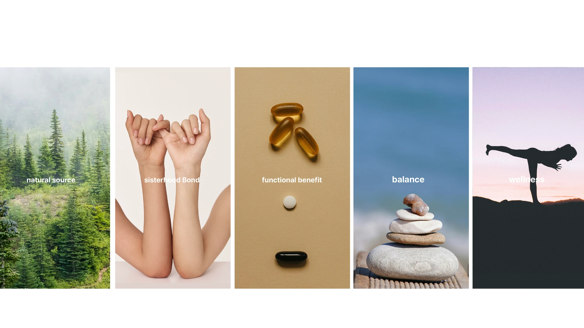
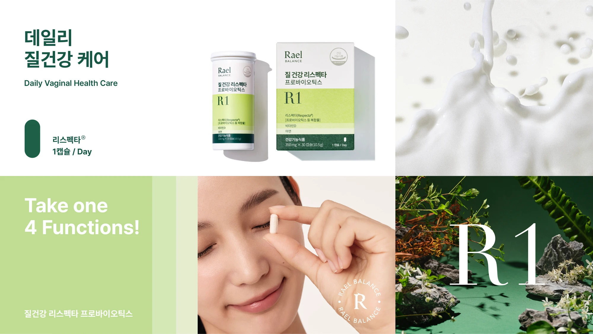
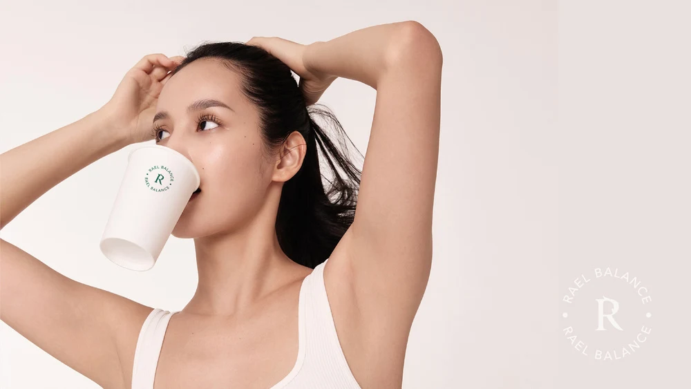
To soften the potentially clinical impression of functional messaging,
graphic motion and illustrated icons are incorporated as content elements,
helping communicate each product’s benefits and role in a more approachable way.
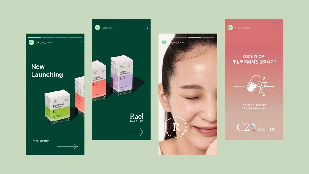
Rael’s brand philosophy—caring for women throughout every stage of life—extends beyond the package itself to every brand touchpoint,
aiming to foster a sense of empathy and connection among women.
Like this project
Posted Apr 3, 2026
Expanded Rael's wellness portfolio into supplements focusing on women's health balance.
Likes
0
Views
1