Owl’s Store Room Brand Identity Renewal
현주 이
Owl’s Store Room Brand Identity Renewal
Brand Strategy, Packaging System, Typeface Design
Q4 2025
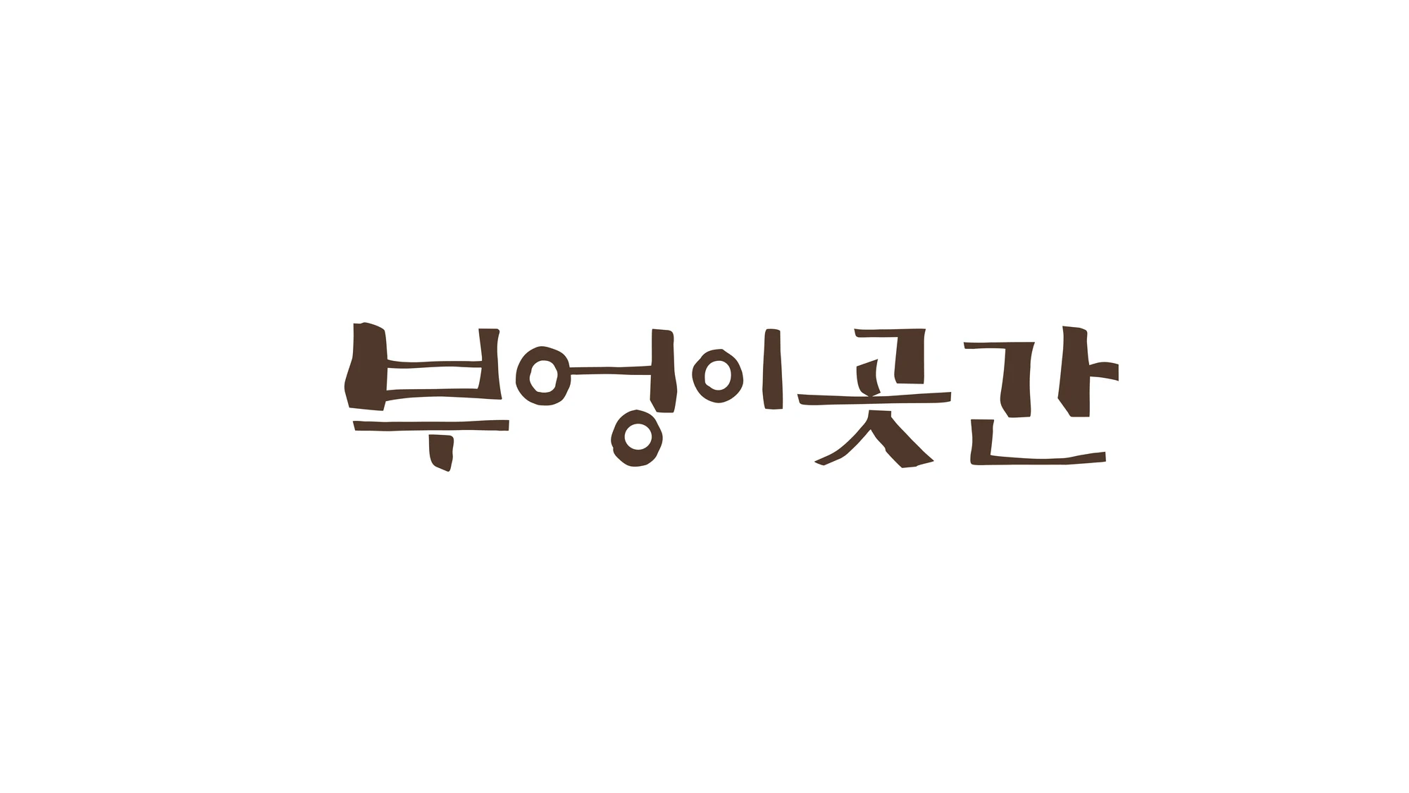
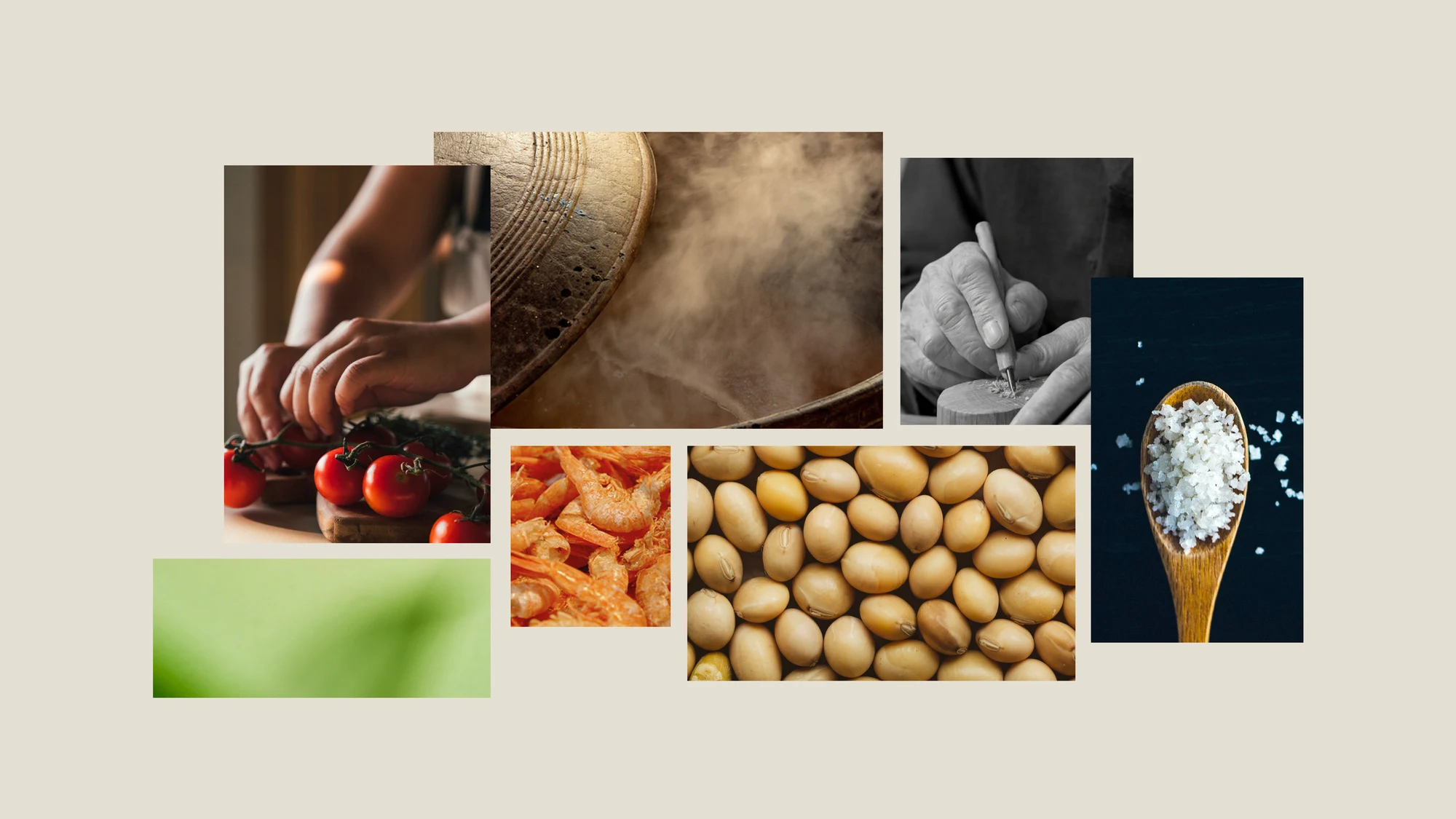
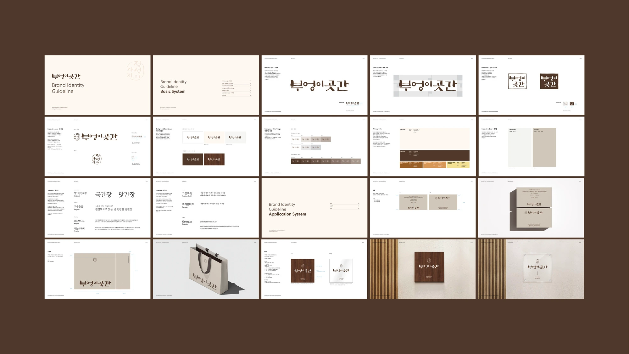
Owl’s Store Room is a traditional jang (fermented sauce) brand built around the values of “the aesthetics of slowness” and “the value of sincerity.”
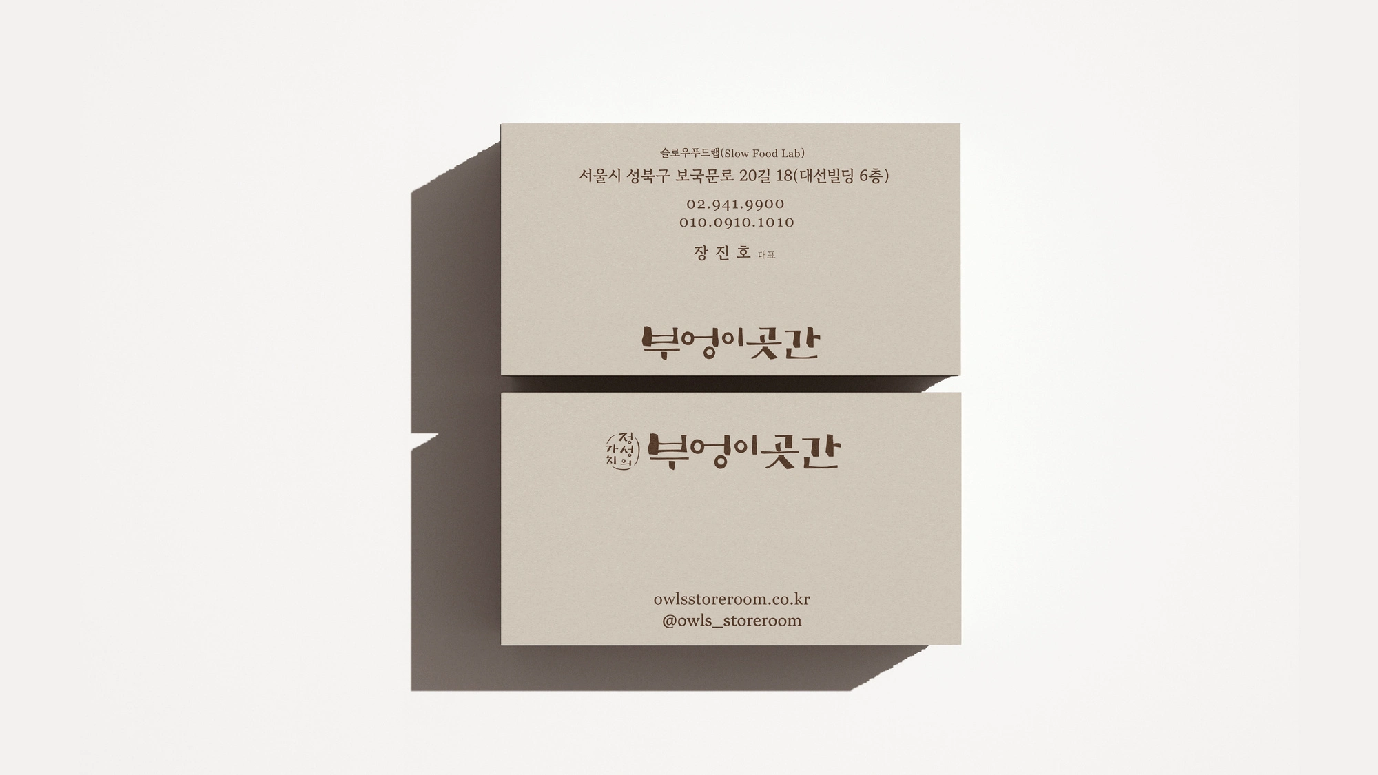
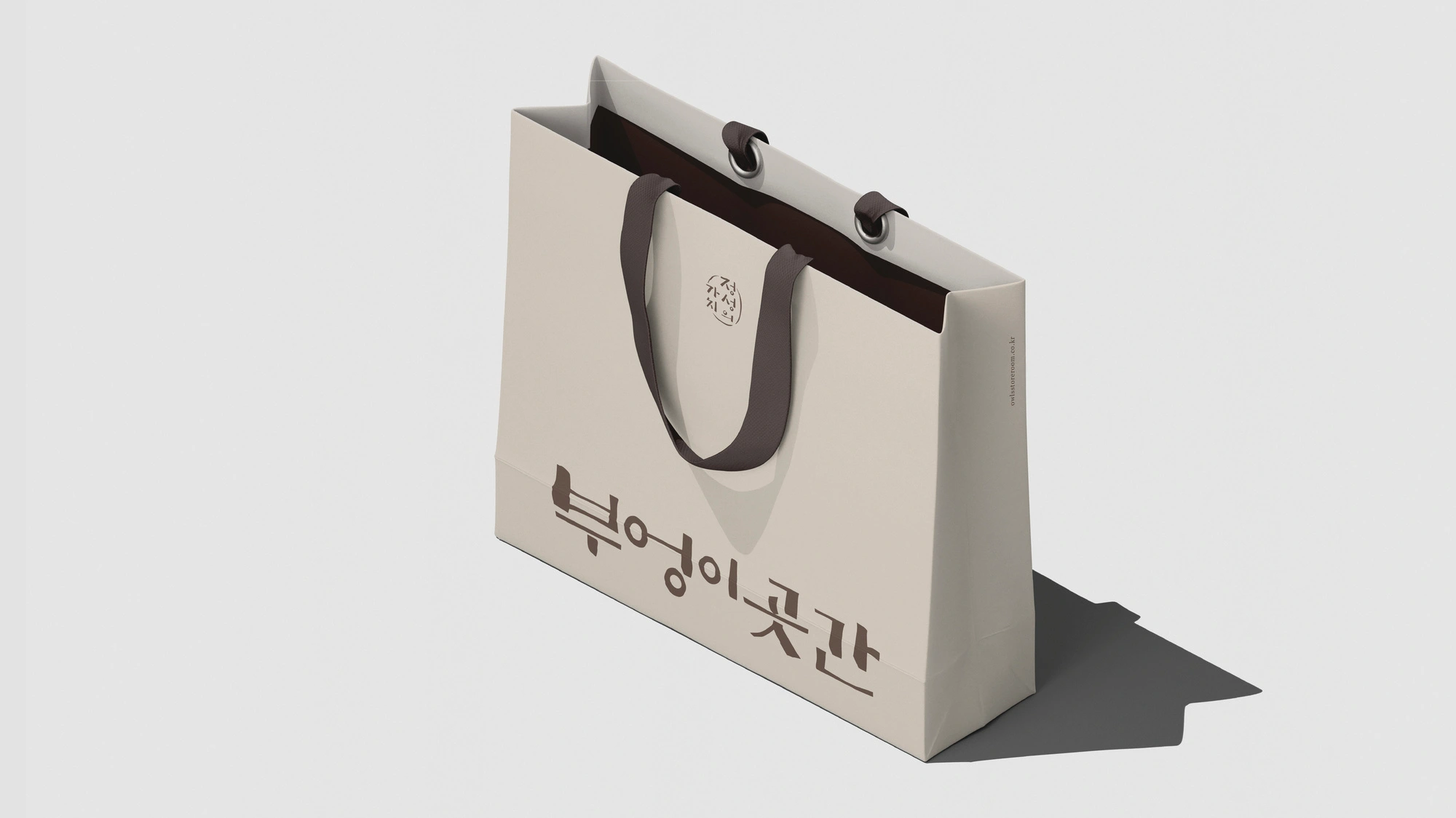
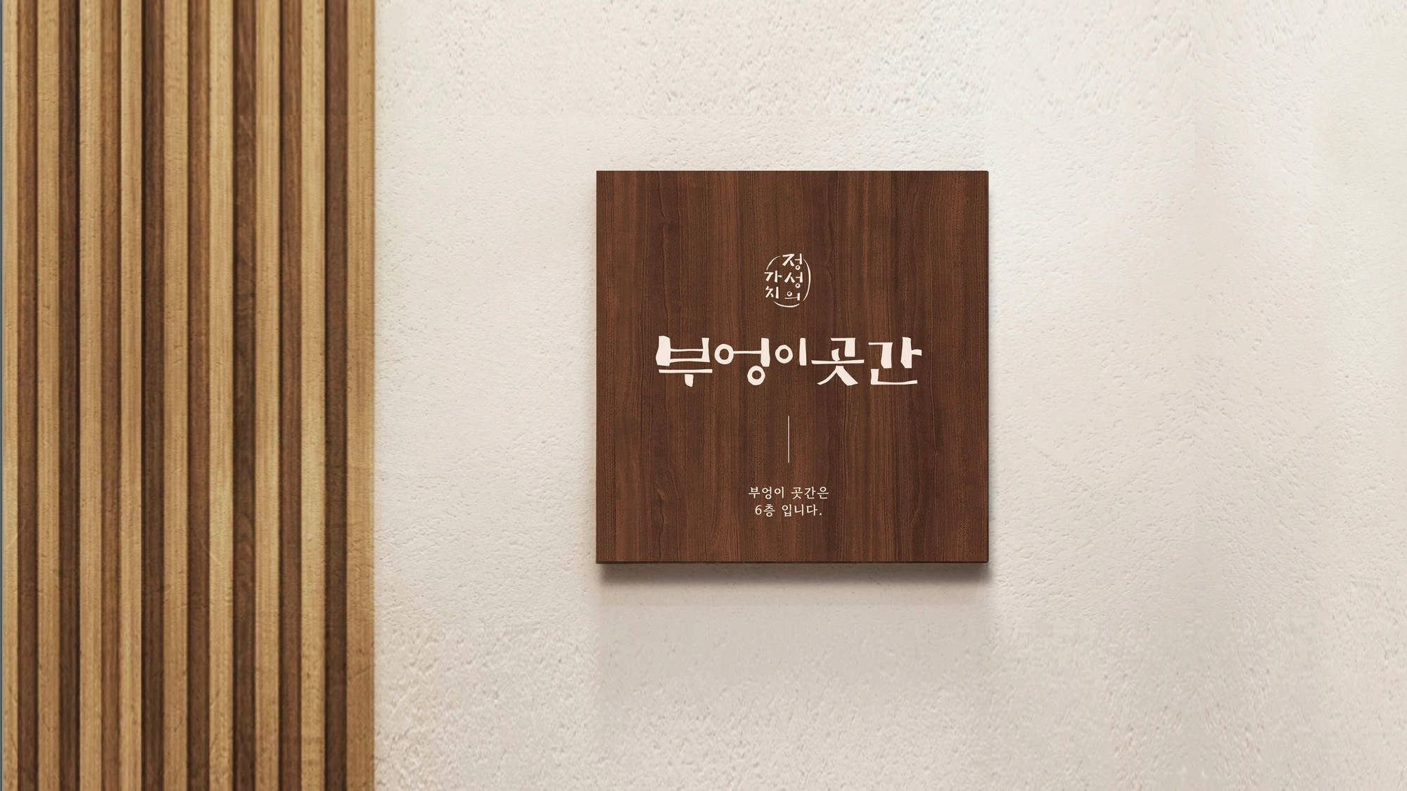
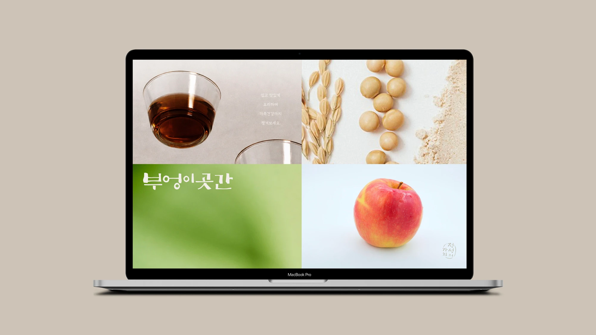
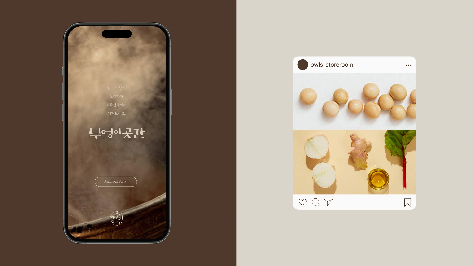
This project focused on refining the logotype structure to maintain the brand’s traditional character while enabling stable application across various media. The original seal-style identity was preserved and enhanced for improved legibility and usability, while an additional open-format logotype without a frame was developed to create a more modern and flexible system applicable across packaging, print, and digital environments.
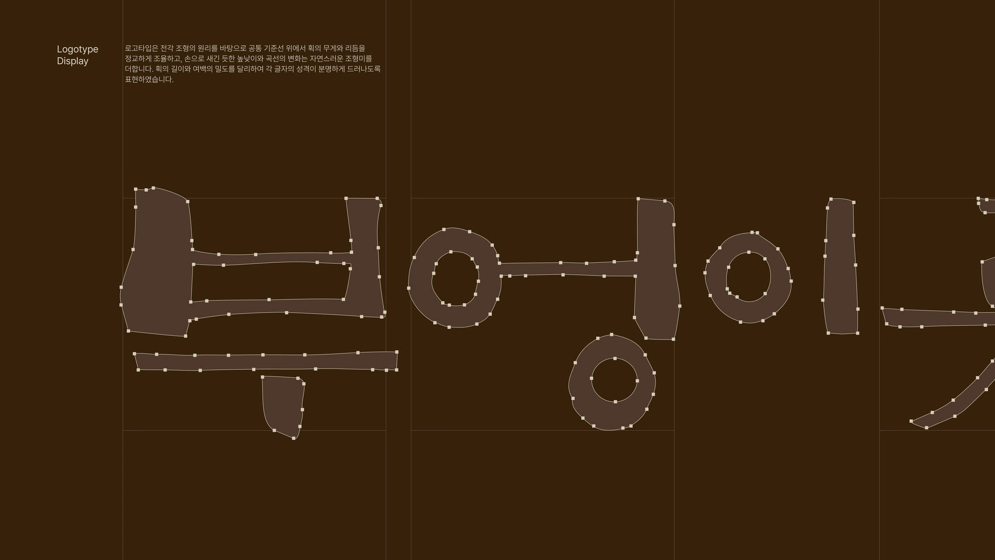
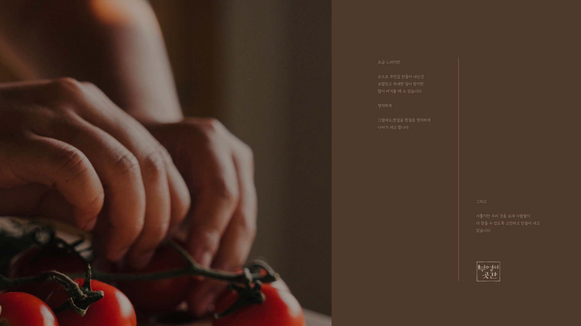
The irregular logotype introduces variations in stroke length and vertical rhythm to visually express the passage of time in fermentation and aging, while also conveying the handcrafted nature of the product.
부엉이곳간은 전통 장(醬)을 기반으로 ‘느림의 미학’과 ‘정성의 가치’를 지향하는 브랜드입니다.
본 프로젝트에서는 브랜드의 전통성과 정서를 유지하면서도, 다양한 매체에서 안정적으로 확장될 수 있도록 로고타입 중심의 구조를 재정비했습니다. 기존의 낙관형 아이덴티티는 유지하면서 가독성을 개선해 활용도를 높였고, 프레임이 없는 오픈형 타입을 함께 정리하여 패키지, 인쇄물, 디지털 환경 등에서 목적에 맞게 선택적으로 사용할 수 있도록 구성했습니다.
비정형의 로고타입은 획의 길이와 높낮이에 변화를 주어 장이 발효·숙성되는 시간의 흐름을 시각적으로 담아내고, 손으로 정성스럽게 만들어지는 제품의 이미지를 표현했습니다.
Like this project
Posted Apr 3, 2026
Comprehensive brand identity renewal for a traditional fermented sauce brand.
Likes
0
Views
4