
Hot sauce with something to say and ingredients you can actually pronounce.
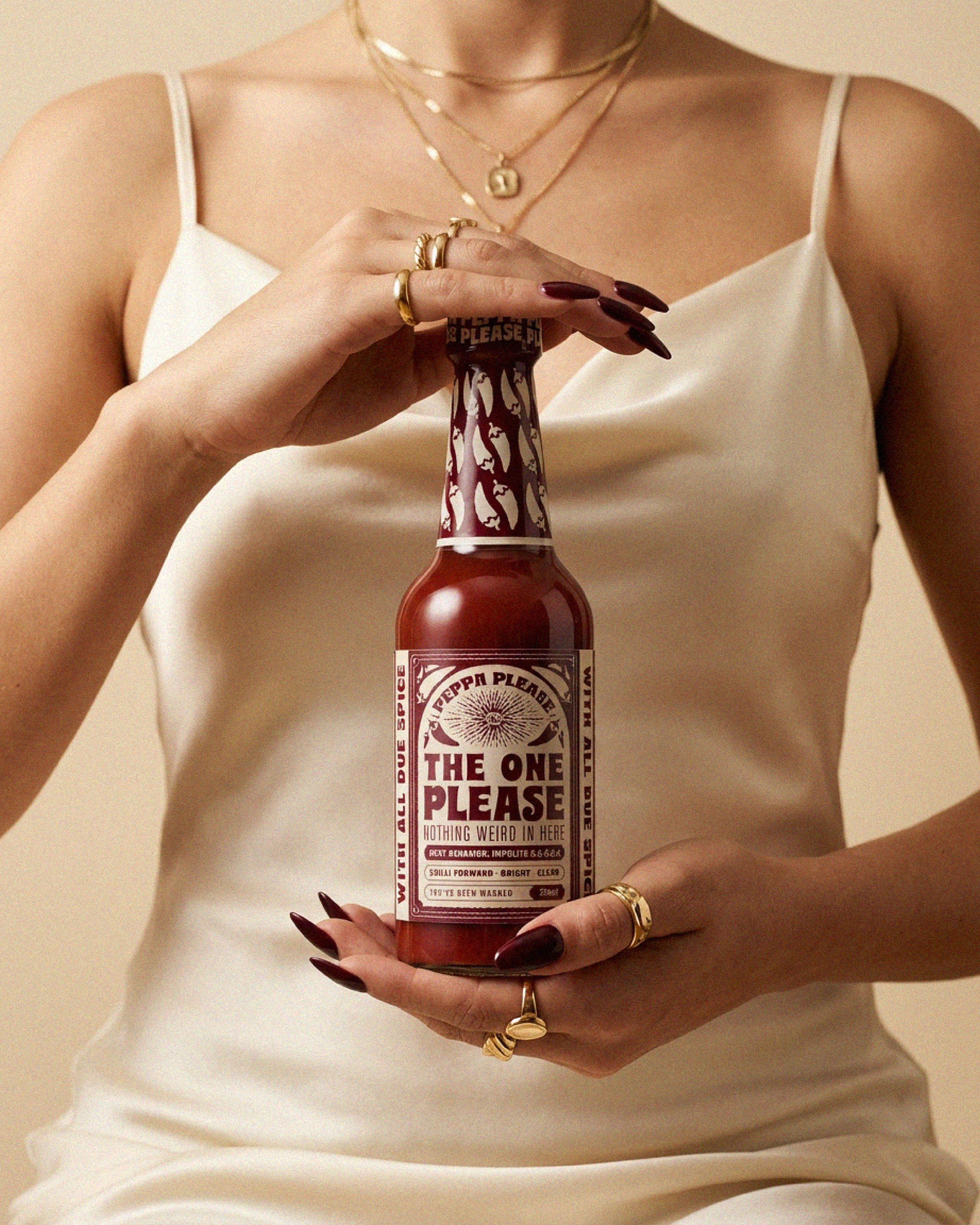
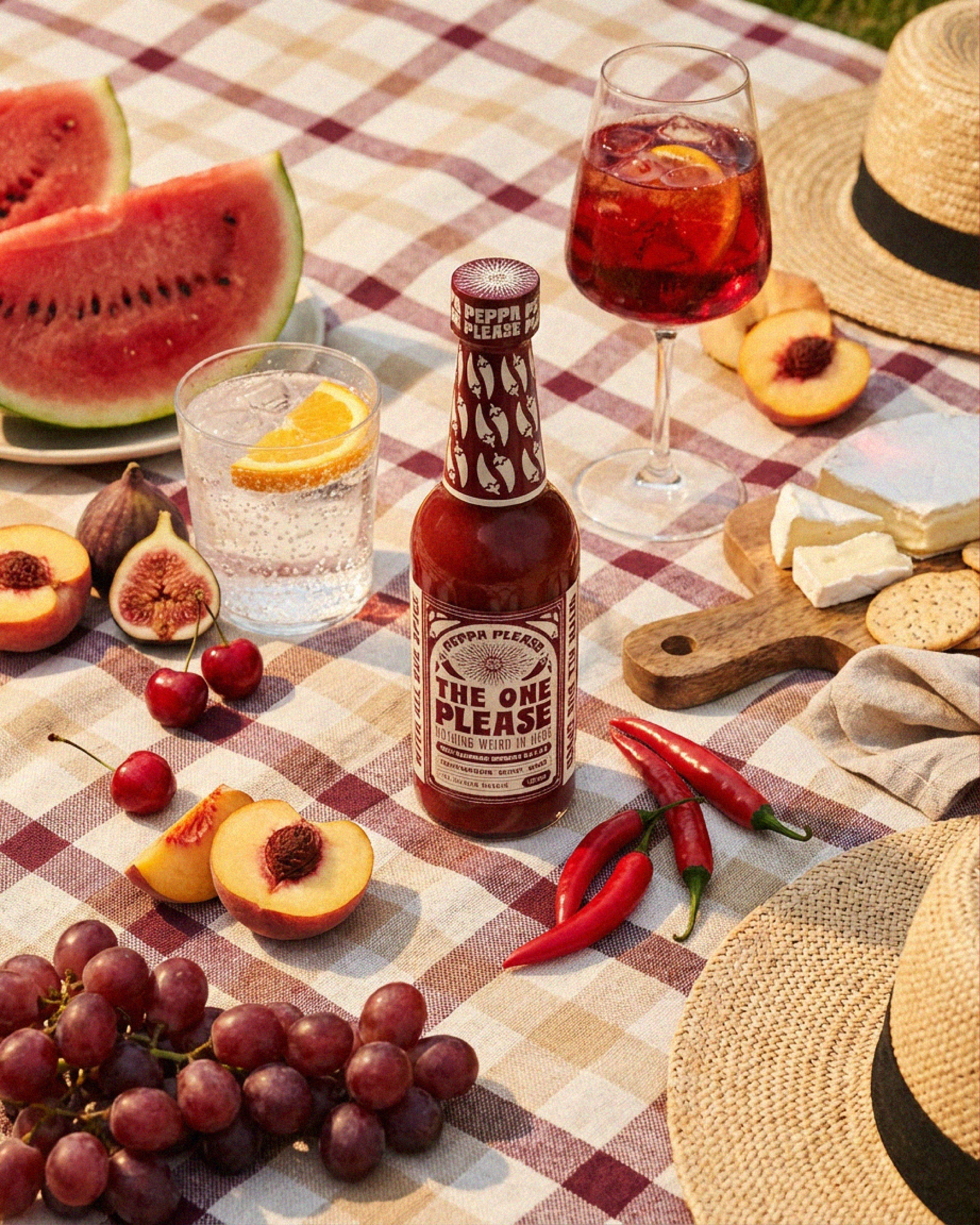
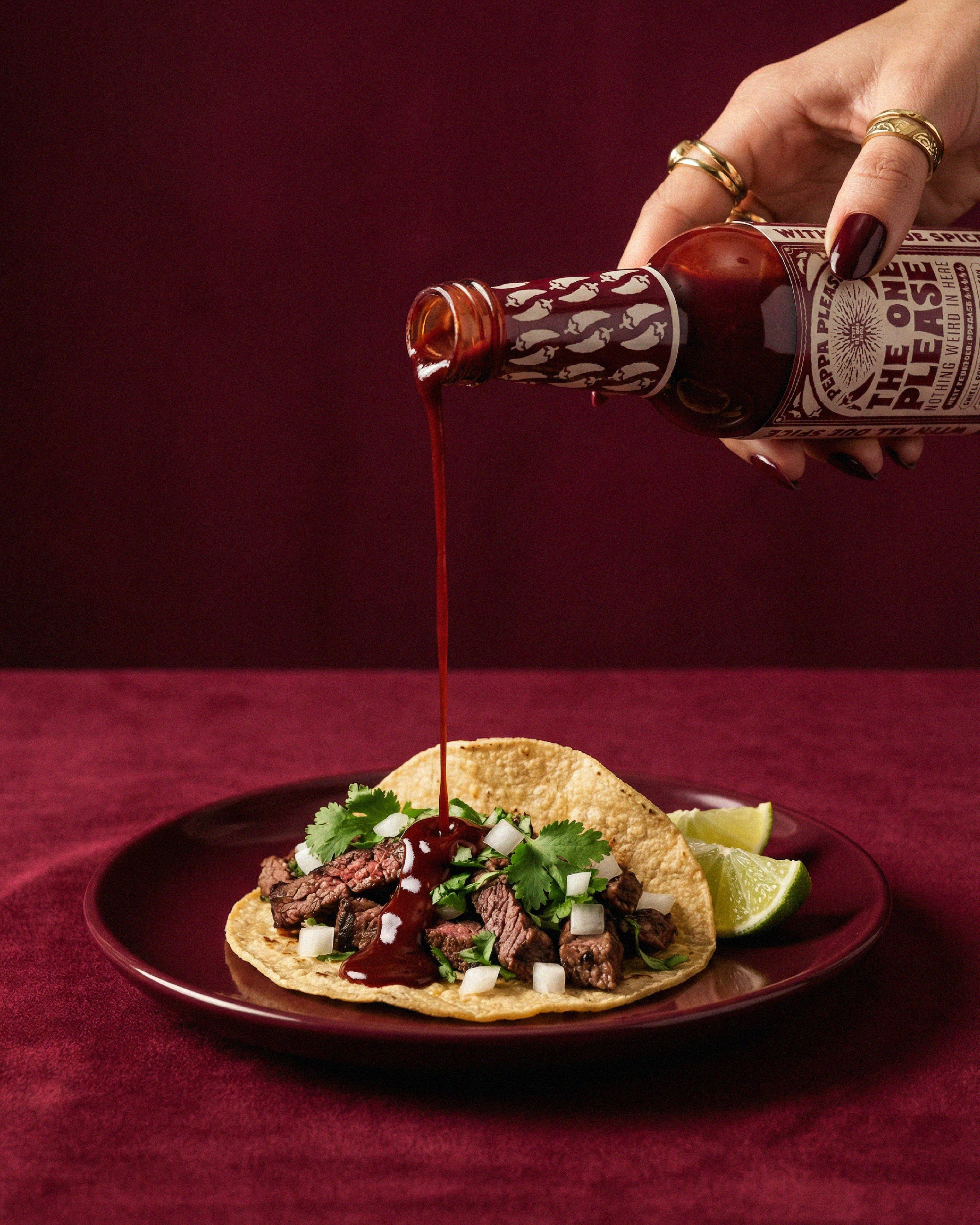
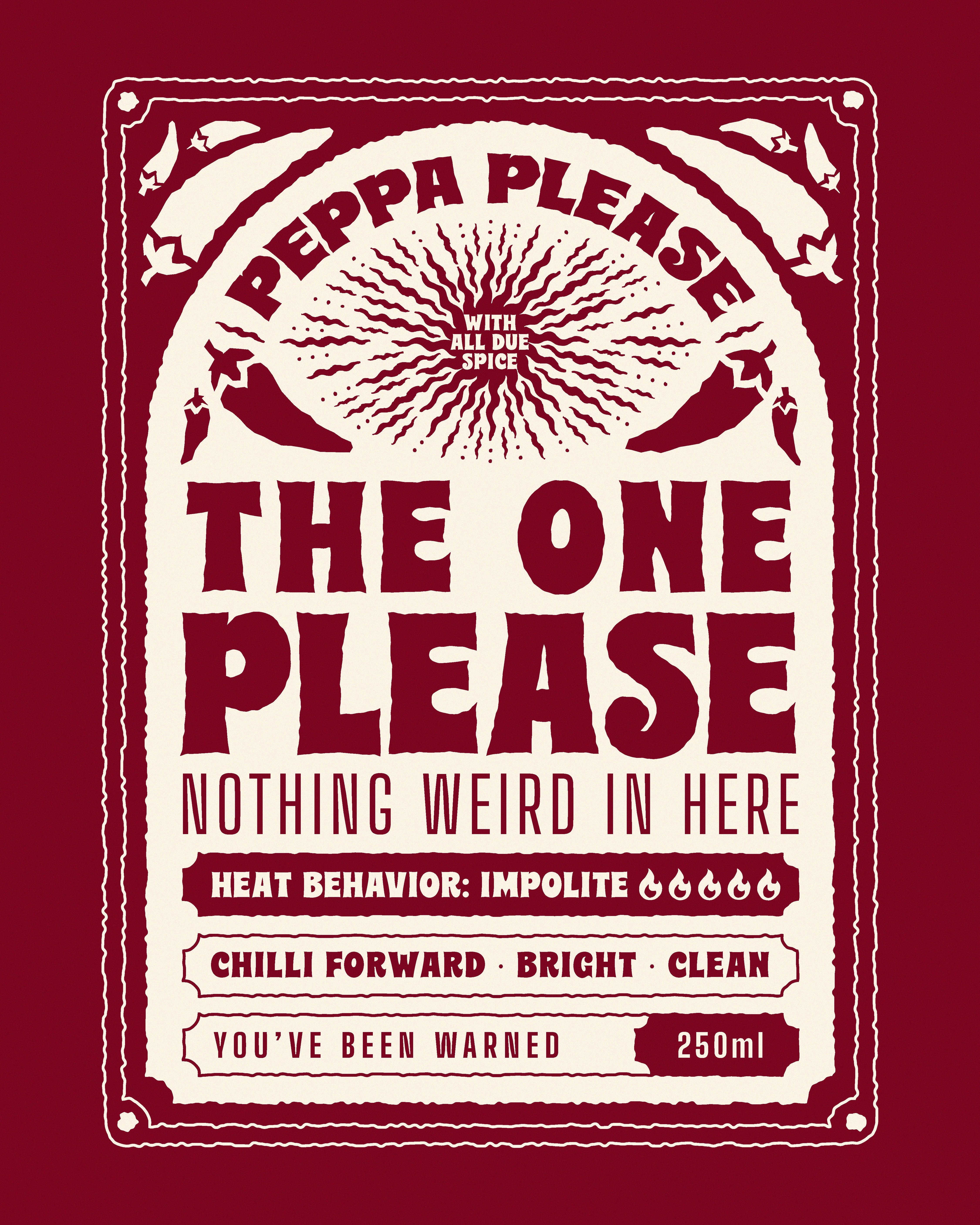
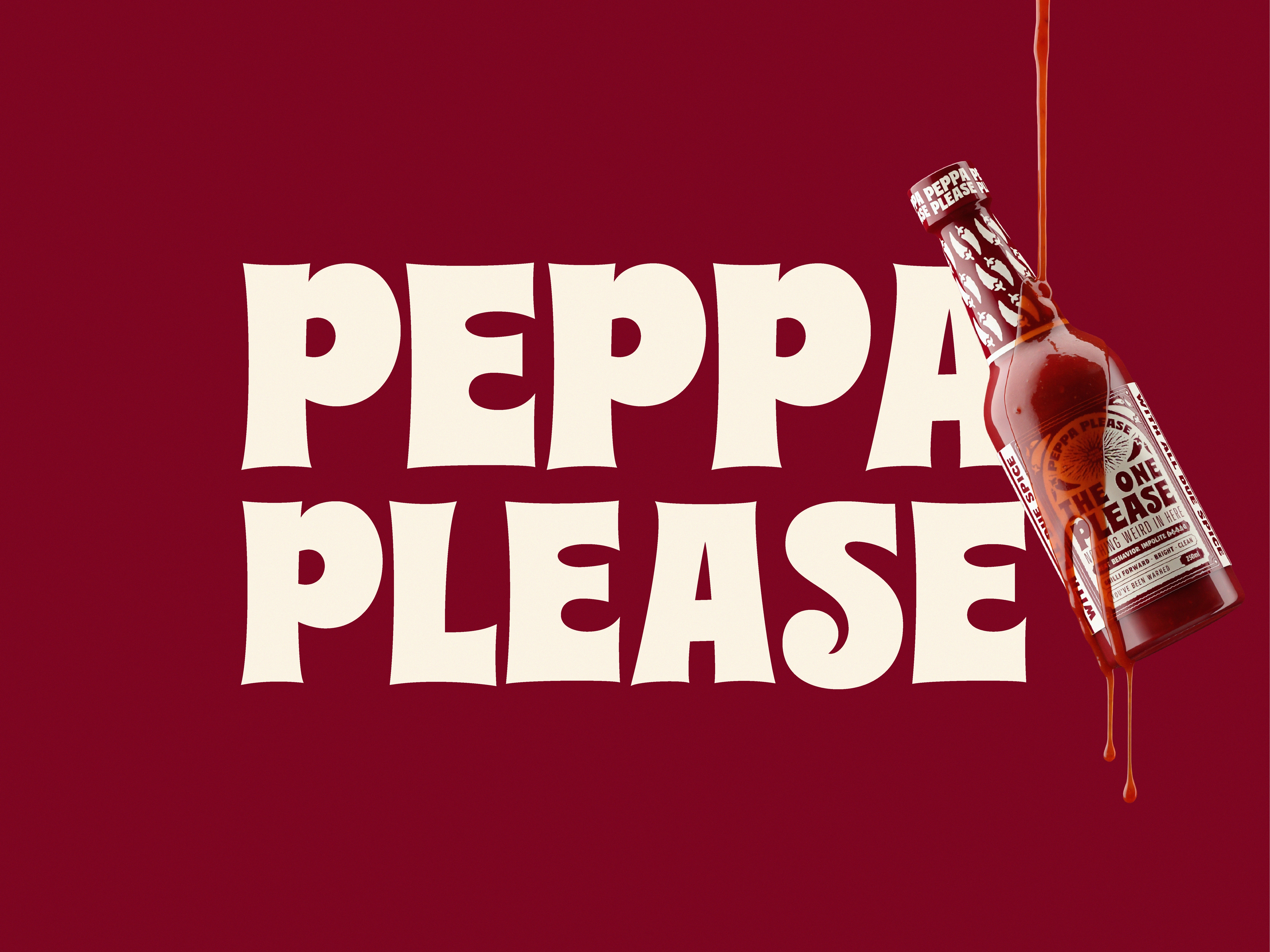
I developed the brand identity and packaging from four keywords: bold, spicy, cheeky, fun. The goal was to balance expressive character with a considered, tactile feel.
The visual direction combines a playful tone with an apothecary-inspired structure. A central sun motif anchors the label system — warm, bold, and slightly mystical — creating a recognizable and flexible core element.
The bottle was modeled in Blender and rendered to produce a consistent set of base visuals. These renders were used as reference inputs for AI-generated mockups, enabling scalable exploration of brand applications while maintaining control over form, lighting, and materials.
0 likes · 0 views · Mar 31, 2026
Hot sauce with something to say and ingredients you can actually pronounce. I developed the brand identity and packaging from four keywords: bold, spicy, che...


