Vodacom V-Live Mobile Gaming Redesign
Hazem K H Madi
Project Snapshot
Cross-functional design engagement for a subscription gaming and entertainment service targeting South Africa’s mobile-first youth. Scope covered web, mobile web, and Android on Vodafone’s live! framework. Pricing ranged R2–R30/month with carrier billing.
User Behavior Observations
Most users were prepaid and data-constrained; 78% relied on mobile data over WiFi. Trust was fragile: 67% feared hidden charges, suppressing sign-ups. Pre-redesign sessions were brief (<90s) and task abandonment high. Users were uncertain if games required download or could play instantly. A nine-category IA forced scanning rather than quick play, creating discovery friction. Persona “Thabo” prioritized instant fun, zero-risk trials, and family-safe content.
Market & Context Observations
Data cost shaped behavior more than content variety. Network variability on 3G/4G demanded fast, lightweight pages. Retail store interviews revealed billing anxiety rooted in past WAP-era charges. Youth audiences shared devices, increasing need for safe defaults.
Design Pattern Discoveries
A zero-click, 30s game preview (no data charge) removed trial friction and built trust. One-tap subscription with explicit price bands (R2–R30) and carrier billing pre-fill reduced effort and uncertainty. Offline sync enabled WiFi downloads for later play. IA collapsed from nine categories to four hubs (Games, Video, Kids, Chat). High-contrast cards with bold type and large targets improved scannability and tap accuracy under poor networks.
Technical Constraint Observations
Every feature was tuned for data and latency: image compression, deferred loading, and lightweight previews. Carrier billing was the default payment path. Design adhered to Vodacom brand (red #E20000, Vodacom Sans). Cross-device sync was limited; we prioritized single-device continuity with graceful fallbacks.
Team Dynamics Observations
Two designers, one researcher, three engineers, and one PM iterated in tight loops. Progressive fidelity (flows → wireframes → Figma prototypes) allowed validation with 30 test users and an additional 15 before build. Shared metrics dashboards aligned decisions.
Surprising Findings
Hidden-charge fear (67%) outweighed content interest; transparency messaging had outsized impact on conversion.
Patterns That Emerged
Trust-through-clarity, trial-before-commit, fewer choices, and offline-first thinking are effective in data-constrained markets.
What Worked / What Didn’t
Worked: zero-click previews, explicit pricing, IA simplification, progressive testing. Didn’t: limited A/B tests on pricing display; no referral mechanics; initial separation of technical constraints from UI decisions slowed early progress.
Observations About Impact
Within six months: +34% subscriptions, −28% bounce, session duration up to 4.2 minutes, app rating 4.6 after accessibility improvements. Results validate transparency-led design and lightweight performance as key levers for growth in mobile data–sensitive contexts.
Personal Design Enhancement
Project Context
V‑Live offered mobile games, video, news, and kids content via a one‑tap subscription (R2–R30/month). Youth on 3G/4G networks were the core audience; unlimited access and minimal data overhead were the value props.
My Role & Initial Mindset
I was Lead Product Designer with two designers, one UX researcher, three engineers, and one PM. I started confident in crafting clean UIs, less confident about designing for severe data costs and flaky networks. I expected incremental wins; the market forced fundamental rethinking.
Key Design Challenges I Faced
Content findability across nine overcrowded categories
Only 19% browse‑to‑paid conversion; sessions <90s
Confusion between downloading vs streaming games
67% feared hidden charges
Critical Decisions & Trade-offs I Made
Collapsed nine categories into four hubs (Games, Video, Kids, Chat) to reduce choice paralysis, trading breadth of navigation for clarity.
“Zero‑click preview”
30‑second game trials with no data charge, prioritizing trust over immediate revenue.
One‑tap subscription with upfront pricing and cancellation clarity, accepting an extra modal to ensure comprehension.
Offline mode that syncs over Wi‑Fi, deferring some real‑time features to respect data limits.
Built a UI kit extending brand guidelines with high‑contrast cards, large targets, and loading skeletons to mask network variability.
Skills I Developed or Strengthened
Designing for constraints: data cost modeling and low‑bandwidth UX
Evidence‑based iteration: moving from low‑fi flows to Figma prototypes tested with
15 users
Accessible, performant component design (contrast 4.5:1, focus states, keyboard carousels)
Collaboration & Leadership Moments
I mediated pressure for “quick wins” by sequencing research: surveys (n=250), remote tests (n=30), and store interviews. I framed insights as risks, aligning PM and engineering on a test‑learn cadence. I mentored two designers through the hub redesign and instituted a lightweight design system.
What I Would Do Differently
Run A/B tests on pricing display variants earlier and build a refer‑a‑friend mechanism to harness word‑of‑mouth.
How This Project Changed My Design Approach
I now design trust first. In emerging markets, clarity about cost and data is UX. I prototype with network throttling by default and treat “don’t make me think about megabytes” as a core requirement.
Key Takeaways for Future Work
Reduce choices; increase comprehension.
Make value and price explicit before action.
Build for offline and recovery states early.
Validate fast with mixed methods.
Accessibility improves ratings and reach.
Outcomes: +34% subscriptions in six months, bounce rate −28%, time on site to
4.2 minutes, store rating 4.6.
Executive Summary
Vodacom V‑Live is a flagship digital lifestyle portal for Vodacom South Africa, built on Vodafone’s global live! framework. As Lead Product Designer, I led an
8‑month redesign to create a youth‑focused gaming and entertainment ecosystem that reduced data risk, simplified discovery, and increased conversion.
Problem Statement & Context
High data costs limited spontaneous usage.
Crowded nine‑category IA obscured relevant content.
Low conversion from browse to paid tiers (R2–R30).
First‑time confusion over streaming vs. download.
User Research & Insights
Methods: online survey (n=250), remote usability tests (n=30), in‑store interviews at Vodacom shops.
Findings: 78% rely on mobile data; 67% fear “hidden charges”; avg session <90s.
Persona: “Thabo,” 22, prepaid, seeks quick wins, zero‑risk trials, family‑friendly options.
Design Process & Methodology
Discovery → IA consolidation → low‑fi flows → mid‑fi wireframes → clickable Figma prototypes.
Tested with 15 users across iterations; issues triaged with PM/Engineering.
Weekly design crits; design tokens aligned to brand.
Solution Overview
Bundled, unlimited‑access subscription (R2–R30) for games, video, news, kids.
Optimized for Vodacom
3G/4G with instant streaming and offline downloads to minimize data overhead.
Key Features & Design Decisions
Zero‑click Preview:
30‑second game sample without data charges.
One‑tap Subscription: plan cards with explicit R2–R30 pricing and benefits.
Offline Mode: downloads sync over Wi‑Fi; clear states and storage controls.
Technical Considerations
Built atop Vodafone live! services; carrier billing for frictionless purchase.
Lightweight assets, adaptive bitrates, and caching to reduce data use.
Download manager with Wi‑Fi‑only policy and retry logic for spotty networks.
Design System & UI Highlights
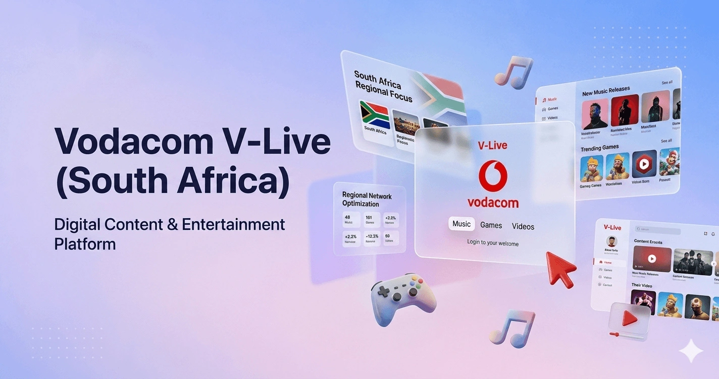
IA: consolidated nine categories into four hubs—Games, Video, Kids, Chat.
Home: swipe carousel with autoplay thumbnails; “Get Started” above the fold.
Game Detail: screenshots, system requirements, data use estimate, one‑click install.
Foundations: Vodacom Red #E20000, white/charcoal; Vodacom Sans (headings) + Open Sans (body).
Components: cards, buttons, modals, toasts, loading skeletons; large touch targets; bold type.
Accessibility & Inclusive Design
• 4.5:1 contrast minimum; high‑contrast mode.
Results & Outcomes
A coherent four‑pillar experience, reduced perceived data risk, and clearer value communication drove engagement and revenue lift.
Challenges & Learnings
Aligning data costs and network reliability with intuitive UI was critical. Next: A/B test pricing prominence, introduce “refer a friend,” and deepen preview surfaces.
Like this project
Posted May 21, 2026
Redesigned mobile gaming service for Vodacom V-Live, increasing subscriptions by 34%.