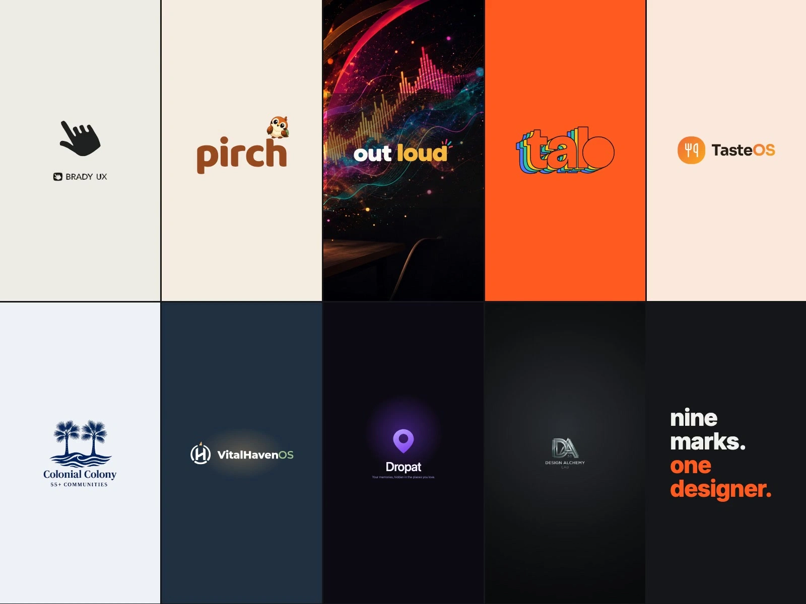
Nine marks: logos and identities for products and clients

Brady Starr

The approach
Every mark here started with the same question: what's the one thing this brand has to say at a glance? Most are for my own products; two are client work (VitalHaven, and Colonial Colony through an agency partner). Each one is shown on the background it was designed for, because a logo is only as good as where it lands.
How I work on a mark
Start from what already exists. If customers recognize something, refine it before replacing it
Find the one idea, then cut everything that doesn't carry it
Test it where it will live: light and dark backgrounds, an app icon, a favicon, a phone screen
Lock the rules so the next person who uses it gets the same result: color, spacing, clear space, what not to do
Deliver the full file set: color, one-color and reverse versions as SVG, PNG and PDF
Brady UX: a hand that points to what's next. My studio mark.
pirch: a friendly wordmark with the sparrow perched on top, for an AI job hunter.
out loud: a bold wordmark with a small burst of sound, for a course about working with AI out loud.
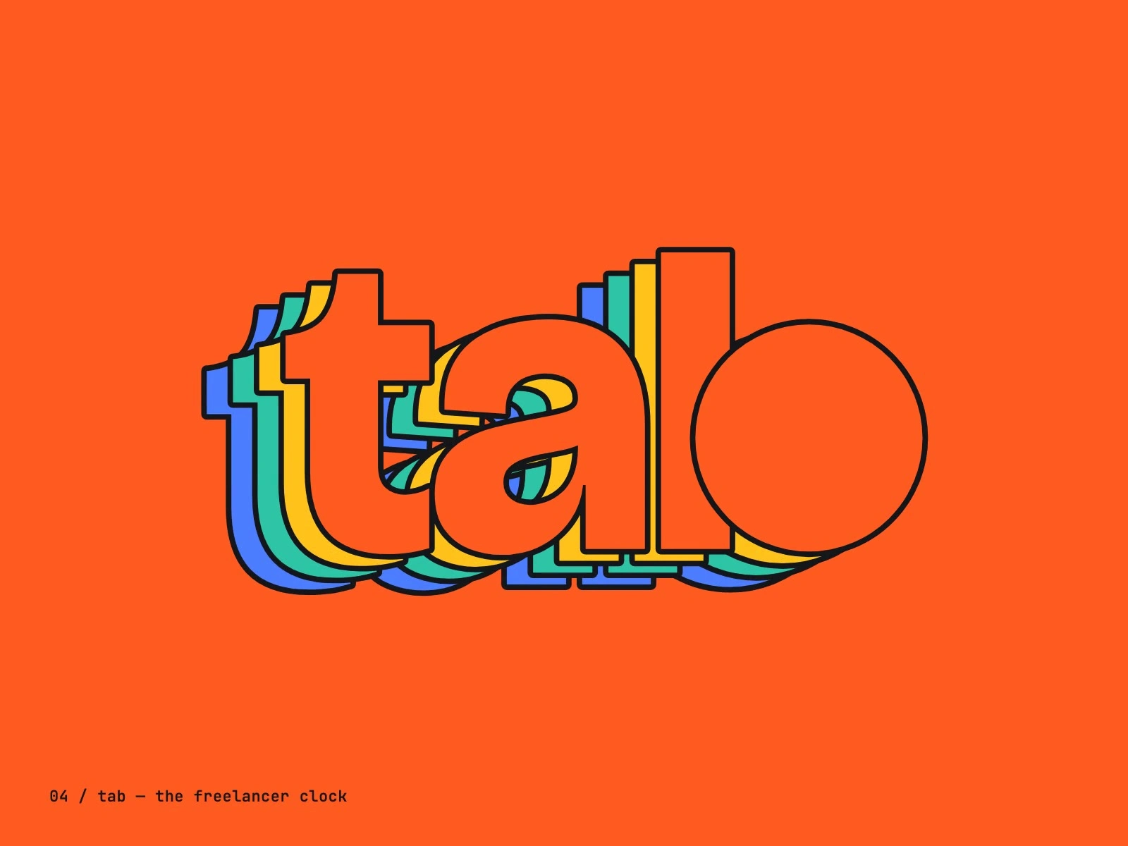
tab: four colored layers stacked behind the word, because your hours stack up.
TasteOS: a fork in a warm app tile, built to read at icon size.
Colonial Colony (client, through an agency partner): twin palms over a wave for a 55+ community.
VitalHaven (client): a wave rising through the H like a beacon, for home health and hospice software.
Dropat: a pin that drops where a memory lives.
Design Alchemy: a metallic DA monogram for an experimental design lab.
What this means for your brand
If your logo is close but not working everywhere it needs to, this is the work I do in my Brand identity refresh: refine what you have, make it hold up on every background and size, and hand over a short guide and the full file set.
https://bradyux.com
Like this project
Posted Oct 11, 2026
Nine logos for my own products and for clients. Each answers one question: what does this brand need to say at a glance?
Likes
0
Views
1