Email Mobile App Design
Peter umeh
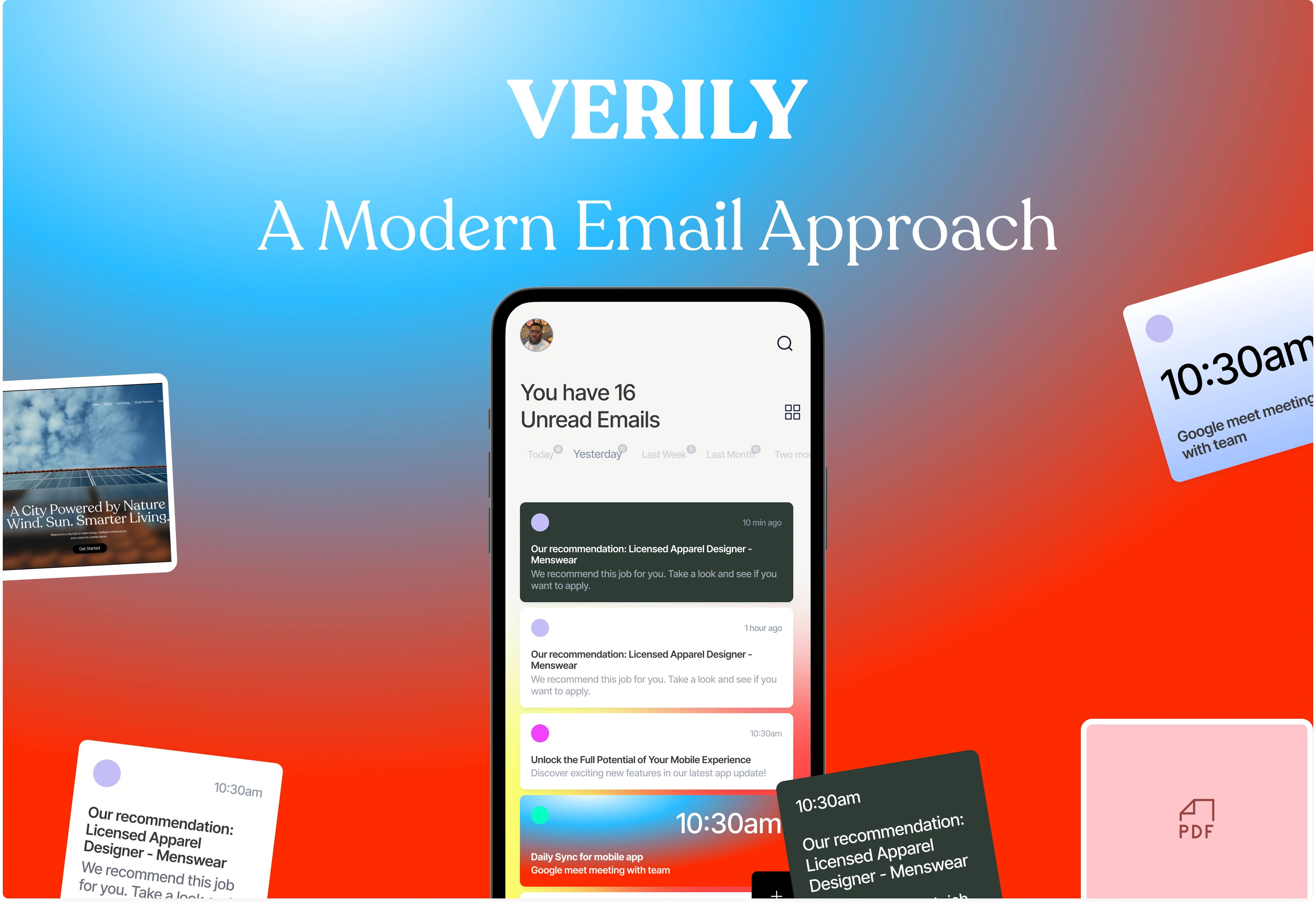
Email app design but make each messages a box, add colour and vibrance, add stack cards.
Overview
Email remains a crucial communication tool, yet many apps feel dated and overwhelming. This project aimed to reimagine the email experience on mobile by prioritizing clarity, visual appeal, and user efficiency.
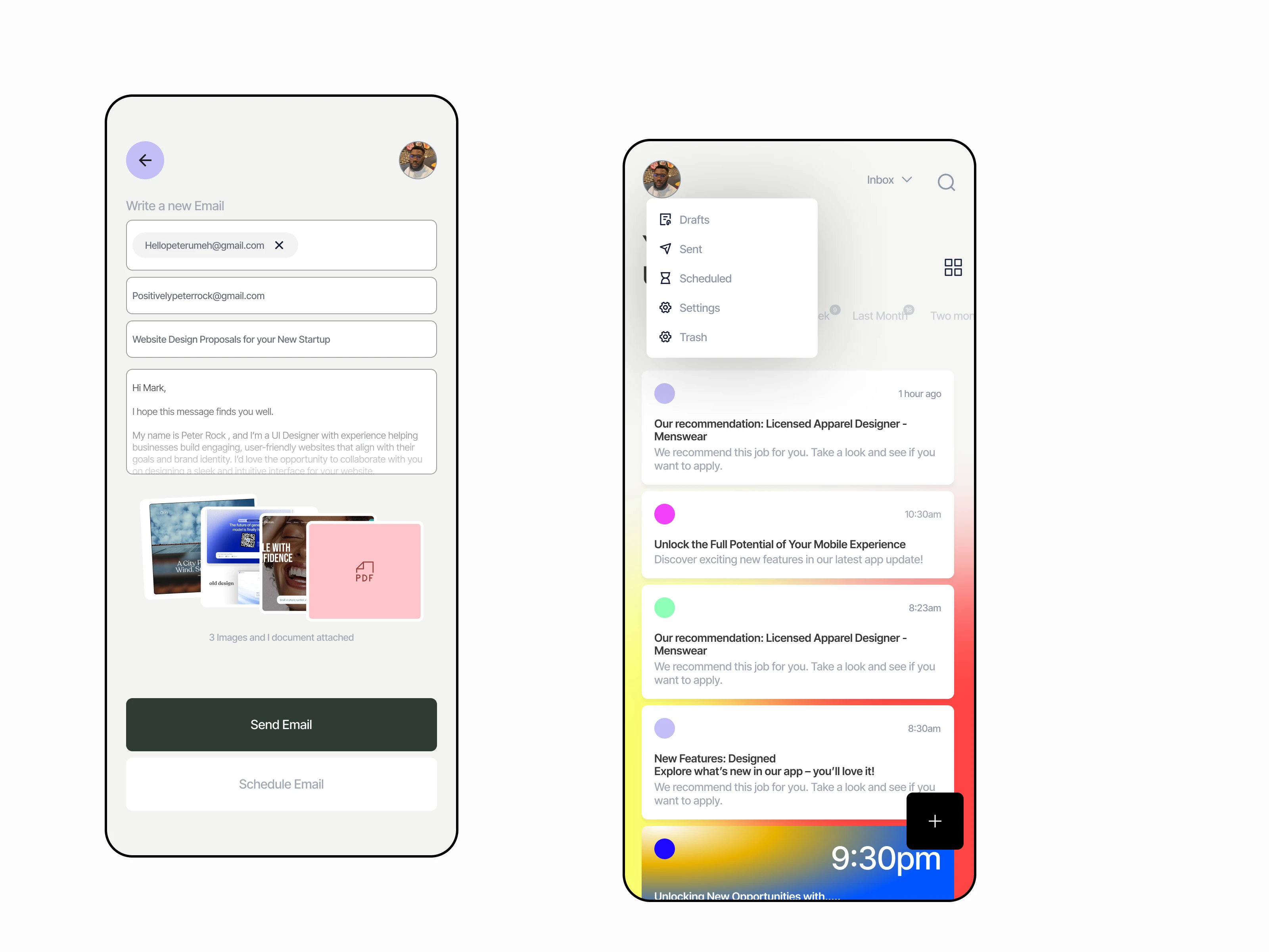
Send messages with style, monitor your inbox, outbox, and send attachments with style. www.peterumeh.com
The challenge
Most email apps are cluttered, making it hard for users to quickly scan and process information. The goal was to design a refreshing and modern interface that simplifies email consumption while adding a personal, joyful feel.
You can search messages, change layout styles to access information much easier.
The Solution
The Solution
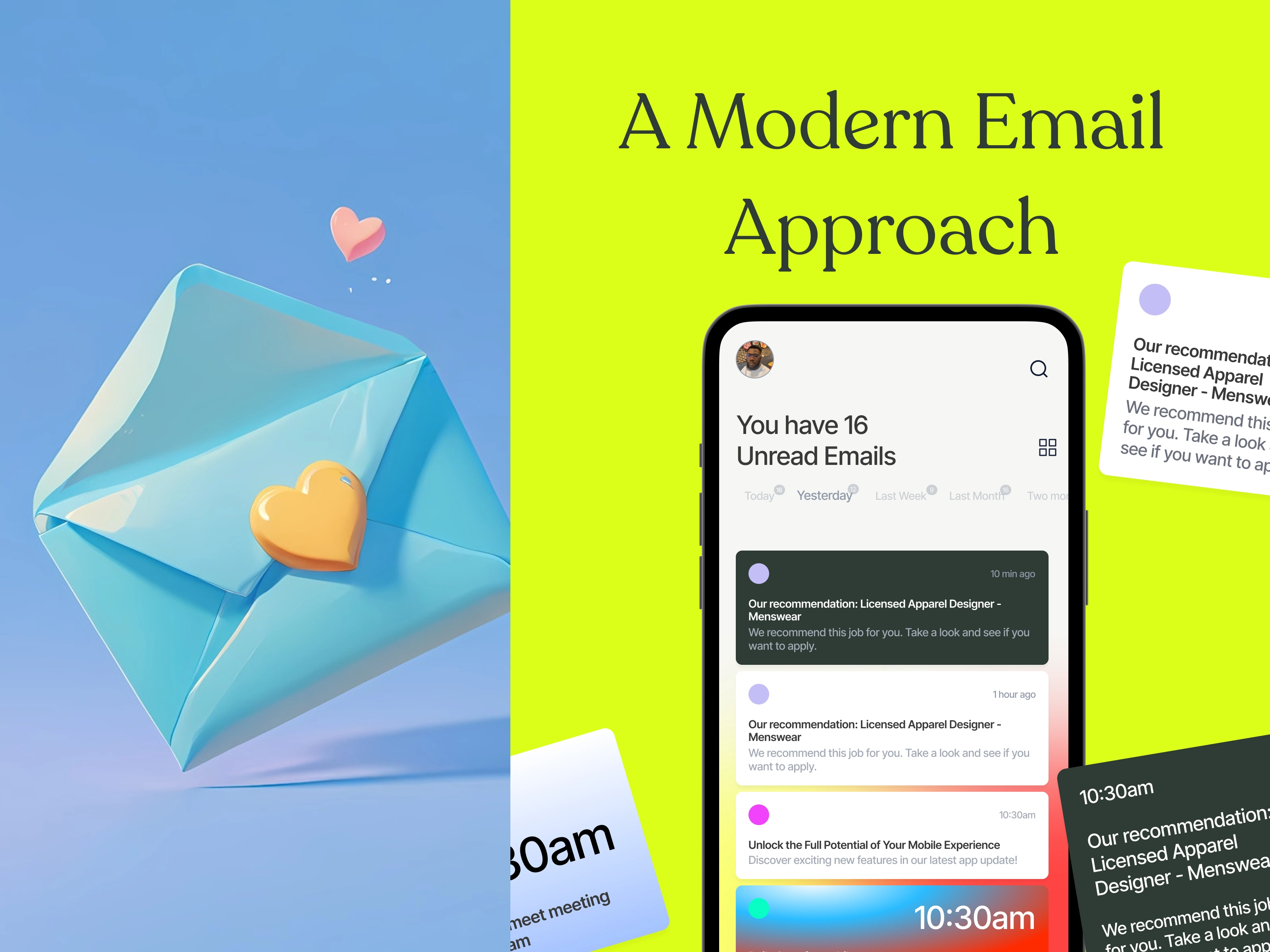
Clean & Friendly Aesthetic: Soft typography and pastel tones create a calming experience. A floating 3D envelope with heart details introduces warmth and emotional connection.
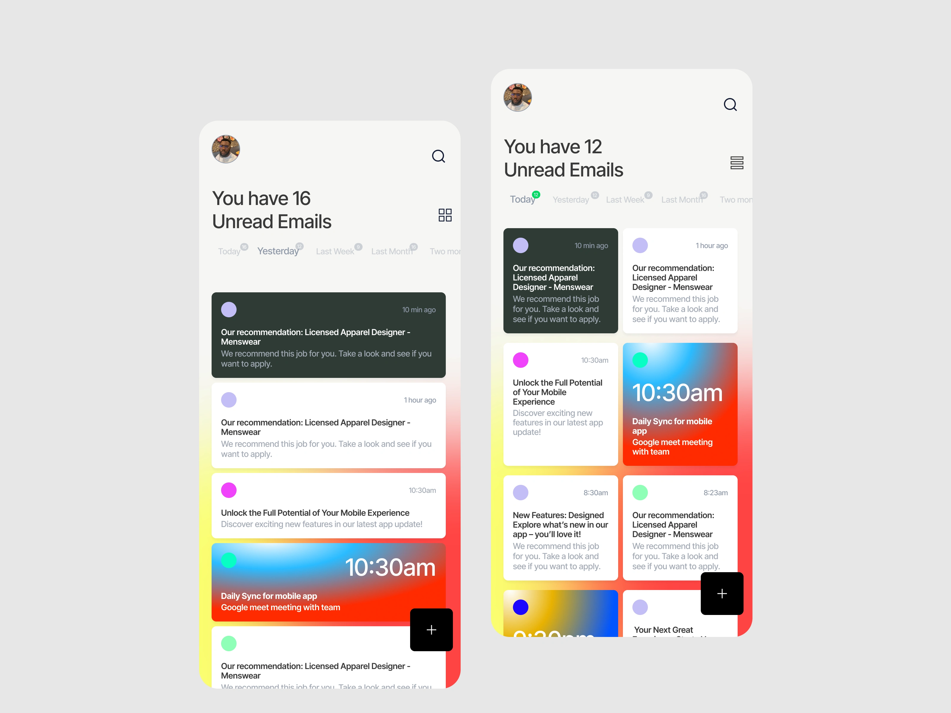
Prioritized Content: Unread emails are clearly highlighted with timestamps and easy-to-skim previews.
Two Viewing Modes: Users can toggle between list view for deep reading and grid view for faster scanning.
Smart Categorization: Tabs like “Today,” “Yesterday,” and “Last Week” allow for contextual sorting without manual filters.
Color-coded Emails: Visual tags enhance quick recognition of types of emails (e.g., job offers, updates, meetings).
This design modernizes how users interact with emails, reducing visual clutter while promoting engagement. The app’s UI brings joy and function together — turning a traditionally stressful activity into a pleasant daily ritual.
Would you like to design a functional Mobile App?
Please send me a message,
Thank You.
Like this project
Posted Apr 21, 2025
Email app designed to be simple, easy, intuitive to use. Attachment and styles. Transform even the most utilitarian tools into delightful digital experiences.