Built with Framer
PuppetVendors - Multi-Vendor Marketplace App for Shopify
Approve request to show earnings
View
Jithin Kumar
Verified
PuppetVendors
Designing a SaaS product site that has to sell complexity as simplicity.
Multi-vendor marketplace software is inherently complicated. Commissions, payouts, order routing, vendor portals, inventory sync, fulfillment splits. The feature list alone could fill a spreadsheet. PuppetVendors had built the #1 rated multi-vendor Shopify app, trusted by 1,000+ stores in 50+ countries, but the marketing site needed to make all of that feel approachable. Not dumbed down. Approachable.
I handled the entire project end to end. Design system and concepts in Figma. Full development, interactions, and responsive implementation in Framer.
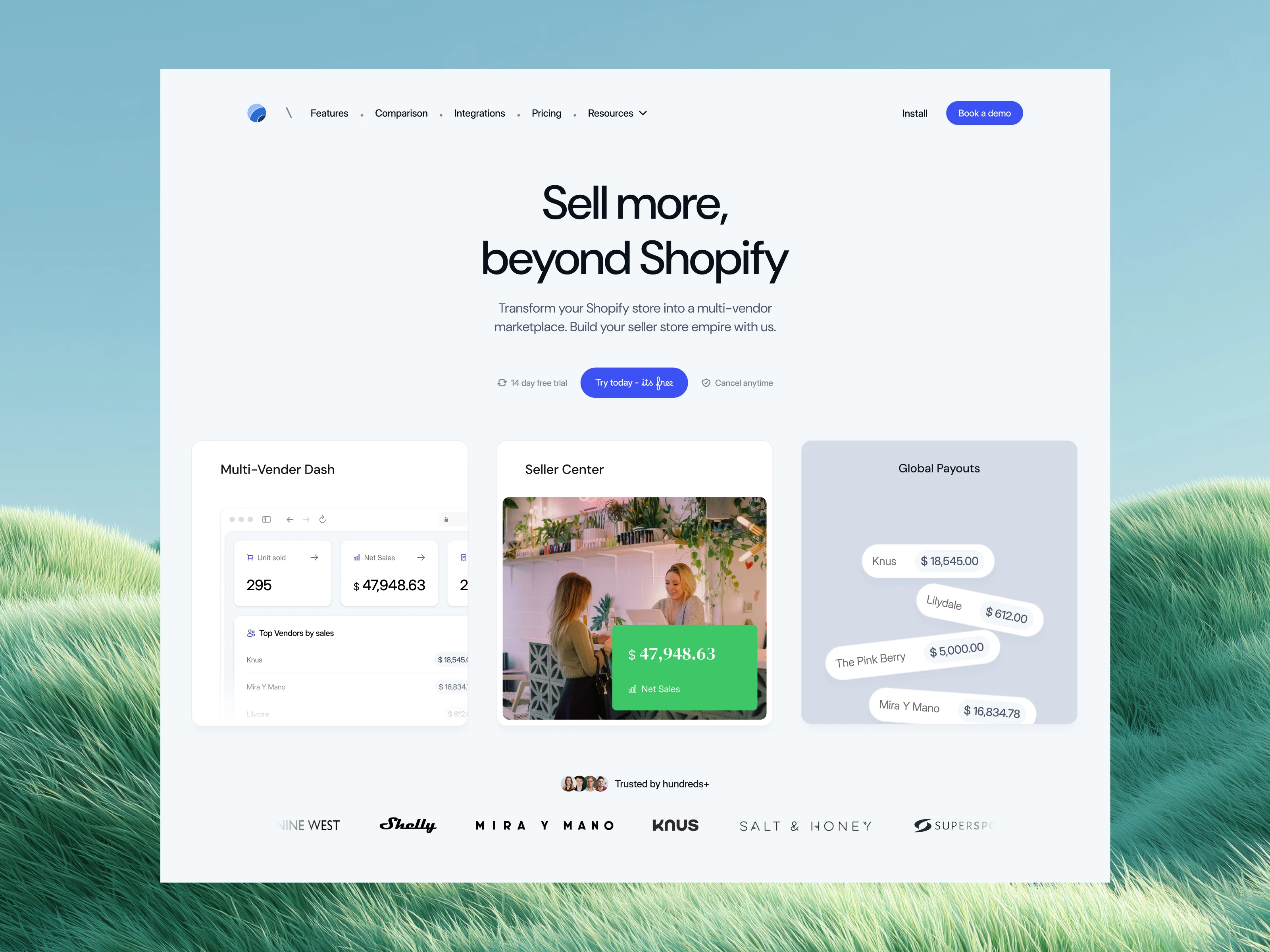
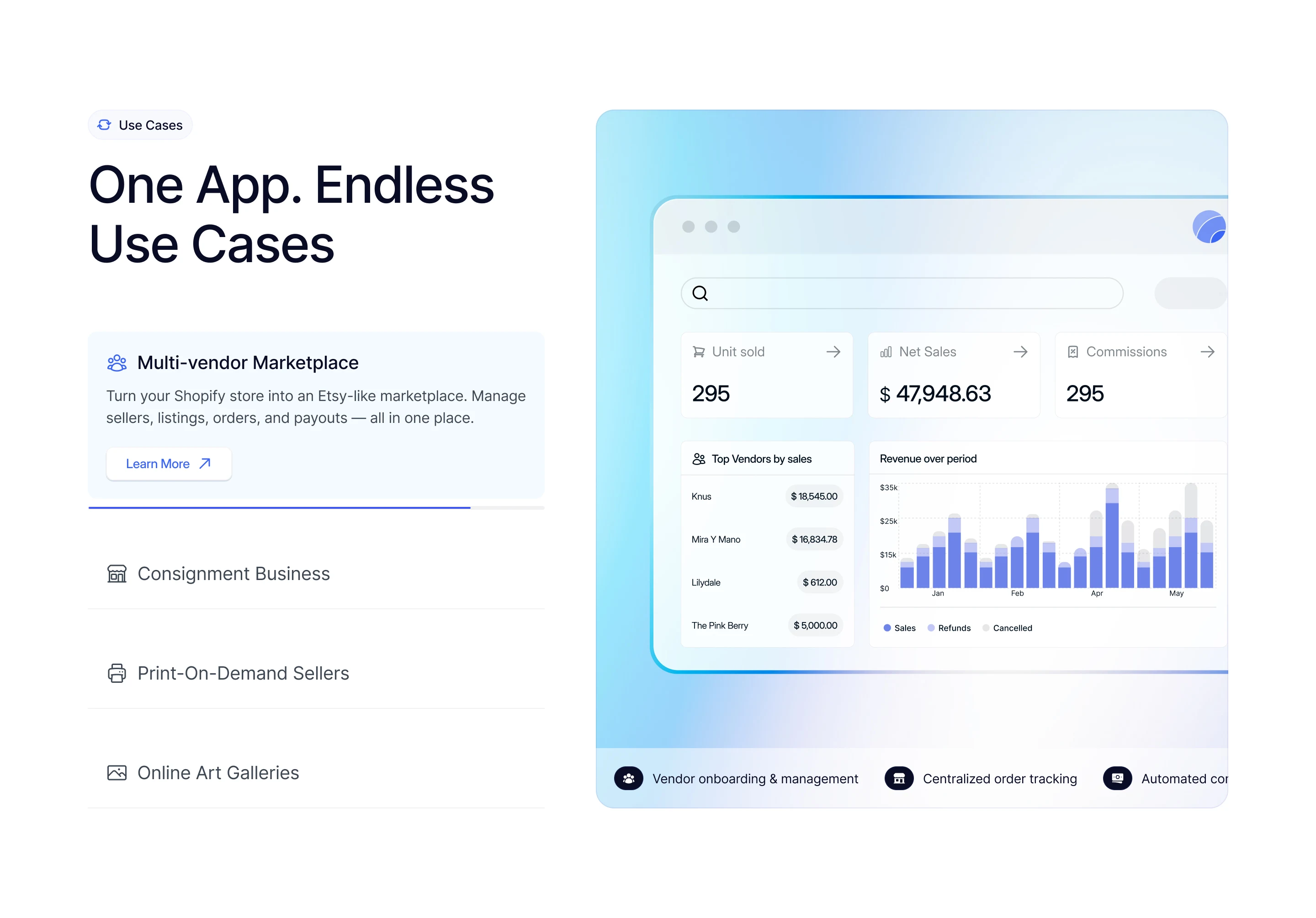
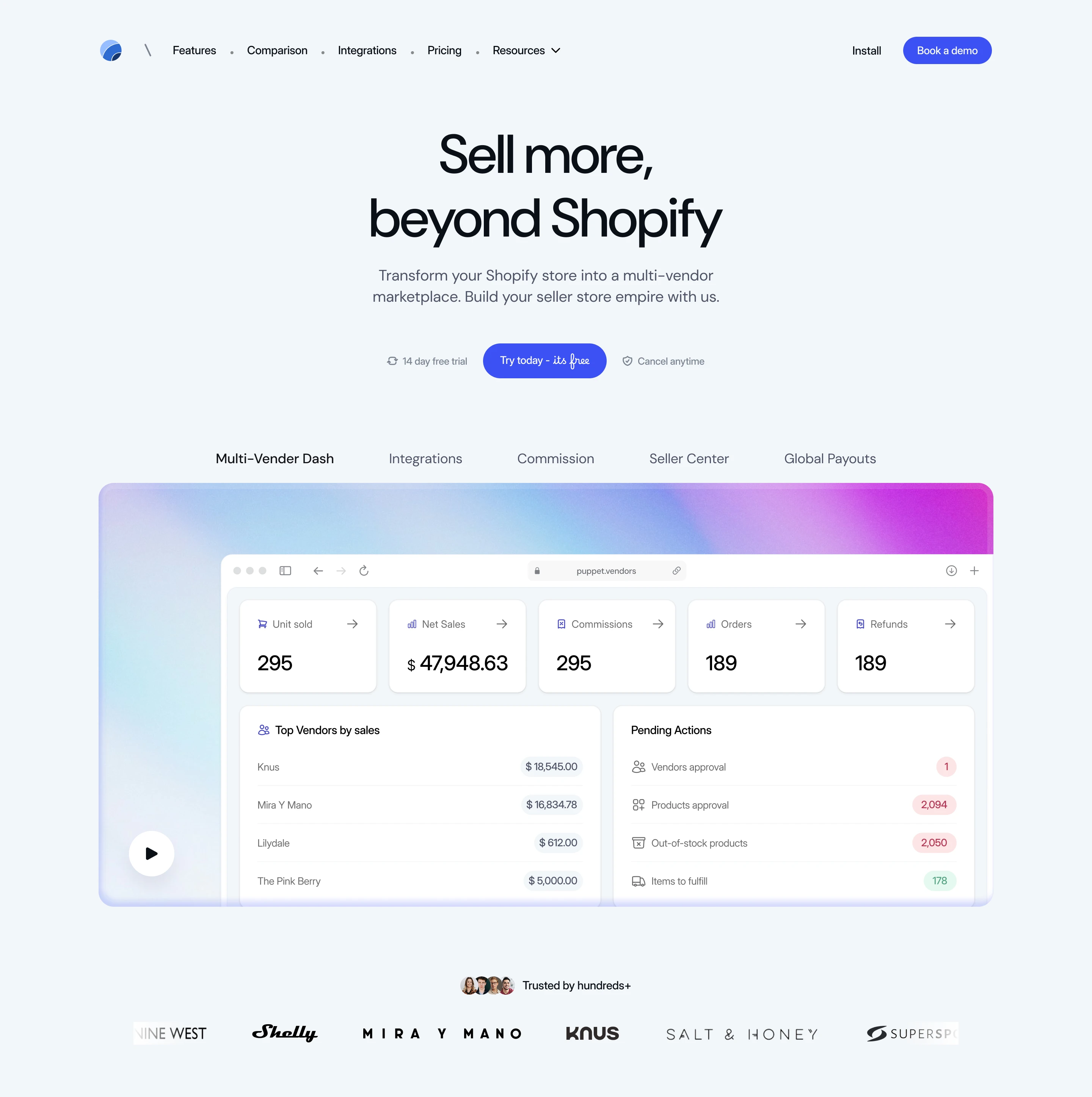
The hero does two jobs in three seconds.
The headline is direct: "Turn your Shopify store into a Multi-Vendor Marketplace." No metaphors, no cleverness. The subline stacks the core value props (vendor dashboards, automated commissions, inventory management) into a single sentence. Below that, a trust bar: "Trusted by 1,000+ Shopify stores in 50+ countries" with real merchant avatars.
But the real work happens on the right side of the hero. A live-feeling dashboard UI shows revenue charts, commission breakdowns, vendor leaderboards, and unit counters with animated number tickers. It's not a static screenshot. It's a designed representation of the product that moves, scrolls, and breathes. The visitor sees the product working before they've read a single feature description.
The use cases section reframes features as business models.
Most SaaS sites organize by features. PuppetVendors organizes by what you're trying to build. The "Use Cases" section presents five distinct marketplace models: Multi-Vendor Marketplace, Consignment Store, Print-on-Demand, Online Art Galleries, and Multi-Vendor Reporting. Each one is an accordion that expands with a tailored description.
This is a strategic design choice. A store owner running a consignment shop in Thailand and a digital art gallery in Australia have completely different mental models. By leading with use cases instead of features, the site lets each visitor self-select into the narrative that matches their business. The feature details come after, once the visitor already feels understood.
The case study callout embedded in this section (75+ artists onboarded in 47 days with zero dropoff) adds concrete proof right where the visitor is evaluating fit.
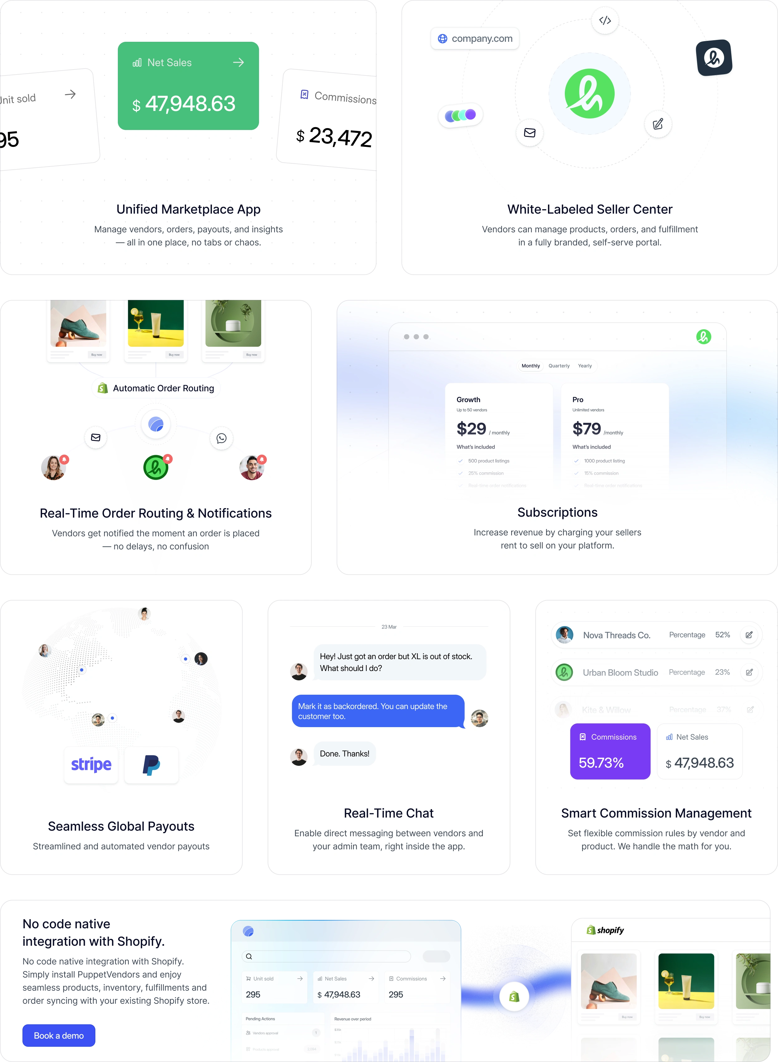
The features section is a product tour disguised as a scroll.
Seven feature blocks, each with its own visual treatment:
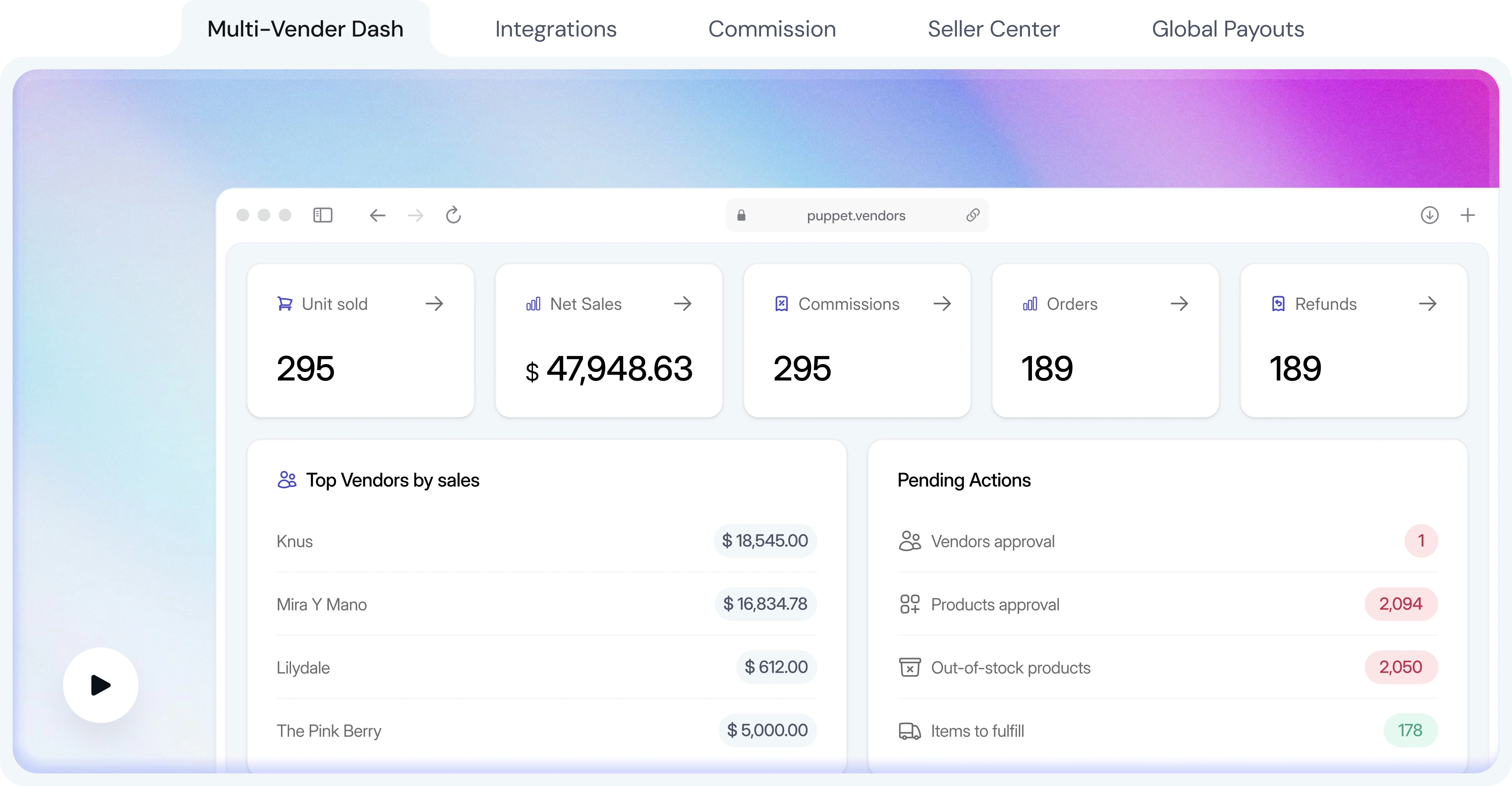
Unified Marketplace App shows the admin dashboard with commission stats, unit counts, and net sales in a clean card layout. The message: everything lives in one place.
White-labeled Vendor Center demonstrates the branded portal concept with a domain bar (company.com) and product cards. Vendors see your brand, not PuppetVendors'. This is a major selling point for enterprise buyers, and the design makes it tangible.
Real-Time Order Routing visualizes the automatic split: multi-vendor orders routed to the right vendor instantly. The UI mock shows product cards flowing into vendor-specific queues.
Vendor Subscriptions displays a pricing table within the feature card itself, showing how marketplace owners can charge vendors recurring fees. It's a feature-within-a-feature, and the nested pricing UI makes the capability immediately concrete.
Automated Vendor Payouts lists vendors with their payout amounts alongside Stripe and PayPal logos. No explanation needed. The visual is the explanation.
Real-Time Chat shows an actual conversation thread between a vendor and admin, complete with message bubbles, timestamps, and avatars. It feels like a real product interaction, not a mockup.
Smart Commission Management displays vendor-specific commission percentages in a clean table with progress indicators.
Each feature block uses consistent spacing, a subtle background pattern, and product UI that feels alive. The blocks alternate between left-aligned and right-aligned layouts to keep the scroll from feeling repetitive.
The integrations section removes the "will it work with my stack" objection.
Four tabs: Automation, Marketing, Shipping Providers, and Accounting. Each tab reveals a grid of integration logos. The Zapier callout (8,000+ apps) covers the long tail. Webhook and API mentions signal to technical buyers that custom integrations are possible.
The layout is scannable. If your tool is in the grid, you move on. If it's not, the API and Zapier options catch you. Two seconds to resolve the objection.
The interactions sell the product before the product does.
The animated number tickers in the hero (81m units sold, commission counts) create a sense of scale and activity. They tick up as you watch, suggesting a platform that's processing real transactions right now.
The vendor leaderboard carousel auto-scrolls through top vendors by sales, reinforcing the marketplace concept with real-feeling data.
Feature cards use scroll-triggered reveals with staggered timing. The dashboard UIs within each feature block have subtle hover states and micro-animations that make them feel interactive, even though they're marketing representations.
The testimonial carousel supports navigation arrows with smooth card transitions. The logo marquee in the trust bar runs at a comfortable reading pace.
Every interaction serves the same goal: making an abstract SaaS product feel tangible and alive.
What made this project challenging.
SaaS product marketing for a tool this feature-rich is a balancing act. Show too little and the buyer doesn't understand what they're getting. Show too much and they're overwhelmed before they sign up. The solution was to organize everything around the visitor's mental model (what am I building?) rather than the product's internal structure (what features do we have?). Every section answers a question the buyer is already asking, in the order they're asking it.
The result is a site that makes a complex B2B SaaS product feel like something you could set up this afternoon.
Like this project
What the client had to say
Great experience working with Jithin on the PuppetVendors website redesign. He was responsive, flexible with feedback, and quick to iterate. He consistently shared multiple designs and was always available to discuss and refine ideas.
Kriang Khanijomdi, PuppetVendors
Mar 9, 2026, Client
Posted May 18, 2026
Designed and built PuppetVendors' marketing site end to end in Figma and Framer for the #1 rated Shopify multi-vendor marketplace app.
Likes
0
Views
43
Timeline
Jul 18, 2025 - Mar 9, 2026
Clients
PuppetVendors