Built with Webflow
Sunsama - Designed & Developed a Calm Productivity App
Approve request to show earnings
View
Jithin Kumar
Verified
Sunsama
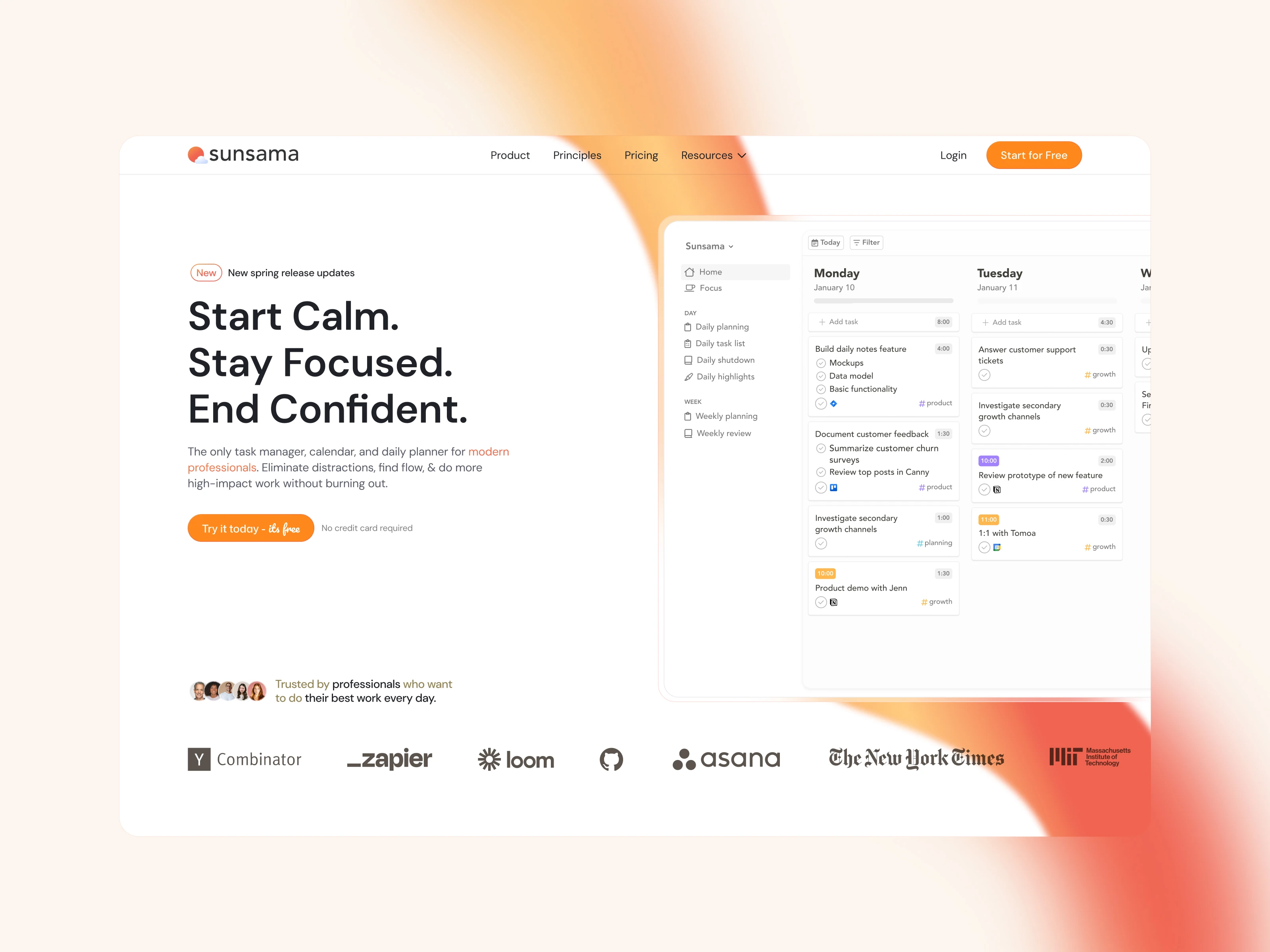
The productivity tool that had to feel like the opposite of productivity software.
Most task managers look like they were designed to give you more work. Dense sidebars, aggressive notification badges, tables that scroll forever. The irony is thick: the tool meant to reduce your stress is itself stressful to look at. Sunsama had already solved this at the product level, a daily planner that helps professionals feel calm, stay focused, and end the day on time. But the marketing site needed to make that same promise the moment someone landed on it, before they ever signed up.
I handled the entire project end to end. Design concepts and system in Figma. Full development in Webflow. Every layout, interaction, and responsive breakpoint.
The visual system borrows from the product's own philosophy.
Sunsama's product is built around the idea that less is more. The website had to embody that without feeling empty. I worked with a restrained palette: soft neutrals, warm whites, and selective pops of Sunsama's brand colors only where they earn attention. The typography is clean and confident, with enough weight to feel authoritative but enough spacing to feel breathable.
Every section has room to exist on its own. No stacking five features into a single viewport. No cramming logos and testimonials into the same row. The layout gives each idea its own moment, the same way Sunsama gives each task its own time block.
The homepage is structured around a single emotional arc.
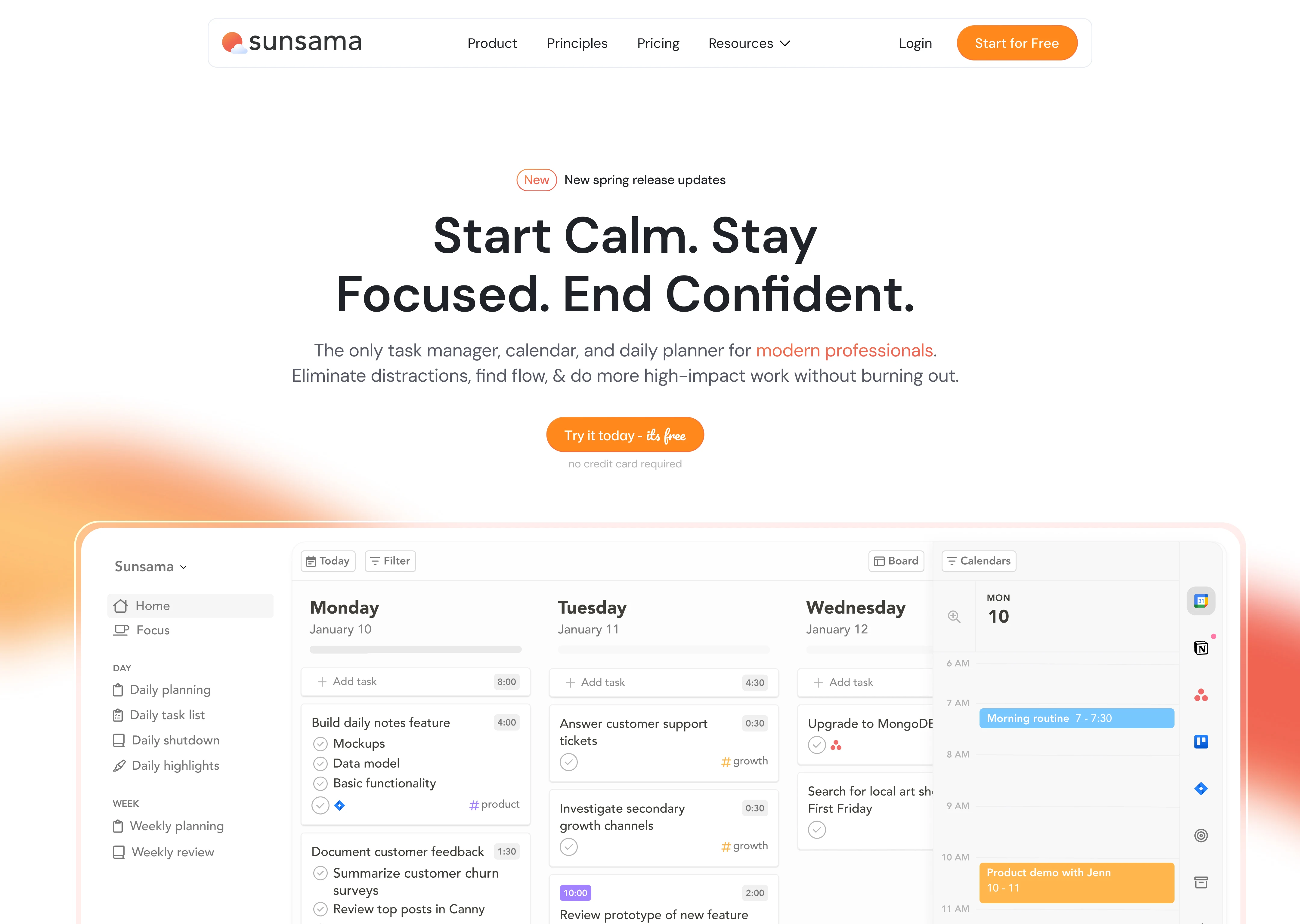
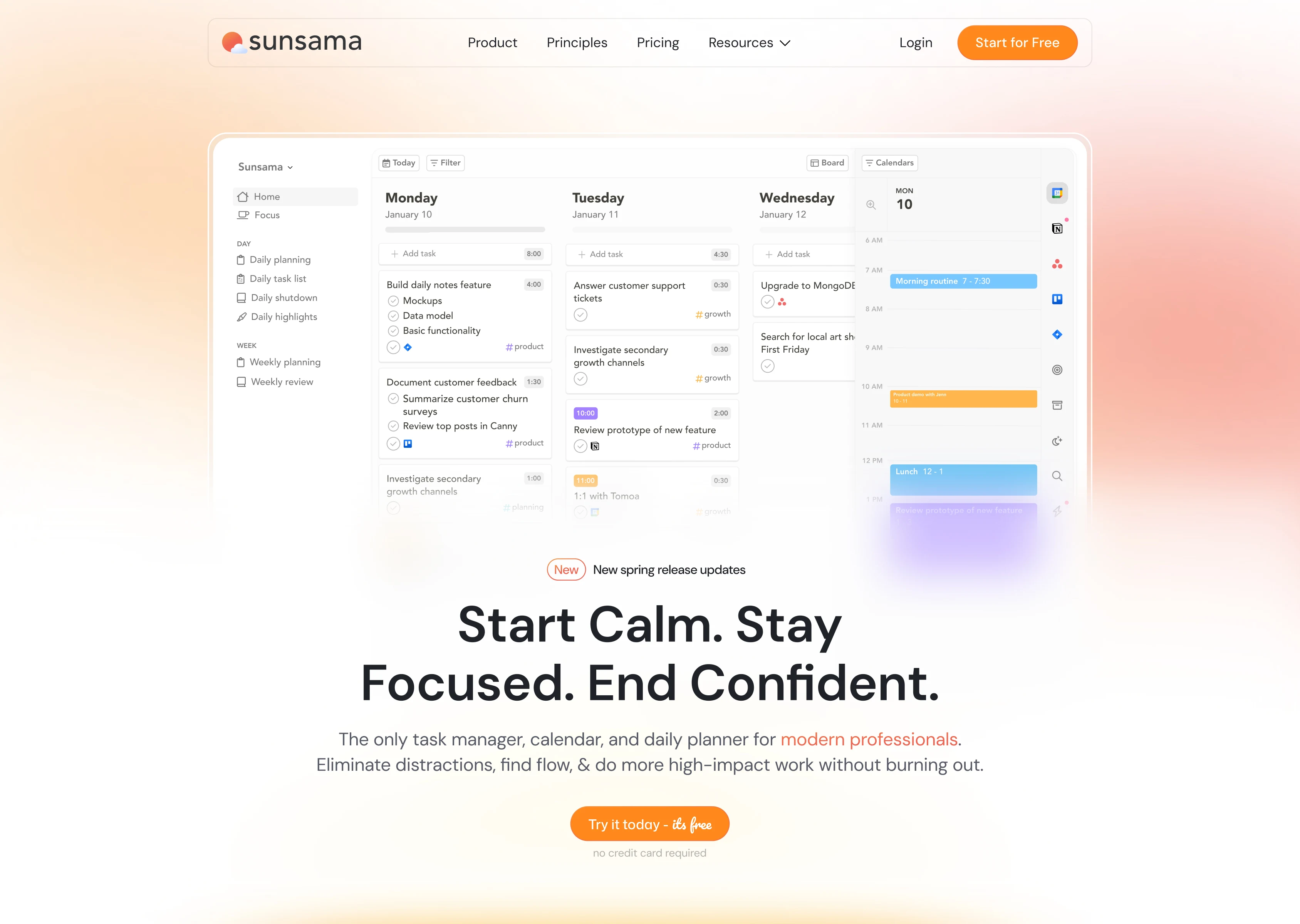
The site doesn't open with a feature list. It opens with a feeling: "Start Calm. Stay Focused. End Confident." That's the entire product promise in 7 words. The hero pairs this with a clean product screenshot showing the daily planner view, tasks and calendar side by side, so visitors immediately understand what they're looking at.
From there, the page follows a deliberate emotional journey:
The problem. "Work is f***ing chaotic." Bold, honest, and immediately relatable. Three pain points laid out with red X marks: always on, constantly interrupted, struggling to manage tasks and meetings. This section doesn't sugarcoat anything. It meets the visitor exactly where they are.The solution. Sunsama turns chaos into clarity. Three green checkmarks mirror the red X's above: end the day on time, block focus time, see tasks and meetings in one plan. The visual symmetry between problem and solution is intentional. It makes the transformation feel concrete, not abstract.
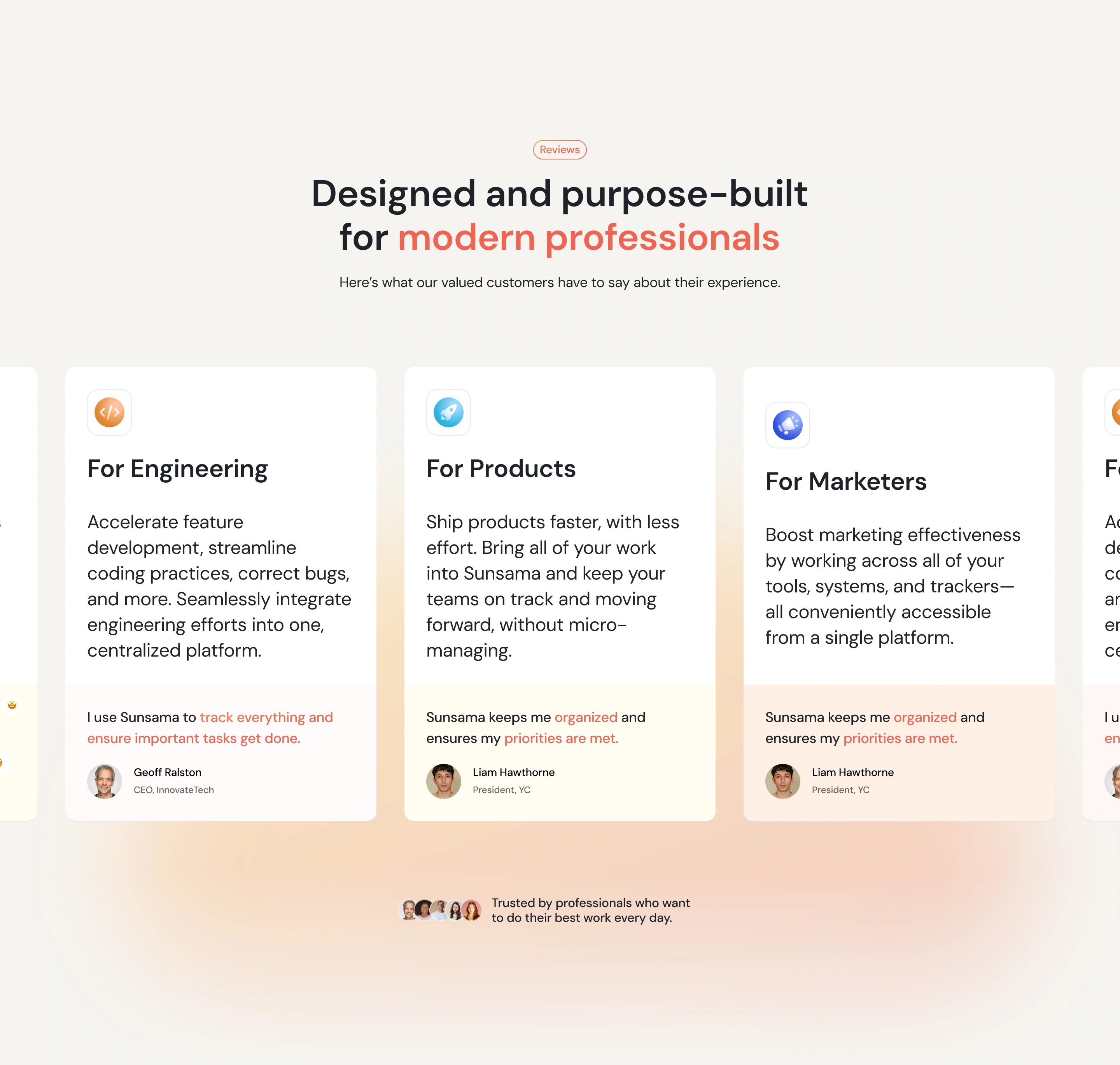
Social proof. Testimonials from the President of Y Combinator, founders, and CEOs. Logo bar featuring Zapier, GitHub, MIT, Asana, NYT, Loom, and HubSpot. The NYT Wirecutter "Best Scheduling Tool" badge anchors credibility throughout the page.
The features section teaches through showing, not telling.
Three feature blocks map to the daily arc: "Start your Day," "Work through your day," and "Make every day count." Each block leads with an emotional headline, follows with a concise explanation, and is supported by product UI screenshots that show exactly what the feature looks like in practice.
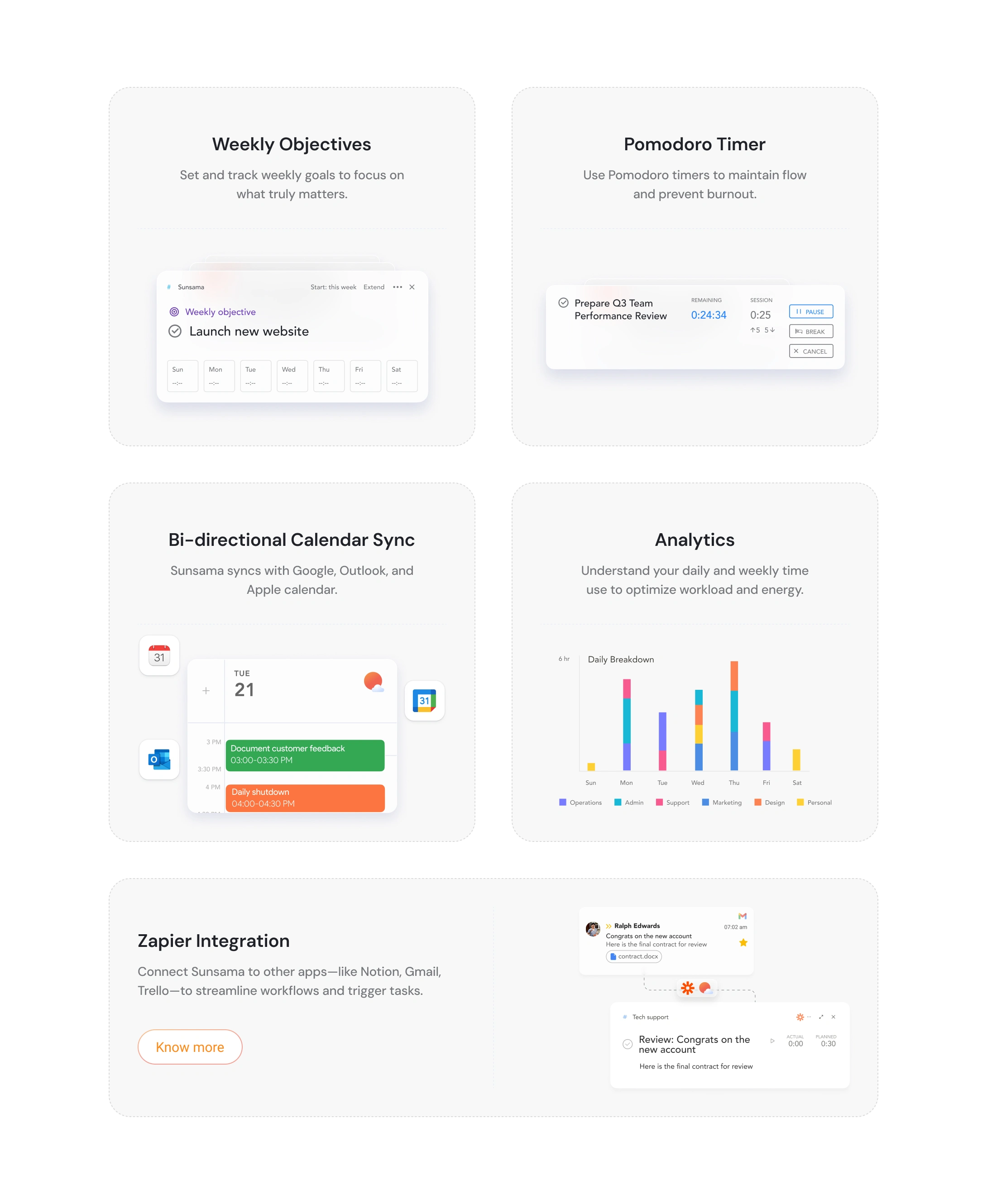
Within each block, sub-features are broken into digestible cards:
Morning planning: Visualize and block time on your calendar. Unify work across tools. Pull tasks from Asana, Trello, Jira, Gmail, Slack, and more into one focused list.
Midday focus: Focus mode with Pomodoro timers. Mute distracting apps. Automatic break reminders that actually feel human (emoji-based check-ins, not corporate pop-ups).
End of day: Daily shutdown ritual. Automatic progress tracking. Analytics showing where your time actually went, broken down by category across the week.
The product screenshots are the real stars here. Each one is carefully framed to show just enough UI to be useful without overwhelming. They're not full-app dumps. They're cropped, contextual glimpses that make you want to try the thing.
The integrations section solves a real objection.
"Will this work with my existing tools?" is the first question any productivity-tool buyer asks. The integrations section answers it with organized rows: Calendar Apps, Project Management Apps, Task Management Apps, and Email/Messaging Apps. Each category gets a one-line value prop and a grid of recognizable logos.
The layout is scannable in under 3 seconds. If your tool is there, you keep scrolling. If it's not, Zapier covers the gap. Objection handled.
The comparison table is competitive without being aggressive.
A clean feature comparison grid puts Sunsama against Akiflow, Motion, and Todoist. Green checks and red X's. No editorializing, no "we're better because..." copy. The table lets the features speak. Sunsama checks every box. The competitors don't. That's the entire argument.
The interactions reinforce the calm.
Every animation on this site is slow on purpose. Scroll-triggered reveals use gentle fades and slides. Nothing snaps into place. Nothing bounces. The testimonial carousel transitions smoothly between quotes. Hover states on integration icons and feature cards are subtle, just enough to confirm interactivity.
The logo marquee in the social proof section runs at a pace you could read while walking. The comparison table loads progressively as you scroll, so you're never hit with a wall of data.
This restraint is the hardest part to get right. The instinct is always to add more motion, more personality, more "delight." But Sunsama's brand promise is calm. The interactions had to honor that.
The CTA strategy mirrors the product's daily rhythm.
"Try for free" appears in the hero, mid-page, and at the bottom. "14-day free trial, no credit card required" removes friction every time. The final CTA section strips everything back to a single line: "Make every day count." One button. No distractions. The same philosophy the product itself teaches.
What made this project different.
Designing for a productivity tool is a paradox. The site has to communicate a lot of information (features, integrations, comparisons, testimonials, pricing) without ever feeling information-heavy. Every section had to earn its place by answering a specific visitor question, and the transitions between sections had to feel as intentional as the daily planning ritual Sunsama teaches its users.
The result is a site that practices what the product preaches: focused, calm, and confident that less, done well, is enough.
Like this project
Posted May 18, 2026
Designed and built Sunsama's marketing site end to end in Figma and Webflow, with restrained interactions and conversion-focused structure.
Likes
1
Views
25
Timeline
May 20, 2025 - Sep 22, 2025
Clients
Sunsama